Slider Pro
Installing Builder Addons
Note: Builder Addons require the Themify Builder. You can use it with either any Themify theme or the Builder plugin.
Installing Builder Addons is exactly the same as installing WordPress plugins.
To install the addon:
- Firstly, download the addon zip file from the link provided in your Themify Member Area.
- NOTE: some browsers (eg. Safari) auto extract zip files automatically. Right-click on the download link and select "Save Linked File As" and it will allow you to download as a zip file.
- Login to your site's admin area.
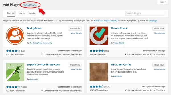
- Navigate to WP Admin > Plugins > Add New.
- Now, click the "Upload Plugin" link.
- Select "Browse" and navigate to the plugin zip file which you downloaded in the first step and then select the "Install Now" button.
- This will initiate the plugin installation process, and once finished, you can then activate the plugin.
Importing the addon demo layout
Each addon zip file contains a sample Builder data file which you can import to your site. It helps you to understand how the addon demo is created.
To import the addon demo data:
- First, extract addon zip file to your local computer
- You should have a folder of the addon. Inside there is a folder named "sample", and inside that folder there is a Builder data file in a zip format (eg. "addon_name_sample-builder-layout.zip").
- To import the Builder layout, login to admin and then go to the page frontend where you want to import the Builder layout. From the top admin bar > select Themify Builder > Import / Export > Import, upload the sample zip file.
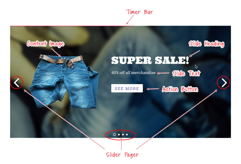
Slider Overview
To help you get started below is an image where we've highlighted various elements within the slide of the Slider Pro addon.
Using the Slider Pro Addon
Once addon is installed, you will find the Slider Pro addon module in the Themify module panel. The module is available in both backend and frontend edit mode (just like all standard modules).
- In the backend: you can find the Slider Pro module in the Themify Custom Panel.
- On the frontend: you can see the modules after turning on the Builder from top admin bar > Themify Builder > Turn On Builder.
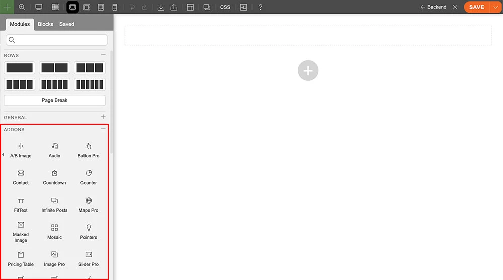
- Drag and drop a Slider Pro module in a row.
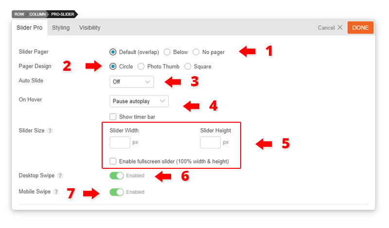
- Slider Pro Options:
- 1) Slider Pager = Select the position of the slider pager.
- Default (overlap) = Default which has the next/prev and circles overlap in the middle.
- Below = Pager will appear below the slider.
- No Pager = No pager or circles.
- 2) Pager Design = Select the design that you would like your pager to appear as.
- Circle = Pager will appear as a circle for each slide.
- Photo Thumb = Pager will appear as a thumbnail preview of each slide.
- Square = Pager will appear as a square for each slide.
- 3) Auto Advance to next slide = Select the number of seconds that you would like the slider to automatically advance to the next slide.
- Show Timer Bar = This gives you the option to either show or hide the "timer bar" that will appear at the top of the slider.
- 4) Slider Width and Height = Indicate the width and height of your slider (leave empty to have auto width and height).
- NOTE: The Slider Pro has auto fullwidth feature, so it displays the slider fullwidth and scales it proportionally. To achieve custom dimension, you must enter the slider width and height. Please try to enter slider width = 1160px (which is the page width) and height = 600px.
- 5) Slider Row Options = Choose to either duplicate or delete the slide. Scroll down to see an expanded description of the Slider row options.
- 6) Add New Row = Add as many rows as you would like on your Slider Pro.
- 1) Slider Pager = Select the position of the slider pager.
- Slider Row Options:
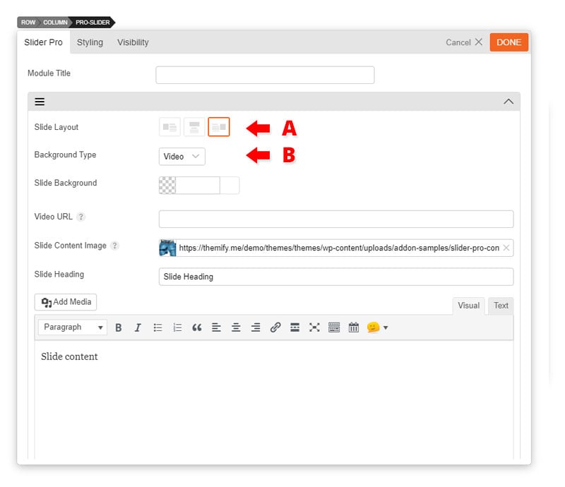
- A) Slide Layout = Choose a slide layout that indicates where your text/image will be placed on the slide
- B) Slider Background Type:
- Image:
- Slide Image Background = Choose to either use a solid color background or use one from your media library.
- Slide Content Image (Only for icon right and left slide layout) = Input the image you would like to appear on the left/right side of the slide
- Slide Heading = Heading text of slide
- Text Editor = Input any text that you would like using the editor.
- Slide Text/Link Color = Input the color for the text and link color.
- Video - Similar to the image background type. The only difference is that the Slide Image Background is replaced with the Video URL.
- Video URL = Input Youtube, Vimeo, or embed link to your slide
- Image:
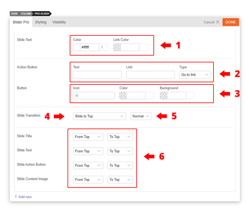
- Action Button:
- Text = Input text that you would to appear inside the button.
- Link = Input the link of the button.
- Icon = Input the icon that you would like to appear on the left of the text.
- Color = Indicates the text and icon color.
- Background = Indicates the background containter of the button.
- Animation:
- Slide Transition = Is the animation that occurs for each slide.
- Duration = Is the number of seconds that you would like the animation to occur.
- Slide Title, Text, Action Button, and Content Image = Choose the animation that will occur for each element on the slide.
- Start Animation = Is the animation that occurs when the element enters the slide
- Duration = Is the number of seconds that you would like the animation to occur as it enters the slide
- End Animation = Is the animation that occurs when the element exits the slide
- Duration = Is the number of seconds that you would like the animation to occur as it exits the slide
- Start Animation = Is the animation that occurs when the element enters the slide
- Slide Transition = Is the animation that occurs for each slide.
FAQs
1. How to make Slider Pro auto fullwidth without affect the height?
Add the following code in Appearance > Customize > Custom CSS:
.module-pro-slider .slider-pro {
	width: 100% !important;
	max-width: 100% !important;
}
2. How to keep content image and text both visible on mobile?
Due to small mobile display, the slide content image is hidden on smaller viewport. You can make them visible by adding the following code in Appearance > Customize > Custom CSS:
@media (max-width: 780px) {
	.module-pro-slider .bsp-slide-content-center .sp-slide-image,
	.module-pro-slider .bsp-slide-content-right .sp-slide-image,
	.module-pro-slider .bsp-slide-content-left .sp-slide-image {
		display: block !important;
		transform: none !important;
	}
	.module-pro-slider .bsp-slide-content-right .sp-slide-text,
	.module-pro-slider .bsp-slide-content-left .sp-slide-text {
		width: 60% !important;
	}
	.module-pro-slider .bsp-slide-post-title,
	.module-pro-slider .bsp-slide-excerpt {
		transform: none !important;
	}
}