30 Jul 2014
Styling
Welcome to the Customize Panel Documentation, this guide contains everything that you need to know about Themify Customize Panel. It covers the entire set of features available under the Customize Panel and will guide you on how to use them, effectively.
The video covers a brief introduction and demos of all of the features available in the Themify Customize panel.
We had used the Basic theme as a base for this documentation, other themes may have different elements, however most will have the following settings available.
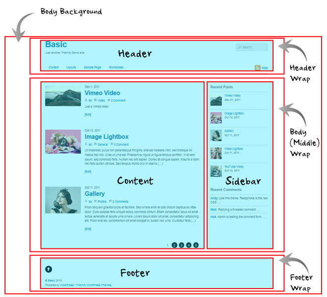
Structure
Themes are structured with specific areas which you can customize in the Customize Panel, here is the structure of a standard Themify theme:
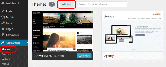
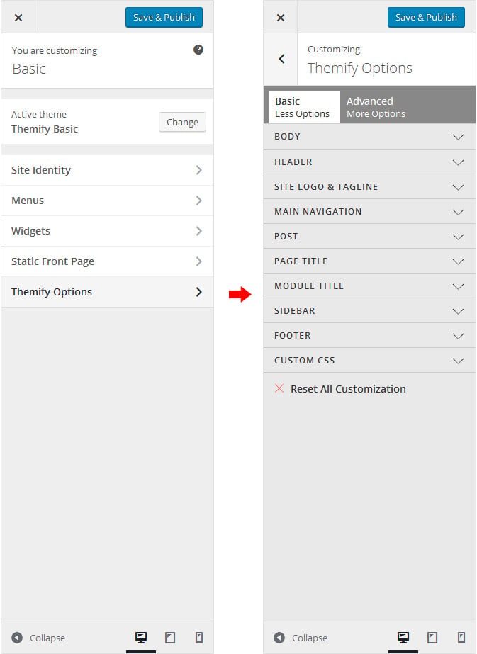
How to access Customize Panel
You can acess the Themify Customize Panel from the back-end, as well as from the front-end of your site.
1. Back-end
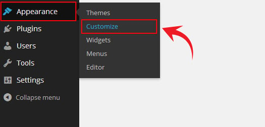
- Go to WordPress Admin > Appearance > Customize
2. Front-end
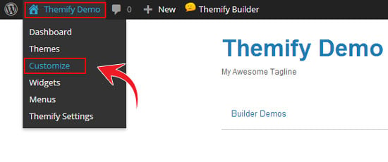
- Navigate to the Top Admin Toolbar > Customize
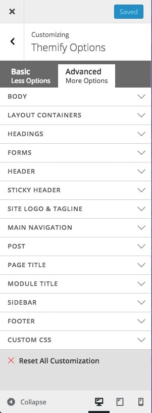
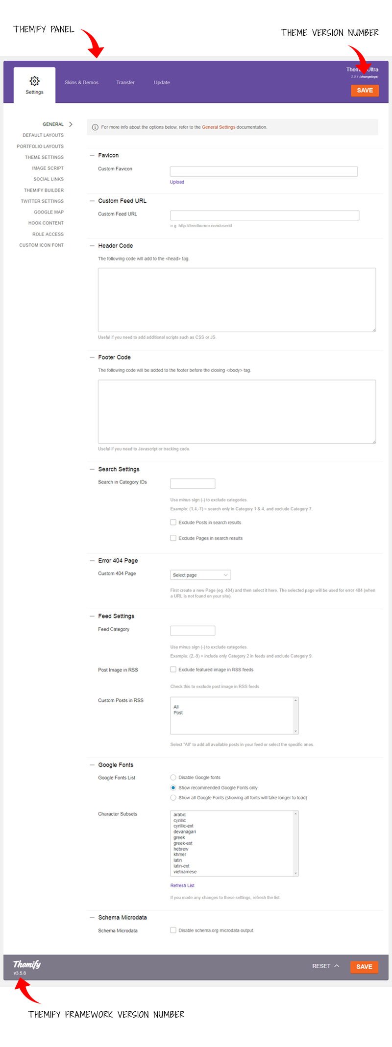
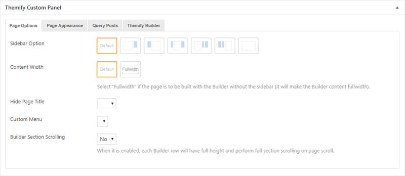
Customize Panel
In the Customize panel you will see the following tabs:
- Body
- Layout Containers
- Headings
- Forms
- Header
- Site Logo & Tagline
- Main Navigation
- Post
- Page Title
- Sidebar
- Footer
- Custom CSS
- Reset All Customization
- Responsive Styling
- Static Front Page
- Widgets
Body
The Body tab of the Customize panel is for altering the main body font of the theme, this is the main font style that all other text elements will inherit from. Some of these settings will be overridden in the other styling settings, such as post titles, etc.
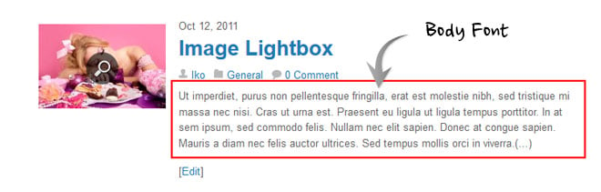
The above is an example of the body font, however all text elements may inherit attributes set in the Body tab.
There are multiple sections under the Body tab:
- Body
- These are the properties applied to the entire body section of your site.
- Body Font
- These are the properties applied to the body font as standard.
- Body Link
- These are the properties applied to the body font when a link is shown.
- Body Link Hover
- These are the properties applied to the body font when a link is hovered over by the user.
The properties present in the Body tab are covered in the Customize Properties - Background, Fonts, and Borders & Spacing.
Layout Containers
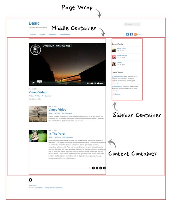
The Layout containers tab is to customize the various containers or sections of the theme such as page wrap, page width, middle, content, and sidebar containers.
- Page Wrap
- These are the properties applied to the page wrap container of the theme.
- Page Width
- These are the properties applied to the page width container of the theme.
- Middle Container
- These are the properties applied to the middle container of the theme.
- Content
- These are the properties applied to the content container of the theme.
- Sidebar
- These are the properties applied to the sidebar container of the theme.
The properties present in the Layout Containers tab are covered in the Customize Properties - Background,and Borders & Spacing, section.
Headings
The Headings tab of the Customize panel is for applying styling to the heading tags (H1 to H6) in your content. Note that styling the heading tags might also affect the heading tags used in the templates (eg. the post title also uses H2 or H1 tag).
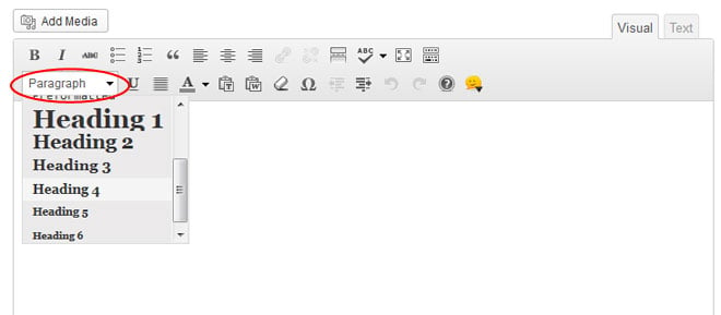
The properties present in the Heading tab are covered in the Customize Properties - Fonts section.
Forms
The Forms tab of the Customize panel is for applying styling to the various forms found on your site.
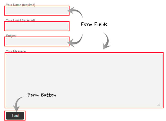
There are multiple sections under Form tab:
- Form Fields
- These are the properties applied to the form fields as standard.
- Form Fields Focus
- These are the properties applied to the form fields when they are selected and have focus.
- Form Buttons
- These are the properties applied to the form buttons (such as "Submit" or "Reset" buttons) as standard.
- Form Buttons Hover
- These are the properties applied to the form buttons when they are hovered over by the user.
The properties present in the Forms tab are covered in the Customize Properties section, using elements from Background, Fonts, and Borders & Spacing.
Header
The Header tab of the Customize panel is for applying styling to the site header.
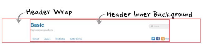
There are multiple settings under Header:
- Header Wrap
- These are properties applied to the entire header element of the theme.
- Header Inner Background
- These are the properties applied to the inner background of the base header element.
- Header Font
- These are the properties applied to the fonts of the base header element.
- Header Link
- These are the properties applied to the links within the header element.
- Header Hover
- These are the properties applied to the links within the header element when they are hovered over by the user.
The properties present in the Header tab are covered in the Customize Properties section, using elements from Background, Fonts, Borders & Spacing, and Width & Height.
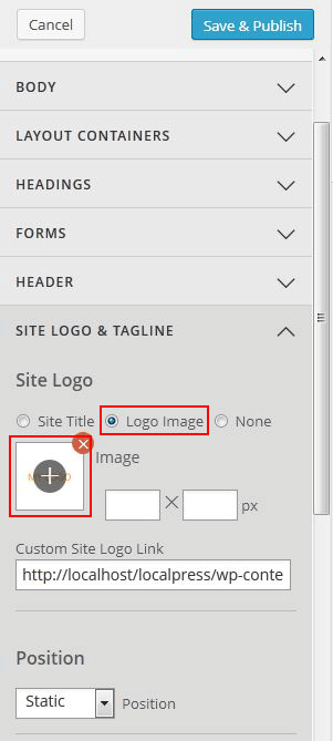
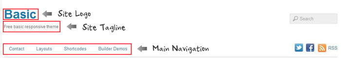
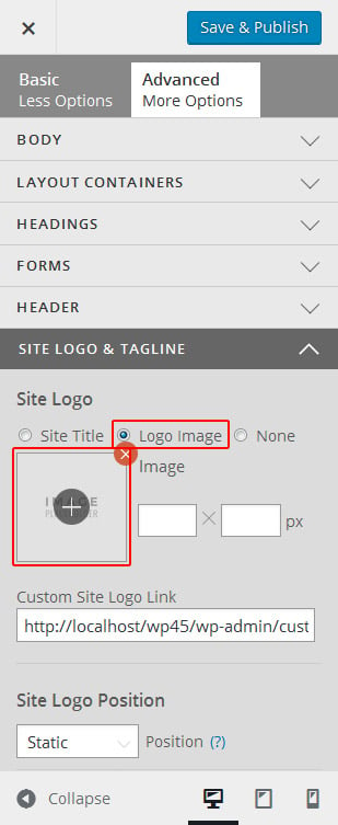
Site Logo & Tagline
The Site Logo & Tagline tab of the Customize panel is to setting and customize the site logo, site title, and the site tagline. Site Logo Image To display a logo image instead of text:
- Go to Appearance > Customize > Themify Options > Site Logo
- Under "Site Logo", select "Logo Image" radio button
- Click on the plus (+) sign button, and upload a logo image
- You can also use custom site logo link (optional)
- Specify the image width and height
- To reposition the logo accordingly, choose the appropriate position from the Position dropdown, enter the values in "top," "right," "bottom," and "left" position.
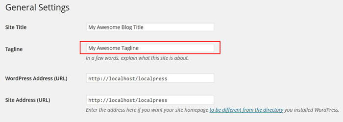
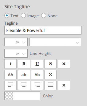
Site Description (Tagline) To remove or edit the site description using Theme customizer
- Go to Appearance > Customize > Themify Options > Site Tagline
- Edit or remove the text in the Tagline field
- You can customized your site's tagline using customized fonts, text effects, alignments, and colors from the available dropdown options.
To reposition the site description:
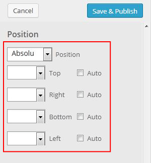
Choose the appropriate position from the Position dropdown, enter the values accordingly in "top," "right," "bottom," and "left" position.
The properties present in the Site Logo & Tagline tab are covered in the Customize Properties section, using elements from Fonts, Positioning, Display, and Width & Height.
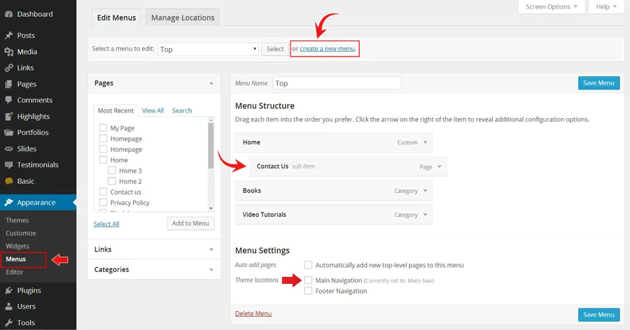
Main Navigation
The Main Navigation tab of the Customize panel is for applying styling to the main navigation menu.
There are multiple sections under Main Navigation:
- Main Navigation
- Here you can select the desired menu from the dropdown to be appeared on your site.
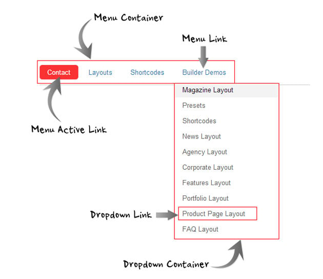
- Menu Container
- These are the properties to set the position of the main navigation container.
- Menu Link
- These are the properties applied to the top-level links in the main navigation menu.
- Menu Link Hover
- These are the properties applied to the top-level links in the main navigation menu when they are hovered over by the user.
- Menu Active Link
- These are the properties applied to the current active page links in the main navigation menu.
- Menu Active Link Hover
- These are the properties applied to the current active page links in the main navigation menu when they are hovered over by the user.
- Dropdown Container
- These are the properties applied to the main navigation dropdown menu.
- Dropdown Link
- These are the properties applied to the links in the main navigation dropdown menu.
- Dropdown Link Hover
- These are the properties applied to the links in the main navigation dropdown menu when they are hovered over by the user.
Properties present in the Header tab are covered in the Customize Properties section, using elements from Background, Fonts, Borders & Spacing, and Positioning.
Post
The Post tab of the Customize panel is for customizing the blog post layout container, titles of the blog posts, post meta, post date, more link, post nav, and grid post titles on your site.
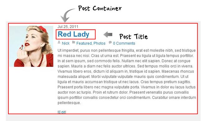
- Post Container
- These are the properties applied to the post container of the posts on your site.
- Post Title
- These are the properties applied to the titles of the posts on your site.
- Post Title Hover
- These are the properties applied to the post title when it is hovered over the user.
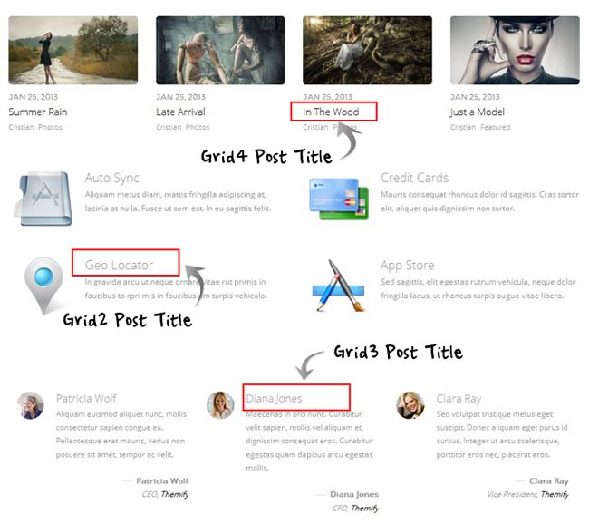
- Grid4 Post Title
- These are the properties applied to the fonts used in the Grid4 post title.
- Grid3 Post Title
- These are the properties applied to the fonts used in the Grid3 post title.
- Grid2 Post Title
- These are the properties applied to the fonts used in the Grid2 post title.
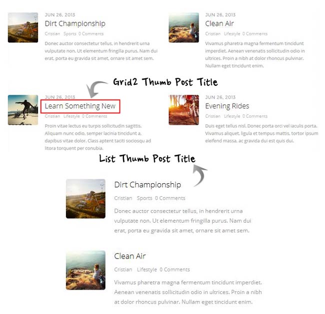
- Grid2 Thumb Post Title
- These are the properties applied to the fonts used in the Grid2 Thumb post title.
- List Thumb Post Title
- These are the properties applied to the fonts used in the List Thumb post title.
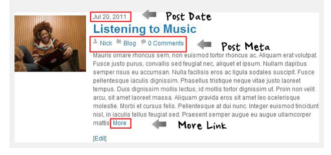
- Post Meta
- These are the properties applied to the fonts used in the post meta elements.
- Post Meta Link
- These are the properties applied to the post meta elements when a link is shown.
- Post Meta Hover
- These are the properties applied to post meta elements when a link is hovered over by the user.
- Post Date
- These are the properties applied to the post date elements.
- More Link
- These are the properties applied to the more link which can be shown on blog posts when using "Full Content" display mode or a custom excerpt.
- More Link Hover
- These are the properties applied to the more link when it is hovered over by the user.
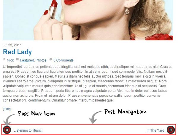
- Post Navigation
- These are the properties applied to the base post navigation area.
- Post Navigation Link
- These are the properties applied to the links within the post navigation element.
- Post Navigation Hover
- These are the properties applied to the links within the post navigation element when they are hovered over by the user.
- Post Nav Link Icon
- These are the properties applied to the Post Nav Icon within the post navigation element.
The properties present in the Post Navigation tab are covered in the Customize Properties section, using elements from Fonts, Background, and Borders & Spacing.
Page Title
The Page Title tab of the Customize panel is for applying styling to the titles of pages on your site.
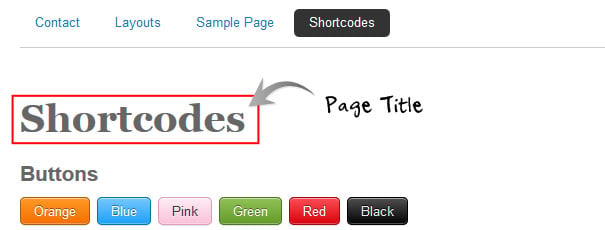
The properties present in the Page Title tab are covered in the Customize Properties - Fonts section.
Sidebar
The Sidebar tab of the Customize panel is for applying styling to the sidebar.
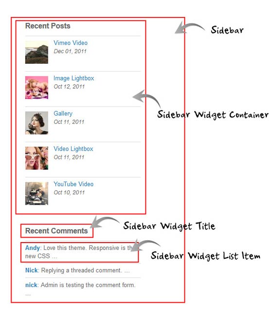
There are multiple sections under Sidebar:
- Sidebar Font
- These are the properties applied to fonts in the sidebar element.
- Sidebar Link
- These are the properties applied to links in the sidebar element.
- Sidebar Hover
- These are the properties applied to links in the sidebar element when they are hovered over by the user.
- Sidebar Widget Container
- These are the properties applied to the widget container areas in the sidebar.
- Sidebar Widget Title
- These are the properties applied to the widget titles in the sidebar.
- Sidebar Widget List Styling
- These are the properties applied to the widget list items in the sidebar.
The properties present in the Sidebar tab are covered in the Customize Properties section, using elements from Background, Fonts, and Borders & Spacing.
Footer
The Footer tab of the Customize panel is for applying styling to the footer.
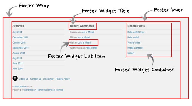
There are multiple sections under Footer:
- Footer Navigation
- This property is to select the menu to be appeared on the footer navigation bar.
- Menu Container
- These are the properties applied to the footer menu container of your site.
- Menu Link
- These are the properties applied to footer menu in the footer element.
- Menu Link Hover
- These are the properties applied to footer menu when a link is hovered over by the user.
- Menu Active Link
- These are the properties applied to footer menu when a link in the footer menu is active.
- Menu Active Link Hover
- These are the properties applied to footer menu when an active link in the footer menu is hovered over by the user.
- Footer Wrap
- These are the properties applied to the entire footer container of your site.
- Footer Inner
- These are the properties applied to the entire inner footer container of your site.
- Footer Font
- These are the properties applied to fonts in the footer element.
- Footer Link
- These are the properties applied to links in the footer element.
- Footer Hover
- These are the properties applied to links in the footer element when they are hovered over by the user.
- Footer Widget Container
- These are the properties applied to the widget box areas in the footer.
- Footer Widget Title
- These are the properties applied to the widget titles in the footer.
- Footer Widget List Styling
- These are the properties applied to the widget list items in the footer.
The properties present in the Footer tab are covered in the Customize Properties section, using elements from Background, Fonts, and Borders & Spacing.
Static Front Page
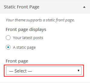
This feature allows you to configure the front page on your site, either choose to show your latest post or a static page which, can be selected from the dropdown box.
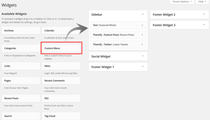
Widgets
Using the Customize Panel, you can also add, remove or arrange the widgets on all of the widgetized area of your site.
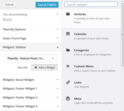
To add widgets using Customize with live preview
- Go to Appearance > Customize
- Choose the widget area, where you want to add/remove widget.
- Now click on "Add a Widget" button.
- A list of all the available widgets will appear, now select the desired widget.
- The selected widget will be added to the widget area.
- Give the title to your widget, and your widget will go live on your site.
Custom CSS
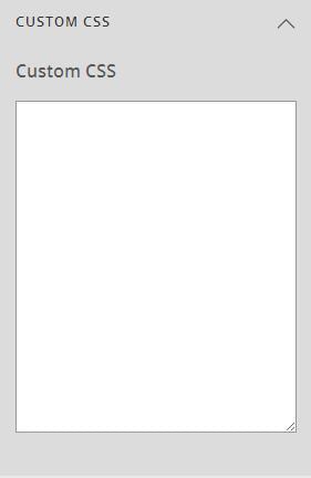
The Custom CSS tab of the Customize panel is for adding custom CSS code to the theme.
In the text area provided you can add any CSS code you wish to apply to the theme, and this will be added after any other styling of the theme.
Reset All Customization
The Reset All Customization tab allows you to reset the entire customization that you made using Customization Panel on your site including the changes in the styling done using any Custom CSS codes.
Note : Be cautious while using Reset All Customization, the changes done using this feature are irreversible.
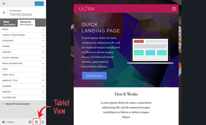
Responsive Styling
This features allows you to style how your site looks on tablet, mobile, or desktop. This feature is found at the bottom of the Customize Panel. You can toggle on what you edit by clicking on the icons.
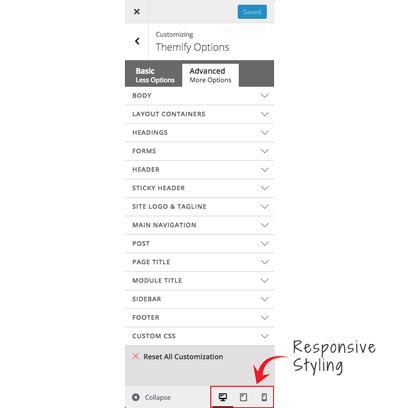
Notes: When you edit the styling in both tablet or mobile view, you'll notice that some of the options will not be accessible. This is because some of the theme elements are not applicable, or cannot be customized, on the tablet or mobile.
Customize Properties
There are various styling properties available to be customized, and these will vary from tab to tab, however they all fit into the following categories:
Background
Background Image: The background-image property sets an image for the background of an element. Background images can be set by one of the following methods: selecting one of the already present backgrounds from the list of thumbnails, manually entering an image URL, or uploading an image. Checking "No Background image" will remove the background image. Background Color: The background-color property sets a color for the background of an element. You can set a background color here as well by manually enter a color code, or alternatively click the box next to the field and a color picker will appear. Background Repeat: The background-repeat property sets if/how a background image will be repeated.
- Repeat = The background image will be repeated both vertically and horizontally.
- Repeat X = The background image will be repeated only horizontally
- Repeat Y = The background image will be repeated only vertically
- Do not repeat = No repeat
Background Position: You can set the position of the background image, this will determine where the background image begins - for example, setting it to right center would start the background image from the right of the element vertically centered.
Fonts
Font Size: You can set the size of the font in the text element, and select the type of units to use from the dropdown (pixels, em, %) Font Family: The font-family property sets the font for an element. Use the dropdown menu to select a font family for the text element from a list of standard fonts. Line Height: You can set the height of each line in the text element, and select the type of units to use from the dropdown (pixels, em, %) Text Decoration: The text-decoration property specifies the decoration added to text.
- Underline = Defines a line below the text
- Overline = Defines a line above the text
- Strike through = Defines a line through the text
- None = No decoration
Color: The color property sets the color of text for an element. You can specify the color by entering a color code manually or clicking the box next to the field to open a color picker. Tip: You can also set the opacity of the color in the color picker, by adjusting the drag selector up/down to the desired value in the opacity slider. Font Weight: The font-weight property sets whether text is normal or bold. Font Style: The font-style property sets whether text is normal or italic. Font Variant: The font-variant property specifies whether or not a text should be displayed in a small-caps font. Text Alignment: The text alignment property controls the alignment of text.
- Left = Aligns the text content to the left
- Center = Aligns the text content to the center
- Right = Aligns the text content to the right
- Justify = Automatically aligns the text content between both left and right.
Text Transform: The text-transform property controls the capitalization of text.
- Capitalize = Capitalizes the first letter of each word
- Uppercase = Makes all words uppercase
- Lowercase = Makes all words lowercase
- None = No transform
Borders & Spacing
Border: Use the fields to set the color, size and style of the border on each side of an element, you can set color by entering a color code manually or clicking the box next to the field to open a color picker. Select "Apply to all" to reduce options to one setting for all sides. Margin: Margin defines the space around elements. Use the fields to set the margin amount for each side of an element. Select "Apply to all" to reduce options to one setting for all sides. Padding: Padding defines the space between the element border and the element content. Use the fields to set the padding amount for each side of an element. Select "Apply to all" to reduce options to one setting for all sides.
Width & Height
Width: You can set the width of an element, and select the type of units to use from the dropdown (pixels, em, %) Height: You can set the height of an element, and select the type of units to use from the dropdown (pixels, em, %)
Positioning
Position: You can set the position of an element.
- Static = Positions the element where it is placed within the normal flow of the layout.
- Fixed = Positions the element at a set position, as set below in pixels from a side of the element (top/bottom, left/right), and it will remain here even when the page is scrolled.
- Relative = Positions the element at a position relative to its normal position.
- Absolute = Positions the element at a position, as set below in pixels from a side of the element (top/bottom, left/right), relative to the first non-static parent element.
Display
Display (Site Logo): The display property under site logo will allow you to select between two modes:
- Site Title = This will output the site's title in the site logo element.
- Image = This will output an image in the site logo element. You can select "Upload" to upload an image or enter the URL manually, and also set the dimensions of your logo here.
I switched theme (or added a child theme), all my Customize settings are gone?
Note Customize data is associated to the activated theme (ie. when you switch to another theme, the Customize options will be different). To carry the Customize data from one Themify theme to another Themify theme, use the Customize's Export and Import feature located on the Customize panel).
Also note that the activated child theme is considered as a separate theme. If you see your Customize data is gone after activating a child theme, don't panic. Simply export the Customize data with the parent theme activated, then switch to the child theme and import the Customize data.