Update: Polls are now closed! Thank you everyone for voting, and special thanks to all our contestants. We will announce the winners soon.
3 weeks ago we asked all of you to submit your Themify powered WordPress site to participate in our first ever Showcase Site Competition. We're very excited to announce that we've received over 500+ site submissions! After reviewing each one, we've finally narrowed the list down to 20 sites. It wasn't easy, but we're proud to announce the finalists who made it to the final 20. Now it's up to all of you to vote, which site you think should take home the grand prize! We've outlined the top 20 sites below, feel free to review them and vote which site you think should win! The site that receives the most votes in one week takes home the prize. Vote Here!
Voting Ends: Monday, July 27, 2015 (11:59pm EST) (more…)
This tutorial will show you how to code your own custom addons/modules for Themify Builder.
Let's Get Started
Each module in the Builder consists of three files, a module-*.php file (only registers the module to Builder), and a template-*.php file (handles the display of the module), and a JavaScript file that does most everything else: controls the options displayed when editing the module, how data is saved for the module, renders the live preview, etc. For the default modules in Builder, the module PHP files are located in themify-builder/modules directory inside the Builder, the template files can be found in the themify-builder/templates and the JS files can be found in themify-builder/js/editor/modules folder.
We can add new modules via a plugin, or include them in the theme.
Let's start by creating a simple module that displays a Hello World message. First under wp-content/plugins/ directory of your WordPress installation create a new folder (you can name this folder anything that you would like). This folder will hold all of the files required for the module. Inside that folder create a file named "init.php" and paste this inside:
<?php
/*
Plugin Name:  Hello World
Version:      2.0
Author:       Themify
Description:  Sample Builder module to greet the world!
*/

defined( 'ABSPATH' ) or die;
This is all that is needed for WordPress to identify the plugin, now if you head over to the Plugins manager in admin dashboard, you can activate it.
Now let's add the codes to load our module PHP file:
This tells the Builder that when needed, load the modules/module-helloworld.php file inside the plugin. So let's create "module-hello-world.php" file inside the modules folder:
Note the "TB_" prefix and "_Module" suffix for our module's classname. This is the naming convention that you must follow in order for Builder to recognize the module. The "get_module_name" method returns the name of the module (this shows up in the editor interface), but also adds a filter to load an script file named "active.js" when Builder is active. As mentioned, this JavaScript file is where the module is actually defined. So next step, let's create that file:
The script creates a class named "ModuleHelloWorld" that extends "tb_app.Module". Note the "Module" prefix for the module name, this is required. The getOptions() method returns an array of options to show when you're editing the module, the "default()" method return an object of option_name : option_value pairs that define the default values those options will have, and the builderSave() method which is called when the module is saved, this can be useful if you want to validate or cleanup the module data before saving.
Now our module is ready. You can open the Builder editor and add this to your page:
So what does the module display on the front end? At the moment, nothing. We haven't add the template file for the module that will actually render it, to do that create "template-hello-world.php" file inside the /templates folder and paste this in:
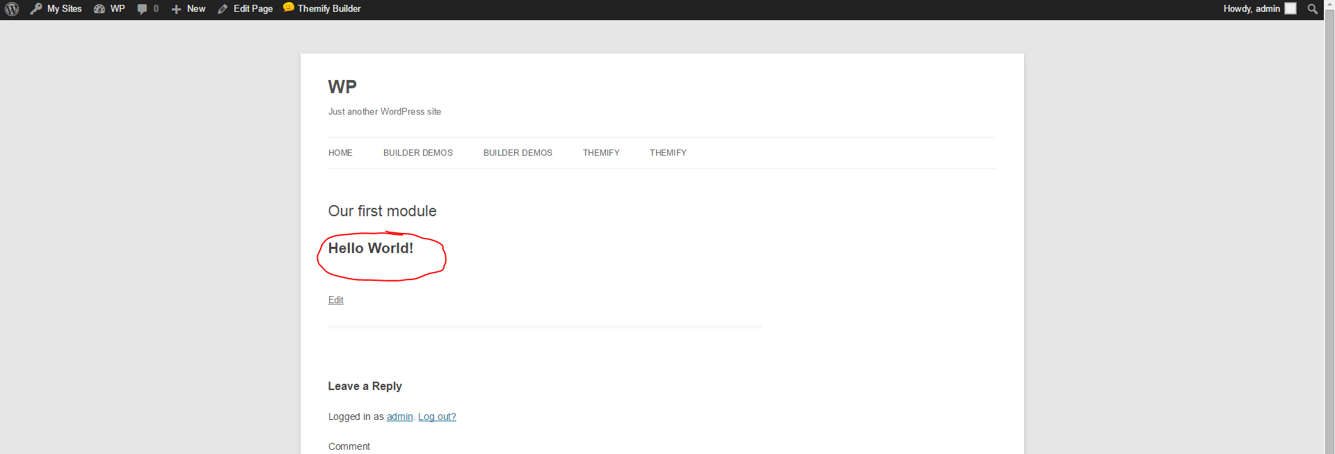
<h1> Hello World! </h1>
Viola! Now if add the module to a page and view that page on front end, you can see the output:
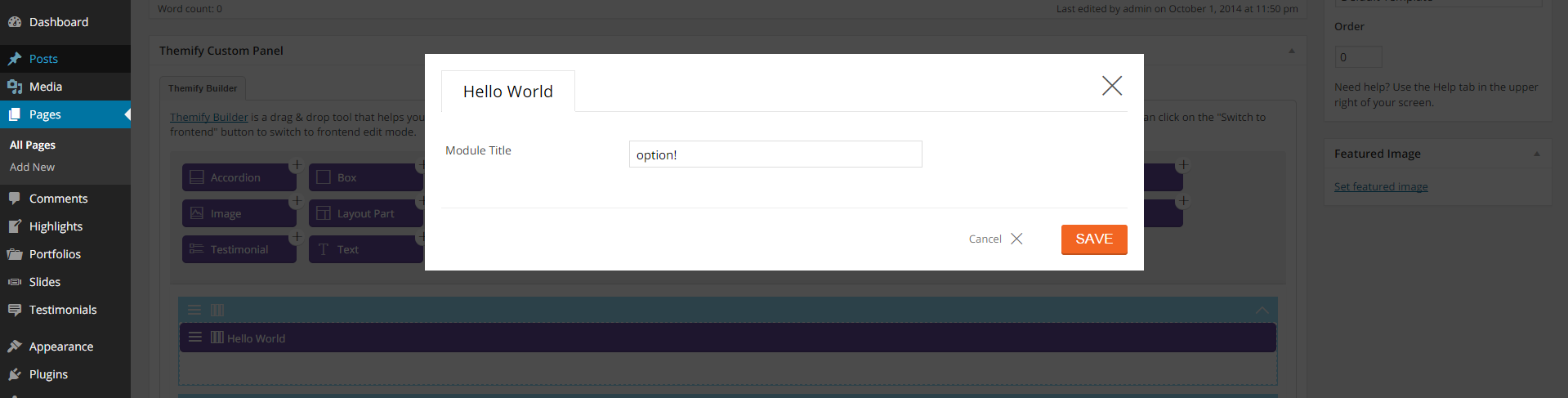
Showing the same HTML snippet each time we add the module might be what we need, however often you want to add options to the module that dynamically changes it's output, so let's change the getOptions method to show an option where we can change who we want to say hello to:
static getOptions() {
    return [
        {
            id : 'say_hello',
            type : 'text',
            label : 'Hello Text'
        }
    ];
}
In the module's template file the options are accessible using the $args['mod_settings'] array, every key of this array is an option saved for the module, so now change the template file:
Congratulations, you just made your first Builder module. You can download the complete code here.
Example 2: Quotes module
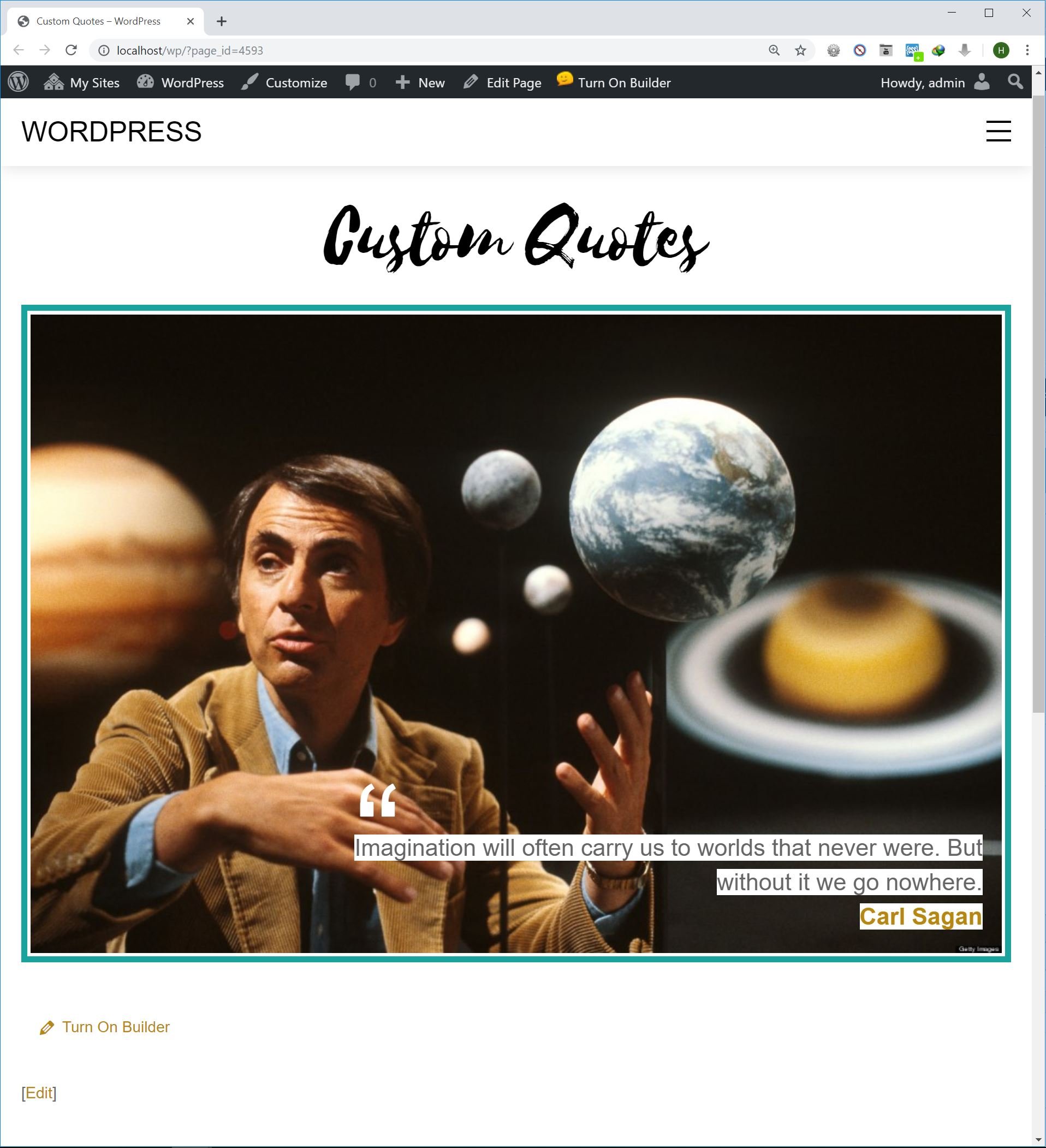
Now let's dig deeper and create a more practical module. Let's say our client runs a heavy-content website and regularly posts quotes, so to pimp up the pages let's design a quote style module that our client can use:
Custom Quotes module sample
The quote style consists of an image, the quote text itself and the name of it's author. The only problem is this requires a specific bit of HTML to make. Handing a txt file to the client to copy and paste, then change the bits and pieces is not very practical. An option is to create a shortcode that outputs the quote, however shortcodes are not user friendly either. Your client will have to remember the exact shortcode and parameters used to replicate the same output.
First step like our Hello World module, create a directory inside the wp-content/plugins/ folder, add an init.php file inside it and paste this in:
Same as before, we just point Builder to the file where the module PHP is registered. Now activate the plugin in the Plugins manager.
Next create "module-quotes.php" file inside the the /modules folder and paste this in:
<?php
if ( ! defined( 'ABSPATH' ) ) exit; // Exit if accessed directly
class TB_Quotes_Module extends Themify_Builder_Component_Module {

    public static function get_module_name():string {
        add_filter( 'themify_builder_active_vars', [ __CLASS__, 'builder_active_enqueue' ] );
        return __( 'Quote', 'custom-quotes' );
    }

    public static function get_module_icon():string {
        return 'quote-right';
    }

    public static function get_js_css():array {
        return array(
            'css' => plugin_dir_url( dirname( __FILE__ ) ) . 'assets/style.css'
        );
    }

    public static function builder_active_enqueue( array $vars ):array {
        $url = plugin_dir_url( dirname( __FILE__ ) ) . 'assets/active.js';
        $version = '1.0';
        $vars['addons'][ $url ] = $version;

        return $vars;
    }
}
The get_js_css() method n module returns an array which defines what files to load when the module is used on the page. In our case, we only need an stylesheet for customizing the design of the quote, so the method returns the path to an style.css file. Also the get_module_icon() is used to display an icon (from Themify icon set) for this module.
Next, create a folder named "assets" inside the plugin and add the "active.js" file in it:
((api,createElement,themifyBuilder ) => {
    'use strict';
    api.ModuleQuotes = class extends api.Module {

        constructor(fields) {
            super(fields);
        }

        static getOptions() {
            return [
                {
                    id : 'quote_text',
                    type : 'textarea',
                    label : 'Text'
                },
                {
                    id : 'quote_image',
                    type : 'image',
                    label : 'Image'
                },
                {
                    id : 'quote_author',
                    type : 'text',
                    label : 'Quote Author'
                },
                {
                    id : 'quote_link',
                    type : 'url',
                    label : 'Link'
                },
                {
                    type : 'custom_css_id'
                }
            ];
        }

        static default() {
            return {};
        }

        static builderSave(settings){
            super.builderSave(settings);
        }
    };
})(tb_app,tb_createElement,themifyBuilder);
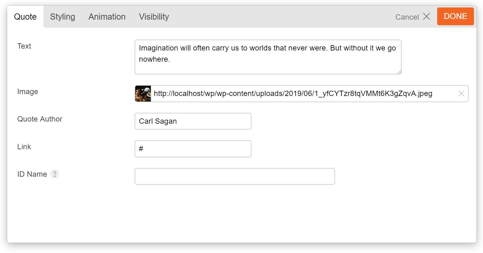
Here we add four options in the module, three text options to put the quote text, the name of its author, and the link to the quote author's website, and an option to put the image. Now when you add the module you can see the options:
Perfect! Now for the module's template, create "template-quotes.php" in the /templates folder and add:
The snippet is pretty straight forward, we just check if some options in the module are set and if so output the proper markup.
NOTE: To set the default options for the module we use wp_parse_args function and pass it two things: $args['mod_settings'] array that holds the saved settings of the module, and an array of defaults, this way we'll have a default value. Also the extract function is used to turn each of the options into a separate variable, this makes working with them easier.
The rest of the code is just spitting out the proper markup we need to show the quote.
Last step is to add the CSS codes that style the quote, if you recall in TB_Quotes_Module class we used the get_js_css() to set a path for an stylesheet, so in the "assets" folder create a file named "style.css" add the CSS codes. You can get that from the this link.
You can download the finished plugin here which includes an alternative layout for quotes, and also sets up the Styling options for the module.
Field Types
The Builder has a variety of field types you can use to create the options for the modules, the table below lists some of available field types:
Type
Description
* Repeatable?
text
General text box to input texts. You can set the "colorpicker" parameter to true to turn the text box into a color picker field.
Yes
icon
Icon picker, user can choose from the icons included in the Builder. For an example of this check the Feature module.
Yes
image
Image uploader, user can upload images or select one from the Media Library.
Yes
textarea
Multi-line text input.
Yes
wp_editor
Shows the TinyMCE editor to input formatted texts.
Yes
radio
Multiple choice option where only one can be chosen.
Yes
checkbox
Multiple choice option where none or any number of the choices can be chosen.
Yes
builder
"builder" field can be used to create repeatable rows of data (for example Accordion and Tabs modules use this feature), field types that in this table are highlighted as Repeatble can be used in the "builder" field type.
* whether the field type is repeatable and can be used in "builder" fields.
Override module templates in themes
The built-in Builder modules are also customizable, where you can change the look using the options provided by the module. However sometimes you need to change how the modules structure its output, and in such cases overriding the template files of the modules comes very handy. To achieve this first navigate to <theme_root>/themify/themify-builder/templates/ directory, here you can find the template files used by various modules. Now copy the template file for the module you want to change and paste it in <child_theme_root>/themify-builder/ directory and customize it.
First, you will need to download the plugin zip file from the Member Area on the Themify site.
Note: Some browsers (e.g. Safari) may auto-extract zip files. Right-clicking on the download link and selecting "Save Linked File As" will allow you to download the ZIP version.
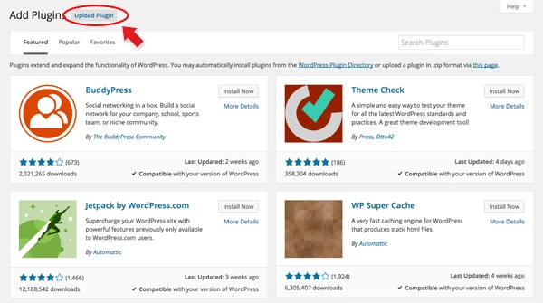
Then go to your WP Admin > Plugins > Add New > Upload Plugin.
Now upload the plugin zip file and click "Install Now".
After the plugin is installed, click "Activate Plugin" to activate the plugin.
FYI: If you can't install the plugin using WordPress plugin installer, you may also use a FTP software to install the plugin. To install plugins with an FTP method: extract the plugin zip on your local computer then upload the plugin folder to your FTP server where you installed WordPress > wp-content > plugins folder. Then login to your WP Admin > Plugins to activate the plugin.
Import Sample Data
If you are starting a new site and would like to import the sample content as seen on the demo site, here are the steps:
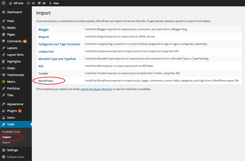
Go to "WP admin > Tools > Import"
Click WordPress (if you are prompted to install the importer plugin, do so)
Upload the sample-content.xml file (located in the theme folder > sample folder > sample-content.xml file)
You will be asked to map a user to the content and import the file attachments. Check "Download and import file attachments" to import the demo contents.
If the content don't seem to import, try to import again without checking "Download and import file attachments" checkbox.
Now you may edit or delete the content as you like.
Demo Images
The images shown on the demo site are not part of the theme package, nor are they included in the sample content. As such you will see placeholder images for the sample content and, should you wish to, these can be replaced after importing.
Tiles Plugin Demo Video
Using the Tiles Plugin
Once plugin is installed, you will find the Themify Tiles section in the WP Admin panel. Similar to a custom post type you can create your tiles layout with live preview at the backend, and the publish it on any post/page by inserting the shortcode.
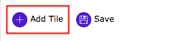
Let's start by first creating a new tiles group. You can do this by clicking "Add New".
Click "Add Tile" found at the bottom of the page. A popup window will appear where you can a list of tile options will appear.
Tiles Options
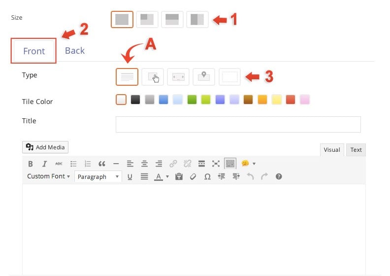
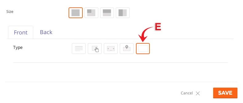
1) Size = There are 4 tile sizes.
Large = large square block
Square = small square block
Landscape = horizontal half block
Portrait = vertical half block
2) Front Tile tab = Click the front tab to edit the front of the tile.
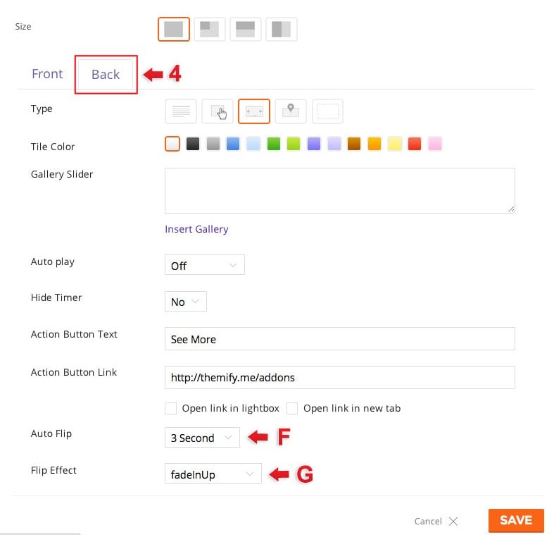
3) Type = Choose from 5 different types of tiles.
A) Text = Display text content in Tile.
Enter "Title" (optional)
Enter text in content editor (shortcodes are supported).
Enter "Action Button Text" this will appear at the bottom left corner of your tile.
Enter "Action Button Link" this link will redirect users when they click the action button text.
Open as a lightbox = Open link in a lightbox
Open in a new tab = Open link in a new tab
Custom Style = Below are some color options that you can customize
Background Color = Use the color picker to pick a color for the background of the tile.
Text Color = Use the color picker to pick a color for all the text on the tile.
Link Color = Use the color picker to pick a color for all text links on the tile.
Add a background image by inserting a image URL from your media folder or upload it directly.
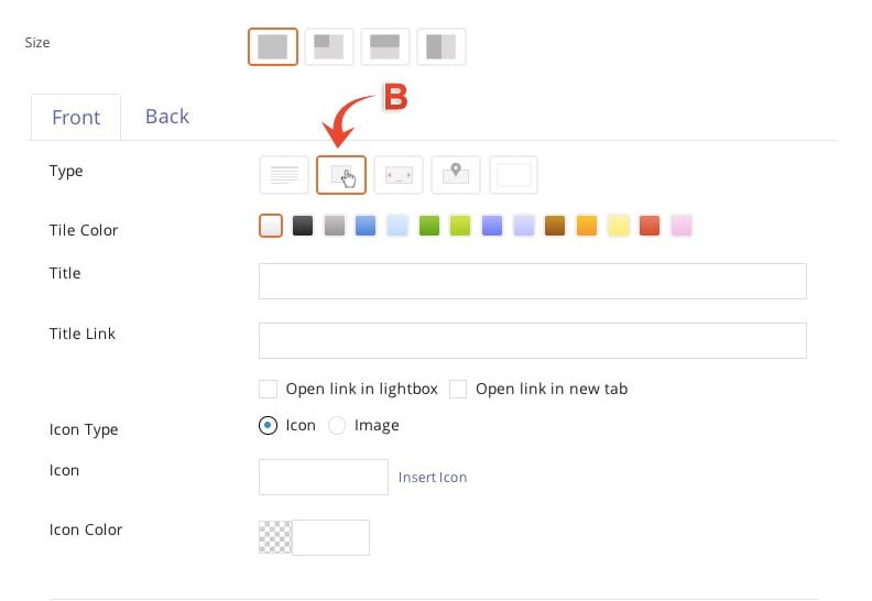
B) Button = Create a clickable button type tile
Enter "Title" (optional)
Enter "Title Link" which will allow your title to open an external link
Image = insert a image URL from your media folder or upload it directly. The image will appear at the center of the tile.
Custom Style = Below are some color options that you can customize
Background Color = Use the color picker to pick a color for the background of the tile.
Text Color = Use the color picker to pick a color for all the text on the tile.
Link Color = Use the color picker to pick a color for all text links on the tile.
Add a background image by inserting a image URL from your media folder or upload it directly.
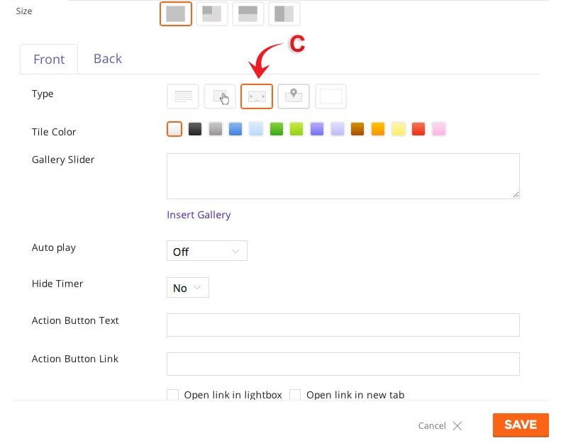
C) Gallery = Create a gallery type tile
Insert a "Gallery Slider" by clicking "Insert Gallery". Choose images from your media library or upload new images.
Choose the amount of second you would like your gallery to "Auto play" or turn it off by selecting "Off" on the drop down menu.
Choose to hide or display the timer.
Enter "Action Button Text" this will appear at the bottom left corner of your tile.
Enter "Action Button Link" this link will redirect users when they click the action button text.
Open as a lightbox = Open link in a lightbox
Open in a new tab = Open link in a new tab
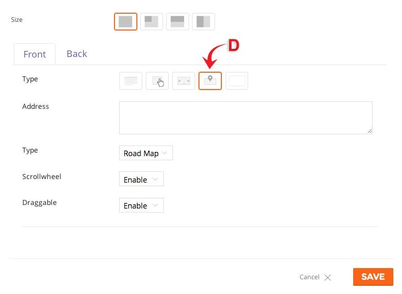
D) Map = Display where you are with the map type tile.
Enter "Address" as you like.
Choose which map "Type" you would like to display - Road Map, Satellite, Hybrid, or Terrain.
Choose to enable or disable the "Scrollwheel".
Choose to make the map "Draggable" when users drag the click on a certain part of the map.
E) Blank = Display nothing at the front of your tile.
4) Back Tile tab = Click the back tab to edit the back of the tile.
The back tile can be edited just like the Front tile but with some additional features highlighted below:
F) Auto Flip = Disable or choose the amount of second you would your tile to flip automatically.
G) Flip Effect = Choose from 10 different flip effects. We highlight all the flip effects on our Tiles demo page.
Adjust tile sizes
To customize the size of the tiles you can use this custom CSS code (if you're using the Builder plugin you can go to Themify Builder > Custom CSS and paste it in there, otherwise go to Themify > Customize > Custom CSS and paste):
body .tf-tile.size-square-large,
body .tf-tile.size-square-large .map-container {
	width: 480px;
	height: 480px;
}
body .tf-tile.size-square-small,
body .tf-tile.size-square-small .map-container {
	width: 240px;
	height: 240px;
}
body .tf-tile.size-landscape,
body .tf-tile.size-landscape .map-container {
	width: 480px;
	height: 240px;
}
body .tf-tile.size-portrait,
body .tf-tile.size-portrait .map-container {
	width: 240px;
	height: 480px;
}
IMPORTANT: The tile masonry is based on the small tile dimension where large tile size is 2 times (eg. if the small tile is 240px, then the large tile is 480px). Be sure to match the large and portrait tile size by 2 times the small tile size)
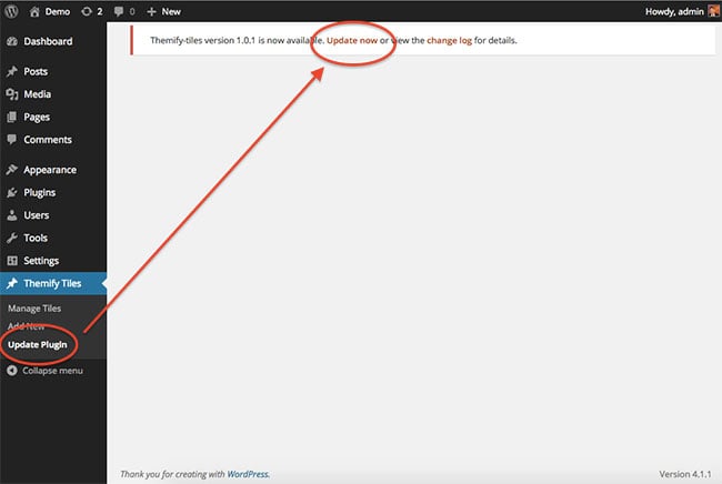
Update Plugin
You will receive notifications of updates to the plugin whenever you are on admin dashboard page for the plugin, these notifications will provide a link that will redirect you to the Update plugin page for the Tiles plugin on your dashboard.
You can find a list of updates and the changes made in each in the Builder changelogs which are also linked in the notification.
You can also manually update by downloading the latest ZIP file from your Themify member area and either deleting the plugin on your site and following the installation instructions above again, or by uploading the contents of the new ZIP via FTP and overwriting the existing plugin folder.
Reinstall Plugin
If the auto plugin update does not work, you may reinstall the Themify plugin by following the steps below. Reinstalling the plugin shouldn't affect the content/data because they are saved separately in the database. To be safe: you should backup your WordPress content (posts, pages, menus, etc.) before reinstalling it. To backup your WordPress content, go to wp-admin > Tools > Export and export all content to a zip file. You may use wp-admin > Tools > Import to import these content in the future if necessary.
Login to Member Area to download the latest themify-builder.zip (keep it as .zip file, do not extract it)
Login to your site wp-admin
Go to Plugins (where WordPress lists all the plugins on your site)
Deactivate the Themify plugin (plugin can not be deleted if it is active)
Now click on the "Delete" button to remove the Themify plugin (the "Delete" link is located under the Themify plugin name)
Remain on the Plugins page, click on the "Add new" button (located at the top of the page), click on the "Upload Plugin" link, upload the latest themify-[plugin-name].zip and activate it (basically the same procedure as you would install a new plugin)
Force responsive tiles on all screen sizes
You can enable or disable this feature in the plugin's settings page.
This documentation will guide you through the steps needed to install and use the Themify Builder plugin.
NOTE: Themify Builder plugin is the standalone plugin version of the Builder included in the Themify framework. If you are using a Themify theme, this plugin is not required. The purpose of this plugin is to use Themify Builder with third party themes.
Installing Builder
You can install the plugin using the following steps:
First, download the plugin zip file from the link provided in your Themify member area.
NOTE: some browsers (eg. Safari) auto extract zip files automatically. Right click on the download link and select "Save Linked File As" will allow you to download as a zip file.
Log in to your site's admin area.
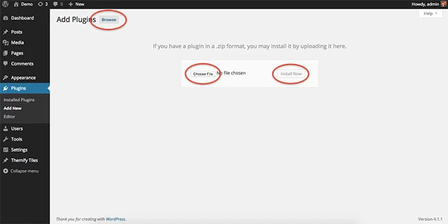
Navigate to WP Admin > Plugins > Add New
Now, select the "Upload" option on this page.
Select "Browse" and navigate to the plugin ZIP file which you downloaded in the first step, and then select the "Install Now" button.
This will initiate the plugin installation process, and once finished you can then activate the plugin.
Updating Builder
You will receive notifications of updates to the plugin whenever you are on the settings page for the plugin, these notifications will provide a link to automatically install the update.
You can find a list of updates and the changes made in each in the Builder changelogs which are also linked in the notification.
You can also manually update by downloading the latest ZIP file from your Themify member area and either deleting the plugin on your site and following the installation instructions above again, or by uploading the contents of the new ZIP via FTP and overwriting the existing plugin folder.
Reinstall Builder
If the auto plugin update does not, you may reinstall the Themify Builder plugin by following the steps below. Reinstalling the plugin shouldn't affect the content/data because they are saved separately in the database. To be safe: you should backup your WordPress content (posts, pages, menus, etc.) before reinstalling it. To backup your WordPress content, go to wp-admin > Tools > Export and export all content to a zip file. You may use wp-admin > Tools > Import to import these content in the future if necessary.
Login to Member Area to download the latest themify-builder.zip (keep it as .zip file, do not extract it)
Login to your site wp-admin
Go to Plugins (where WordPress lists all the plugins on your site)
Deactivate the Themify Builder plugin (plugin can not be deleted if it is active)
Now click on the "Delete" button to remove the Themify Builder plugin (the "Delete" link is located under the Themify Builder name)
Remain on the Plugins page, click on the "Add new" button (located at the top of the page), click on the "Upload Plugin" link, upload the latest themify-builder.zip and activate it (basically the same procedure as you would install a new plugin)
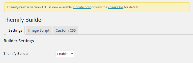
Builder Settings
There are a number of settings on the Themify Builder plugin page, these are broken into two sections and are as follows:
Builder Settings
Themify Builder - This option is used to enable/disable the Builder functionality.
Module Exclude - This option can be used to exclude specific modules from being loaded and usable by Builder, it will also disable the custom post types associated with a module for those which include them.
Image Script
img.php - The image script is used in the Builder content to crop images dynamically to any dimension. This can be used to disable the Image Script used by Builder globally, so that Builder will instead use the images generated by WordPress rather than dynamically creating them.
Image Quality - This option will set the quality of images output by the Image Script on a scale from 0 - 100, with 100 being highest quality.
Cropping Alignment - This option can be used to set where the origin point will be when images are cropped by the Image Script.
Vertical Cropping - This option can be used to enable/disable vertical cropping of images to fit a set height. If disabled, images will not be cropped, and height will be based on aspect ratio of the image.
Default Featured Image Size - This is an option available when the Image Script is disabled, and will determine the size of the WordPress generated image used when outputting images for scaling.
Using Builder
For an in-depth explanation of the various features of Builder, and how to make use of the functionality of the plugin, you can refer to the Themify Builder documentation.
All Themify shortcodes are discontinued in all themes. You need to install Themify Shortcodes plugin if you want to use these shortcodes.
To insert a shortcode, simply paste the sample shortcode listed below in the post or page content editor. If you want to run the shortcodes in sidebar widget, drop in a Text widget and insert the shortcode in the Text box. This documentation lists all the shortcodes packed in the theme. You may configure the shortcode by changing/adding the parameters.
Button
Available parameters:
style= style of the button. You can combine the following options (eg style="large yellow rounded fa-bell"):
first = first column. It is used to clear the floating and margin space. You need to enter the first attribute in the grid parameter of every first column.
If you need to use columns nested inside another column, use the [themify_sub_col] shortcode instead. The parameters are the same than in the general [themify_col] shortcode.
Advanced: CSS classes for columns
Columns also support adding a custom CSS class that you can use to stylize them later in Custom CSS. This must be done with care because it can break the column layout if you have a class that is used for another purpose, so try using unique class names and use them to apply style only to these.
For example, you could use the column shortcodes to create a pricing table and add CSS classes to stylize later depending on the product offer:
In this example, we could use .product-pack to apply a consistent style for columns, .entry-pack, .standard-pack and .advanced-pack to apply a different icon for the package and use .first-pack to add a specific style for the first pricing column. After we have our classes in place, we can use them to target the elements we want to stylize in Styling > Custom CSS.
Horizontal Rule (hr)
Available parameters:
color = color of the horizontal rule (pink, red, light-gray, dark-gray, black, orange, yellow, white)
To display your content in a blockquote, wrap the text with: [themify_quote] content here [/themify_quote]. It will output as <blockquote> content here </blockquote>
Is Logged In
To display a special message or specific content to logged in users of your site, you may use the is_logged_in shortcode:
[themify_is_logged_in] messge here [/themify_is_logged_in]
Is Guest
To display a special message or specific content to guests (someone not logged in) of your site, you can use the is_guest shortcode:
[themify_is_guest] messge here [/themify_is_guest]
width = width of the map container (px or % value)
height = height of the map container (px or % value)
zoom = map zoom level (1 - 16, default = 8)
type = map type (roadmap, satellite, hybrid, terrain, default = roadmap)
scroll_wheel = map scroll (yes, no, default= yes)
draggable = map dragging (yes, no, desktop, default= yes). Setting this parameter to "desktop" will disable it in mobile devices making it draggable only in desktop.
Sample usages:
[themify_map address="Yonge Street and Eglinton Ave. Toronto, Ontario, Canada" width=100% height=400px]

[themify_map address="12 Main St. Toronto, Ontario, Canada" width=300px height=200px zoom=16]
Twitter
To use the Twitter shortcode: you would need to create an access token from the Twitter site and then insert the access token code in Themify > Settings > Integration API > Twitter API Settings (refer to this tutorial for details).
Use the post_slider shortcode to display a slider of posts.
Available parameters:
limit = number of post to query (default = 5)
category = category ID number or category name (default = all categories). Use minus number to exclude category (eg. category=-1 will exclude category 1)
image = show post image or not (yes, no, default = yes)
image_w = post image width (default 240px)
image_h = post image height (default 180px)
title = show post title (yes, no, default = yes)
unlink_image = remove the link on featured image (yes, no, default=no)
unlink_title = remove the link on the post title (yes, no, default=no)
The slider shortcode works just like the <ul> and <li> tag. It requires the opening and closing tag. You would need the opening [themify_slider] and closing [/themify_slider] tag. Then each slide requires the opening [themify_slide] and [/themify_slide]. You may insert any HTML tags in the [themify_slide].
[themify_slider]
	[themify_slide] one [/themify_slide]
	[themify_slide] two [/themify_slide]
	[themify_slide] three [/themify_slide]
[/themify_slider]

[themify_slider auto="1" scroll="1" speed="fast"]
	[themify_slide] one [/themify_slide]
	[themify_slide] two [/themify_slide]
	[themify_slide] three [/themify_slide]
[/themify_slider]
List Posts
Use the list_posts shortcode to query any number of post from any categories.
Available parameters:
limit = number of post to query (default = 5). Enter -1 to query all posts (eg. limit=-1).
category = category ID number or category name (default = all categories). Use minus number to exclude category (eg. category=-1 will exclude category 1)
offset = number of posts to skip over (default = 0)
order = specifies ascendent or descendent order (ASC, DESC, default = DESC)
orderby = criteria used to order posts (author, comment_count, date, menu_order, rand, title, default = date)
post_type = creates the list using only posts with this type (default = post)
taxonomy = the taxonomy to retrieve posts from, affects the "category" parameter (default = category)
image = show post image or not (yes, no, default = yes)
post_meta = display post meta (yes, no, default = no)
post_date = display post date (yes, no, default = no)
more_text = more link text (note more text is only available if display=content and the post has more tag)
style = layout style (list-post, grid4, grid3, grid2, grid2-thumb, list-thumb-image, default = list-post). You may also add custom css class in here (eg. style="grid4 custom-class").
unlink_image = remove the link on featured image (yes, no, default=no)
unlink_title = remove the link on the post title (yes, no, default=no)