Themify Builder V4 Release - The Best Update Ever!
After months of developing, testing, and perfecting - we're excited to share with you all the new and greatly improved Themify Builder 4.0! We don't normally jump a version with our updates, but this is our best update to date and we are releasing it as Builder V4. We've revamped the Builder interface on both the frontend and backend. Not only does it have a super polished interface, but it also includes many improvements that enhance your user experience and increase productivity. Read on below to see the details.
A Whole New User Experience
The new interface changes the game for the user. It’s faster, smoother, and provides a more accurate preview. The previous Builder (3.5.8) has a few cluttered interface elements (such as the row and column top bar options) which didn't give a true WYSIWYG (what you see is what you get) preview. In this version, the Builder interface elements are hidden until you hover over it. This also allows you to see the live result without having to preview the page on a separate window. We also added a subtle animation when you hover over a button or a dropdown menu - the interface elements fly-out smoothly for a better experience. Builder V4 is not just about looking good. The updates were designed for an improved workflow adding to greater productivity.
Updated UX Features:
Input Slider & Arrow Keys Increment
Allows you to drag various styling input options (ie. padding, margin, font size) like a slider and see it applied live on your site. No need to type in numbers manually any longer. Just hover over the input, start dragging, and the preview will show you the live result as you drag. To achieve a precise input, you can use the up or down arrow key to increase or decrease the value by 1 point.
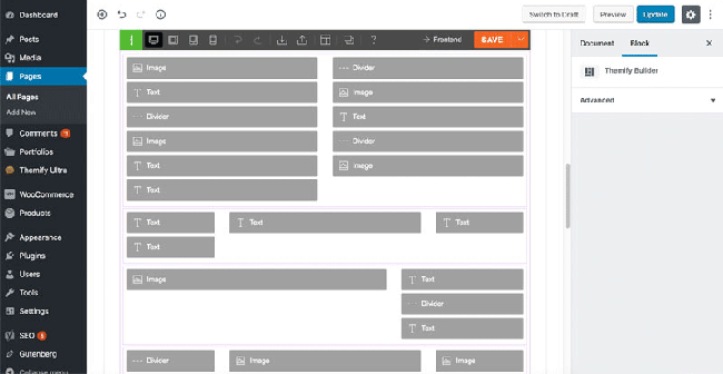
Row Drag Zooming
When your layout starts building up with many rows, moving rows around in the layout can be quite frustrating, especially moving a row from the very bottom to the very top. We've made the row dragging experience easier by zooming out of the page as you reorganize your rows, giving you an overview of your entire page.
Resize-able Responsive Preview Window
Now you can resize the preview window to any viewport width. Simply drag the vertical bar on the left or right edge of the preview window to resize to the exact viewport width. It is smart enough to detect the viewport width and activate the breakpoint styling accordingly. For example: when you resize the preview window to meet the mobile breakpoint, it will activate mobile styling.
Quick Module Search
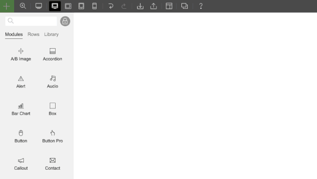
To help you locate the modules faster, the module panel search form is auto focused. Let’s say you want the "Slider" module. Just hover over the "+" module button and start typing the name of the module. As you type, all the modules will filter out according to the name you type. This is a huge time saver and allows you to efficiently use any and all modules to your heart’s content.
Hover-able Elements
In the previous version, when you hover over a module, there is an overlay covering the module which was used for dragging purposes. We've removed that hover overlay yet allowed the modules to remain draggable by its container. The advantage of this change is to allow you to see the hover state. For example: you can hover over a button module to see its hover styling state or you can click on the slider arrow to see the next slide.
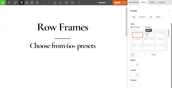
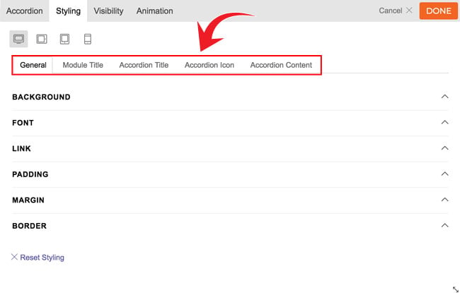
Row/Column Frame Styling
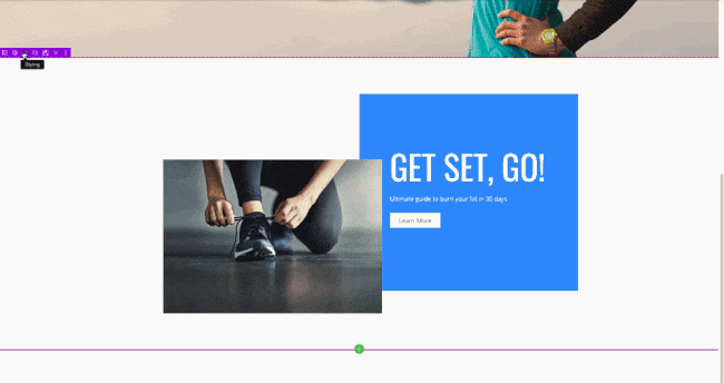
One of the most commonly requested features was ‘section shape divider’ as seen on other builders. We've built something that is similar but better that we’ve called ‘frame styling’. Most other builders only have top and bottom shape dividers, but Themify Builder allows you to style all of the edges (from top, bottom, left, and right) - which is why it’s called "frame". You can choose from 25 beautiful preset shapes or upload your own shapes (eg. you can upload your SVG or PNG file as the frame style). There are options to set frame width, height, color, and repeat. What is really cool is you can style the frame differently for desktop, tablet, and mobile allowing you to truly tailor your audience’s experience.
Layout Part Live Edit
The Builder Library feature was well received since we released it a few months ago. Now we've made it even better. You can save any existing rows and modules as reusable templates and Layout Parts. Layout Parts can be edited live on the spot without directing yourself to another page or opening a lightbox. This gives you a more accurate preview of how the Layout Part looks on the actual page. Another cool feature of the new Layout Part live edit tool is being able to drag the dropped modules from the Layout Part back to the page. Let’s say you have a module inside the Layout Part that you want moved back to the page, simply drag it outside the Layout Part edit frame and drop it back to the page.
New Alert Module
Have you ever wanted to display a message for a certain period of time? Let’s say you want to display a sale or promotion for a few days. The new Alert module is a perfect tool to help you stay on point. Inspired by our own Themify Popup plugin, the alert visibility can be scheduled, displayed for a specific number of times, showed to either login/public visitors, and auto closed after a certain number of seconds. The Alert module can also be used as an action box. There is an optional action button to display a message or redirect the guest to another page once it is clicked. With the flexible schedule feature, you can just set it once without the hassle of having to come back and edit the page to remove it!
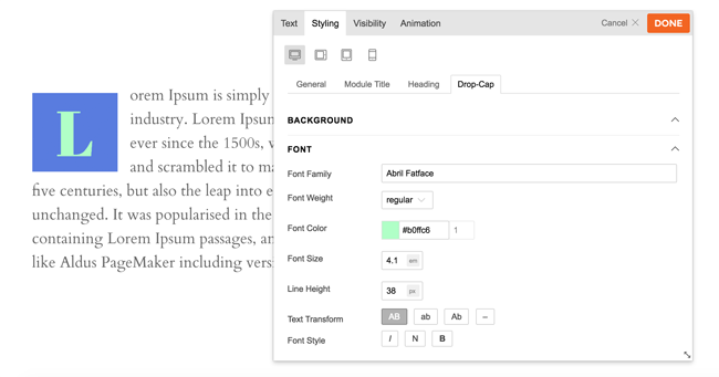
Drop Cap Feature in Text Module
Love drop cap? Well we have good news for you. We've added a drop cap feature in Text module. After the drop cap is enabled, you can style it however you want in the Styling tab. With the font, background, padding, margin, and border styling options, you can literally style the drop cap to any design of your choice.
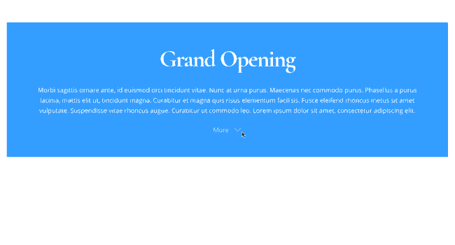
Read More Button in Text Module
Don't kill your readers with a lengthy text block. Now you can insert a read more button to trim down the text and focus on the visuals in the text module. Readers who want to read the full content can click the "read more" button.
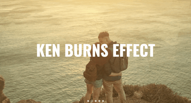
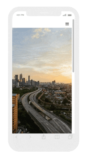
Ken Burns Effect
As a new row background slider effect, we've added the "Ken Burns" effect. Many users have suggested this effect before and we are happy to include it in this release. With Ken Burns effect enabled, the background images pan, zoom, and fade slowly providing an astonish visual effect.
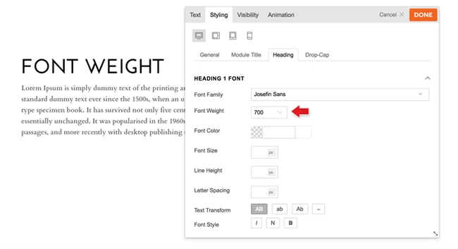
Google Font Weight Selection
Typography plays a huge role in design appeal. A slight difference in font weight on your design could have a different feel. With this in mind, we've added an option to select the available font weight with all Google Fonts. As long as the Google Font you've selected has different font weight options, you will see the font weight option on the Builder styling panel.
More Module Styling Options
As we were testing V4 with all the modules, we realized the styling options were limited in the previous version. Thus we've added more styling elements and options. You can pretty much style all elements on each module now.
Video Background Mobile Support
Video background now works on mobile! Now available when using newer phone mobiles, you can now choose the video background and it'll also appear on mobile.
Others
Below are some of the notable features that we've recently released.
Gutenberg Compatibility
In case you haven't heard of Gutenberg yet, it is the new editor in the upcoming major WordPress release. The old editor will be replaced and thus this draws a lot of compatibility concerns in the industry. At the moment, Gutenberg is available as a stand alone plugin. Developers are encouraged to fix their themes and plugins to be compatible with Gutenberg. Don't worry, Themify has got you backed. All Themify themes and the Builder are compatible with Gutenberg (read our Gutenberg compatibility post for more details).
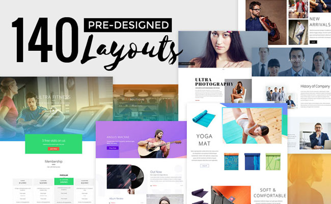
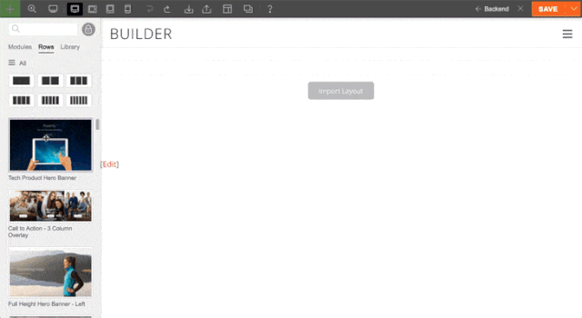
140+ Predesigned Layouts
Speed up the development of your website with our professionally designed templates. Predesigned layouts are extensive and detailed page templates that you can import to your site. Just load the layout, edit the content and images and you’re done! We have 140+ predesigned layouts to choose from.
57+ Predesigned Rows
Unlike predesigned layouts that import the entire page template, predesigned rows allow you to import row layouts one at a time. You can mix and match rows to build and entire custom page. With the new 34 predesigned rows we recently added, there are 57+ pre- designed rows in the library.
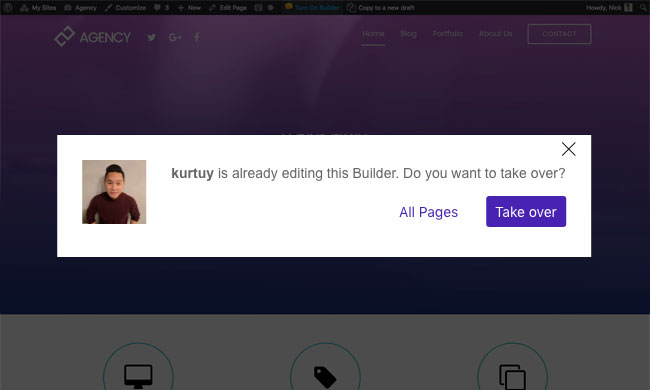
User Editing Detection
Have you ever spent hours editing a page, then someone in your team accidentally edits the same page and writes over your work? You no longer need to worry about this. When you try to edit a page with the Builder that another person is currently working on, it will alert you with an option to overtake the page. Once the page is overtaken by another person, the Builder will turn off on the other end.
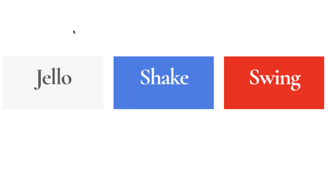
Hover Animation
Similar to the entrance animation we have, the hover animation triggers an animation effect when the user hovers over the element. It is a cool feature to capture a user's attention. You can do things like make a module swing or pop when the mouse cursor is hovering over it.
Video Tutorials
If a picture is worth a thousand words, then a video is worth better than a million. As part of our Builder V4 release, we've released a series of video tutorials to help you to learn the new interface and features quicker. You can access the videos by clicking on the help button ("?") at the top of the Builder toolbar. We will be adding more videos and tutorials as we go. Please subscribe to our official Themify YouTube channel to always get the latest videos.

Important Notice & Tips: Make Sure Everything is Updated!
- We've updated all themes and all Builder addons for this release. Please note that the new Builder requires the new addons to work hand in hand. After updating the theme/ framework, please update all addons as well.
- If something goes wrong after the update, you can roll it back to the previous version at Themify > Updates, select the previous version and click "Re-install Theme".
- If there any error/bugs occur after the update, please notify us and we will fix it ASAP.
- If you are using the Builder plugin version, be sure to update all addons after updating the Builder plugin.
30% Sale - Give Us a Try!
With these changes and so many more, we’ve updated and revamped the Builder to be exactly what you need - powerful, flexible, and incredibly responsive. We are celebrating the v4 release with a 30% OFF promotion. Sign up the Master Club for just $62.30 with the coupon code below.
CODE: BUILDERV4
It includes 42 responsive themes (check out our most popular themes such as Ultra, Shoppe, Music, Parallax, and more), 12 plugins (including the popular Builder plugin and Post Type Builder), 24 Builder addons, and 5 PTB addons.
July 31, 2018 @ 9:11 pm
Do I need to pay something now to get this upgrade or is that included in my current subscription?
July 31, 2018 @ 9:16 pm
If you have an active membership, simply go to Themify panel to update it. All themes and Builder addons have been updated to the latest v4.
August 8, 2018 @ 12:00 am
Hi I went to the panel but didn’t see anything about updating to v4. Thanks
August 8, 2018 @ 11:56 pm
Hi Jon,
If you don’t see any update notification on your Themify panel, please click “Updates” tab and click “Re-install Theme” – it is same as upgrading the theme to the latest version.
August 1, 2018 @ 5:51 am
Wow, just wow. You guys are fantastic. Thank you.
August 1, 2018 @ 2:31 pm
This looks really ggreat. Updating my theme now, can’t wait to start discovering the new v4.0.
August 3, 2018 @ 4:31 pm
In a previous post, you gave the warning not to test the beta on a live version of your site. What happens when WordPress updates to the new Gutenberg editor or we install this latest update? What could potentially happen to our websites? Between the change to their editor and your change to the builder (which are meant to work together), that’s a lot of changes. I’m afraid of my website being changed. Was that only a problem for the beta version of your new editor? And if it’s okay to do it to a live website now, which do I update first? Your update or WordPress’s? Thanks.
August 3, 2018 @ 9:39 pm
Hi Stephanie,
Our Builder is compatible with Gutenberg. It is ok to update Themify on your live sites. So far Builder V4 release has been well receiving. If Gutenberg is your concern, update core WP on a dev site first to test water.
August 3, 2018 @ 9:25 pm
Is very good and great, I want it to suggest one good option for the builder maybe in the future. To have a a rounded corner option. It would be nice if it had this option. I looked and looked but couldn’t find it.
August 6, 2018 @ 1:01 pm
Great work guys!! Love the new updates. Is Video Background Mobile Support working ok as it seems to only work on some pages/sites for me?
August 8, 2018 @ 11:55 pm
This is a fantastic update! The Builder is so freaking smooth and fast! Good job guys! The ken burns effect is lovely.. very good!
+1 on rounded corners and box-shadow styling.
August 9, 2018 @ 7:16 pm
Wow impressive! The Builder is very responsive now and those new styling options really help to make custom layouts. You guys should work on inline editing next (you know when you click on a text, it triggers a cursor to edit text with styling toolbar). That would be a very nice feature. Hope you guys consider it.
August 9, 2018 @ 7:17 pm
Yes, that is on our roadmap. Glad you like the new Builder. We will work harder to make it better.
August 9, 2018 @ 9:04 pm
Hi,
Just wanted to say that this is probably your best update ever as per the post title. I’m a lifetime member and have been using your themes for many year. My favorite theme is Ultra. Please keep up the good work and make Ultra a better theme because it is my only theme choice for my client works. I already have my old child theme for Ultra that helps me to develop client sites faster. Cheer guys!
August 9, 2018 @ 9:10 pm
By the way, how did you guys make this fullwidth post layout? It really makes this post stands out from the other posts.
August 14, 2018 @ 9:54 pm
It is a custom coded template in our theme. If you are using a Themify theme (eg. Ultra), you can achieve the same result by selecting the sidebar and content width option in the Post > Themify Custom Panel > Post Options.
August 14, 2018 @ 1:16 am
Fantastic update guys! I just got a chance to update. Really love the color code for row, column, and module. It is a complete new interface, yet feels familiar from the previous version. Building with the builder is a pleasant experience. I think you guys have the most complete responsive styling tool among all builders in the market. Great job!
August 14, 2018 @ 4:00 am
Great job! I really love this update. The Builder is very responsive now and those new styling options really help to make custom layouts.
August 14, 2018 @ 9:47 pm
I had the Standard Club membership before. Since you guys removed Standard Club, can I use the renewal discount to sign up Master Club? Really want to get this latest V4 version.
August 14, 2018 @ 9:49 pm
Yes, you can use the renewal discount to sign up Master Club. If you have any question related to accounts and billing, feel free to contact us: https://themify.me/contact.
August 17, 2018 @ 3:05 am
Wow wow wow! I really love that row frame thing you guys added and the ken burns animation looks amazing. Where and how do you enable ken burns? I can’t seem to find it. +1 on the inline editing. Keep up the good work!
– Dave, da designer
August 18, 2018 @ 8:46 pm
The Ken Burns effect is available in Row > Styling > Background > Slider -> select “Slider Mode = Ken Burns”.
August 18, 2018 @ 8:50 pm
I’m a lifetime member. Really happy to see this update. I feel like my investment is worth it. I really like the responsive styling preview mode – the drag to resize is a smart idea. Still learning on how to WP things. Hope you guys will have more video tutorials and easy to use tools. Thanks for the updates.
August 20, 2018 @ 4:15 pm
My masters club expired do you have a renewal discount?
August 20, 2018 @ 11:14 pm
Yes, please use BUILDERV4 to redeem a 30% discount.
October 21, 2018 @ 8:43 pm
So do I understand it right ? You have to buy a Master Club license, it is not enough to buy a theme to get the builderv4 ?
October 22, 2018 @ 1:26 pm
You can access the Builder V4 in the following ways:
Hope that answers your question. If you need any further clarification with anything, please don’t hesitate to reach out to us. Thank you for your patience.