After months of hard work at the Themify headquarters, we’re launching a major update for Themify Builder. We’ve streamlined the interface, reducing clutter and increasing the workspace, and added live preview! Now you can instantly see any changes you make as the preview is updated in real time. To see all the latest additions in our new update, watch our new Builder video and read more below.
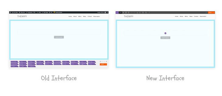
Better User Interface
Less is More
The first thing you might notice is the new interface. It is less cluttered for a faster performance and a smoother workflow. All the tools are placed in the top toolbar, providing more working space in the preview area.
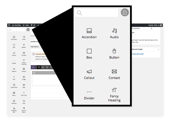
Backend Interface
The backend has the same consistent-looking interface and tools. The module panel is purposely designed to have the same width as the WordPress admin sidebar. You can lock the module panel to keep it visible at all times making it easier to drag & drop modules.
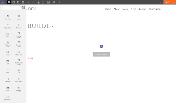
Live Preview
The next feature you will notice is the live preview. As you type or make a change, it instantly updates the preview. When you drop in a new module, it generates the pre-fill content to suggest how the module works.
Column Directions
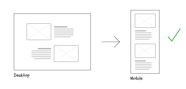
One of the nifty features we want to highlight is the column direction. It allows you to select columns to float from left-to-right, or right-to-left on all different breakpoints: desktop, tablet, and mobile. A good sample usage of column direction is to create a perfectly responsive zig-zag layout. The image below illustrates an example of an image and text block in zig-zag order. On mobile, you can see the two text blocks are stacked on top of each other, which does not flow nicely.
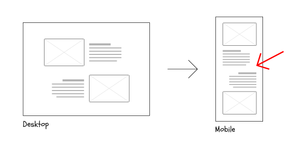
To solve the above problem, now you can select the bottom row to float from right-to-left on mobile.
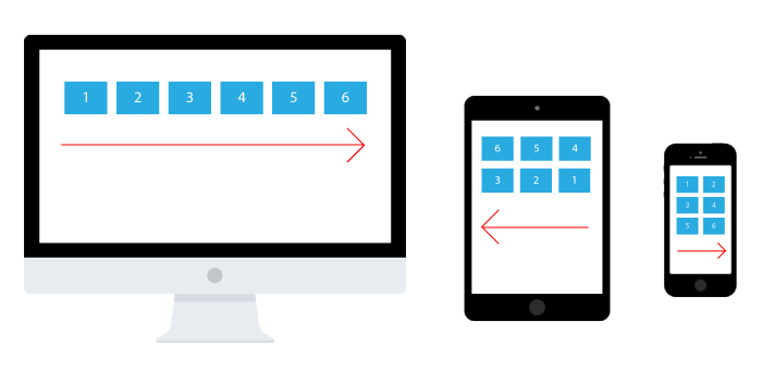
Responsive Grids
One of the most commonly requested support ticket items is how to change the grid row/columns on tablet and mobile. Now the responsive grid feature allows you to take full controls of grids on desktop, tablet, and mobile. The grid feature works together with column direction. With that being said, you can make responsive grids like the 6-column for desktop floating from the left, the 3-column for tablet floating from the right, and the 2-column for mobile floating from the left.
Important Upgrade Notes
- All themes, Themify framework, Builder plugin, and all Builder addons are updated to the latest version.
- You must upgrade all of them together (Themify theme/framework/Builder plugin and Builder addons).
- If you see any errors or malfunctions, upgrading them to the latest version might resolve the problem.
April 3, 2017 @ 1:17 pm
Great!!!
April 3, 2017 @ 1:48 pm
Dont understand how to upgrade?
April 5, 2017 @ 1:12 am
To upgrade to the latest version, please go to Themify panel page (you should see the upgrade message).
April 3, 2017 @ 1:58 pm
Amazing.
April 3, 2017 @ 2:22 pm
WOW!!!
This is best then Divi 3?
April 3, 2017 @ 2:47 pm
Top
April 3, 2017 @ 3:56 pm
Beautiful! Looks great, hope its as stable. great work.
April 3, 2017 @ 3:59 pm
You guys did some fantastic update here!
Makes me very happy to see something this fantastic
Now please make the update Prozess easier or centralized at least, so I don’t need to update every theme and plugin on every page one by one and enter user and password over and over again like 5 times just for 1 page with a few builder addons
Thanks and keep up the good work!
April 4, 2017 @ 6:44 pm
Yes, an easier way up upgrade and possibly even an auto upgrade option would be very useful!
April 5, 2017 @ 1:08 am
You can auto update the theme on the Themify panel page.
April 3, 2017 @ 4:03 pm
This looks really good. Can wait to take it for a spin! Looks like your really listened to developers, users. Fixed a few pet peeves for responsive layouts! Thanks
April 3, 2017 @ 4:08 pm
Column Directions
Very smart solution that saves a lot of time …… I definitely made a great investment with themify.me
April 3, 2017 @ 4:15 pm
Looking great, thanks !
April 3, 2017 @ 6:16 pm
I’ve had a problem with my site which uses the Agency theme. All the fonts change from sans serif to serif, it’s the same on your own demo site:
https://themify.me/demo/themes/ultra/
Then click on agency.
The typewriter is also behaving strangely, when I preview it correctly uses the colour I want when highlighting the text but when I save it goes back to white background on white text which looks bad.
April 5, 2017 @ 1:10 am
Sorry about this problem. This is fixed and released. Please upgrade Ultra again to the latest version.
April 3, 2017 @ 9:04 pm
Love the style of previews and greatly appreciate your continued updates to Themify!
April 4, 2017 @ 5:43 am
awesome!!
April 4, 2017 @ 6:44 am
Awesome thank so guys
April 4, 2017 @ 12:44 pm
Congrats. The new design is very attractive and live previews are great.
April 5, 2017 @ 1:10 am
Thank you!
April 4, 2017 @ 4:49 pm
You guys/girls have NO IDEA how happy i am for this update!
I’m reading that you have responsive grids now, sitting in a coffee shop relaxing before I start work, and I don’t want to relax anymore… I’m eager to get on my computer and get everything updated and play with it!!!
Themify really gives me a huge design advantage, without needing to BE a designer or developer to implement the changes i want to make to my site.
Thank you for empowering me to make my website beautiful and functional for my customer’s!
April 5, 2017 @ 1:09 am
We’re adding more new features soon. Hope we won’t disappoint you.
April 4, 2017 @ 6:43 pm
Very useful updates. Thank you Themify.
Your hard work is appreciated.
April 5, 2017 @ 1:08 am
Glad you like it. Cheer!
April 5, 2017 @ 5:59 am
Really great update, we were waiting for one like this, really good job ! thanks
and I join Felix for the possibility bulk updates, would be another great update
April 5, 2017 @ 1:56 pm
I’m using builder and several plugins but not a themify theme. Is there a way to autoupdate the plugins?
April 5, 2017 @ 3:24 pm
Hi Brenda,
Unfortunately, at the moment it is not possible to auto update the plugins without logging in your Themify credentials. We do apologize for the inconvenience and thank you for your understanding.
April 5, 2017 @ 2:15 pm
Figured out how to update and now the A/B Image plugin doesn’t work. I deactivated it, deleted it and reinstalled as suggested but it still doesn’t work. :(
April 5, 2017 @ 2:34 pm
What am I doing wrong? Updated everything. Both Image Pro and Image A/B still doesn’t work. :(
April 5, 2017 @ 3:26 pm
Please allow us to help you with this. Do you mind contacting us here – https://themify.me/contact ?
April 5, 2017 @ 5:44 pm
All my sites are breaking since updating to this new version of themify. Please help. Created multiple tickets w/ no fix.
April 11, 2017 @ 5:49 pm
PLease allow us to help you with this. Do you mind contacting us here – https://themify.me/contact ?
April 5, 2017 @ 5:51 pm
See this post — need a fix ASAP!
https://themify.me/forum/topic/fatal-error-several-sites-breaking#post-342782
April 6, 2017 @ 6:42 pm
Thanks for flagging this. An update will be released asap to address that problem.
April 5, 2017 @ 8:01 pm
I really enjoy Themify and it makes things so much easier but it also makes me want to rip all of my hairs out. The mobile version is not responding at all on the Ultra Theme
April 6, 2017 @ 6:41 pm
Could you email your site URL or post it on our forum: https://themify.me/forum? We can help to inspect what is breaking the mobile design on your site.
April 12, 2017 @ 2:27 am
Fantastic update guys! Like the improved interface and speed. Always excited about upgrades like these! Love what you’ve been doing with Themify Popup as well.
April 12, 2017 @ 5:30 pm
Thanks for the positive feedback :) We really appreciate it!
May 2, 2017 @ 1:13 pm
I am an economist by profession and Themify made me use building WordPress sites as a hobby. Now, I manage 7 websites all up with themify as the builder. The new version is amazing as I can see the look and feel it live before saving my site to be up. Thank you themify.
May 2, 2017 @ 4:11 pm
Wooohooo! This is great news :) We’re very happy to hear this and appreciate your positive feedback.