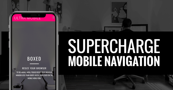
Mobile usage has overtaken desktop web use last year, which means that a site’s mobile interface is especially important. Configuring the perfect mobile menu button, or burger menu button as some call it, is the next step in perfecting what your site looks like on a phone or tablet.
We’ve added a variety of mobile menu styles in Ultra and Shoppe. Users can now select a particular mobile menu style for any and each page. From fade overlays, to flips, or zooms, you can easily choose how your menu drops down.
View the demo now or go straight to customizing and playing around with the various options by updating to the latest version today.
November 12, 2018 @ 3:27 pm
Great Feature, but I can not find anything related to than on customizing.
I have already updated to the last version.
November 12, 2018 @ 5:57 pm
The mobile menu option is available in Themify > Theme Settings (global) or per post/page edit in the backend Themify Custom Panel > Page Appearance.
November 12, 2018 @ 11:43 pm
In my woocommerce panel I was warned about a new update in my Shoppe theme, but when I click on upgrade it forward me to wp-admin/update-core.php and nothing is showing there… also when I enter in Themify > Themify Settings > Update > Check for updates. says that there is no update available… (I’m using shoppe 1.3.5)
November 12, 2018 @ 8:49 pm
Thank you!
November 12, 2018 @ 9:34 pm
I launched the demo and love it. Should build a new website just to try it well.
November 13, 2018 @ 12:17 am
I’m in Shoppe 1.3.6 and there is nothing like mobile menu option in Themify > Theme Settings
November 13, 2018 @ 12:19 am
nvm, found it under theme appearance, thank you
November 19, 2018 @ 5:58 pm
It’s probably just me, but somehow I just can’t find where to configure the mobile menu like shown above. I’m looking under Theme Settings, but can’t find it.
December 11, 2018 @ 8:03 pm
Hi Nick,
If you are using Ultra Theme v2.1.2+ or Shoppe Theme v1.3.6+ you can find the Mobile Menu Style option in Themify Settings > Theme Settings > Theme Appearance: https://cl.ly/a645e587a4b0
December 11, 2018 @ 8:04 am
may i ask where can i find the setting ?
December 11, 2018 @ 8:04 pm
Hi Desmond,
If you are using Ultra Theme v2.1.2+ or Shoppe Theme v1.3.6+ you can find the Mobile Menu Style option in Themify Settings > Theme Settings > Theme Appearance: https://cl.ly/a645e587a4b0