We love sharing and featuring sites that use our WordPress themes. Seeing how each site is creatively designed and transformed really motivates us to design and create more. And in honor of those sites which have used our Themify themes, we share to you our top 10 favourites of 2014.
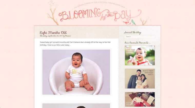
1. Blooming by the Bay
Blooming by the Bay is one of Themify's first few original showcase sites. Their site really exemplifies simplicity, elegance, and character. Using the Elemin as their base theme, they created a personal blog, which is built to show the stories of Dan, Misono, and their lovely children. Dan and Misono used soft colour schemes and easy sidebar navigation that enables them to highlight their favourite moments, from month-by-month gallery pictures of their newborn, to birth stories, post stories, and social links. Their site captured the hearts of their audience not only through adorable pictures of their children, coupled with captivating designs, but also through the amazing site layout, allowing visitors to easily get updates and stay in-touch with them.
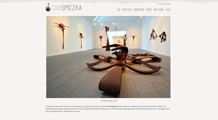
2. Sculptor Sam Spiczka
Number two goes to the sculptor Sam Spiczka. Designed using our Tisa theme, this site's homepage slider just captivates and captures your attention, drawing you to browse further. Its portfolio post layout, gallery photos, and custom font styles enable site visitors to easily navigate and see Sam's work.
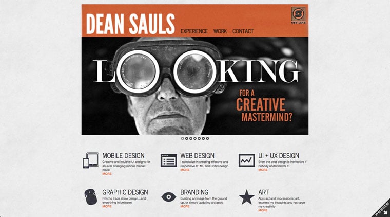
3. Dean Sauls
This is a cool resumé-style website, also designed using our Tisa theme. The site was built to showcase himself, with his focus on marketing his skills and expertise to get clients. His homepage is creatively designed with a slider at the top of the page, to act as a banner, explaining the site's purpose with clever use of texts and images. As you continue to scroll-down, you'll find a list of skills he specializes in, the works he's done, as well as, his personal biography.
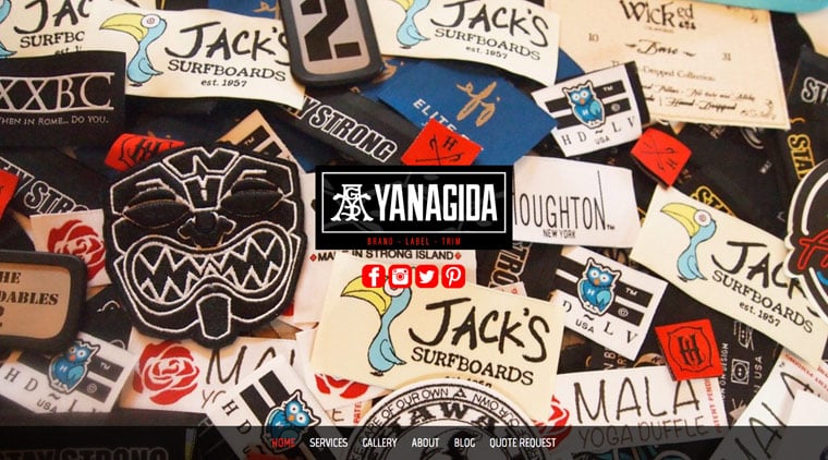
4. YANAGIDA Label
This has got to be one of the coolest header design that we've seen that use our Parallax theme. With its fascinating background image, logos, and red & white designed social links, YANAGIDA creates a really cool look as soon as you open their site. But don't let the header design confuse you. As you scroll further down their main page with its smooth parallax scrolling effect, they've designed a simple and clean layout that effectively showcases their services, with galleries of pictures, short blurbs, their blog, as well as, a contact section all located in their homepage.
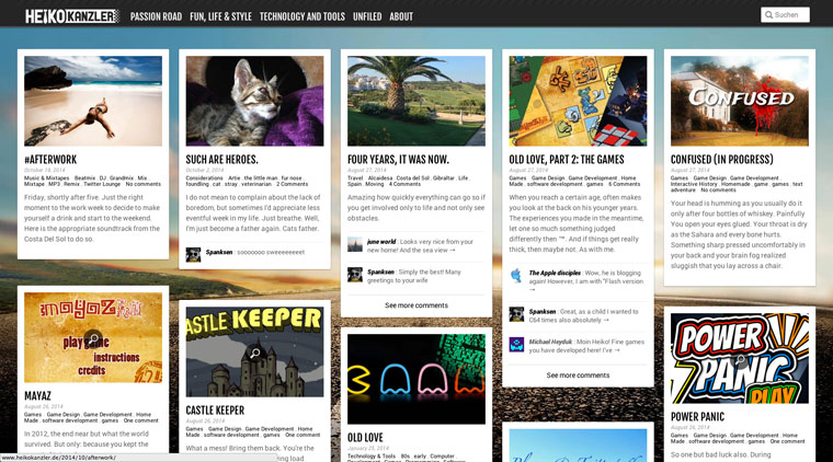
5. Heiko Kanzler
This Porsche driving, Mac-Addict consultant creates this amazing personal blog site using our Pinterest inspired, Pinboard theme. With the auto stacking layout with infinite scrolling Heiko is able to highlight his blog posts with excerpts of text, images, and even comments on posts.

6. Players Travel
This site makes us really want to go on a vacation. Based on our Agency theme, they creatively designed their homepage layout to showcase various services and events that they offer with eye-catching images and text, with credible testimonials at the bottom of the page, to increase the credibility of their services.
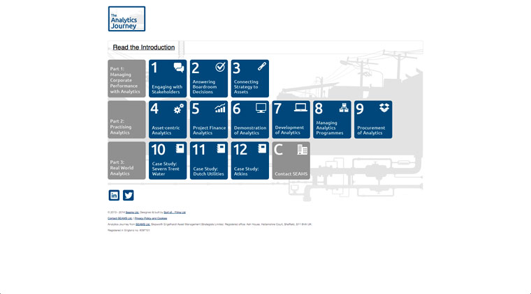
7. The Analytics Journey
Using Themify's Metro theme, this site is straight to the point, and captivating at the same time. Perfectly laid out using the hover flip animation tile feature, which when pressed, a light box appears, revealing the content of each tile. There is great attention-to-detail and amazing concept, enabling them to easily relay their message to the users.
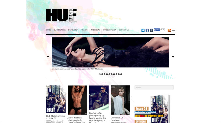
8. HUF Magazine
Designed using our Responz theme, this fashion magazine brings their edgy content out of their magazine into their website, showcasing their editorials through top sliders. All front-page content is shown in a 4-column layout with minimal design. Their monthly updates focus on exhibiting their latest content, photo shoot updates, as well as, advertising campaigns at the home page.
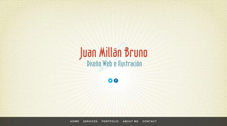
9. Juan Millán Bruno
Juan takes our Parallax theme and creates one of the best designer sites we've seen. With Its simplicity and ease of navigation, more visitors are reeled in. The simple design, however, is perfectly complemented with its smooth parallax scrolling, beautifully designed fly-in animation content and artistic mini-photo sliders.
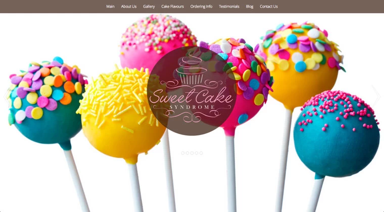
10. Sweet Cake Syndrome
We saved the sweetest site for last. The Sweet Cake Syndrome site, based on our Parallax theme site really brought out our sweet tooth. With its mouth watering pictures at the heading slider and all throughout the site, you are definitely drawn in to try out everything they make. The parallax scrolling is like giving you a sneak peak before showing you the entire image as you scroll down. With it's neatly and clearly laid out content the Sweet Cake Syndrome take our top 10 spot.
Would you like Themify to feature your site?
This wraps up our top 10 sites for 2014. We know we missed a lot of other great sites out there that uses our Themify themes. Please let us know and contact us. We'd love to feature your site next time and also place it on our showcase page.
November 4, 2014 @ 4:22 am
Hi:
I’d love for you to take a look at my Digital Marketing Consulting website, done with the Flat theme. I love it and I’m sure it would look great on your showcase page. If you need any more details please let me know :)
Cheers,
Alex
November 4, 2014 @ 6:31 am
Nice to see you !
My favorite:
https://themify.me/demo/#theme=koi
Greetings full of sun from Hannover, Germany !
November 5, 2014 @ 9:56 am
Great post.
Thanks for sharing this awesome post.
November 23, 2014 @ 4:46 pm
Thanks for sharing this awesome post. But what about labnol.org?
December 3, 2014 @ 10:59 pm
Hi Arafin,
The theme your using doesn’t seem to be one of our themes. Unfortunately, the post focused on sites that were powered by the Themify themes.
February 27, 2015 @ 11:35 pm
Hi Kurt Uy,
I agree with you,tech blog labnol.org using different wordpress theme.I think Labnol.org blog should try themify theme :) thanks
December 3, 2014 @ 12:09 pm
Thanks Themify for making it easy for me to create a really great site for my client – Sculptor Sam Spiczka. This was one of my first responsive sites, and we were both really happy about how it turned out.
Thanks again for sharing it:)
December 3, 2014 @ 11:00 pm
Hi Lisa,
Glad you like it! And thank you for making such a great site :) Feel free to share anymore sites that you make using Themify themes we’d love to feature them again :)
December 9, 2014 @ 6:37 pm
Thanks for sharing this awesome post. Beautiful projects!
December 12, 2014 @ 5:40 am
Hi,
I like the Win8 style with colored tiles and so I am interested to see real websites that use the Metro Theme. Can you show me some?
Many thanks
Klaus
December 17, 2014 @ 9:58 pm
You can find more Metro sites here: https://themify.me/tag/metro
You might be interested in our Tiles Builder addon: https://themify.me/addons/tiles
December 17, 2014 @ 12:27 pm
Hi,
I’m trying to set up a page like No. 10 (the sweets) with only a background image without any module (e.g. text) in it. But without the “sections” of the former parallax version it seems not possible anymore. The page deleted the sections with only a background image with parallax scrolling. How can it look like No. 10?
Can you help me?
Kinds, Romy
December 17, 2014 @ 9:49 pm
Please post on our forum: https://themify.me/forum and our team will help. :)
November 11, 2016 @ 1:40 pm
Nice sharing. Hope I will also use themify themes on my upcoming site.
August 26, 2019 @ 1:39 pm
Do you mind if I quote a few of your posts as long as I provide credit and sources back to
your blog? My blog site is in the very same niche
as yours and my visitors would certainly benefit from some of the information you present here.
Please let me know if this okay with you. Thank you!
August 26, 2019 @ 7:14 pm
Hi there,
Definitely that’s doable. Please refrain from taking out complete chunks and copy and pasting it to your site as this is not good for SEO purposes. As long as you rewrite in your own words what we’ve said, all should be fine!