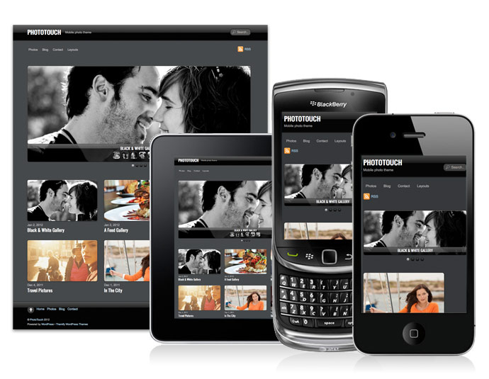
Hope you had a fantastic holidays and that you've taken a lot of photos over the holidays because we have a new responsive photo theme for you - PhotoTouch. It is a beautiful photo theme designed with mobile devices in mind. It features a gallery/slideshow that mimics the iPhone native Photos app. User can swipe or press arrow keys to go through the photos, double tap, auto play, pinch and expand, etc. Combined with the responsive design and slider, PhotoTouch is the perfect theme to showcase your photo portfolios. Most importantly, it works on both desktop and mobile devices such as iPhone, iPad, Blackberry, and Android phones (view demo).
We are offering 30% disount code for this new theme. Use the coupon code "phototouch" for a 30% discount off this theme until Jan 12, 2012.
Responsive Design
To see the responsive design, view the demo and resize the browser window or view it with a mobile device.
Mobile Slideshow
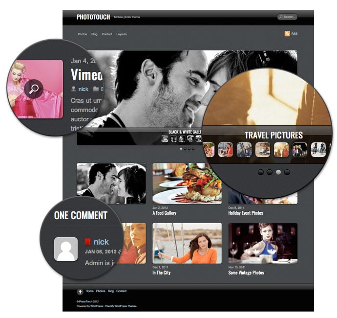
A slideshow that you can tap, swipe, drag, pinch and expand - just like the iPhone Photos app.

Responsive Slider
A responsive slider with optional mini thumbnail gallery.

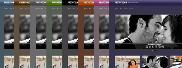
8 Additional Skins
On top of that, it also comes with 8 additional skins.

Other Features:
Lightbox Media Link
You can attach a lightbox media link to the post image. The lightbox link can be an image, video (YouTube, Vimeo, etc.), or iFrame URL.
Back to Top Button
It has a scroll to top button at the footer.
Custom Main & Footer Navigation
The theme includes a customizable main menu and an optional footer menu.
Footer Widgets
You can display up to 4 optional footer widgets.
Footer Text
Footer text can be replaced at the Themify option panel.
RSS Icon and Search Form
RSS icon and search form can be excluded as well.
Default Layout Options
The theme offers various list and grid layout options where you can set in the option panel.


January 6, 2012 @ 9:52 am
Contrary to Marks eloquent comment, I really like this theme. I love using Themify responsive Themes and look forward to trying PhotoTouch.
January 6, 2012 @ 4:01 pm
Thanks for the support.
January 6, 2012 @ 1:18 pm
congrats! very cool theme, good luck with sales!
January 7, 2012 @ 5:57 am
A very sleek theme with clever features you have here … I love the header and footer design also
Let the sales flow :)
February 15, 2012 @ 10:02 am
Wow impressing, im going to try it ASAP!
March 19, 2012 @ 7:52 am
Thanks for the support.
March 24, 2012 @ 1:05 pm
Wow superb theme, I will use this in my next work.
May 14, 2012 @ 4:39 pm
It’s very good to give discount coupon code, so many people have the possibility to buy