Responz: 3-Column Responsive Theme
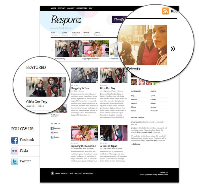
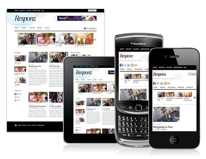
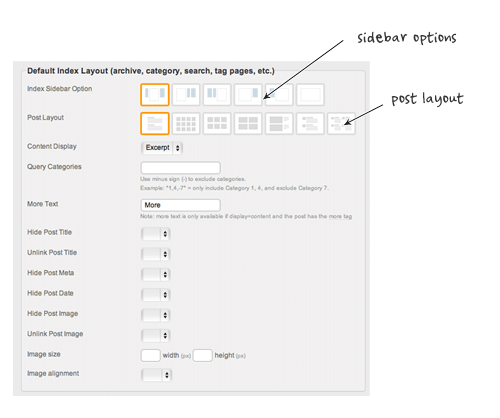
Responz is a 3-column responsive theme for news and editorial sites. The design is minimal and elegant with great typography. It looks great on any resolution on desktop and mobile devices such as iPad, iPhone, Android, and Blackberry. There are many layout options built in Responz. You can choose from 2 sidebars, 1 sidebar, or fullwidth along with various list view and grid view post layouts. The sidebars can be on the right side or left side. It is very flexible and highly customizable.
We are offering 30% disount code for this new theme. Use the coupon code "responz" for a 30% discount off this theme until Nov 22th, 2011.
Responsive Layout
To see the responsive layout, view the demo and resize the browser window or view it with a mobile device such as iPhone, iPad, Blackberry, or Android. View more responsive themes.
Sidebar Options
You can set to have 2 sidebars, 1 sidebar or fullwidth without any sidebar. You can build many different layouts by combining the sidebar options with the post layouts.
Dual Navigations
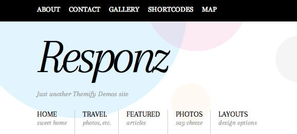
Header contains two customizable navigations: main navigation with text title and optional top navigation.
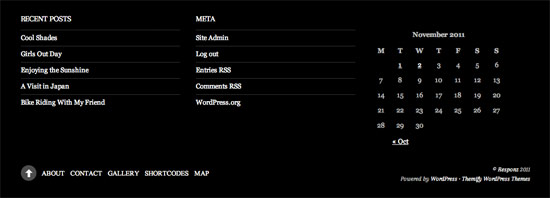
Footer Menu and Widgets
The footer includes customizable footer widgets and footer menu.
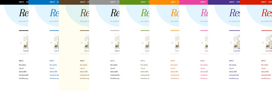
8 Additional Color Skins
November 16, 2011 @ 4:09 pm
Thanks for info, really a nice theme,
November 16, 2011 @ 4:35 pm
Im buying it
November 16, 2011 @ 5:14 pm
This is a perfect theme for an entertainment news site
November 21, 2011 @ 7:58 am
great theme, thanks for creating, we love themify themes!
February 13, 2012 @ 11:17 am
Can you play videos on this theme? Thanks!
March 19, 2012 @ 7:56 am
Thanks for info, really a nice theme