What is Responsive WordPress Theme
Responsive WordPress themes and responsive design in general has emerged as a hot topic in the digital world. At Themify, we made the decision to create responsive WordPress themes rather early on, and it has become one of our strongest features and selling points. Because of our extensive knowledge in this domain, we wanted to clear up exactly what you get with a “responsive WordPress theme” and what it means when you buy an awesome WordPress theme from Themify.
What is a “responsive WordPress theme”?
When answering this question, we can also answer the question “What is a responsive design?” A responsive design and responsive WordPress theme utilize CSS and JavaScript to adapt a website’s layout to the user’s “viewport.” For those who don’t know, a “viewport” is essentially the visible portion of the canvas inside a web browser.
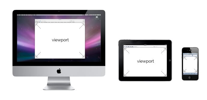
We use responsive design to create a consistent user experience for browsers of all shapes and sizes because the digital world doesn’t run on just 4:3 resolutions anymore. We adapt content to viewports of different sizes, including everything from mobile phone browsers all the way up to large television screens.
Many people confuse “responsive design” with “mobile design,” but mobile design targets mobile devices specifically, whereas responsive design includes support for mobile devices and many more.
What does “responsive design” look like?
To get an idea of what responsive design, especially in WordPress, can achieve, take a look at our Elemin theme.
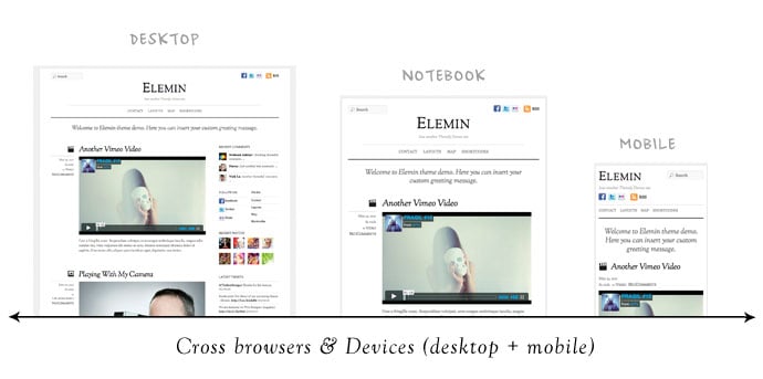
Elemin displays nicely on your standard browser size, but you can change the size of your browser to get an idea of how the layout changes and adapts along with the width of your browser window. The layout never breaks, and the content simply flows to fit with the browser’s viewport.
A viewer can enjoy a website using the Elemin theme on their desktop, their laptop, their notebook, their tablet, their mobile device, and even their television. The layout and experience of the website remains consistent throughout.
Here are some more hand picked responsive WordPress themes from Themify
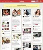
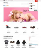
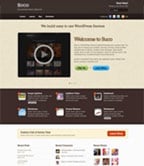
As shown in the examples below, responsive design is not limited to just blog theme. It can be complex grid layout like Pinboard, Ajax shop theme Minshop, 3-column Responz, and corporate theme with responsive slider like Suco. Check our responsive themes collection for more.

October 20, 2012 @ 3:45 am
thanks for sharing the knowledge of responsive.
October 20, 2012 @ 8:47 am
Themify themes are always elegant and beautiful :) Now, they are even better with responsive design
October 23, 2012 @ 11:10 am
Thanks for descriptive post about Responsive themes, I used elemen one of my blog, It looks great :)
October 24, 2012 @ 9:03 pm
I just noticed that “fullscreen” is not in the list when I click “responsive” yet the theme that came out after it is.
October 25, 2012 @ 1:47 am
Thanks. It is fixed now.
October 25, 2012 @ 3:04 am
Great article, Responsive is definitely the way forward! I try not to make a website without it now.
October 28, 2012 @ 4:34 am
thank you for sharing this article it is of so much help.
November 4, 2012 @ 3:28 am
Nice theme. Definitely worth installing it for ease of use and convenience.
November 4, 2012 @ 4:43 am
Responsive design will be required for all WordPress themes later.I think so
November 9, 2012 @ 8:12 am
I like the responsive themes more after reading this article. Good job.
November 14, 2012 @ 7:21 pm
Thanks for the explanation, responsive design is definitely the future of websites.
November 25, 2012 @ 1:18 pm
How to include image from other servers (like flickr)? Can they be used in a responsive layout as well?
December 19, 2012 @ 5:57 am
Hey Themify,
I know what you mean, Hi there all, it can my own first time to build a website, generously help me. i want to perform a apparel delivering to be able to flower nurseries globly website ( certainly not weblog ). Sorry… however i actually MAY NEED concept with regard to WEBLOG…..: ) hans is definitely an recognized site that’s not the on the web store: ) can anyone recommend me personally what kind of theme or even quiosco do i need to choose within wordpress which is ideal? because there are lots of themes/tamplete to choose from such as reactive, 20 11, suffusion and so on, extremely confuse……. and in addition, must i change my personal web hosting from justhost in order to hostguard? Thankyou and also have a pleasant time: ) Lu
Regards
January 17, 2013 @ 4:51 am
Great blog thank you :)
January 23, 2013 @ 6:49 am
oh, all the great themes !
February 19, 2013 @ 12:29 am
Great blog thank you :)
October 10, 2013 @ 5:57 pm
Everyone want to get a responsive design for their website. and you demonstrated awesome wordpress themes. It’s good for wordpress designers.
February 13, 2015 @ 4:37 pm
Great posting, about How to Build a Restaurant Website with WordPress
thank you!!!
February 14, 2015 @ 9:47 pm
Glad to hear you like :)
May 11, 2015 @ 1:10 pm
useful information.i got valuable idea about responsive wordpress theme.right now,responsive wp theme also plays important role on google top rank.so,we should use responsive theme for better user experience and google top rank.thanks