With Google now favouring mobile friendly sites, creating responsive sites have never been more important. But making sure that your site looks good on all devices can be tricky, especially with background images. For this tutorial, we're going to explain how background images varies in different devices, and how the Builder background position option can help fix this issue.
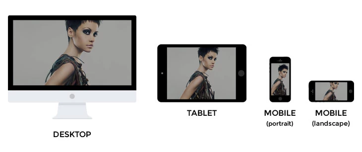
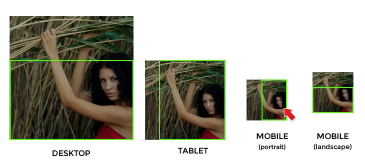
The image below illustrates how background image displays on different devices/resolution. By default, the parallax and fullcover background image is displayed in the center. So you can see that the image is fine because the subject (which is the girl model in this example) is in the center of the image.
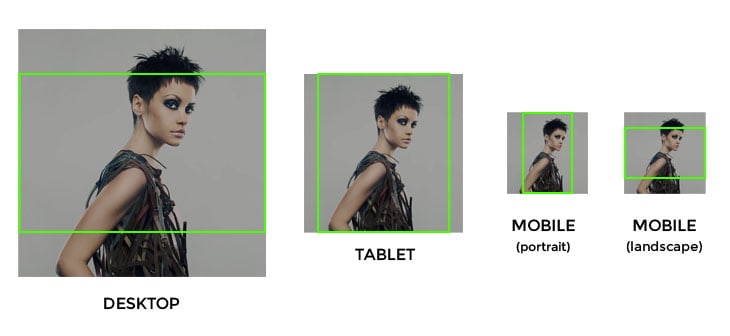
However, if the image subject is on the side like the example below. You will see how the face of the model is being covered on certain resolution because the image is positioned in the center.
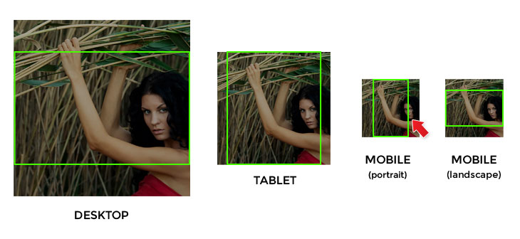
To resolve this problem, we recently added the “Background Position” option in the Builder row background options.
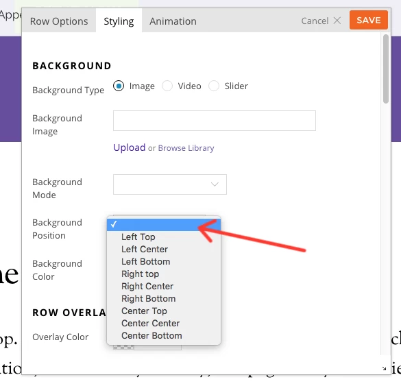
By selecting the background position (for this example, we will select "right bottom"), you can keep the image subject in the visible area.
February 18, 2016 @ 2:59 pm
Thank you for this awesome feature :-)
uproar.dk (Built with Themify)
February 18, 2016 @ 5:50 pm
Hi Morten,
Nice looking site :) Feel free to submit your site here – https://themify.me/showcase-submit to add on our showcase page.
February 18, 2016 @ 6:01 pm
That’s another great feature! :)
February 22, 2016 @ 12:13 pm
This type of adjustment could also work with the background of selected images to pages. As I mentioned in a call mine: https://themify.me/forum/topic/background-2
The images have different performances in each device, not like this article …
Link to the website where this occurs “error”: http://www.comsamambaia.com.br/
April 7, 2016 @ 6:27 pm
Our support team will help via the forum.
April 2, 2016 @ 10:45 am
nice tweak to resolve background image positioning..thanks for another useful feature
April 3, 2016 @ 6:11 am
That’s a really nice feature, most of the themes miss this one, which makes the background irrelevant.
April 9, 2016 @ 6:37 am
what is the picture is not at the right bottom? Just want to know how flexible this is. if its what am thinking then themify has won me over for good.
Thanks
April 10, 2016 @ 11:11 pm
Hi Banks,
You can set it to showcase as right bottom, if you’d like. If you need more detail/clarification for this, please send us an email with more detail at info[at]themify.me and we’ll provide you more accurate support.
May 11, 2016 @ 9:26 pm
Dear,
I do not have this option, where can I update.
Regards
May 12, 2016 @ 1:18 am
You can update on your WP Admin on the Themify panel. If you cannot find it please send us an email at info[at]themify.me with your username so we can check your account details.