Here Comes the Builder Responsive Styling!
In the previous update, we focused on the backend features that help you to manage Themify Builder/theme easier such as the revisions, visibility control, and role access. In this update release, we are happy to add more cool new features that'll help you build better responsive sites with Themify.
Responsive Styling
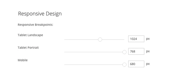
Styling how your site will look on tablet, mobile, or on desktop, has never been easier now with responsive styling. Built with live preview, it allows you to style the design of your site across all devices when editing the Builder on the frontend. The icon buttons allows you to easily toggle and preview between various devices.
In addition, you can also set the breakpoint settings. This allows you to set the viewport width the responsive styling should apply.
Column Alignment
Column alignment is a simple feature that sets the columns alignment either top, middle, or bottom. A good sample usage of this feature is to align columns in the middle perfectly without having to add padding.
More Styling Options
We're giving you even more control on how you can style each module, now all modules come with more styling options. With this new update, you can style almost every element of each module.
Aside from these enhancements, we've also added some bug fixes to the framework ensuring that it runs smoothly. We've put a lot of work to adding these new features, and we can't wait to see all of you use these cool new features on your site. Feel free to post your feedbacks in this blog post comments.
May 18, 2016 @ 11:07 am
As always a very nice and useful update. Thanks a lot.
May 18, 2016 @ 11:40 am
…it’s getting better and better!
Good update!
Best regards
Bartek
May 18, 2016 @ 12:06 pm
I like!
May 18, 2016 @ 2:23 pm
Maybe a stupid question but how do I update?
May 18, 2016 @ 5:11 pm
There should be a notification at the back of your site on your WP Admin dashboard. Here’s our documentation on how to upgrade your theme – https://themify.me/docs/upgrading#auto-upgrade
May 18, 2016 @ 2:46 pm
Where can I find those “In addition, you can also set the breakpoint settings.” ?
May 18, 2016 @ 5:14 pm
You can find this by going to your WP Admin > Themify theme > Themify Settings > Themify Builder > Scroll down to the new Responsive Design option. And you’ll see these options. Here’s a screenshot to show you what I mean – http://cl.ly/1v00061x3C19. Let me know if you encounter any difficulty with this via email at info[at]themify.me
October 13, 2018 @ 1:44 pm
Hi! I have a problem with my theme not loading on properly on mobile device. All of the articles and words are scrambled. What can I do to fix this Issue? Thank you!
May 18, 2016 @ 2:58 pm
such a great update!
May 18, 2016 @ 3:06 pm
Hooray! Buttons can now be custom-colored! But it’s a little strange to see the present color selections and then the button link customization. There’s still some clumsy coding in overwrites, but this is a big improvement.
May 18, 2016 @ 3:42 pm
Well done! You guys have revolutionized my ability to create amazing websites for my clients. Keeps getting better and better!
May 18, 2016 @ 5:10 pm
Thanks Blake :) We’re very happy to hear this!
May 18, 2016 @ 7:40 pm
From what I can see, great update. Bit frustrating that I can’t drag things like text modules into the screen anymore, but I’m sure I’ll get used to it!
May 19, 2016 @ 10:27 pm
Due to technical and performance concerns, we disable the drag & drop in responsive preview. We will revisit this feature in the future. Hope you like the new responsive styling so far.
May 19, 2016 @ 2:30 am
Much needed. Thanks for the update guys!
May 20, 2016 @ 7:40 pm
Is anyone running into problems with this? It doesn’t seem to be giving me a preview for the different screen options (on Parallax theme with no sidebar) :(
May 21, 2016 @ 4:37 am
Hi Mikey,
Do you mind trying to clear your Builder Cache? To do this, please go to your WP Admin > Themify theme > Themify Settings > Themify Builder (https://themify.me/docs/builder#builder-cache). If this doesn’t fix the issue, please send us your site URL via email at info[at]themify.me. We will then further investigate this issue and provide you with further support.
May 22, 2016 @ 10:13 pm
Success! Thanks so much for the tip, Kurt. I’m so pumped for this easy responsive styling! Great upgrade :)
February 8, 2017 @ 10:06 pm
Hello, I apologize if this has been asked in the past but I cannot seem to find anything in the side bar. I have an issue with my website where on mobile, when the phone is vertical, the gallery opens the image in its normal size (where it fits the width of the phone). When I tilt the phone horizontally, I would expect and would love the image to increase in size a bit to expand; maybe not to the entire width but at least larger than the vertical view. It does not. It remains quite small. It basically stays locked in the same width as when it is vertical. Is there a way to change this? I am using Themify Ultra and the standard Gallery drag and drop it provides.
Thank you!!
February 9, 2017 @ 5:50 pm
Please contact us here: https://themify.me/contact and provide the site URL where we can see the problem.
May 22, 2016 @ 3:14 pm
Great new enhancement. It’s just about time so I can extend my yearly subscription. Keep up good work.
May 24, 2016 @ 1:46 am
Thanks :) Appreciate the love!
May 24, 2016 @ 2:53 am
hi kurt, what do you think if i use themify for movie blog ?
May 24, 2016 @ 8:10 pm
Hi Candice,
Our themes are perfect for any type of blogs :) Send us an email at info[at]themify.me with some sample site layouts that you would like to replicate and I’ll provide you with some theme recommendations :)
May 25, 2016 @ 11:28 am
Hi!
I’m using Themify with both Bold and Magazine. This upgrade works fine on Magazine, but not on Bold.
The Buttons to update Bold have also disappeared from the Themify Settings tab. I was having problems updating before and I reinstalled the theme successfully, just before launching. Now the site is online, so I don’t really want to do that again unless there’s no other solution… Help? :)
May 25, 2016 @ 4:55 pm
Hi Cristina,
Please contact us here – https://themify.me/contact. Please include your site URL and your Themify username. We’ll review your account and further investigate the issue you encountered. Thank you for your patience.
June 20, 2016 @ 8:33 am
i need to learn how to use this ..quickly.
i guess am stuck with themify for now.
Only qualms i have encountered here is the customer service response that doesnt answer my questions specifically but in a generic manner.
But its a good and friendly theme and i know the business is getting better.
August 9, 2016 @ 3:21 am
Thanks for this resource. I am just beginning to learn about the responsive design features of the Themify.me themes and Builder framework Thanks @Imran for pointing me in the right direction :)
September 2, 2016 @ 6:03 pm
Hi hope you can help
been trying out the the responsive break point and its working great.
i would like to keep the mobile menu option as my default as i find that less intrusive. is there any way this can be done
September 2, 2016 @ 7:23 pm
Yes, this is possible :) Please allow our developers to help you out with this. With that said, do you mind opening a new ticket on our support forum so that one of our developers can help you with this issue?
To open a new ticket, please log in to your Themify member area (https://themify.me/member/login). Click on the support tab and this will redirect you to the forum where you can open a new ticket.
December 8, 2016 @ 7:04 pm
In the past, I have tried so many page builders out there … I use the Themify Builder exclusively now, because it’s so superior! Thank you and keep up the great work!!!
December 9, 2016 @ 6:02 pm
Thanks for the awesome feedback :)
March 23, 2017 @ 1:59 pm
Hi,
I am having issue with my website,
its working fine in google chrome, but i m trying to open in microsoft ege and internet explorer first time it opens properly and when i refresh my page few content is missing, i have tried different computers but my issue is there.
and when i open my website in mobile phone its not showing the content as it should be.
March 24, 2017 @ 3:08 pm
Please allow us to help you with this. Do you mind contacting us here – https://themify.me/contact and we’ll provide you with further support?
March 24, 2017 @ 4:38 pm
I have a question about responsive styling. GREAT that you can now toggle between devices/desktop/laptop to preview but where do you customize pages that have been created with the builder if the images and other elements are off (need to be re-sized) on devices?
Thanks!
March 30, 2017 @ 4:46 pm
Hi Alexis,
When you click on the tablet or mobile icons, you’ll not only get a preview but also be able to style the row, column, or modules. When you click on the brush icon, a lightbox will appear where you’ll see various styling options available for tablets or mobile (ie. padding, margin, border).
January 15, 2018 @ 4:01 am
I just updated my themify and its not responsive on mobile…How do I fix this?
January 15, 2018 @ 4:43 pm
Please allow us to help you with this. Do you mind sending us your site details here – https://themify.me/contact. This will allow us to better provide you support.
August 17, 2018 @ 7:35 pm
Hello there,
I am having issues with the mobile version. I’m using Parallax and for some odd reason the mobile version is not the same as what I see when I’m in WordPress in development mode.
When you go to the site on the mobile version it’s all black and you need to swipe down to see the page… also the nav menu doesn’t display across top, while in WP it does!? Any assistance would be greatly appreciated.
Thanks
August 18, 2018 @ 8:45 pm
We can help you with this. Please contact us: https://themify.me/contact or post on our forum: https://themify.me/forum.
June 26, 2019 @ 3:14 pm
hello, themify actually the responsive styling feature is not working on my website even after updating the feature is not working. so can you please help me solve this problem as soon as possible.
June 27, 2019 @ 2:21 pm
Hi Samad,
Thanks for your message and please allow us to help you. Would you send your site url, admin access, and paste this message to our email here: https://themify.me/contact
We’ll get back to you shortly!