Themify Builder Documentation
This documentation is an extensive guide on how to use the Themify Builder, a drag and drop page builder with live edits and previews. Themify Builder works with WordPress posts and pages, as well as custom post types. Shortcodes and HTML tags are supported with the Text or HTML/Text module. The Builder can be used in both backend edit mode and frontend edit mode.
NOTE: The Themify Builder is included in the framework of all themes. If you are using a Themify theme, you don't need to install the standalone Builder plugin additionally.
To Start
To use the Builder to design your page layout, you would need to create a Page or Post first. Go to your site's WP-admin > Pages > Add New, then you will see the Builder interface in the backend. Click "Publish" to publish your page and then you can use the backend Builder interface or frontend to design your page layout. To switch to frontend: view the page on the frontend, then click "Turn On Builder" on the top admin bar and you will see the Builder interface to design your layout.
Backend Edit Mode
To use the Themify Builder in the backend:
- First add or edit a post/page.
- If you are using WordPress 5+ with Gutenberg enabled (default), you should see a Builder Block like the screenshot below.
- If Gutenberg is disabled, you will find the "Themify Builder" tab below the WordPress classic editor.
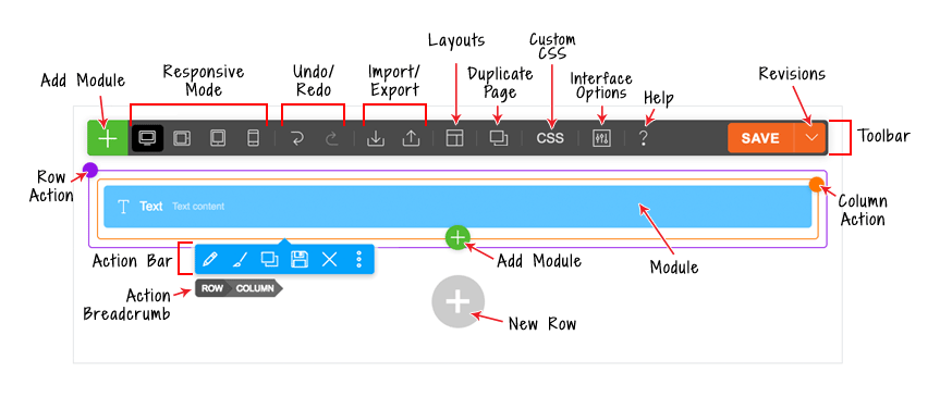
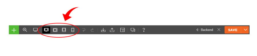
Toolbar
On the Builder Toolbar, you will find these buttons:
- Plus Button = To open module panel.
- Responsive Styling = Customize styling on Desktop, Tablet Landscape, Tablet Portrait, or Mobile.
- Undo/Redo = Undo/redo (you can use keyboard shortcuts Cmd+Z and Cmd+Shift+Z).
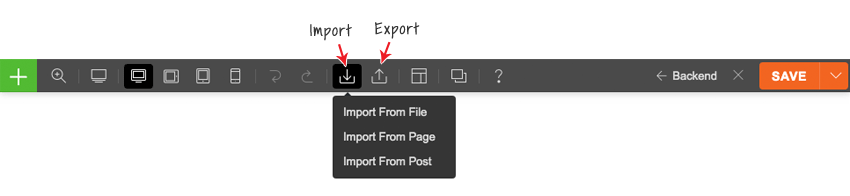
- Import = Import Builder content from a data file, existing posts, or pages.
- Export = Export the Builder content (export will generate a ZIP file which can be imported later using the import option).
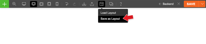
- Layouts:
- Load Layout = Import pre-designed Builder Layouts to the current page.
- Save as layout = Save current layout to use on another page.
- Duplicate This Page = duplicate the page along with the Builder content.
- Page Custom CSS = Allows you to add custom CSS to the specific page.
- Interface Options = Choose your interface options such as enable hover mode and right-click menu.
- Help = Click to open the Builder Tutorial video lightbox and view the keyboard shortcuts.
- Save = Save the Builder content.
- Revisions = Revisions allow you backup and restore your previous layout. To access revisions, click on the arrow button beside the Save button. You can select to save or load a revision.
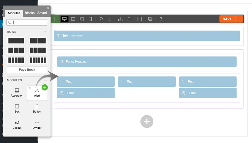
Adding Modules
- Click on the plus (+) icon found on either the top left of the toolbar or in the last row, to open the module panel.
- To add modules, you can drag & drop module to the canvas area or click on the green plus (+) button in the top right corner.
Row Options
To access the row options:
- If you have hover mode enabled, just hover over the row action button (the small purple dot). To enable/disable hover mode, go to the top toolbar > Interface Options, then toggle the "Hover Mode" switch off.
- If you have hover mode disabled, click the row action button or click any where on the row, then click the row button on the action breadcrumb.
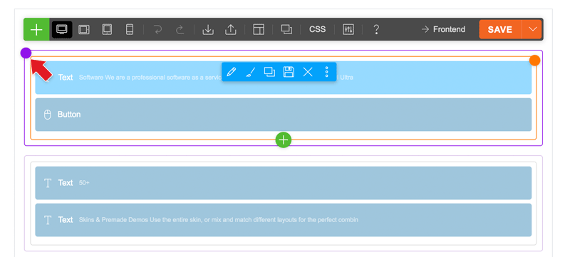
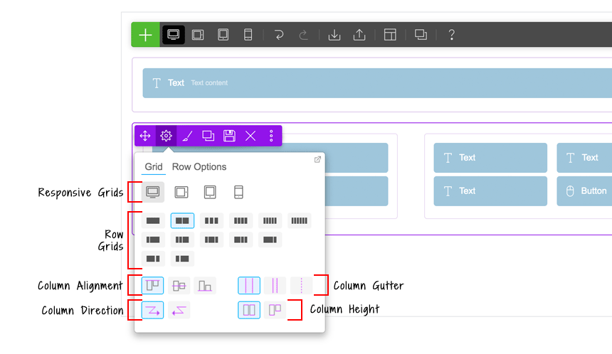
On the row action, click on the gear icon to trigger the row option dropdown menu. The row option dropdown has these options:
- Responsive Grids: To have a different grid on desktop, tablet, and mobile: first click the device icon, then click the row grid icon.
- Row Grids: You can also set the column arrangement on mobile or tablet.
- Column Alignment: Set modules in the entire row to top, middle, or bottom alignment (Click here for more info).
- Column Direction: Set column float direction either from left-to-right or right-to-left.
- Column Gutter: The spacing/gap between columns.
- Column Height: By default, all columns within the row are full height. You can change it to auto height which means the height of the column will vary depending on the content inside the column.
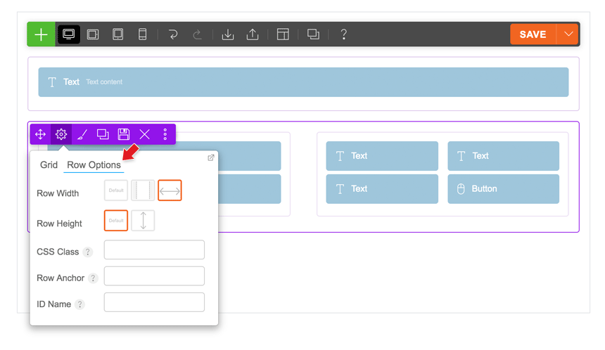
On the row option dropdown menu, click the "Row Options" tab to see more options:
- Row Width:
- Default = Row background and row content area is within the container width.
- Boxed = Row background will be fullwidth, but the row content area will be within the container width.
- Fullwidth = Both row background and row content area will be fullwidth completely.
- Row Height:
- Default = Row height varies depending on the content inside the row.
- Full Height = Row will be 100vh (viewport height) and the content inside will be by default middle aligned vertically.
- CSS Class: Add additional custom CSS classes.
- Row Anchor: Add row anchor for scrollTo anchor feature.
- ID Name: Add ID name for Sticky Scrolling feature.
Frontend Edit Mode
The frontend edit mode works similar to the backend mode except it provides a live preview.
To use the Themify Builder on the frontend:
- View any post or page on the frontend (NOTE: WordPress' default homepage is actually a blog archive page, so you would need to create a static front page to use the Builder on a homepage).
- On the frontend, from the top admin bar (make sure your WP Admin Toolbar is enabled), click "Turn On Builder".
- You will see the Builder toolbar at the top.
- Click on the green (+) icon found on the top left corner, or in the last row to open the module container.
- Drag and drop, or click the green (+) button, to add a module to the column/grid.
- On the frontend, you can dock the panel to either left or right side by dragging the panel to the left/right edge of the screen.
Using Builder on Homepage
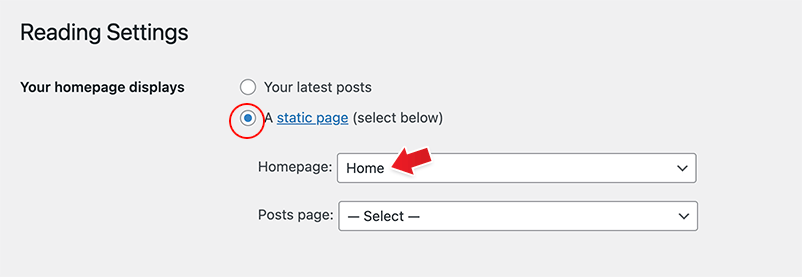
The default WordPress homepage is actually a blog archive page which shows all of your latest posts. Please note that the Builder does not work on archive pages. To use the Builder on the homepage, first you must create a static page (e.g. "Home") and then go to WP Settings > Reading and set that "Home" static page as the front page.
To use the Themify Builder on the homepage:
- First add a new page (e.g. Home).
- Publish the page and create the Builder layout as you like.
- When you are done, go to WP Settings > Reading, on the "Front page displays" option, select the "A static page" radio button, then from the "Front page" dropdown menu, select the "Home" page that you've created.
- Leave the "Posts page" option empty (if you need to create a "Blog" page, please refer to this tutorial).
Responsive Grids
The Builder grid is responsive by default. But if you want the row grid to be different on tablet and mobile, you can use the responsive grid feature. For example: you can set the row grid to a 4-column on desktop, then change it to a 2-column on tablet, and a 1-column on mobile.
To use responsive grids:
- On desktop mode, select your desired row grids
- To change a row grid on tablet: click on the tablet icon on the toolbar, then change the row grid option
- To change a row grid on mobile: click on the mobile icon on the toolbar, then change the row grid again
Responsive Styling
This features allows you to style how your site looks like on a tablet, mobile, or desktop. To access this feature, first turn on the Builder > on the Builder toolbar select to view your site on Desktop, Tablet Landscape, Tablet Portrait, or Mobile. When these icons are selected you'll see a live preview where you can customize the styling and the module data.
Notes: When you edit the styling in both tablet or mobile view, you can add or edit the Builder content. But when you do this, note that it will apply on the desktop version as well. Only the styling is applied specific to the device you're viewing (ie. mobile styling only applies on mobile).
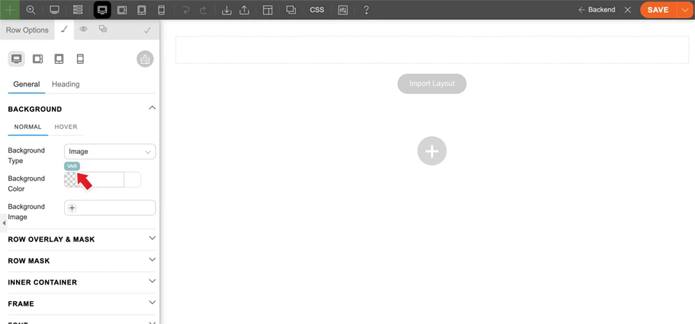
Style Variables
Style Variables are useful for defining reusable styling values such as colours, fonts, and spacing. When you change a variable, it will update everywhere that variable is used on the site. You can edit and apply Style Variables in both Builder and Customizer (they share the same variables for consistency).
To Add/Edit Style Variables:
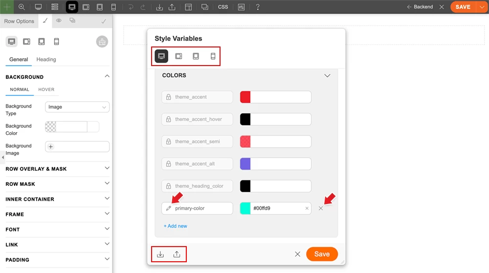
- Go to any module or row styling option. Hover over any styling input that supports font, number, or colour options. A "VAR" button will appear. Click the "VAR" button, then click "Edit Variables".
- On the Style Variables panel, there are different types of variables:
- Color = Use the colour type for any colour value such as font colour, background colour, border colour, text-shadow colour, etc.
- Font = Use the font type for font-family values.
- Number = Use the number type for any numeric value such as font-size, line-height, padding, margin, border width, border-radius (corners), etc.
- You might see theme-specific variables on the Style Variables panel such as theme_accent and theme_accent_hover. You cannot delete or rename these theme-specific variables because they are default variables in the theme. However, you can add custom values to override them (for example, you can change the theme_accent colour to any colour of your choice).
- To add a variable, click "Add new", then enter the variable name and value. Spaces are allowed in the variable name, but they will be replaced with hyphens if you enter a space.
- After the variables are created, you can assign them by hovering over a styling input, clicking the "VAR" button, and selecting the variable.
To Rename Variables:
- It is recommended not to rename any variable once it is in use. When you rename a variable, existing layouts that use it will no longer render the value.
To Delete Variables:
- It is also recommended not to delete any variable that is in use. Once it is deleted, layouts that use it will no longer render the value.
Responsive Variable Values
Variable values can also be responsive. This means you can specify a different value for each breakpoint: desktop, tablet landscape, tablet portrait, and mobile. Responsive variables are especially useful for font size, padding, margin, and corners. For example, you can set a larger font size for headings (H1-H6) on desktop and reduce the font size for tablet and mobile. You can also use larger rounded corners or padding/margin on desktop, and smaller values on mobile.
- To set a responsive value: On the Style Variables panel, click one of the device icons to select a breakpoint, then enter the variable value. You only need to set responsive values if you want the variable to have different values on different device breakpoints.
To Import/Export Variables:
- To export: On the Style Variables panel, click the "Export" icon, which will prompt you to download a JSON file.
- To import: Click the "Import" icon. If your site already has variable names that match those in the imported JSON file, it will ask whether you want to overwrite or skip duplicates.
- FYI: When you import or export a Builder layout that contains in-use variables, the variable data will be included. If your site does not already have those in-use variables, they will be imported.
Builder Shortcuts
Below are some Builder shortcuts that can improve your productivity and save you time:
- Double-click = Double clicking on a row, column, or a dropped module will bring up the options lightbox
- Cmd + S (PC: Ctrl+S) = Save (if a lightbox is open, it will save changes made in the lightbox, otherwise it will save changes made with the Builder)
- Cmd + Z (PC: Ctrl+Z) = Undo
- Cmd + Shift + Z (PC: Ctrl+Shift+Z) = Redo
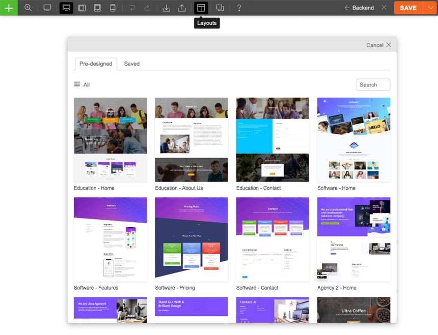
Builder Predesigned Layouts
Builder Layouts are predesigned layouts which you can import to any page for quicker prototyping. You can use the predesigned layouts to get your page started or create your own from scratch using the Builder.
To import predesigned layouts:
- On the Builder Toolbar > click Layouts > click Load Layouts
- Select the thumbnail you'd like to import. Then choose to either replace your current Builder layout or append it.
- If you already have custom Builder Layouts created/saved, it will be available on the "Saved" tab.
Creating Custom Builder Layouts
You can either create custom layouts from scratch or save from an existing post/page created with the Builder.
Method 1) To create new Layouts from scratch:
- Go to WordPress Admin > Themify > Builder Layouts.
- Click on "Add New" button.
- Enter the title, upload the Featured Image (optional) and click "Publish".
- Use the Builder edit panel to create the Layout as desired and click "Save" when you are done.
- The new Layouts will be available on the "Saved" tab of the "Load Layouts" lightbox.
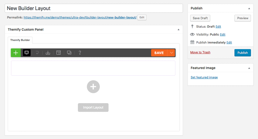
Method 2) To save Layouts from an existing post/page:
- Go to the frontend of the page you want to save as a Layout, and turn on the Builder.
- On the Builder Toolbar > click Layouts > click Save as Layout.
- Then enter the title and upload the Image Preview (optional), and click "Done".
Layout Parts
Layout Parts are re-usable parts of a layout that can be included into the Builder content or anywhere in the post content or widget using its shortcode. Layout Parts can be edited live on the spot without directing yourself to another page or opening a lightbox. When the Layout Part is updated, any post or page using that same Layout Part will be also updated simultaneously. Layout Parts are extremely useful for showing the same content in multiple areas/pages (e.g. client logos, contact info/map, banner ads, service list, etc.).
How to create Layout Parts
You can create Layout Parts from scratch or by saving any existing module/row.
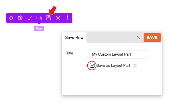
Method 1) Save any existing row/module as a Layout Part:
To save any row/module as a Layout Part, click on the element, then click on the save () icon, enter the title and check the "Layout Part" checkbox.
Method 2) Create Layout Parts from scratch:
- Go to WordPress Admin > Themify > Builder Layout Parts.
- Click on "Add New" button.
- Enter the title, upload the Featured Image (optional) and click "Publish".
- Use the Builder edit panel to create the Layout as desired and click "Save" when you are done.
- The new Layout Parts will be available on the "Saved > Parts" tab of the module panel.
How to display the Layout Parts
There are 2 methods to show the Layout Parts:
- Using the "Layout Part" module.
- Using the shortcode.
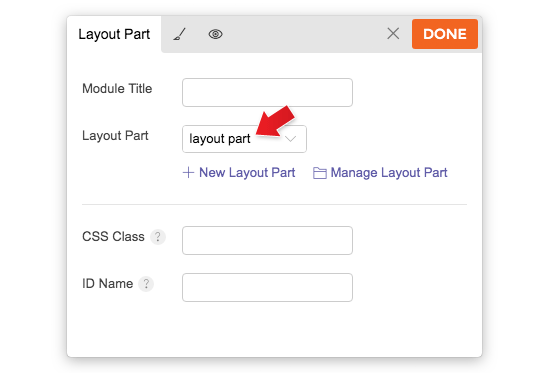
Method 1) Using the "Layout Part" module
The "Layout Part" module works exactly the same as all other modules. Simply drop in the "Layout Part" module and select the Layout Part.
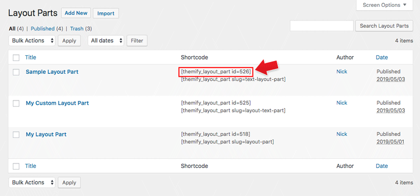
Method 2) Using the shortcode
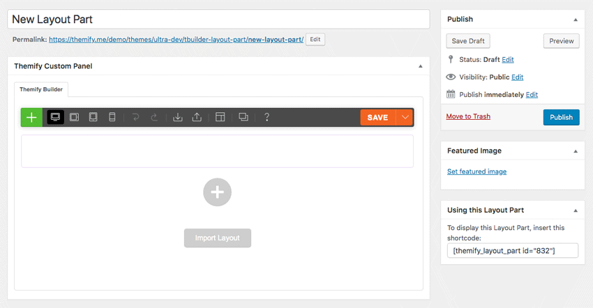
You can also display Layout Parts using the following shortcodes in the post content, Text widget, and inject it in the page using the Hook Content.
The Layout Part can be queried by its slug name or post ID.
- = this means show the layout part with slug name 'client-logos'.
- = this means show the layout part ID# 12 (find out how to post the ID number).
- You can get the Layout Part shortcode from WP-Admin > Themify > Layout Parts
Mega Menu
The Mega Menu feature enables you to make the most of the WordPress menu by showcasing featured posts and multi-column dropdowns with various links and widgets.
To use the Mega Menu:
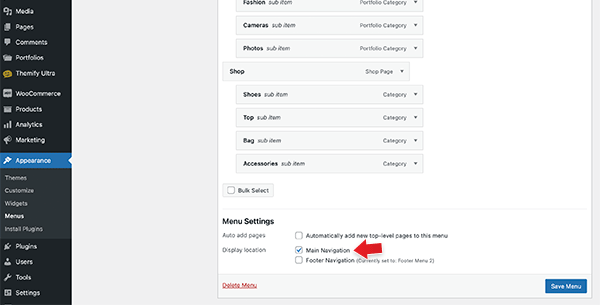
- To make use of the Mega Menu feature, you'll first need to set up the menu at WP-Admin > Appearance > Menus.
- Once you've created the menu (follow the steps below), you can assign that menu as the 'Main Navigation,' and the mega menu will appear in the primary navigation area of your theme. Note: Mega menu support is available only in the following themes: Ultra, Shoppe, Music, Parallax, Fullpane, Peak, and Magazine. If your theme doesn't support the mega menu feature, you can still use the Builder Menu module to display it.
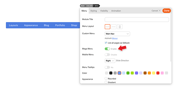
- You can display the mega menu using the Builder's Menu module. Simply drop in a Menu module, choose the menu you've configured with the mega menu feature, and then enable the "Mega Menu" option.
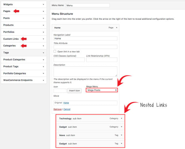
- To create Mega Posts on the mega menu dropdown:
- Go to WP-Admin > Appearance > Menus, add a new menu or edit any existing menu.
- Add a "Pages" or "Custom Links" and select "Mega Posts" on the Mega Menu dropdown option.
- Next, include 'Tags' or 'Categories' as link types in the nested menu. For instance, you would set the Blog page link as the parent link and then nest the categories/tags links. When users hover over the Blog link, they will be able to see the recent posts of the corresponding categories/tags within the mega menu dropdown.
- Note: The nested items must be Tags or Categories. This will display recent posts associated with the chosen tag/category. If the Tags option is not visible, click on the 'Screen Options' located in the top-right corner, and ensure that the 'Tags' option is checked.
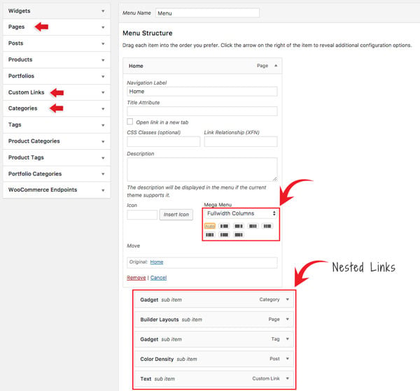
- To set Fullwidth Columns:
- Add a "Pages" or "Custom Links" and select "Fullwidth Columns" on the Mega Menu dropdown option.
- Select the column layout from the preset that appears - Default is set to "Auto",
- Then add any link (Pages, Posts, Custom Links, Tags, Categories) or widgets. This will display nested links in multiple columns.
- Setting Navigation Titles Above Nested Links:
- Utilizing the 'Fullwidth Columns' option, you can also establish header titles that appear above the nested links. To achieve this, simply add an additional layer of nested links beneath the initial set of nested links, as demonstrated in the screenshot below:
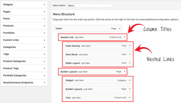
- Utilizing the 'Fullwidth Columns' option, you can also establish header titles that appear above the nested links. To achieve this, simply add an additional layer of nested links beneath the initial set of nested links, as demonstrated in the screenshot below:
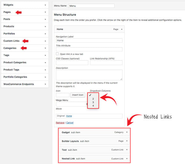
- To set Dropdown Columns:
- Add a "Pages" or "Custom Links", select the "Dropdown Columns" option, and then select the number of columns (2, 3, or 4).
- Then add any link (Pages, Posts, Custom Links, Tags, Categories) or widgets. This will display the nested links in the number of columns as you selected.
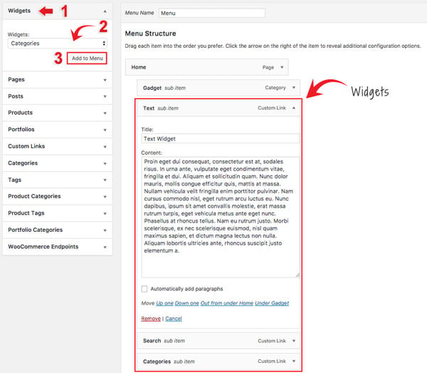
- To add Widgets in the mega menu:
- Select the "Widgets" link type and select the widget from the dropdown menu option.
- Click "Add to Menu" and customize the widget as you like (eg. you can drop in a Text widget and enter your custom text).
Builder Import/Export
The Builder Import/Export tool can be used to share Builder layouts with clients or use it as a backup to create different versions of your layouts (i.e. export the Builder content for backup purposes which you can roll back in the future).
- To Export: on the Builder Toolbar, click Export (it will prompt you to download a zip file).
- To Import: on the Builder Toolbar, click Import, then click either import from a zip file or from existing posts/pages.
ScrollTo Row Anchor Menu (Single Page Menu)
To achieve scrollTo row anchor:
- Step 1) First enter in a Row Anchor name in Row Options (e.g. "portfolio")
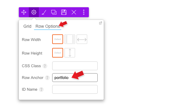
- Step 2) Then go to WP-Admin > Menus and create a new menu. Add a new "Custom Links", on the URL option, enter the anchor name with a number sign (#) in front of it (eg. "#portfolio")
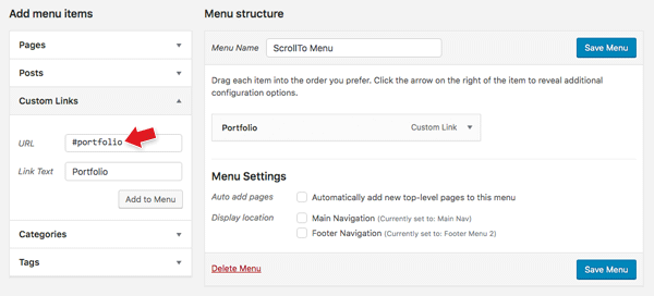
- Result: When the #portfolio link is clicked, or when users go the URL with the #portfolio anchor (e.g. http://yoursite.com#portfolio), it will scroll to the row where you've specified that Row Anchor = "portfolio"
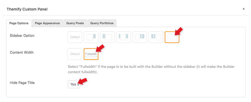
Fullwidth Page Layout
Fullwidth layout is only available in Themify themes. You can create a complete fullwidth page without a sidebar and page title.
To set a fullwidth layout (available in Themify themes only):
- Add or edit a page, on the Themify Custom Panel, select:
- Sidebar Option = no sidebar icon
- Content Width = fullwidth
- Hide Page title = Yes (optional: this will hide the page title so everything can be built with the Builder)
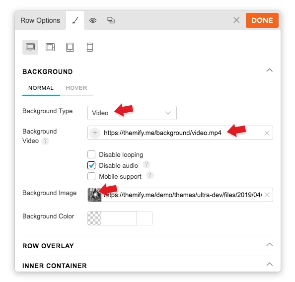
Video Background
To display a background video:
- With the Builder turned on, select the row where you want to show the video background > select Styling icon > Styling Tab
- Background Type: Select "Video"
- Background Video: Choose to upload an mp4 video, or insert a YouTube/Vimeo link.
- NOTES:
- Audio must be disabled in order to have video auto play in background.
- Inserting a YouTube/Vimeo link won't allow users to toggle the video (i.e. play, pause, or mute). It will just auto play the video when users visit your site.
- Background Image: This is a fallback background image. You'll need to insert a fallback background image because the video background does not work on mobile.
- NOTES:
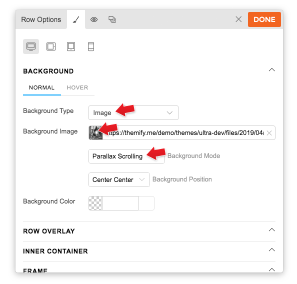
Parallax Scrolling Background Image
To display a parallax scrolling background image:
- With the Builder turned on, select Row > Options > Styling Tab, upload a "Background Image" and select "Parallax Scrolling" in the "Background Mode"
- Optional: select a "Background Position" for the image.
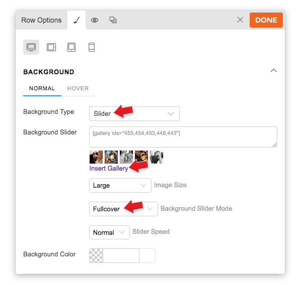
Slider & Ken Burns Background
To display an image background slider:
- With the Builder turned on, select Row > Options > Styling Tab
- Click "Insert Gallery" and insert a gallery by selecting library images or upload images (it will then insert a [[gallery]]shortcode in the textarea)
- Image size = Select the size of the image that you would like the images to appear
- Under "Background Slider Mode", you can select:
- Fullcover = slider images will scale to fully cover the row.
- Best Fit = slider images will automatically fit within the row.
- Ken Burns = the background images will pan, zoom, and fade slowly providing a unique visual effect.
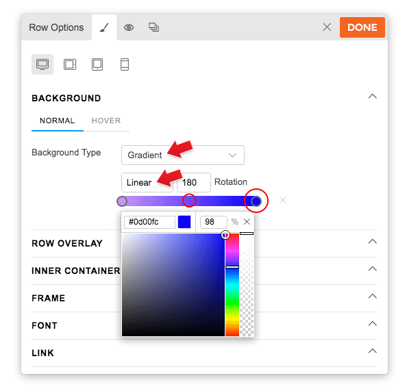
Gradient Background
To display a gradient background:
- With the Builder turned on, select the row where you want to show the gradient background > select Styling icon > Styling Tab
- Background Type: Select "Gradient".
- Background Gradient: Here you can select to showcase the gradient effect as linear or radial, and also adjust the rotation on how you would like the color gradient to appear.
- Color gradient Bar: The color selector bar gives a preview of how your color gradient will look on your row or column.
- Click on the color bar to add a new color to the gradient color scheme.
- Drag the color circles to adjust the gradient.
- Color gradient Bar: The color selector bar gives a preview of how your color gradient will look on your row or column.
Row/Column Frame Styling
Style all row/column edges (from top, bottom, left, and right) with the row frame styling. You can choose from 25 beautiful preset shapes or upload your own shapes (eg. you can upload your SVG or PNG file as the frame style). There are options to set frame width, height, color, and repeat. It can also be styled differently for desktop, tablet, and mobile.
To apply row/column frames:
- Row: select a Row > Styling tab (or click the brush icon) > Frames. Select the tab where you'd like to place the frame: Top, Bottom, Left, or Right. Each tab will show the following options:
- Type = Choose from the 25 presets or add your own custom frame (support SVG or PNG files).
- Color = Set the color and opacity of the frame (Does not apply if you set custom frame).
- Width = Width of the frame in px, %, or em.
- Height = Height of the frame in px, %, or em.
- Repeat = Set the number of times you would like the frame to repeat.
- Display below content or Display above content = Choose whether you'd like the frame to appear below or above the row content.
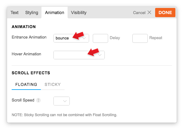
Entrance Animation
Animation is the transition effect that triggers when the elements enters the viewing area. It can be set to rows and modules individually.
To apply: edit any row or module and click on the "Animation" tab and you'll see the following animation effects:
- Entrance Animation: The animation will trigger when the element is visible in the viewport.
- Delay: Enter a number of seconds to delay the animation (eg. if you enter "1.5", it will wait 1.5 seconds before the animation is triggered)
- Repeat: Enter the number of times you'd like the animation to repeat.
- Hover Animation:
Animation will trigger when you hover over the element.
Scroll Effects
A scroll effect is the movement of an element that is triggered by the scrolling of a page (ie. as you scroll the page, the element has an animation effect). View the demo here to see how it works.
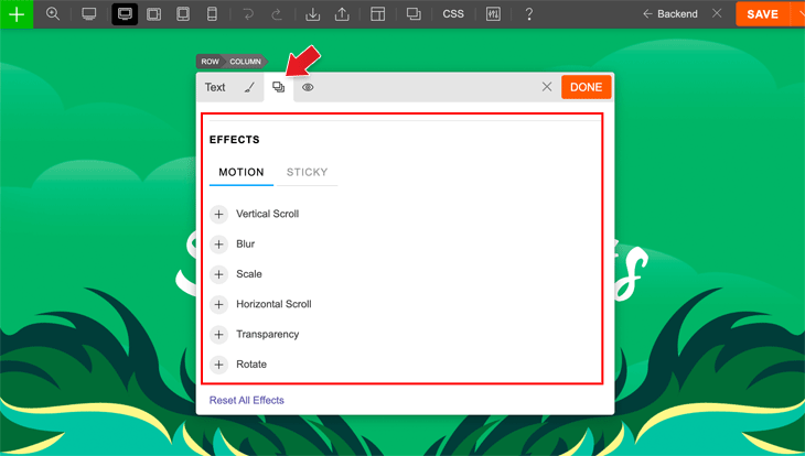
To enable scroll effects:
- Edit any module or row, go to the Animations tab > Effects > Motion and you'll see all of the scroll effects listed:
- Vertical: Make an element scroll up or down, at various speeds and viewport.
- Horizontal: Make an element scroll left or right, at various speeds and viewport.
- Transparency: Make an element fade in, fade out, fade in out, or fade out in.
- Blur: Make an element's blur effect fade in, fade out, fade in out, or fade out in.
- Rotate: Make an element rotate left or right, at various speeds and origin points.
- Scale: Make an element grow bigger or shrink smaller, at various speeds and origin points.
Vertical Scroll:
To enable vertical scroll, select a Direction, Speed, and Viewport:
- Direction: select 'Up' or 'Down' to change the direction your element travels (up moves the element to the top of the screen, down moves the element to the bottom of the screen)
- Speed: selecting a speed will change how fast or slow the scroll effect animates (level 1 is the slowest, 10 is the fastest)
- Viewport: selecting a viewport range will control where on your screen an element's scroll effect will be active (0% is at the very bottom of your browser's screen, 100% is at the very top of the browser's screen)
Horizontal Scroll:
To enable horizontal scroll, select a Direction, Speed, and Viewport:
- Direction: select 'To Left' or 'To Right' to change the direction your element travels (left makes the element move toward the left of the screen, right makes the element move toward the right of the screen)
- Speed: selecting a speed will change how fast or slow the scroll effect animates (level 1 is the slowest, 10 is the fastest)
- Viewport: selecting a viewport range will control where on your screen an element's scroll effect will be active (0% is at the very bottom of your browser's screen, 100% is at the very top of the browser's screen)
TIP: To create a Diagonal Scroll effect, add both a Vertical + Horizontal Scroll!
Transparency:
To enable transparency, select a Direction and Viewport:
- Direction: select one of the following options
- Fade In: the element will fade in from invisible to visible
- Fade Out: the element will fade out from visible to invisible
- Fade Out In: the element will fade out, then fade back in
- Fade In Out: the element will fade in, then fade back out
- Viewport: selecting a viewport range will control where on your screen an element's scroll effect will be active (0% is at the very bottom of your browser's screen, 100% is at the very top of the browser's screen)
Blur:
To enable blur, select a Direction, Level, and Viewport:
- Direction:
- Fade In: the element will go from blurry to clear
- Fade Out: the element will go from clear to blurry
- Level: selecting a level will determine the severity of the blur effect (level 1 is the least blurry, level 10 is the most blurry)
- Viewport: selecting a viewport range will control where on your screen an element's scroll effect will be active (0% is at the very bottom of your browser's screen, 100% is at the very top of the browser's screen)
Rotate:
To enable rotate, select a Direction, Number of Spins, Transform Origin, and Viewport:
- Direction: select 'To Left' or 'To Right' to change the direction your element will spin (left makes the element spin counter-clockwise, right makes the element spin clockwise)
- Number of Spins: select a number to determine the number of spins you want
- TIP: For more subtle movements, opt for any decimal numbers under 1. For eg. A spin number of 0.25 will cause a quarter turn, or 0.05 will cause an even slighter movement)
- Transform Origin: the transform origin determines at which point on the element the spin will occur. Select a transform origin by dragging the blue dot anywhere in the transform origin box or leave it at the default Center, Center position. (eg. Selecting a transform origin of Top Left means that the Top Left corner of the element will be the most static and the rest of the element will spin around this origin point)
- Viewport: selecting a viewport range will control where on your screen an element's scroll effect will be active (0% is at the very bottom of your browser's screen, 100% is at the very top of the browser's screen)
TIP: To create cool multiple effects, you can set one or two scroll effects, for example, to start at 10-40%, and a third and fourth to begin at 41-90%.
Scale:
To enable scale, select a Direction, Scale Ratio, Transform Origin, and Viewport:
- Direction: select 'Scale Up' or 'Scale Down' to change the way the element will resize (Scale Up increases the element's size, Scale Down decreases the element's size)
- Scale Ratio: select a number to determine the how big or small the element will resize to relative to it's current size
- TIP: Scale Up at a Scale Ratio of 1.1 means the element will become 10% bigger, a Scale Ratio of 2 means the element will double in size
- Transform Origin: the transform origin determines at which point on the element the scale will occur. Select a transform origin by dragging the blue dot anywhere in the transform origin box or leave it at the default Center, Center position.
- Viewport: selecting a viewport range will control where on your screen an element's scroll effect will be active (0% is at the very bottom of your browser's screen, 100% is at the very top of the browser's screen)
TIP: To check your scroll effects on the fly, keep another tab open of the live page you're working on to refresh and quickly view your changes. View our demo here for inspiration.
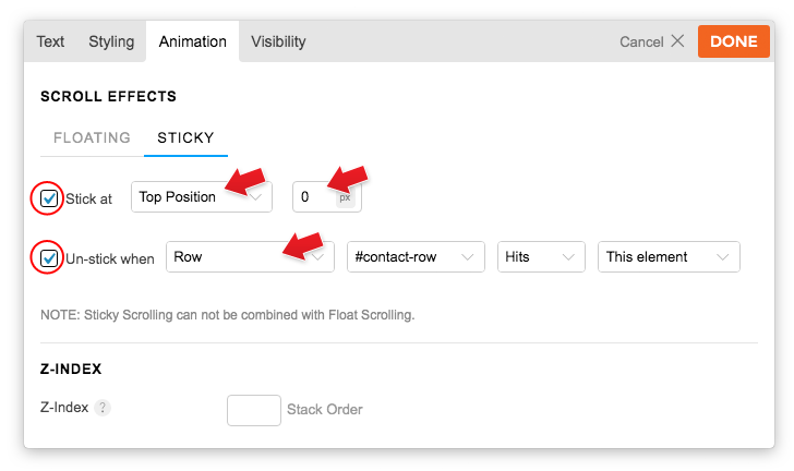
Builder Sticky
The sticky effect allows you to make certain rows/modules stick on the screen when it scrolls to a certain point.
To apply: edit any row or module and click on the "Animation" tab, click on the "Sticky" tab, and you'll see the following options:
- Sticky:
- Check "Stick at" checkbox and then select the position, either "Top Position" or "Bottom Position", that you'd like the module to stick at. Then enter the position value (eg. if you select stick at top position 0px, it means the element will stick when it is scrolled to 0px from the top of the page).
- If you don't enable the "un-stick" option, the element will remain sticky. With the un-sticky option, you can specify when to un-stick the element. To specify un-stick: check "Un-stick when" checkbox, then select the un-stick conditions (eg. if you select un-stick when row #contact-row hits this element, it means the element will un-stick when the row with the ID name 'contact-row' scrolls to the element).
- Z-index: Module with a greater stack order number is always in front of a module with a lower stack order. If you find an element is behind a certain element, you can increase the z-index to adjust the stacking order.
Global Style
Global Style (GS) is a time-saving feature that allows you to reuse the same styling in multiple instances across the entire site. Simply style any row, column, or module to your liking, then save it as a GS (Global Style), and reuse it by inserting it onto any other element of your choice. When you edit a GS, all the changes are automatically applied to any element using that same GS (read the announcement post for more details).
How to Save Styling as a Global Style:
You can save any element's style settings as a Global Style to have for safe keeping, or to reuse it on another module.
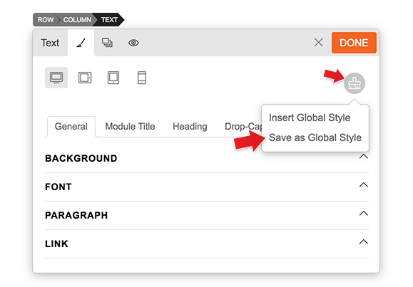
- To save as a Global Style: edit any module or row, go to the Styling tab > click the Global Styles big paintbrush icon (in the top right corner), click 'Save as Global Style', enter a Global Style name, click 'Yes' to apply your new Global Style.
How to Insert a Global Style:
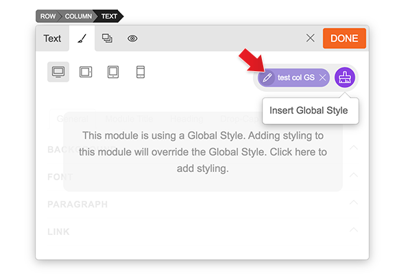
You can reuse a Global Style by inserting it onto another module of your choice. NOTE: Once you insert a GS, the paint icon will be highlighted in a purple colour to indicate that a GS has been inserted.
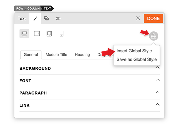
- To insert a Global Style: edit any module or row, go to the Styling tab > click the Global Styles paint icon, click 'Insert Global Style' and select your Global Style of choice.
How to Edit a Global Style:
You can edit any saved Global Style. NOTE: Any changes you make will automatically be reflected on any module that is occupied by that same Global Style (ie. the changes will apply site-wide on any module with that GS).
- To edit a Global Style: edit any module or row that has an existing Global Style inserted, go to the Styling tab > click the Global Styles paint icon, click the pencil icon next to the Global Style name, make your styling changes, then click 'Save Style' to save.
How to Import, Export, and Delete a Global Style (In the Backend):
You can manage all of your Global Styles on the backend, including importing, exporting, deleting, and editing any saved Global Style.
To access the backend of Global Styles:
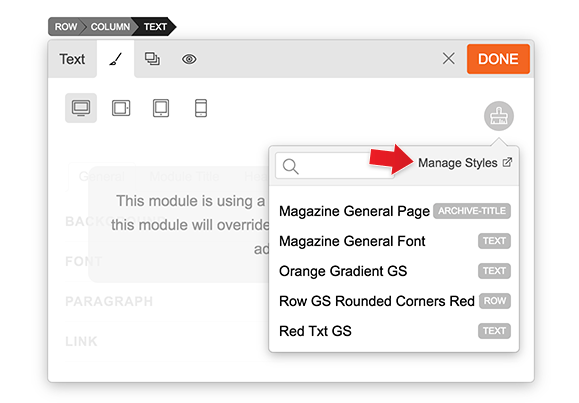
Option A) Edit any module or row that has a GS inserted, go to the Styling tab > click the Global Styles paint icon, click 'Insert Global Styles' > click 'Manage Styles' from the top right corner.
Option B) Go to WP Admin > Themify > Global Style.
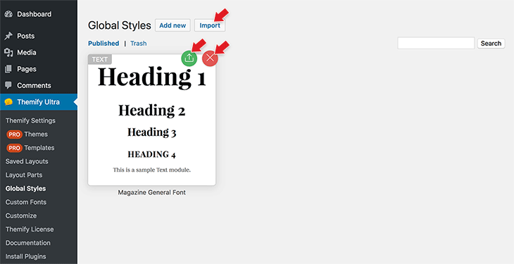
On the GS backend, you can do the following:
- Export: Click the green export icon to export a GS.
- Import: Click the import button to import a GS.
- Delete: Click the X icon to delete a GS. NOTE: Once you delete a GS, it will affect the styling of all modules that have the GS inserted throughout the entire site.
- Edit: Click the thumbnail to edit the GS.
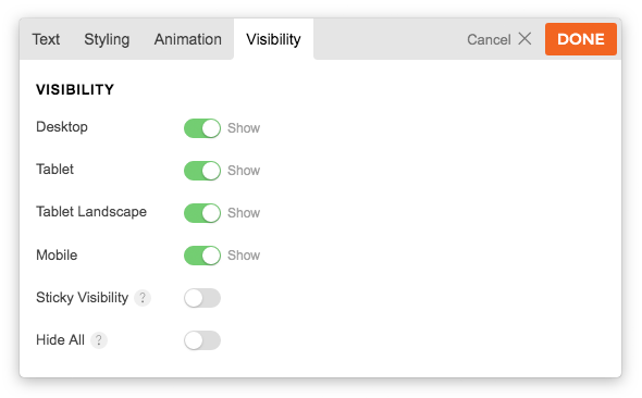
Visibility Control
You can set rows and modules to be visible on specific device breakpoints (desktop, tablet, and mobile). By default, all device views are visible.
To set Visibility:
- Edit any row or module, click the "Visibility" tab, and then click the toggle switch to set hide/show.
- Desktop = Hide desktop will hide the object when the viewport is larger than tablet landscape.
- Tablet Landscape = Hide tablet landscape will hide the element when the viewport is in the tablet landscape breakpoint.
- Tablet Portrait = Hide tablet portrait will hide the element when the viewport is between mobile and tablet portrait.
- Mobile = Hide mobile will hide the element when the viewport is smaller than the mobile breakpoint.
- Sticky Visibility = The element will be hidden when its parent row's sticky effect is active.
- Hide All = The element will be hidden on all devices.
- FYI: The breakpoints can be set at "Themify > Theme Settings > Responsive Design".
Display Conditions
You can use "Display Conditions" to hide/show a module, sub-row, or row on specific pages and conditions. Display conditions are useful for creating dynamic Builder Pro templates and Layout Parts. Instead of creating duplicate templates, you can use display conditions to set certain rows or modules to show or hide on specific pages and conditions.
To apply Display Conditions:
- Edit any row or module, click the "Visibility" tab, and then click "Add Condition" (if there is no condition, the element will show on all pages).
- Select either the "Show on" or "Hide on" option, and then choose a condition.
- Entire Site = All pages on the entire site.
- Front Page = Front page (home page).
- 404 Page = The not found page.
- All Singular = All singular post views (this applies to all single views of all post types).
- All Archives = All archive views (this applies to all archive views of all post types).
- Date Archives = Date archive view of a post type.
- Search Results = Search results page.
- Author Archives = This applies to all author archive views.
- Pages
- Pages = This applies to static pages. You can apply it to "All" pages, or uncheck "All" to search for specific pages.
- Child Pages = This applies to the child pages of the selected page(s).
- Posts
- Posts = This applies to all posts. You can apply it to "All" posts, or uncheck "All" to search for specific posts.
- All Post Archives = All post archives refer to post categories, tags, date archives, author archives, etc.
- Categories = Applies to post category views. You can apply it to "All" categories, or uncheck "All" to search for specific categories.
- Tags = Applies to post tag views. You can apply it to "All" tags, or uncheck "All" to search for specific tags.
- In Category = Applies to single views of posts assigned to specific categories.
- In Tag = Applies to single post views of posts assigned to specific tags.
- WooCommerce
- Shop Page = WooCommerce shop page.
- Products = This applies to all products. You can apply it to "All" products, or uncheck "All" to search for specific products.
- All Product Archives = This applies to all general product archive views such as product categories, product tags, brands, etc.
- Brands = Applies to product brand views. You can apply it to "All" brands, or uncheck "All" to search for specific brands.
- Product Categories = Applies to product category views. You can apply it to "All" product categories, or uncheck "All" to search for specific product categories.
- Product Tags = Applies to product tag views. You can apply it to "All" product tags, or uncheck "All" to search for specific product tags.
- In Brand = Applies to single views of products assigned to specific brands.
- In Product Category = Applies to single views of products assigned to specific product categories.
- In Product Tag = Applies to single views of products assigned to specific product tags.
- Full Cart = The cart page when it is full.
- Empty Cart = The cart page when it is empty.
- Other custom post types & taxonomies. If you have custom post types or taxonomies registered by plugins or custom code, they will be listed here as well.
- Others
- Date/Time = Applies the condition to a specific date and time.
- Login Users = Applies to logged-in users.
- Logout Users = Applies to logged-out users (public visitors).
- Roles = Applies to specific logged-in user roles.
- Custom Fields = Applies the condition based on the custom field value. You can check whether it is empty, not empty, equal to, not equal to, contains, does not contain, less than, or greater than.
Page Break
This new feature allows you to break your Builder layout into multiple pages. Making your pages load faster while still allowing your readers access to read all of your content.
How to use Page Break:
- To add a Page Break: on the module panel, drag the "Page Break" module under the row where you want to break the page. You can drop as many Page Break modules as you want (each Page Break module will create an inner page).
- To remove the dropped Page Break: hover over the Page Break module on the layout and click on the "X" button.
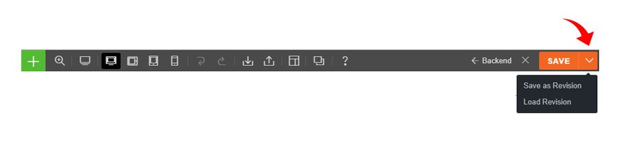
Revisions
Builder Revisions gives you a "save as" like feature, allowing you to save your Builder layout with unlimited versions. The Builder will log this revision and allow you to revert back to it, if you'd like. This is great for users who suddenly make a mistake when changing something from their site and don't know how to fix it.
- To save Revisions: on the frontend Builder, next to the Save button, hover over the arrow and select "Save as Revision"
- To load Revisions: select "Load Revision" and it will prompt you whether to save the current state before loading a revision.
- NOTE: If the revision list on the option lightbox shows a gray color and the revision link is not clickable, it means the revision does not have a Builder layout, thus it won't allow you to load an empty Builder revision.
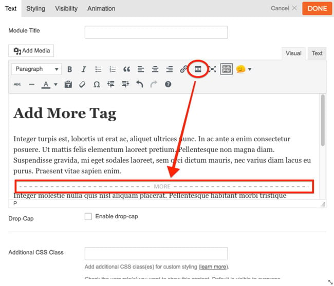
More Tag
You can insert a read more button to trim down the text and focus on the visuals in the text module. Readers who want to read the full content can click the "read more" button.
To add a More Tag:
- Drag and drop a Text module and click on the "More" option toolbar.
Default Modules
These are the default modules that come with the Builder:
- Accordion = Displays expandable/collapsible content.
- Alert = Schedule, display for a specific number of times, show to either login/public visitors, or auto close after a certain number of seconds.
- Box = Displays text content in a box.
- Button = Display button links (it could be a single button or multiple).
- Callout = Displays a "call for action" box (heading with a link button).
- Code = Display code as text.
- Copyright = Display copyright credit text.
- Divider = Displays a divider between modules.
- Fancy Heading = Displays a main heading and a sub-heading with border divider in the middle.
- Feature = Displays an animated circle with a large icon.
- Gallery = Displays a gallery with image lightbox/zoom.
- Icon = Displays a decorative icon with an option to include an icon label.
- Image = Displays an image with title and caption.
- Layout Part = Displays the Layout Part that you've saved.
- Link Block = Display a large link block with icon, title, and a blurb.
- Login = Displays the WordPress login form with password reset feature.
- Lottie Animation = Display Lottie, a light-weight, interactive motion graphic format
- Map = Displays a Google Map.
- Menu = Displays a WordPress custom menu created in Appearance > Menus.
- HTML/Text = Uses HTML/Text to display HTML, JS, and shortcodes.
- Optin Form = Displays newsletter subscription forms (Mailchimp, etc.).
- Overlay Content = Display a burger icon which opens a Layout Part as dropdown or lightbox.
- Page Break = Split your Builder content in multiple pages with pagination.
- Post = Displays posts from any category.
- Service Menu = Displays service/pricing menus.
- Signup Form = Allows your visitors to signup an account in your WordPress site.
- Slider = Displays a slider of posts, images, videos, or text content.
- Social Share = Display social share buttons for users to share your posts/pages.
- Rating Star = Display rating stars.
- Tab = Displays tabbed content.
- Testimonials = Displays customer testimonials in a slider or grid layout.
- Text = Visual text editor with shortcodes and HTML support.
- Table of Content = Auto generate a table of content on the page based on the headings.
- Twitter = Display a Twitter account's feed (require Twitter API entered in Themify settings).
- Video = Embeds videos from YouTube, Vimeo, etc.
- Widget = Displays any WordPress widget.
- Widgetized = Displays a widget area.
Themify Builder Settings
Builder Settings (Themify theme version)
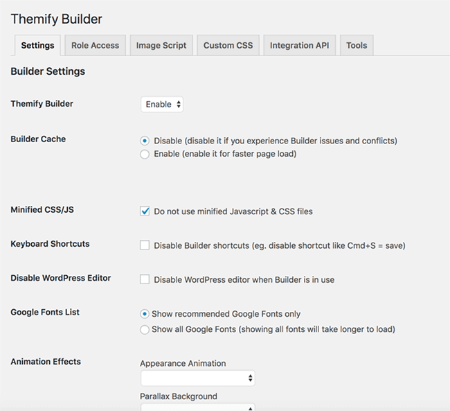
If you are using a Themify theme, the Builder settings can be found in the Themify panel > Settings > Themify Builder.

On the Builder setting panel, you should see:
- Themify Builder Options:
- Enable/disable the Builder completely (NOTE: when the Builder is disabled, the entire Builder content will not appear on all pages)
- Animation Effects:
- Disable appearance animation, parallax background, float scrolling and sticky scrolling on tablet, mobile, or on all devices.
- Builder Modules:
- Disable the modules individually (NOTE: when a module is excluded, only the excluded module will not appear on the page).
- Tools:
- Find & Replace: Find and replace all content entered in the Builder. For example: if you've moved to another domain, you can use the find & replace tool to replace all URLs in the Builder to the new domain.
- Regenerate CSS Files: Use this tool to regenerate the Builder styling (ie. it will re-generate the Builder styling CSS files on the server when a visitor views the page).
- Maintenance Mode: Enable maintenance mode if you don't want public visitors to see your site (ie. when you are still building the site or in the progress of setting up something on the site, you can use this tool to display a maintenance/coming soon page). When the maintenance mode is enabled, all pages on the frontend will be redirected to the selected maintenance page.
Builder Settings (Builder plugin version)
If you are using the Themify Builder plugin, the Builder settings can be found on the WordPress admin sidebar > Themify Builder > Settings. The available options on the Builder plugin settings are the same as the Themify settings (only the option interface is different).
Builder Cache & Minified Scripts
Script minification and caching allows you to improve the page site load on the frontend. Since script minification/compiling is a common cause to Javascript conflicts between plugins, it is disabled by default.
To enable script minification & Builder Cache:
- Go to Themify panel > Theme Settings > Builder Cache & Minified Scripts
- Select "Enable minification" radio to enable it. You can also enable Builder cache and gzip caching.
- To reduce file size, all Themify themes and Builder scripts (Javascript and CSS files) are minified. You can disable the minified scripts if you want to use the un-minified version.
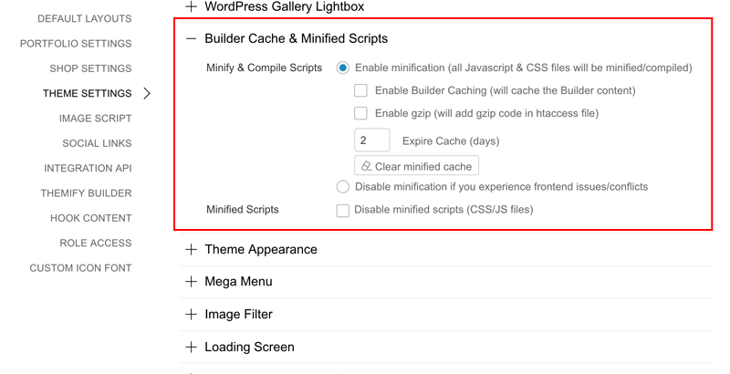
NOTE: If you don't see the Builder Script Minification option in the Theme Settings option, it means caching is not supported with your server (either due to old PHP version or server not permitting to write cache files).
Builder Static Content
If you have WordPress Gutenberg editor enabled (Gutenberg is the new WP editor introduced in v5), you will see the Builder Block which you can move up/down like all other Gutenberg Blocks. If you have Gutenberg editor disabled, you will see the Builder content placeholder like the screen below.
The Builder content placeholder represents where the Builder content will be displayed. You can add content before or after the content placeholder. If you don't see the Builder Content Placeholder, make sure you are using the latest version and try to re-save the post/page again.
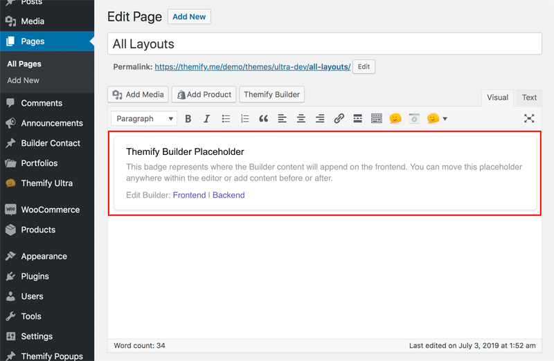
Notes:
- The Builder static content serves as your fallback content when the Builder is disabled/removed. It also allows WordPress to search your content in the Builder.
- When you update the post/page, the Builder static content will refresh/regenerate (this is normal). It will not appear on the frontend when the Builder is active.
- The Builder Content Placeholder badge only applies to WordPress versions prior to 5.0 or if you have Gutenberg disabled. If you are using WP 5.0+, the Builder content is treated as a Gutenberg Block.
Custom CSS Class
Custom CSS class is used by developers to write custom CSS to apply styling to specific elements that contain the CSS class name. The advantage of using custom CSS class is when you update the CSS styling, it will apply to all elements that contain the target class name. You only need to write the custom CSS once, then it can be reused to as many elements as you want by adding the custom class name.
Sample Usage:
- Lets say you have a few rows or modules that you want to have the same yellow background and black text color, you would add 'yellow-box' in the "Additional CSS Class" field (all rows and modules have this field in the option lightbox).
- Then add the sample custom CSS as below. Now whichever rows or modules have that additional CSS class will have a yellow background with black text styling. When you change the CSS code, it will apply to elements automatically without having to edit the Builder.
.yellow-box {
	background: #FFEB3B;
	color: #000000;
}
Builder Addons
The Builder is extendable with Addons. Installing Builder Addons is the same as installing standard WordPress plugins. Here is a detailed tutorial on how to install addons.
FAQs
- Does the Builder work on the homepage?
The Builder works with all posts, pages, and any post type that has the_content enabled. The default WordPress homepage is actually an archive page that shows the latest posts. To use the Builder on the homepage, first create a new Page and then assign that page as the Front Page in WP > Settings > Reading. - I've logged in, but I don't see the WP admin top bar. Why?
If you don't see the top admin bar (WP Admin Topbar) on the frontend, it is likely disabled. To enable top admin bar, edit your user Profile and check the "Show Toolbar when viewing site" option. - I can turn on the Builder, but there is no grid to drop modules.
If you don't see the Builder grid after turning on the Builder (but the module panel presents), it is likely because the template does not have the required WordPress function, the_content() or the template is using the_excerpt(). In this case, try to add a new post or page. - The Builder won't turn on in the frontend. Why?
- First, make sure that you are viewing a single post or page, not an archive page (examples of archive page: search, tag, category, taxonomy archive, etc.).
- Second, make sure the top admin toolbar is enabled in your WordPress site.
- Lastly, it is likely due to plugin conflicts. Try to disable all plugins and check again. - Can I use the Builder to edit the header, sidebar, and footer?
You can use Builder Pro to do this. It allows you to create custom header, footer, and other templates for post, page, WooCommerce and custom post types. - I don't use the Builder. Can I disable it?
Method 1) You can disable the Builder in Themify > Settings > Themify Builder. If you are using the standalone Builder Plugin, deactivate the plugin will disable the Builder.
Method 2) You can also disable the Builder in the child theme functions.php with this code:
<?php
add_filter('themify_enable_builder','custom_disable_builder',100,1);
if(!function_exists('custom_disable_builder')){
	function custom_disable_builder($enable){
		return 'disable';
	}
}
?>
To hide the Themify Builder tab on the Themify panel:
- Paste the following code in the child theme functions.php:/* Add custom styles for admin part */ function custom_child_admin_stylesheet() { wp_enqueue_style( 'child-admin-style', trailingslashit( get_stylesheet_directory_uri() ) . 'child-admin-style.css' ); } add_action( 'admin_enqueue_scripts', 'custom_child_admin_stylesheet' );- Create a child-admin-style.css file. In the css file, paste the following code:
#themify li[aria-controls="setting-themify-builder"] { display: none; } - Once I disable the Builder, will the layouts I created with the Builder show?
No, the Builder is required to render the layouts that are created with the Builder. Once the Builder is disabled, it will show the static content of the Builder (ie. it will show the text content without the dynamic content and styling). - Where are the old custom post types (Slide, Highlight, Portfolio, and Testimonial)?
Note: The updated Themify framework 2.1.2 and Builder plugin 1.3.1. have obsolesced the following custom post types: Slide, Highlight, Portfolio, and Testimonial. To provide backward compatibility, the Highlight posts will remain functional if your site has existing Highlight posts. If you would like to continue using these custom post types, we've created a free plugin called Builder Deprecated CPT. This plugin will unlock the deprecated custom post types. - When I try to import/upload Builder layouts zip or txt file, it says "Sorry, this file type is not permitted for security reason"?
This is because the file format is not allowed in your WordPress network setting. To allow more file extensions, please go to your WP Network Admin > Settings > "Upload File Type" > Add file format extensions (i.e. txt zip). - My WP Admin is HTTPS, when I switch to frontend that is HTTP, the Builder doesn't work.
When you login in admin that is secured (HTTPS), the login session is captured as HTTPS domain. If your frontend URL is not HTTPS, the frontend Builder will not work because the browser treats HTTPS as a different domain. To fix this: go to WP Admin > Settings, change the "WordPress Address" and "Site Address" to HTTPS URL. - How do I trigger an active Tab or Accordion by using URL hash?
First drop in a Tab module and create the tabs as you like. View the page on the frontend with Google Chrome, right-click on the tab navigation and select "Copy Link Address", now you can paste that URL as hyperlink (eg. the link URL would be something like http://yoursite.com/page-url/#tab-tab-6925-0-0-0-6925-2). This works the same for Accordion module (just right-click on the accordion title and then copy link). - I'm using a Themify theme and Builder, there is padding between the header and content area. How to remove it?
That is the content container padding. To remove it, edit the page in the backend, on Themify Custom Panel, select "Content Width = Fullwidth".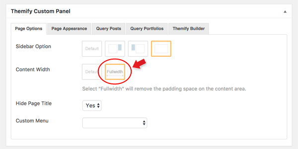
- Disable URL change with scrollTo anchors
On the row anchor option, you can select "Hide anchor on URL" or you can disable it with custom code: https://themify.me/docs/theme-code-snippets#disable-url-change-with-scrollto-anchors - Offset scrollTo position with third party themes
Using ScrollTo anchor feature in Builder, by default it scrolls to the top of the row. To set the scrollTo position, go to Themify > Theme Settings > Themify Builder, enter the "ScrollTo Offset" position. - The theme/Builder shows broken interface due to .gz issue
Make sure your server supports .gz file. Our themes come with pre-packaged .gz compressed files to reduce file size. On Nginx server, it picks up .gz file and serves them instead of the actual asset. Please contact your host provider and ask them to enable this feature. - How to override Builder Post module loop template
If you are using a Themify theme: you would create a child theme, then copyincludes/loop.phpfile from the parent theme to<your-child-theme>/includes/loop.php. Now you can edit the child theme loop template as you want. If you want to override the loop template for other post types, you would rename it to "loop-{posttype}.php" wherein "posttype" is the slug name of your post type. For example, if you have amoviepost type, the file name and path should be:<your-child-theme>/includes/loop-movie.php.If you are using the Builder plugin:
the step is same as above, but the file and folder path is different. You would copy the post template fromthemify-builder/templates/template-blog.phpto<your-child-theme>/themify-builder/template-blog.php.