The number of sites sporting a Themify theme grown a lot during this year, and the immediate effect of that is that we're seeing more and more users in multiple languages now, from Spanish and Portuguese to Arabic and Chinese and many more. This is why we are very happy to announce that our WordPress themes are compatible with WPML, one of the leading multilingual plugins that helps you running a multilingual website with a single WordPress install. Themify has worked with the WPML team to verify that our themes are compatible with their plugin, from settings pages on the back end to the site's front end. You can learn more about WPML and Themify in WPML's press release.
Blog
What is Responsive WordPress Theme
Responsive WordPress themes and responsive design in general has emerged as a hot topic in the digital world. At Themify, we made the decision to create responsive WordPress themes rather early on, and it has become one of our strongest features and selling points. Because of our extensive knowledge in this domain, we wanted to clear up exactly what you get with a “responsive WordPress theme” and what it means when you buy an awesome WordPress theme from Themify.
What is a “responsive WordPress theme”?
When answering this question, we can also answer the question “What is a responsive design?” A responsive design and responsive WordPress theme utilize CSS and JavaScript to adapt a website’s layout to the user’s “viewport.” For those who don’t know, a “viewport” is essentially the visible portion of the canvas inside a web browser.
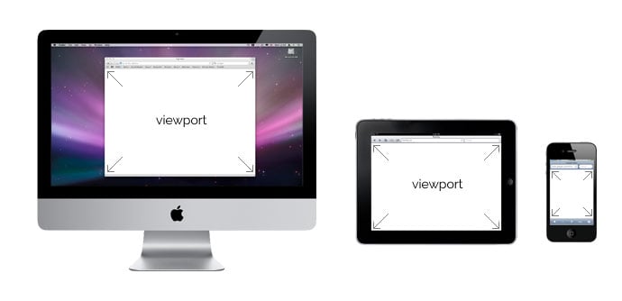
We use responsive design to create a consistent user experience for browsers of all shapes and sizes because the digital world doesn’t run on just 4:3 resolutions anymore. We adapt content to viewports of different sizes, including everything from mobile phone browsers all the way up to large television screens.
Many people confuse “responsive design” with “mobile design,” but mobile design targets mobile devices specifically, whereas responsive design includes support for mobile devices and many more.
What does “responsive design” look like?
To get an idea of what responsive design, especially in WordPress, can achieve, take a look at our Elemin theme.
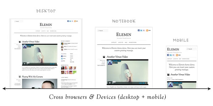
Elemin displays nicely on your standard browser size, but you can change the size of your browser to get an idea of how the layout changes and adapts along with the width of your browser window. The layout never breaks, and the content simply flows to fit with the browser’s viewport.
A viewer can enjoy a website using the Elemin theme on their desktop, their laptop, their notebook, their tablet, their mobile device, and even their television. The layout and experience of the website remains consistent throughout.
Here are some more hand picked responsive WordPress themes from Themify
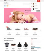
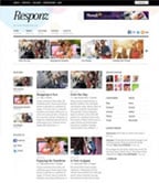
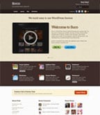
As shown in the examples below, responsive design is not limited to just blog theme. It can be complex grid layout like Pinboard, Ajax shop theme Minshop, 3-column Responz, and corporate theme with responsive slider like Suco. Check our responsive themes collection for more.
Write a Review, Get Two Themify Themes Free!
At Themify, we really enjoy hearing what our customers think of our WordPress themes. We take all the feedback that we hear to build better WordPress themes, improve our existing offerings, and create a better overall experience when using Themify.
We love feedback.
We love it so much that we are proud to announce a new initiative for our customers: write a review of a Themify theme on your blog, and you can get any two (2) Themify WordPress themes for free!
How This Will Work
All you have to do is send in an application that lets us know your name and website. If you are selected for this initiative, you will get 2 free themes of your choice so you can start testing. Within 30 days, you must write a full review: telling us what you like, what you don’t like, and any additional suggestions or feedback you might have. Specifically about design, installation process, usage, and any other aspects you’d like to include. Once you’ve published the post, send us the URL, and those two themes are now yours to keep!
Slide: Responsive Slideshow Theme
We have been building and releasing many awesome WordPress themes lately. We recently launched Pinboard, a Pinterest inspired theme, which is currently one of our most popular themes. Soon after, we released Fullscreen, a fullscreen gallery theme that places the focus on your photos. We followed Pinboard and Fullscreen with Postline, a theme inspired by Facebook's Timeline.
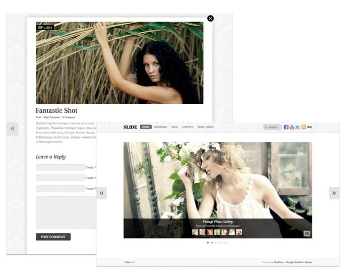
With the success and great reception of our three previous themes, we are excited to announce Slide: a responsive WordPress theme that allows you to present slideshows in complete fullscreen mode. Visitors to your website can navigate through all of your posts in the slideshow without loading a new page. The posts are opened elegantly in an animated lightbox window, allowing the next or previous post to be viewed in the lightbox without exiting the window. Slide is an elegant theme with great design details and fancy transition effects. Get it now!
Limited time offer: use the coupon code "slide" to save 30% off this theme. Offer ends on Oct 5, 2012.
Pinboard v2 = Multisite and Social Sharing
We are proud to announce version 2 of Pinboard, our Pinterest-inspired theme. We've added multisite integration and social share features. For those who are not familiar with the term 'multisite', basically it lets users to create sub-sites under your site. With Pinboard v2, you can setup your WordPress as a multisite which enables users to signup and publish posts on your site. We also bundled an option to open single posts in lightbox mode in this update. Read below for more details.
Multisite Integration
The multisite feature in Pinboard allows you to synce all posts from micro sites in your network and show them in your main site. Users can register in your site and create micro sites. When they publish a post, it will be also published in your main site.
Custom Signup and Login Form
We've built a custom sign up and login shortcode which allows you to display the form anywhere in the post, page, or widget.
Social Share
Now visitors can easily share your posts to Facebook, Twitter, Pinterest, and Google Plus by clicking on the share buttons. Each button contains a counter to show how many time the post has been shared.
Open Posts in Lightbox Mode
In this version, posts can be set to open in a lightbox popup like Pinterest.com.
Upgrade Now
If you are using Pinboard on a single/standard WordPress site, you won't see the multisite options. The social share and open posts in lightbox mode option are available to both. Upgrade Pinboard now via Themify option panel or read this documentation on how to setup Pinboard on a multisite.
Postline, A Theme Inspired by Facebook’s Timeline
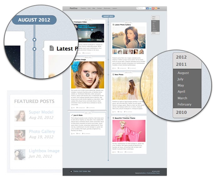
Are you a big fan of Facebook's Timeline feature? You're going to love our newest theme, Postline (view demo), a responsive theme with infinite scroll inspired by Timeline. It is designed to capture different types of post formats like quotes, videos, images, galleries, and many more, allowing you to tell your story on any resolution, whether desktop or mobile device. In addition, Postline is built with infinite scrolling, meaning posts are loaded automatically when you hit the bottom of the page. This theme is perfect for bloggers who want to showcase their photos and videos that are time-sensitive like travel or food photos!
Get this theme at a discounted price: use the coupon code "postline" to save 30% off this theme until Sep 2nd, 2012.