Tiles
Installing Builder Addons
Required: Builder Addons require the Themify Builder. You can use it with either any Themify theme or the Builder plugin.
Installing Builder Addons is exactly the same as installing WordPress plugins.
To install the addon:
- Firstly, download the addon zip file from the link provided in your Themify Member Area.
- NOTE: some browsers (eg. Safari) auto extract zip files automatically. Right-click on the download link and select "Save Linked File As" and it will allow you to download as a zip file.
- Login to your site's admin area.
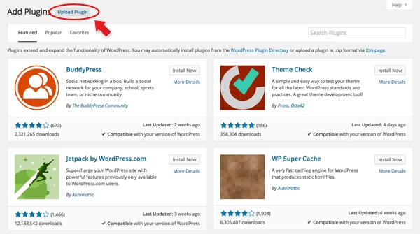
- Navigate to WP Admin > Plugins > Add New.
- Now, click the "Upload Plugin" link.
- Select "Browse" and navigate to the plugin zip file which you downloaded in the first step and then select the "Install Now" button.
- This will initiate the plugin installation process, and once finished, you can then activate the plugin.
Importing the addon demo layout
Each addon zip file contains a sample Builder data file which you can import to your site. It helps you to understand how the addon demo is created.
To import the addon demo data:
- First, extract addon zip file to your local computer
- You should have a folder of the addon. Inside there is a folder named "sample", and inside that folder there is a Builder data file in a zip format (eg. "addon_name_sample-builder-layout.zip").
- To import the Builder layout, login to admin and then go to the page frontend where you want to import the Builder layout. From the top admin bar > select Themify Builder > Import / Export > Import, upload the sample zip file.
Tiles Demo Video
NOTE: The video below is based on a Themify theme. If you use a third party theme, you might not see the Page Options "Themify Custom Panel". However, the Builder and Tiles addon work the same.
Using the Tiles Addon
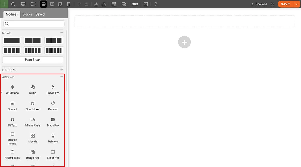
Once addon is installed, you will find the Tiles addon module in the Themify module panel. The module is available in both backend and frontend edit mode (just like all standard modules).
- Create or edit any page and turn on the Builder.
- You will see the Tiles module in the module panel.
Important Note:
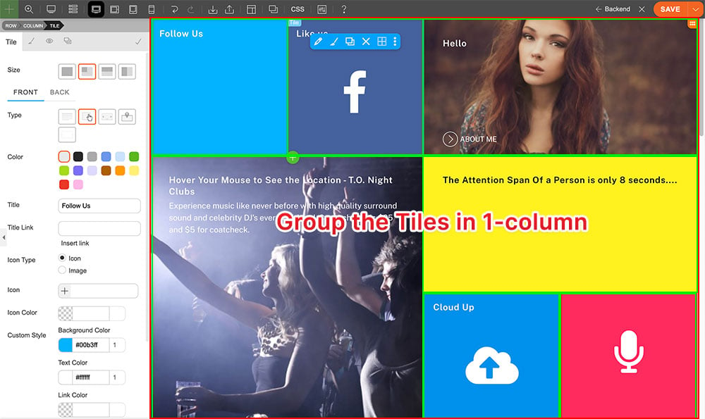
Note that the Tiles module should be dropped in a full-width column. Do not drop individual Tiles in multiple columns.
- Drag and drop a Tiles module in a row.
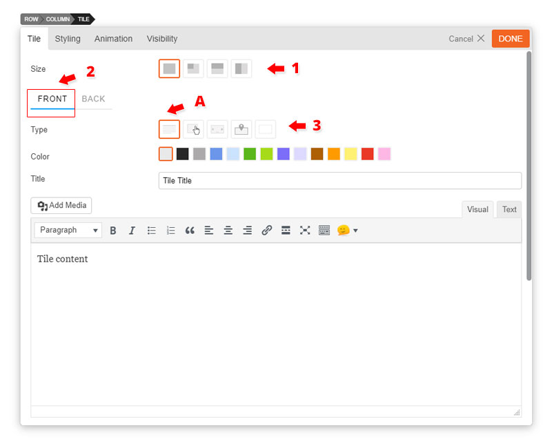
- Tiles Options
- 1) Size = There are 4 tile sizes.
- Large = large square block
- Square = small square block
- Landscape = horizontal half block
- Portrait = vertical half block
- 2) Front Tile tab = Click the front tab to edit the front of the tile.
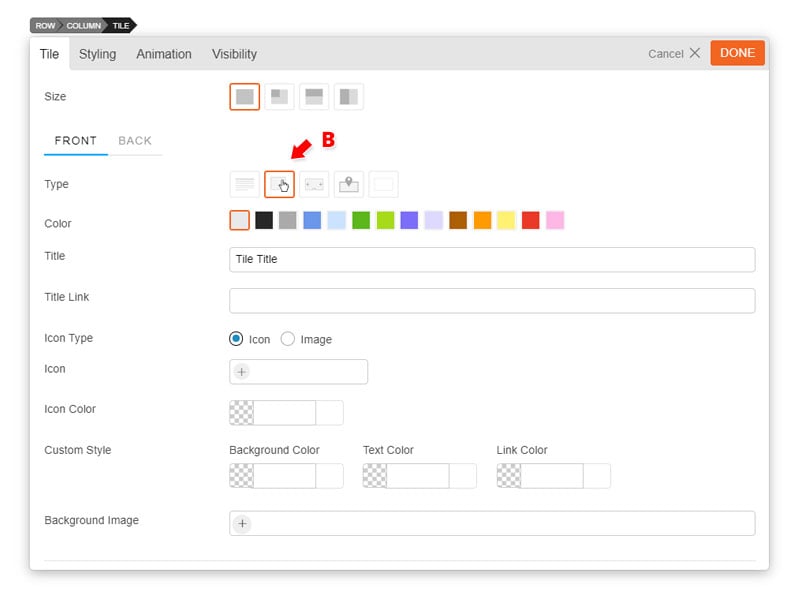
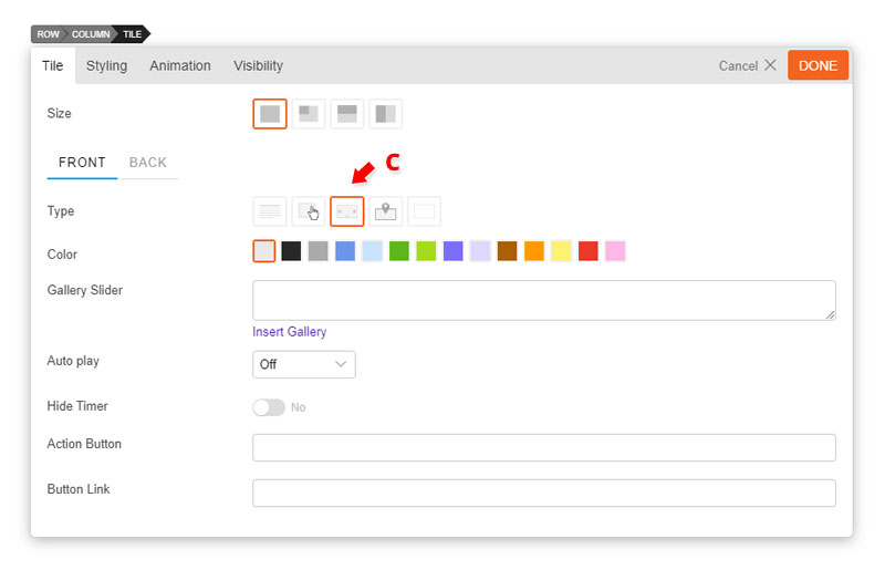
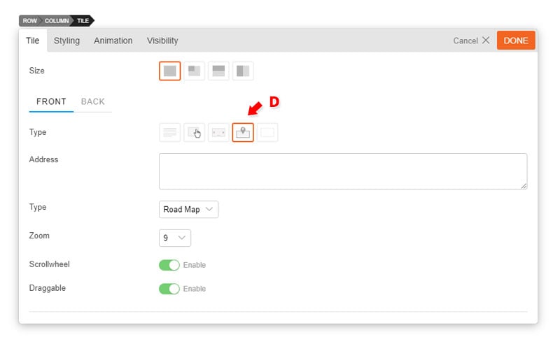
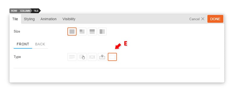
- 3) Type = Choose from 5 different types of tiles.
- A) Text = Display text content in Tile.
- Enter "Title" (optional)
- Enter text in content editor (shortcodes are supported).
- Enter "Action Button Text" this will appear at the bottom left corner of your tile.
- Enter "Action Button Link" this link will redirect users when they click the action button text.
- Open as a lightbox = Open link in a lightbox
- Open in a new tab = Open link in a new tab
- Custom Style = Below are some color options that you can customize
- Background Color = Use the color picker to pick a color for the background of the tile.
- Text Color = Use the color picker to pick a color for all the text on the tile.
- Link Color = Use the color picker to pick a color for all text links on the tile.
- Add a background image by inserting a image URL from your media folder or upload it directly.
- A) Text = Display text content in Tile.
- B) Button = Create a clickable button type tile
- Enter "Title" (optional)
- Enter "Title Link" which will allow your title to open an external link
- Open as a lightbox = Open link in a lightbox
- Open in a new tab = Open link in a new tab
- Choose what kind of icon type you would like:
- Icon = Choose an icon from over 320+ icon list
- Choose an "Icon Color" from the color picker
- Image = insert a image URL from your media folder or upload it directly. The image will appear at the center of the tile.
- Custom Style = Below are some color options that you can customize
- Background Color = Use the color picker to pick a color for the background of the tile.
- Text Color = Use the color picker to pick a color for all the text on the tile.
- Link Color = Use the color picker to pick a color for all text links on the tile.
- Add a background image by inserting a image URL from your media folder or upload it directly.
- Icon = Choose an icon from over 320+ icon list
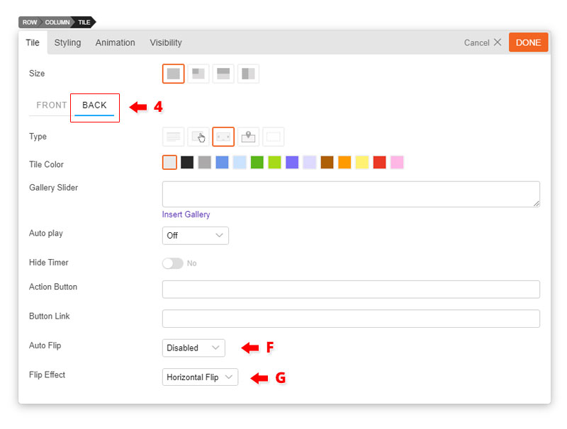
- C) Gallery = Create a gallery type tile
- Insert a "Gallery Slider" by clicking "Insert Gallery". Choose images from your media library or upload new images.
- Choose the amount of second you would like your gallery to "Auto play" or turn it off by selecting "Off" on the drop down menu.
- Choose to hide or display the timer.
- Enter "Action Button Text" this will appear at the bottom left corner of your tile.
- Enter "Action Button Link" this link will redirect users when they click the action button text.
- Open as a lightbox = Open link in a lightbox
- Open in a new tab = Open link in a new tab
- D) Map = Display where you are with the map type tile.
- Enter "Address" as you like.
- Choose which map "Type" you would like to display - Road Map, Satellite, Hybrid, or Terrain.
- Choose to enable or disable the "Scrollwheel".
- Choose to make the map "Draggable" when users drag the click on a certain part of the map.
- E) Blank = Display nothing at the front of at the back of your tile.
- 1) Size = There are 4 tile sizes.
- 4) Back Tile tab = Click the back tab to edit the back of the tile.
- The back tile can be edited just like the Front tile but with some additional features highlighted below:
- F) Auto Flip = Disable or choose the amount of second you would your tile to flip automatically.
- G) Flip Effect = Choose from 10 different flip effects. We highlight all the flip effects on our Tiles demo page.
- The back tile can be edited just like the Front tile but with some additional features highlighted below: