Contact
Installing Builder Addons
Required: Builder Addons require the Themify Builder. You can use it with either any Themify theme or the Builder plugin.
Installing Builder Addons is exactly the same as installing WordPress plugins.
To install the addon:
- Firstly, download the addon zip file from the link provided in your Themify Member Area.
- NOTE: some browsers (eg. Safari) auto extract zip files automatically. Right-click on the download link and select "Save Linked File As" and it will allow you to download as a zip file.
- Login to your site's admin area.
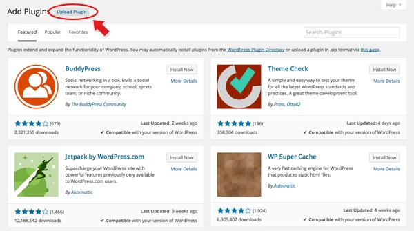
- Navigate to WP Admin > Plugins > Add New.
- Now, click the "Upload Plugin" link.
- Select "Browse" and navigate to the plugin zip file which you downloaded in the first step and then select the "Install Now" button.
- This will initiate the plugin installation process, and once finished, you can then activate the plugin.
Importing the addon demo layout
Each addon zip file contains a sample Builder data file which you can import to your site. It helps you to understand how the addon demo is created.
To import the addon demo data:
- First, extract addon zip file to your local computer
- You should have a folder of the addon. Inside there is a folder named "sample", and inside that folder there is a Builder data file in a zip format (eg. "addon_name_sample-builder-layout.zip").
- To import the Builder layout, login to admin and then go to the page frontend where you want to import the Builder layout. From the top admin bar > select Themify Builder > Import / Export > Import, upload the sample zip file.
Using the Contact Addon
Once the addon is installed, you will find the Contact addon module in the Themify module panel. The module is available in both backend and frontend edit modes (just like all standard modules).
- Create or edit any page and turn on the Builder.
- You will see the Contact module in the module panel, under the "Addons" section.
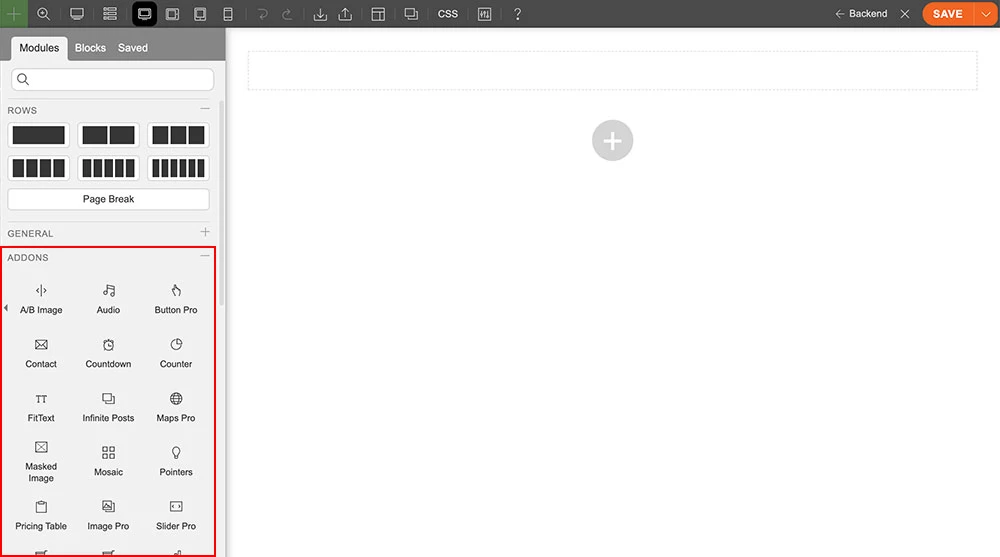
- Drag and drop a "Contact" module into any row.
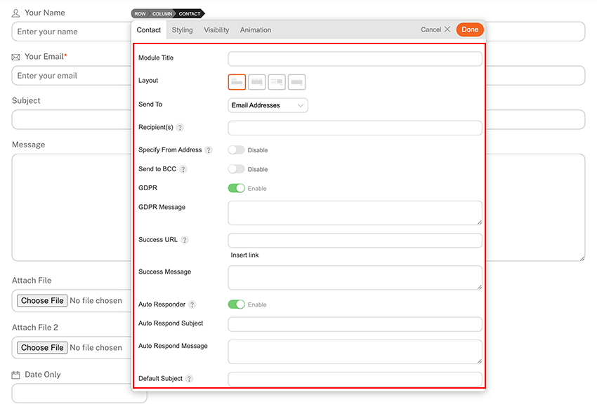
- Contact Options
- Module Title = Optional module title text.
- Layout = Select a layout for the contact form.
- Send To = The email can be sent to:
- Email Addresses = Enter the "Recipient(s)" email address. If you want to send to multiple email addresses, separate each email address with a comma.
- Admin's Email = Sends to the admin user's profile email address.
- Author Email = Sends to the author's email address.
- Selective Recipients = When "Selective Recipients" is selected, a field "Recipient(s)" will appear under the "Form Fields" section, where you can enter the selective recipients.
- Specify From Address = Allows you to use a custom "from" address in the mail header instead of the sender's. Note that the SMTP service will ignore this address.
- Send to BCC = Sends mail as BCC (blind carbon copy); recipients do not see each other's email addresses.
- GDPR = Allows you to show a GDPR checkbox and message to comply with GDPR regulations.
- Success URL = When the form is successfully sent, it will redirect to the success URL that you've entered.
- Success Message = When the form is successfully sent, it will display the success message.
- Auto Responder = Allows you to send an auto-reply message when the user submits the contact form.
- Auto Respond Subject = Auto-response email subject.
- Auto Respond Message = Auto-response email message.
- Default Subject = If the "Subject" field is disabled, this will be the default email subject.
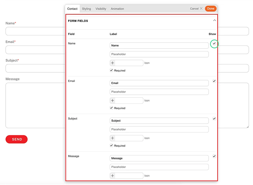
Form Fields
When you expand "Form Fields," you will see the following default fields:
- Name = The field where senders enter their name.
- Email = The field where senders enter their email address.
- Subject = The field where senders enter the email subject.
- Message = The email message.
- You can uncheck the "Show" checkbox to exclude the field.
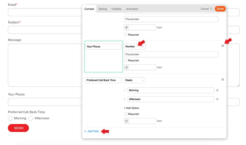
Adding Custom Form Fields
Under the "Form Fields" section, you can add custom fields.
- Click "Add Field" to add a new custom field.
- Enter the field label and select the field type:
- Text = For accepting any text data.
- Email = For accepting email addresses only.
- Number = For accepting numeric data only.
- Telephone = For accepting telephone numbers.
- Textarea = Allows senders to write multiple lines of text.
- Upload File = Allows senders to upload email attachments.
- Radio = Allows senders to choose from radio options (ideal for single selection).
- Select = Allows senders to choose from select options (ideal for single selection).
- Checkbox = Allows senders to select checkboxes (ideal for multiple selections).
- Static Text = Displays static text on the contact form.
- Date = Allows senders to use a date picker to choose a date/time.
- You can make the field required by checking the "Required" checkbox. When "Required" is enabled, the sender must fill in the field to submit the form.
- The "Icon" field is optional (it will display the icon next to the field label).
- To reposition the field order, drag the green area as shown in the screenshot below.
- To remove custom fields, click the "X" icon.
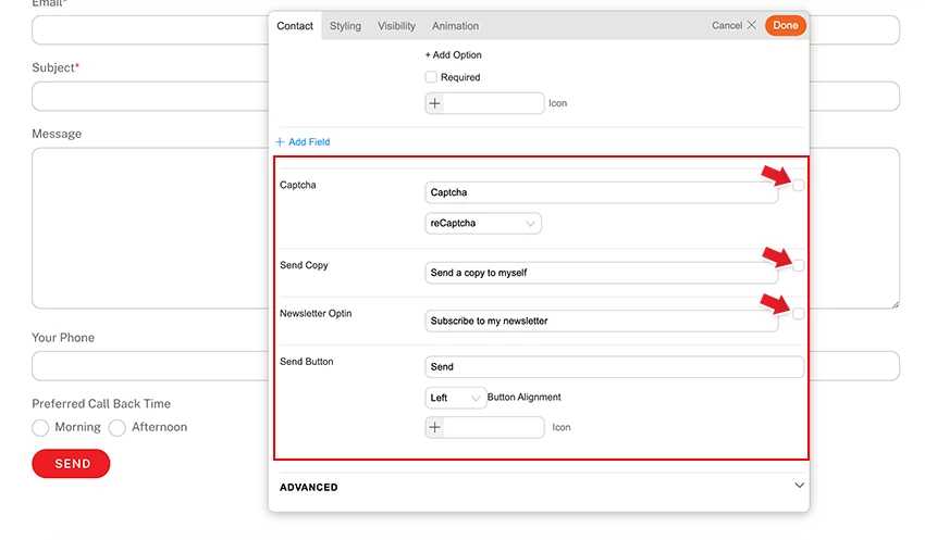
Under the custom fields, you will find the following options:
- Captcha = Captcha (Google reCaptcha, hCaptcha, etc.) helps prevent bots from spamming your contact form. Check the checkbox to enable it.
- Send Copy = Allows the sender to receive a copy of the email. Check the checkbox to enable it.
- Newsletter Opt-in = Allows the sender to subscribe to your email newsletters. You need a newsletter provider such as MailChimp, ActiveCampaign, ConvertKit, etc.
- Send Button = Select the send button alignment and the optional icon.
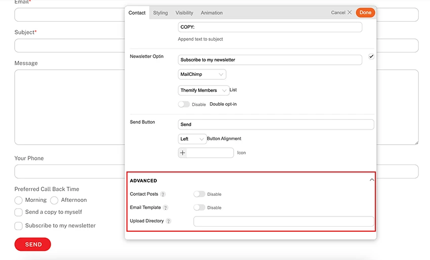
Advanced
Under the "Advanced" section, the following options are available:
- Contact Posts = Creates a copy of the message as a contact post in the admin area. If enabled, you will find the email messages as posts in the wp-admin sidebar > Builder Contact > Contact Submissions.
- Email Template = Allows you to customize the email message template (you can specify which fields to include in the email message).
- Upload Directory = If you want contact attachment files to be uploaded to a specific folder, specify it here.
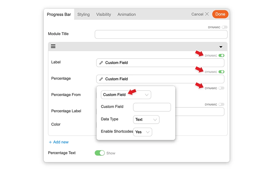
Builder Pro Dynamic
You can use Builder Pro to display addon fields dynamically. Once you have Builder Pro activated, you will see a "Dynamic" toggle button on each field. NOTE: Some fields might not have the "Dynamic" feature if it is unavailable or incompatible. With the dynamic feature, you can display field data from post metadata, shortcodes, custom fields, and other fields created with plugins such as Post Type Builder and Advanced Custom Fields. Refer to Builder Pro Documentation for more information.