Button
Installing Builder Addons
Required: Builder Addons require the Themify Builder. You can use it with either any Themify theme or the Builder plugin.
Installing Builder Addons is exactly the same as installing WordPress plugins.
To install the addon:
- Firstly, download the addon zip file from the link provided in your Themify Member Area.
- NOTE: some browsers (eg. Safari) auto extract zip files automatically. Right-click on the download link and select "Save Linked File As" and it will allow you to download as a zip file.
- Login to your site's admin area.
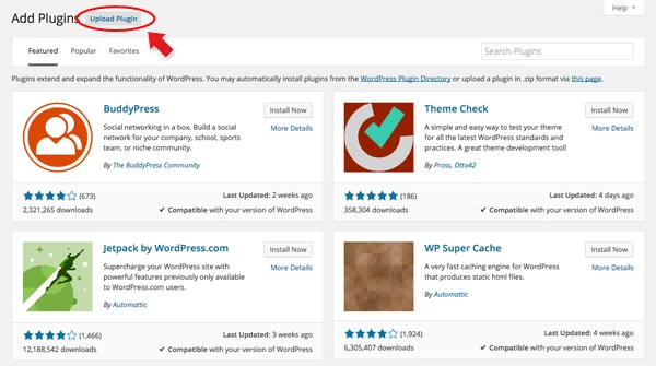
- Navigate to WP Admin > Plugins > Add New.
- Now, click the "Upload Plugin" link.
- Select "Browse" and navigate to the plugin zip file which you downloaded in the first step and then select the "Install Now" button.
- This will initiate the plugin installation process, and once finished, you can then activate the plugin.
Importing the addon demo layout
Each addon zip file contains a sample Builder data file which you can import to your site. It helps you to understand how the addon demo is created.
To import the addon demo data:
- First, extract addon zip file to your local computer
- You should have a folder of the addon. Inside there is a folder named "sample", and inside that folder there is a Builder data file in a zip format (eg. "addon_name_sample-builder-layout.zip").
- To import the Builder layout, login to admin and then go to the page frontend where you want to import the Builder layout. From the top admin bar > select Themify Builder > Import / Export > Import, upload the sample zip file.
Using the Button Addon
Once addon is installed, you will find the Button addon module in the Themify module panel. The module is available in both backend and frontend edit mode (just like all standard modules).
- Create or edit any page and turn on the Builder.
- You will see the Audio module in the module panel, under the "Addons" section.
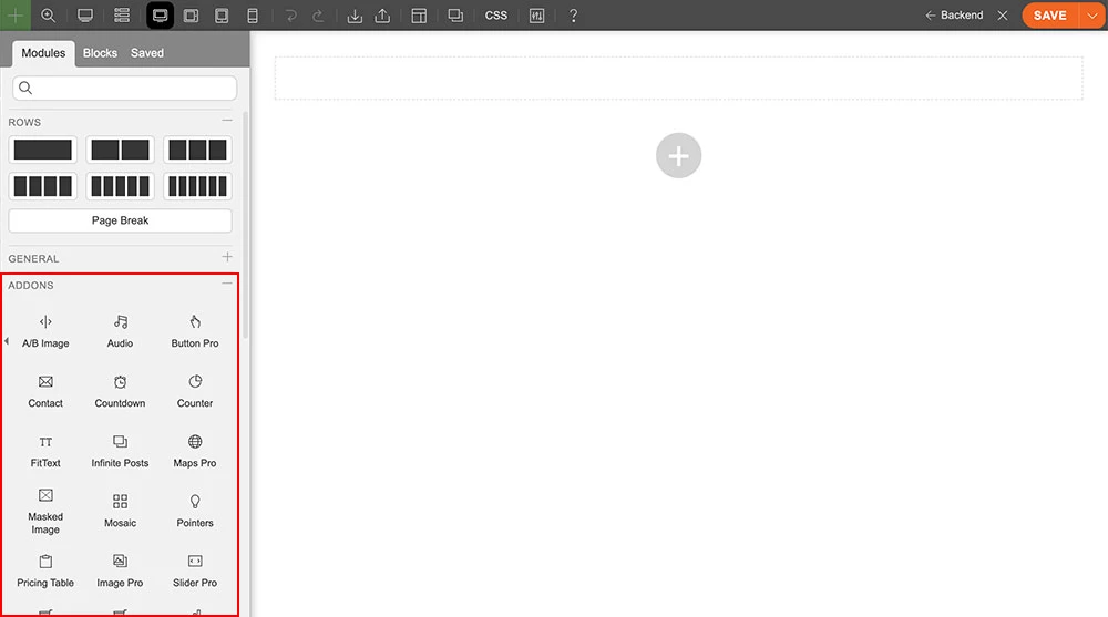
- Drag and drop a Button module in a row.
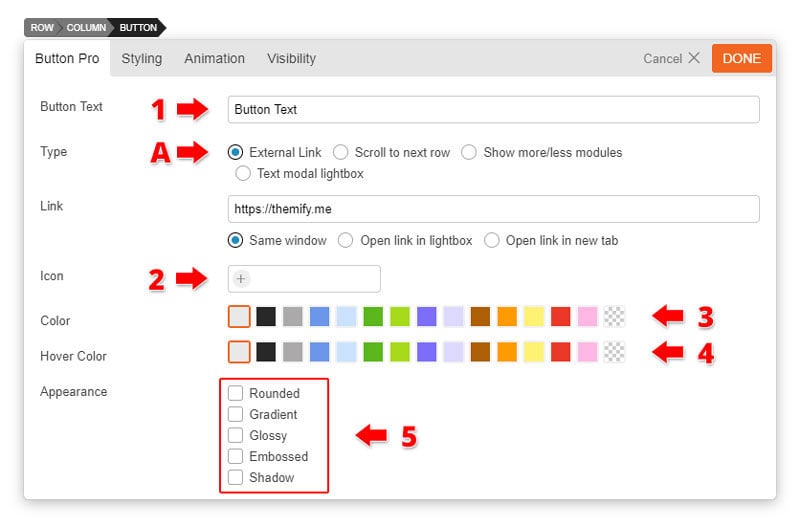
- Button Options
- 1) Button Text = Enter any text you would like to appear inside the button. Default is centered.
- 2) Button Icon = Choose from over 300+ icon by clicking the "Insert Icon" to place an icon on your button.
- 3) Button Color = Choose from our set of popular button colors. If you want a custom color you can do so on the styling panel.
- 4) Button Hover Color = Choose from our preset of popular button colors.
- 5) Appearance = Choose from 5 different types of custom appearances for the button.
- Type = Choose from 4 different types of buttons.
- A) External Link = The ability to insert a link only appears when the external link type is selected.
- Link = Enter any link that you would like too redirect users when they click the button.
- Open as a lightbox = Open link in a lightbox
- Open in a new tab = Open link in a new tab
- Link = Enter any link that you would like too redirect users when they click the button.
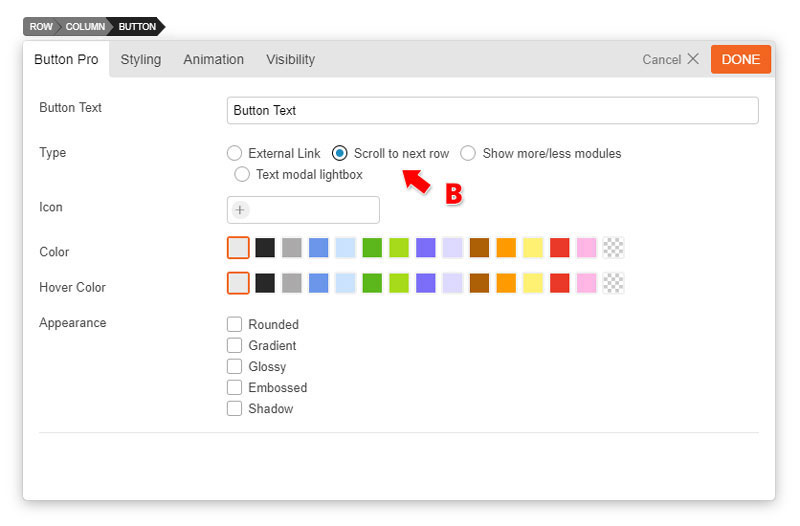
- B) Scroll to next row = When button is clicked it will automatically move the user to the next row.
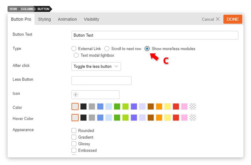
- C) Show more/less = This will allow your users to toggle your content by showing more or less.
- After Click = Choose to either "toggle the less button" (this will leave the button to appear allowing users to toggle between showing more or less of your content) or "hide the button" (when button is clicked it will show more of your content. Users will not be able to toggle between showing more or less).
- Less button text = Choose what users will see after clicking the show more button. (i.e. Show less)
- Note: The content that will appear when showing more is the content underneath the button.
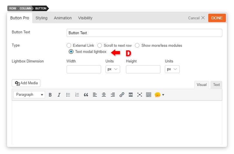
- D) Text modal = Text that will appear on a lightbox. Insert Image or even shortcodes on the text editor. For quick reference click shortcodes listto see the shortcodes it supports.
- A) External Link = The ability to insert a link only appears when the external link type is selected.
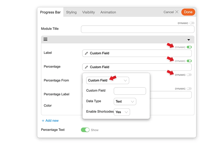
Builder Pro Dynamic
You can use Builder Pro to display addon fields dynamically. Once you have Builder Pro activated, you will see a "Dynamic" toggle button on each field. NOTE: Some fields might not have the "Dynamic" feature if it is unavailable or incompatible. With the dynamic feature, you can display field data from post metadata, shortcodes, custom fields, and other fields created with plugins such as Post Type Builder and Advanced Custom Fields. Refer to Builder Pro Documentation for more information.