
In this tutorial, we’ll walk you through how to create a custom mobile menu layout using the Builder Pro header template. With Builder Pro, you can design flexible, fully responsive mobile menus that complement your website’s unique style. The mobile menu layout will be built using a Layout Part, allowing you to customize it freely with the Builder’s intuitive drag-and-drop interface. The Overlay Content module is used to create the expandable mobile menu functionality. You can design multi-column layouts with any modules you like—such as navigation menus, featured products, or social icons—and your layout will automatically adapt to different screen sizes. View our demo to see it in action (resize your browser window to tablet or mobile size to view the mobile menu feature).
Step 1: Create a Layout Part for the Mobile Menu Layout
Before you begin, make sure you have a Themify theme and the Builder Pro plugin activated. In our demo, we’re using the Ultra theme with the Cosmetic demo content.
To start, you’ll need to create a Layout Part for the mobile menu layout.
- Go to wp-admin > Themify > Layout Parts > Add New Layout Part.
- Name the Layout Part “Mobile Menu Layout.”
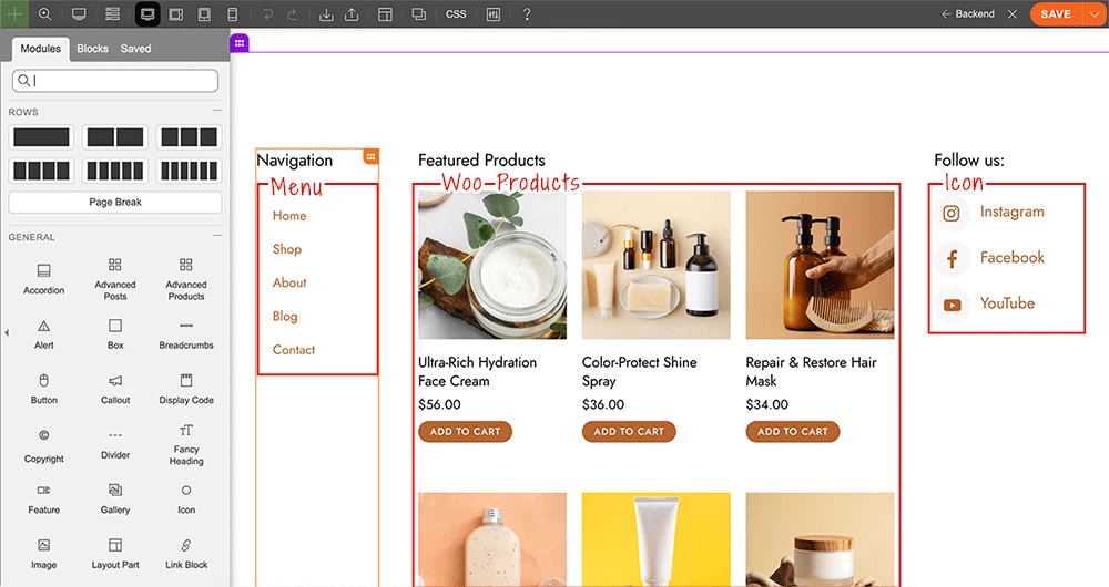
- Then design the layout as you desire. In our demo, we have a 3-column layout: the first column contains the navigation menu, the middle column features products, and the last column displays social icons.
- If you’d like to use the same layout as our demo, download our Layout Part Builder data zip file and import it into your Layout Part using the Builder import tool.
Step 2: Create a Builder Pro Header Template
Once your Layout Part is complete, the next step is to create a header template with Builder Pro.
- Make sure the Builder Pro plugin is activated for this step.
- Go to wp-admin > Themify > Pro Themes and check if you already have a Pro theme created and activated. If not, click “Add New” to create a blank Pro theme and activate it.
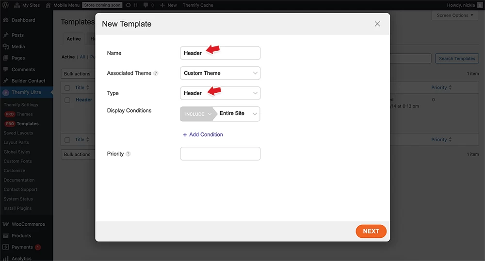
- Once you have an active Pro theme, go to wp-admin > Themify > Pro Templates, click “Add New Template”, name it “Header,” and set the template "Type = Header." You can either import a pre-designed header from the template library (we use the Cosmetic demo header template as the foundation) or create your own custom header design.
- To match the header template design from our demo, download our Pro template Builder data zip file and import it into your header template using the Builder import tool.
Key Points:
Here are some important points to note:
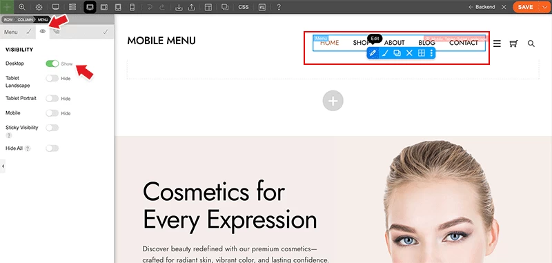
- In the header template, the Menu module is set to be visible only on the desktop breakpoint (so the menu will not be visible on tablet and mobile).
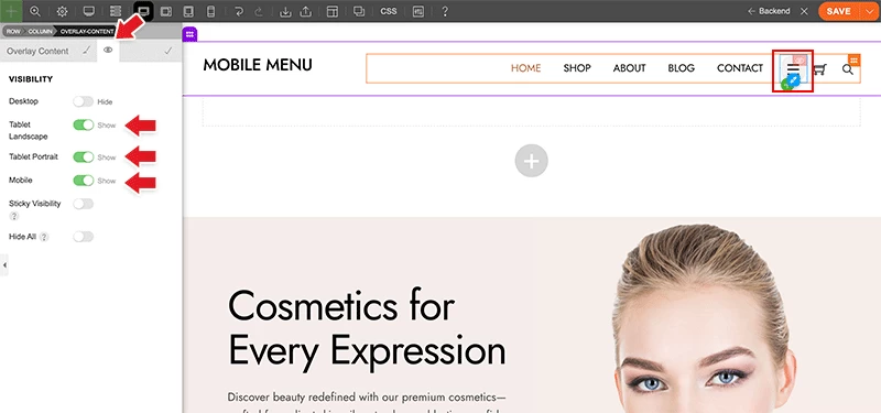
- The mobile menu is created using the Overlay Content module, with the mobile menu Layout Part selected. The Overlay Content module’s visibility is set to appear on tablet landscape, tablet portrait, and mobile breakpoints only (so this Overlay Content module is not visible on desktop).
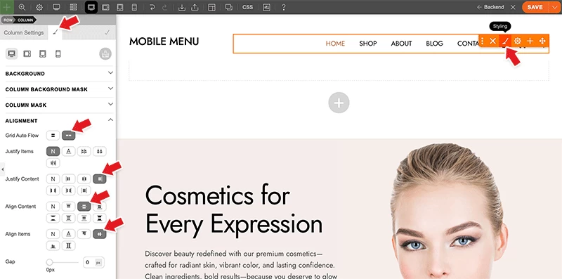
- To align the modules horizontally, go to Column > Styling > Alignment and select the following options:
- Grid Auto Flow = Horizontal
- Justify Content = End
- Align Content = Center
- Align Items = Center
- Optionally, you can enter a “Gap” value to add spacing between the modules.
October 16, 2025 @ 11:36 am
Great update thanks guys :)
October 16, 2025 @ 4:07 pm
Nice Tips.
You should stay updated with new tips and tutorials.
Thanks
October 22, 2025 @ 9:25 am
Absolutely love this update! 🔥 Super excited about the new custom mobile menu — Themify keeps getting better every time! 👏