Creators of the popular game Mousehunt, HitGrab Inc., shared to us how they were able to redesign their site with a tight deadline with Themify. Using the Parallax theme and Themify Builder, they transformed their site into an one-page design which enables them to showcase their games, as well as, the company profile. Continue reading to see how they did it.
Before: HitGrab Inc. Story
HitGrab Inc. is a gaming company that build games on both social and mobile platforms. They were awarded by Facebook a grant of $250,000, out of the thousands of social application companies. Their leading game, MouseHunt, spearheads their charge in becoming one of the top gaming companies by claiming the title of being the first iOS game with over 3 million downloads in 2012. Aside from their success with their games, HitGrab has developed a corporate culture that's fun, exciting, and "a little weird". Their weird attribute is directly correlated to their deep bond with their players and the way they interact with them through social media. With their Mousehunt Facebook page reaching over 400,000 Likes, HitGrab Inc. has created an active and engaged community. Now they want to translate this corporate culture and success they've amassed over the years onto their company website. This led them to begin their own hunt to redesign their site.

Discovery: Choosing a Themify Theme
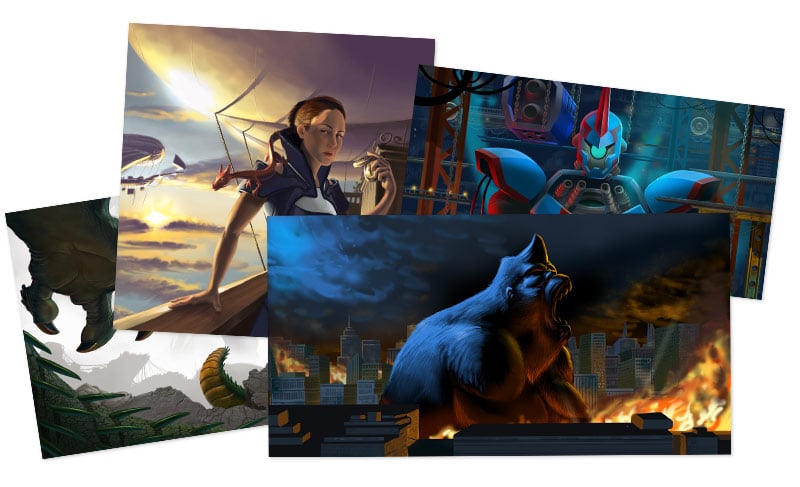
HitGrab reached out to us with the objective of simplifying their site. They wanted a simple one-page design which could allow them to showcase their company profile, history, games, career opportunities, and contact info. We were honored and very excited to participate in this site redesign. To ensure success, we placed one of our most experienced designer and developer to help them with this project. HitGrab had plenty of amazing gameplay images that was created by their design team. These images are loved by thousands of their Facebook fans, which means that effective placement of it on their site was essential for HitGrab. After carefully assessing the features of multiple Themify themes, the parallax scrolling effect and the ability to display a full-height image slider was the deciding factor that led HitGrab to choose the Parallax theme.

The Work: HitGrab Redesigned
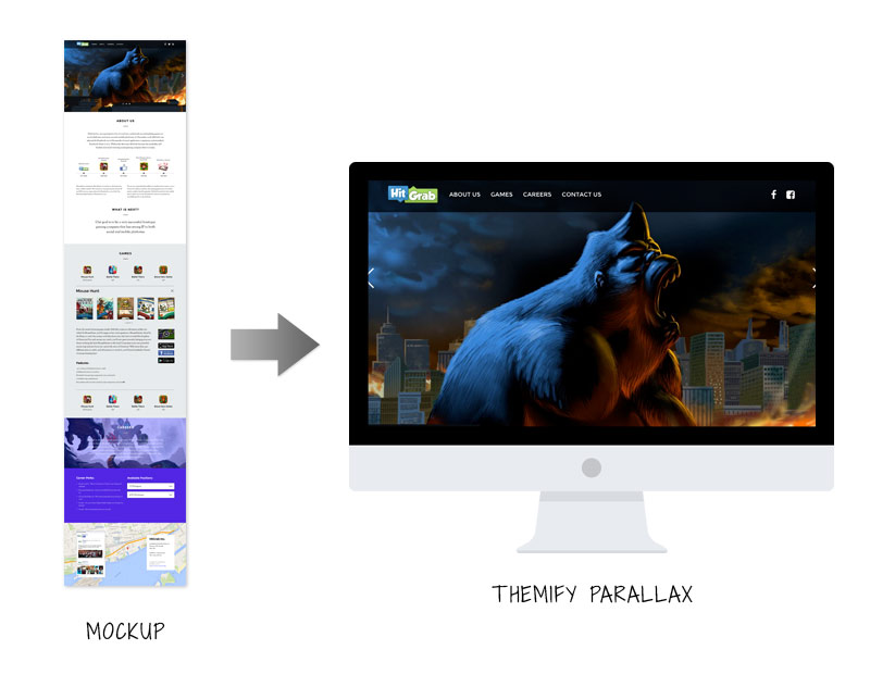
Building the HitGrab site was fun and exciting. We both brought in interesting concepts, ideas, and images to make the redesign visually appealing. Our developer worked closely with HitGrab, providing them support and recommendations that were specific to their needs. A Photoshop mockup was created to get an overview of the design. Followed by the mockup, we created a child theme for the custom header, footer, and stylesheet. The Portfolio post type, from the Parallax theme, was used to showcase HitGrab's games. With the built-in tools from the Themify Builder, it was very easy to construct the one-page layout that HitGrab wanted. Animation effects were easily added to the content and images with the Builder. Because the Parallax theme is a responsive and retina-ready theme, we didn't have to do any extra work for responsive design. The site design responds nicely across all resolution and devices.

Final Remarks
Together, we have rebuilt the HitGrab site within a span of two weeks, meeting their objective of creating a one-page minimalist site that showcased their games and company story. For us it was a great experience and a lot of fun to work with such an amazing company.
Share Your Story Now
How have you used Themify for your site? Whether it's for your business site, personal blog, or portfolio, we'd love to hear your story and share it with other people! Please contact us.
January 8, 2015 @ 12:53 pm
Hi Themify,
Great work – the Themify theming on hitgrab.com shines through just enough to allow for some implicit branding – well done!
Only one shortcoming as far as I can see:
There’s no “To top” scroll button at the bottom of the page. That is a must on one page scrolling websites, I think! :-)
cheers!
Pedro
January 8, 2015 @ 4:21 pm
Thanks for the suggestion. Because the navigation bar is fixed, users can navigate to each section without scrolling as well.
January 8, 2015 @ 1:30 pm
HitGrab:
Where are your pictures nearby people … ?
I think it’s very “cold”.
January 8, 2015 @ 8:44 pm
Themify is just the best PERIOD. I work with hundreds of clients some using Elegant Themes, some Woo Themes (frankly the 3 companies provide unbelievable themes) … still choose Themify … and I honestly am just a businessman without much clue about coding (like zero) .. so if you want a WP that just work … little effort then Themify is your go to. That said, the website I listed is my passion (NPO/Charity) and I use a theme from apptheme… not the best support, but still the best theme for my cause. Shop around (no need to shop all above are incredible value) .. then come to a conclusion and purchase, for me Themify is No 1 choice. John (http://www.rent-a-student.co.za)
January 9, 2015 @ 5:49 pm
Thank you for the kind words.