
Welcome back to a new installment of our Customer Stories. Just like his name Lee Pears, his story is also short and sweet. He shares how he went from a veteran graphics designer for major fashion magazines, including British GQ, Tatler, and Elle UK, into an empowered web designer.
Making the switch from old media to new media can be hard, but Lee shares it isn’t so. Let’s hear from him now.
About Me
My name is Lee Pears. Yep, you guessed it, pears like the fruit. ‘Pears like the fruit’ is actually my Instagram handle because of the amount of times I’ve had to say it so that people would get the spelling right – I at least thought it was about time it paid its dues.
I’d been in publishing with Condé Nast for as long I could remember, and my mid-life crisis was moving away from print and going into digital. No motor bike, ear piercing, or giant crappy tattoo across my back. I left work and went back to college. Last time I was in college was 20 years ago... and that thought was scary.
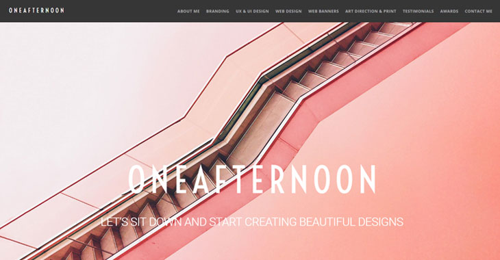
Project: ONEAFTERNOON
Base Theme: Ultra
I studied digital and web design, coupled with my degree from Central Saint Martins in London and my 15 years in print design, I felt well armed for the web design industry...
Before Themify
While in college learning web design, we were using all the usual web designing tools like WordPress, Dreamweaver, and all that. But nothing really grabbed me because my heart lies in designing and a lot of code kept cropping up.
I did love WordPress for its simplicity and easy to understand structure, but then Themify came along and that’s what opened up my eyes and really got me starting.
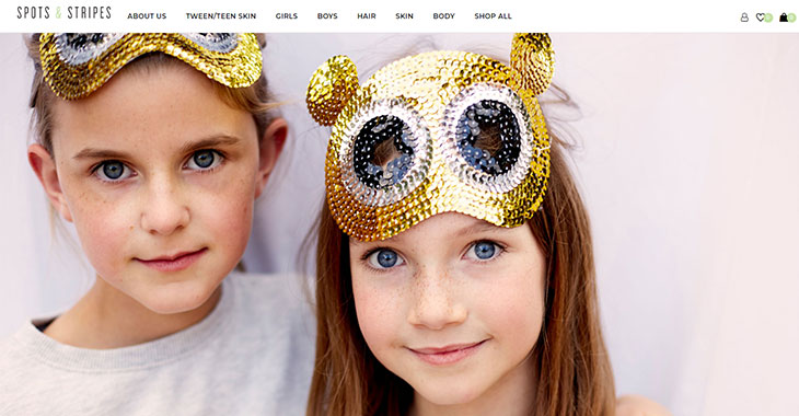
Project: Spots & Stripes
Base Theme: Shoppe
Discovering Themify
I typed into google “parallax websites” and I saw a video by Hogan Chua, so I started watching. I downloaded the free and educational version of the Themify Ultra theme and started designing the website he had created a tutorial on. Once I started creating with Themify, I basically didn’t leave my room for 72hrs. I ended up completing my first personal portfolio website, ONEAFTERNOON, on my own, and only half way through my school’s course.
You should have seen my tutor’s face when I showed him my completed website the next morning. It goes without saying then that web designing with Themify came very natural to me and I started to create some amazing things because the code wasn’t holding me back.
I kept learning, trying things out, applying things I liked, and submitting requests for CSS short codes to bespokely tweak Themify’s themes and addons to work with my designs.
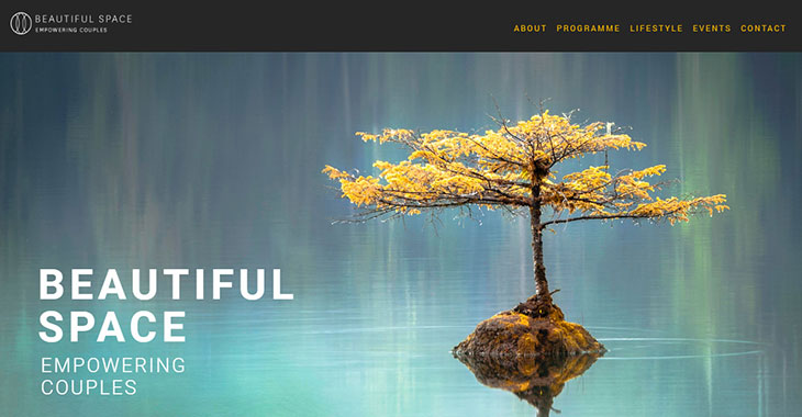
Project: Beautiful Space
Base Theme: Ultra
Themify User Tips
I watched loads of videos about the Builder and Builder Addons and read from the many tutorials available on Themify’s blog. I completely emerged myself into the application and use of Themify’s framework so that I could know my limitations. I find this a good practice so that you’re not offering something you can’t achieve from your platform to a client.
Keep organised. Keep a good folder structure for your work. For example, have an ‘image folder’. Then inside that folder, you can structure your folders into web pages. And always keep your high res images separate from your lower res images, perhaps calling the optimised image folder, ‘saved for web’. You never know when you need to go back to an original high res image.
Top tip for the final stages of your web design is to always check on a device. There’s nothing like actually seeing how your site loads and scrolls on a mobile or iPad screen. It’s completely different when you hold your design in your hand and it inspires you for even better and newer ideas.
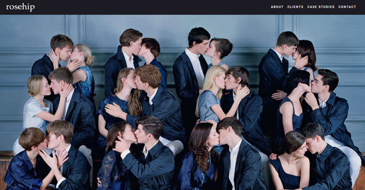
Project: Rosehip Marketing
Base Theme: Ultra
AND ALWAYS... when it comes to responsive styling, start with the desktop view. Then work down the different break points/screen sizes. You get a much cleaner, smoother, finished product when you work down from the desktop view as the software is incredibly responsive and responds to the previous screen size.
Looking to the Future
I’ve been designing websites for a year and half now and really hope that Themify keeps going and growing with design trends and technology. Themify’s doing really very clever stuff and they take the faff out of coding so you can just concentrate on pure design.
My future’s bright. My future’s Themify. (Ha, stole that from an old Orange mobile campaign). Nick, Amit, Dejan and the rest of Themify’s support team have all saved my bacon or fixed a bug with their awesome tech support. I’ve got a very high level of detail and can spot things a mile off, but these guys have always been very helpful and brought out updates for things or provided me custom CSS for my needs.
Share your Customer Story now! Have you created a few intriguing websites using Themify? Do you have an interesting story? Let us help you showcase and share your beautiful work. Please contact us.
June 5, 2019 @ 12:55 pm
I agree with “desktop first”, then phone/tablet when doing responsive websites.
It is just more natural that way, and in any case; desktop is still the only way to use/view the website in all its glory, the desktop version of a responsive website is where the design shines and comes fully to life.
Short auto-playing/looping background video on desktop version, also adds to the overall experience of the webdesign, where as background-video on phones/tablet gets downgraded to an image of the video, which is less exciting, design-wise.
So eventhough smarthones/tablets pushed the idea of
“mobile first” for responsive webdesign, I personally never did that, always stayed with “desktop-first”, then handhelds for responsive, like Lee Pears suggests :-)
June 5, 2019 @ 1:38 pm
Me too. Maybe it’s because that’s how I started and am a bit of an ol’ fogey. Maybe “kids today” naturally think mobile first because that’s the environment with which they’re most familiar. However, my experience has been most mobile first sites look absolutely dreadful on desktop. It’s easier to start big and scale down (if necessary) than to start small and scale up.
#DesktopFirst
#GetOffMyLawn
June 6, 2019 @ 12:40 am
TM Petaccia
Exactly! :-)
#DesktopFirst :-)
#GetOffMyLawn :-)
#ThemifyForever :-)