
We have added a new Style Variables feature to both the Builder and Customizer, making it easier to manage consistent styling across your site. Instead of updating colours, fonts, and spacing one element at a time, you can define reusable variables once and assign them anywhere they are supported.
One of the most useful benefits is responsive variables. Rather than creating and assigning separate variables for desktop, tablet, and mobile, you can use a single variable and set different values for each breakpoint. This makes it much faster to manage responsive font sizes, spacing, and other design settings while keeping your workflow simple and consistent.
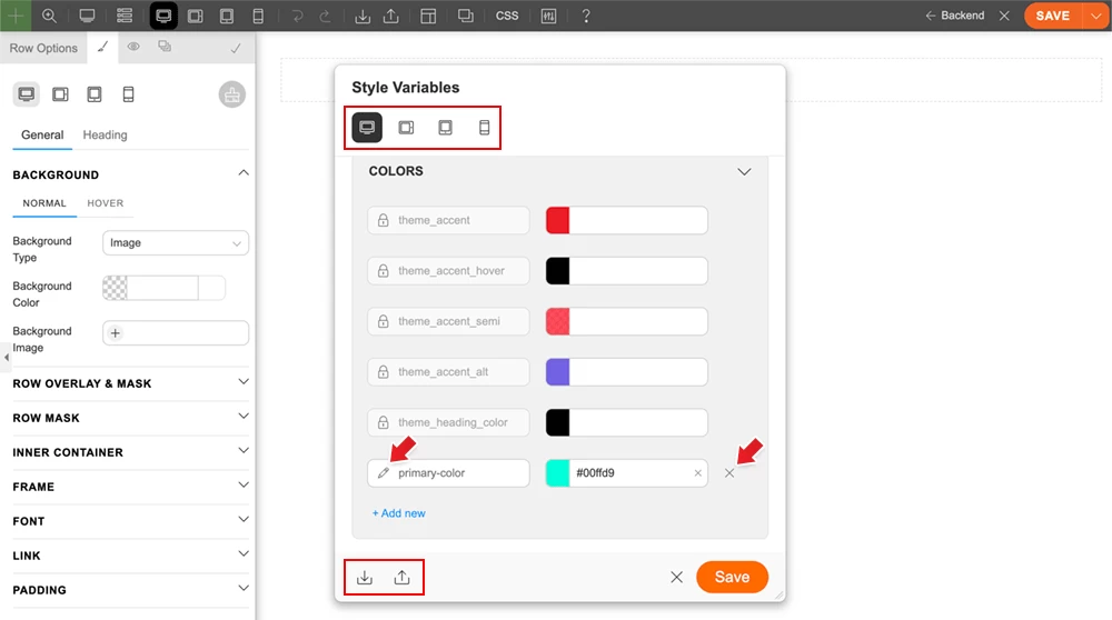
You can also export and import the Style Variables from one site to another. If you export a Builder layout that includes variables in use, those variables will also be imported to the target site.
How to Use Style Variables
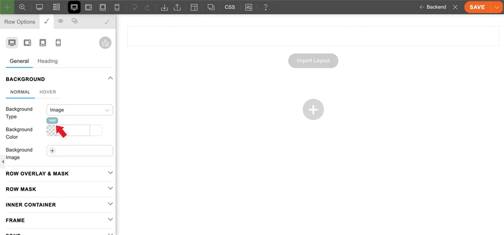
- Go to any module or row styling option. Hover over any styling input that supports font, number, or colour options. A "VAR" button will appear. Click the "VAR" button, then click "Edit Variables". Style Variables are shared between the Builder and Customizer, so you can use them in either or both.
- In the Style Variables panel, there are different types of variables:
- Color = Use the colour type for any colour value such as font colour, background colour, border colour, text-shadow colour, and more.
- Font = Use the font type for font-family values.
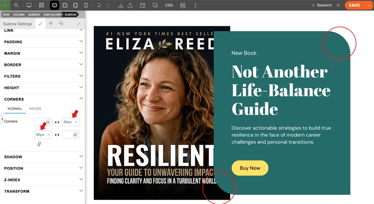
- Number = Use the number type for any numeric value such as font-size, line-height, padding, margin, border width, border-radius (corners), and more.
- You might see theme-specific variables in the Style Variables panel, such as theme_accent and theme_accent_hover. You cannot delete or rename these theme-specific variables because they are default variables in the theme. However, you can add custom values to override them. For example, you can change the theme_accent colour to any colour of your choice.
- To add a variable, click "Add New", then enter the variable name and value. Spaces are allowed in the variable name, but they will be replaced with hyphens automatically.
- After the variables are created, you can assign them by hovering over a styling input, clicking the "VAR" button, and selecting a variable.
Color Type Variables
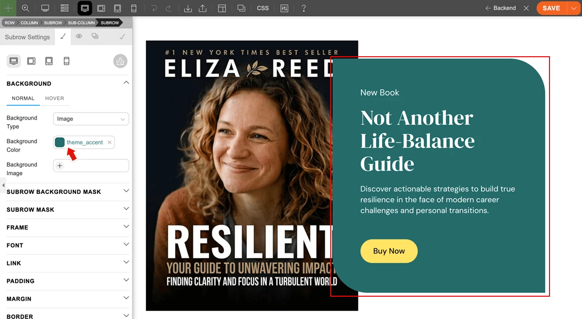
Colour variables are the most commonly used for font and background colours. Let’s take a look at our recent skin, Coach, which has multiple areas with the same green background colour across multiple pages. With the Style Variables feature, you can simply assign the background colour to the theme_accent variable. When you change the value of the theme_accent variable, the colour will update across all pages without having to edit each page individually.
Font Type Variables
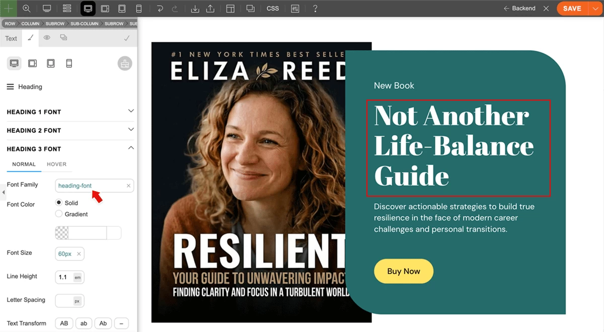
Use font variables for common font styling such as headings and special text with accent font styling. When you change a font variable, the update will apply to all elements where that variable is assigned.
Number Type Variables
Number variables are extremely useful for keeping layouts consistent. You can use them for font-size, spacing such as padding and margin, border-radius (rounded corners), and more. Since Themify Style Variables support responsive values, they are even more useful. You can use one variable and define larger values for desktop and smaller values for tablet and mobile breakpoints, without creating and assigning multiple variables for responsive styling.
April 15, 2026 @ 11:42 am
I have waited for this! Awesome! Keep up the great work! :)
April 15, 2026 @ 1:56 pm
Great news. This was something I was missing in Themify. Thanks!
April 15, 2026 @ 8:46 pm
Great work guys. I would also like to see an option for enabling smooth scrolling sitewide, like this website has: https://grovia.framer.ai
April 15, 2026 @ 8:55 pm
Finally!!! Thanks team 😍😍😍 Catching up again! Love the push on updates laletly!
New functions & features are always welcome