Today we are proud to announce the long anticipated v7 release! Since our last major update (v5), we've been planning to further improve the pagespeed and performance of our themes and the Builder. The v5 update focused on the frontend pagespeed, whereas v7 is for the backend performance. The main goal is to make our themes faster and with better stability. We've re-coded many components in the backend to optimize the overall code — less database queries and lighter code (PHP/Javascript/CSS). We are happy to see many of our user sites getting A+ score on Google Pagespeed Insights (see some of our featured user sites and showcase). This update will make our themes much faster and better!
A significant frontend change in v7 is the Builder row grid system. We've replaced the old CSS flexbox to CSS grid to handle the Builder grid system. Using the CSS grid gives more layout possibilities such as adding unlimited columns, column re-ordering, and creating tiled-like grids.
This is a big update, so we jumped from version 5 to 7. Due to the data structure and grid system changes, we highly recommend not to downgrade your theme once it is upgraded to v7 (read the important notes at the end of this post for more details). Please be advised that all Builder addons and Builder Pro must be updated as well in order to use with v7. Testing the theme update on a development/staging site is recommended.
AFTER UPDATE: If you have any cache plugin or server-side cache and CDN tools (eg. Cloudflare), please remember to clear their cache. If you have Cloudflare Rocket Loader, server cache and mod_pagespeed enabled and experiencing issues, try to disable them.
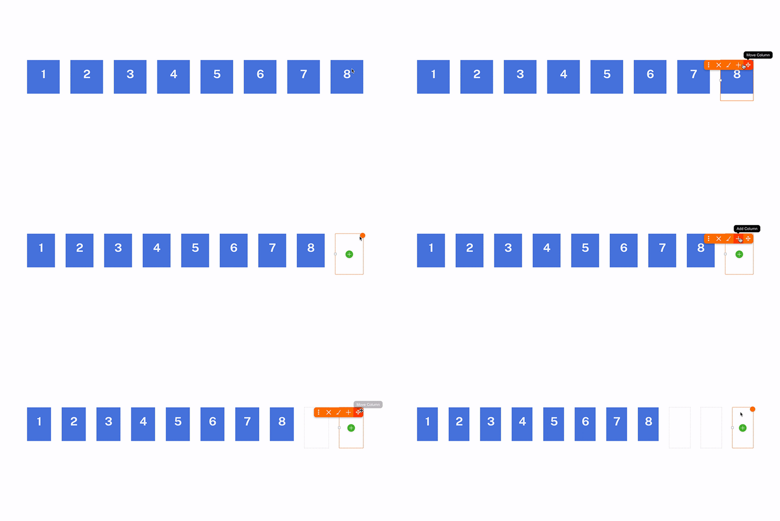
Unlimited Columns
Themify Builder is no longer limited to 6 columns. Now you can add as many columns as you want.
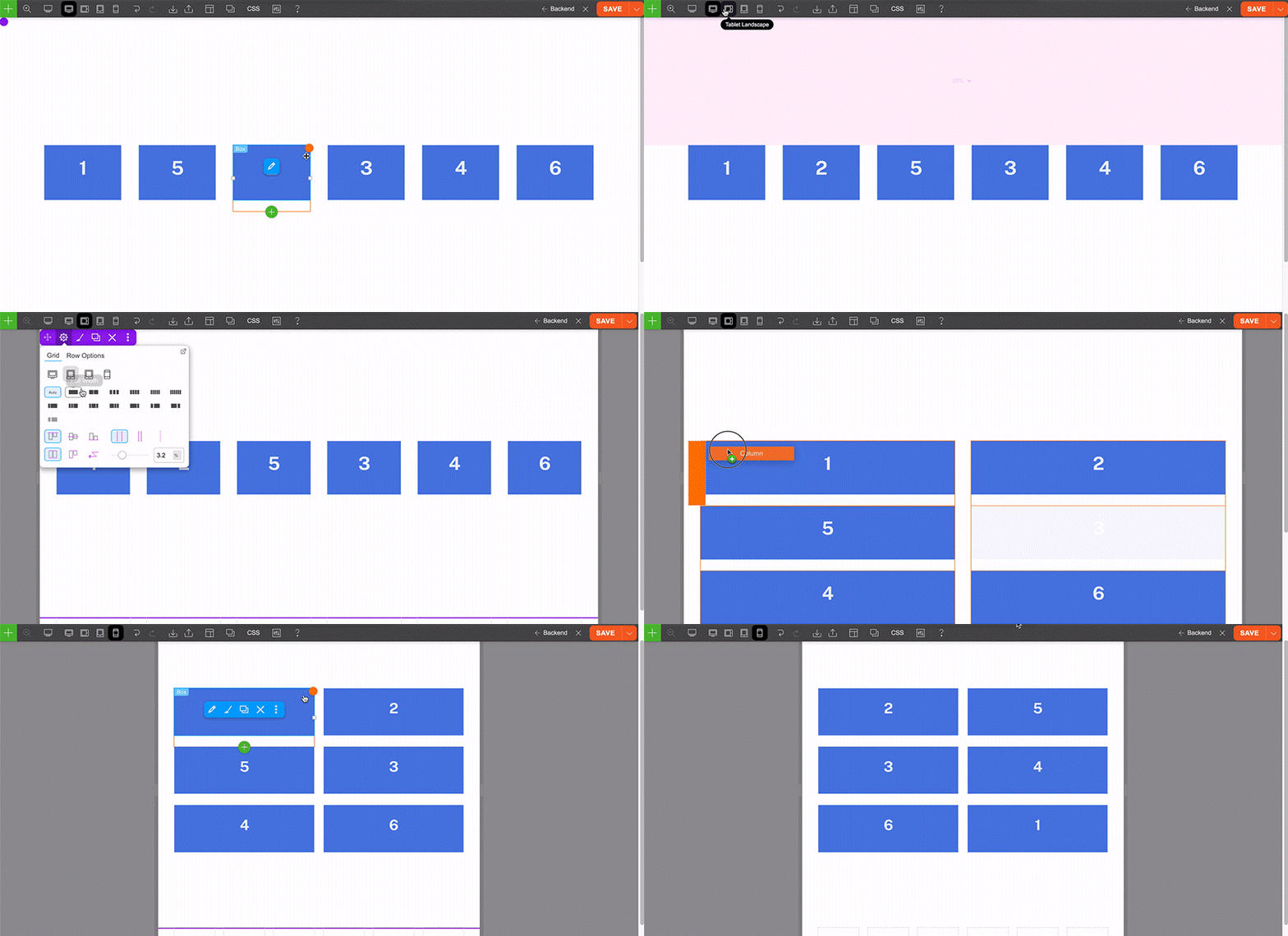
Responsive Column Order
You can move columns to any order or to another row as you like. The old version could only display the columns in left-to-right order or right-to-left on responsive mode. The new version allows you to position columns in any order for desktop, tablet and mobile. That means you can move the last column to the second on the tablet and move first column to the third on mobile.
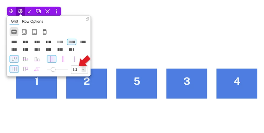
Responsive Gutter Size Control
Now you can set global column gutter width at Themify > Settings > Themify Builder Options. On each Builder row, you can also enter custom gutter width to override the global setting. The gutter sizing is also responsive. You can select/enter different gutter spacing for desktop, tablet and mobile.
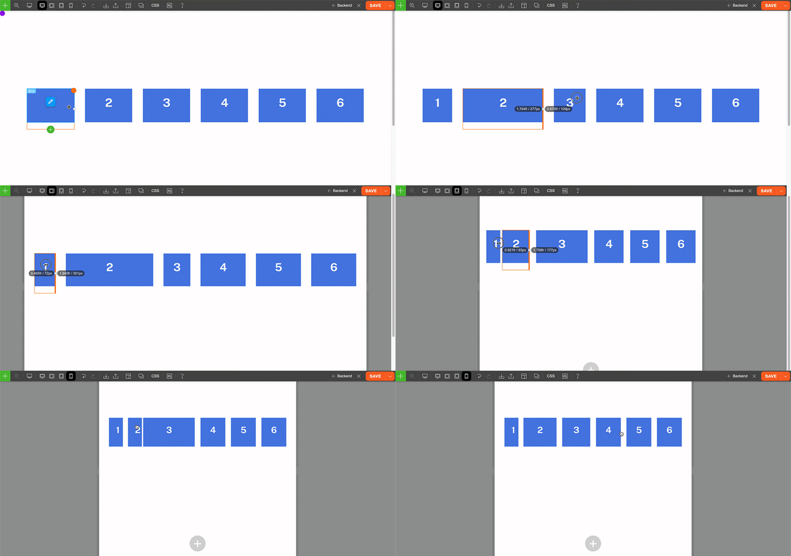
Responsive Column Resize
One of the handy grid features is being able to resize the column width by resizing the column divider. We've improved the feature to allow you to resize the column width differently for desktop, tablet and mobile.
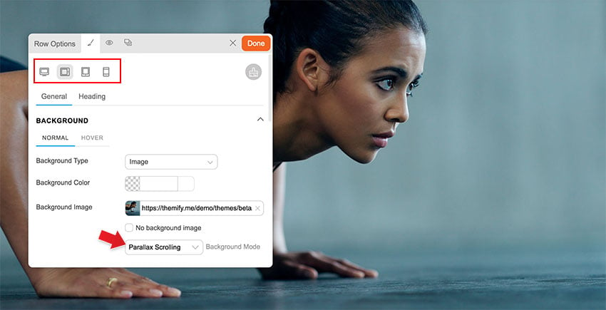
Responsive Background Mode
The background mode now can be responsive. Basically it allows you to select a different background mode for desktop, tablet and mobile. For example: you can have a parallax background image on desktop, zoom on tablet, and then fullcover for mobile.
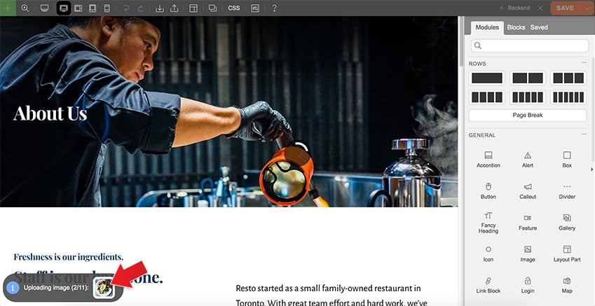
Layout Demo Image Import
When you import a predesigned layout or skin demo, our framework can download the demo layout images to your site. This will prevent broken or not found image errors when our server is down or the image files are removed on our server.
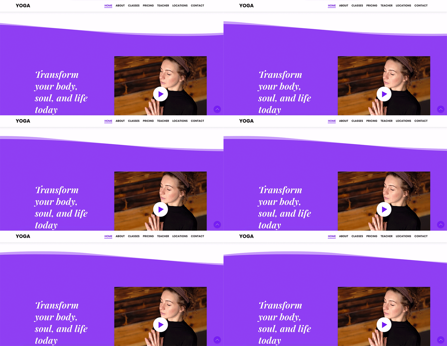
Row Frame Animation
We've added a little nice touch to the row frame. You can enable animation on the row frame to make it scroll in forward or reverse direction.
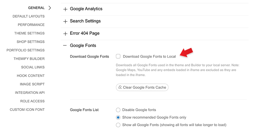
Download Google Fonts for GDPR Purpose
Due to the GDPR laws, a lot of European users are concerned with using Google Fonts because Google uses cookies to track the font usages. So we've added a feature to download the in-use Google Fonts to your local server. To enable this feature: go to Themify > Settings > General > Google Fonts, check "Download Google Fonts to Local". Once you enable it, our framework will download the Google Fonts that are called in the theme, the Builder and the Customizer.
Gallery - Drag to Sort
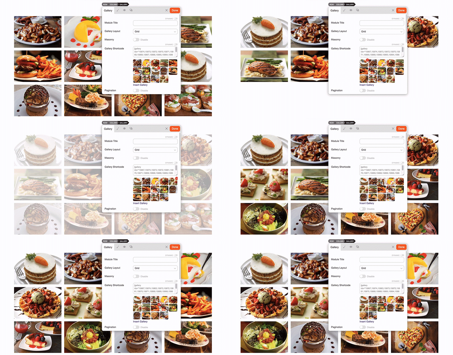
On the Gallery module, now you can drag the gallery preview items to sort them without having to go back to the media lightbox. You can also click on the "X" icon to remove the image in the gallery.
Video - Hover to Play
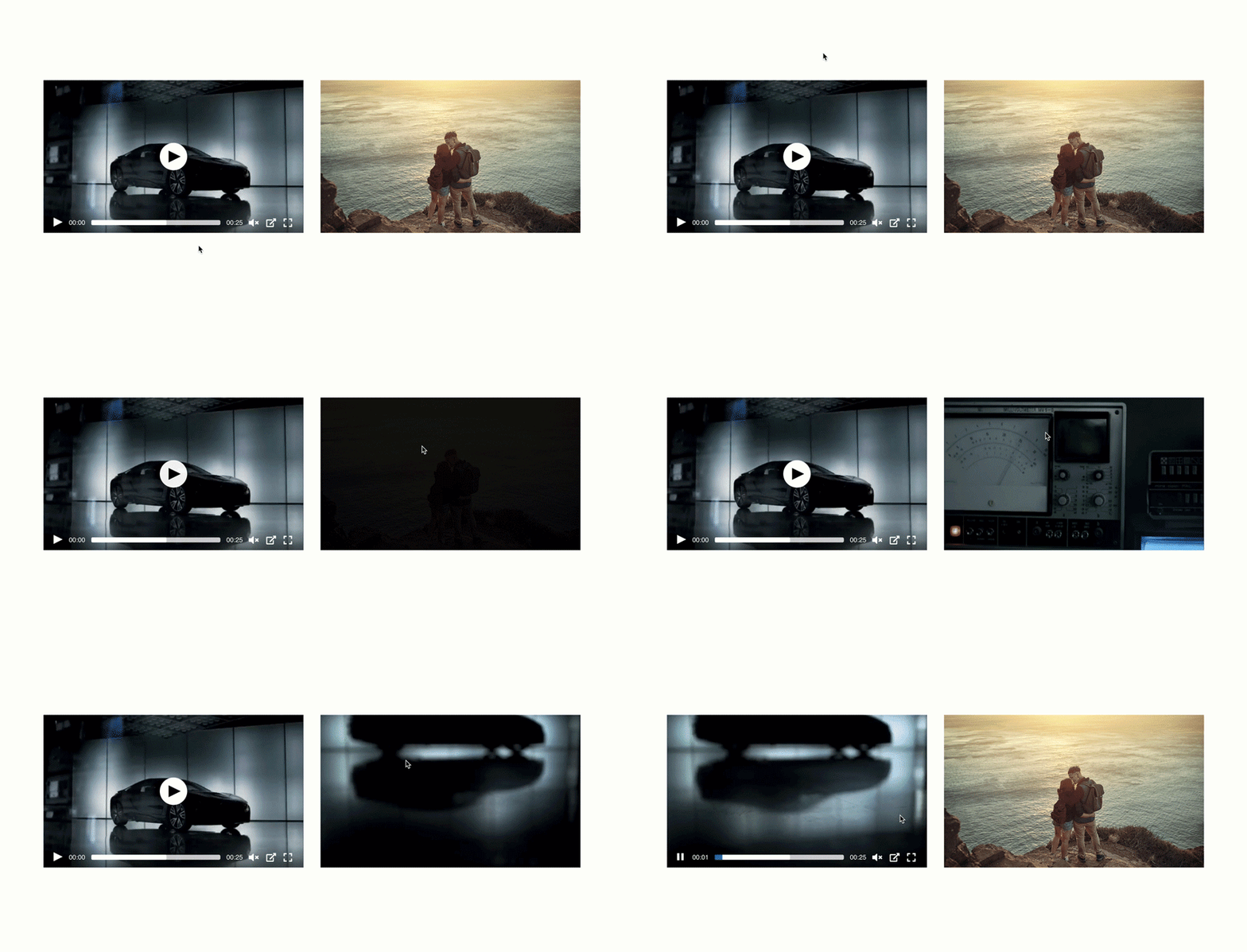
If you have a mp4 video in the Video module, you will see the additional "Play on Hover" option. Basically it plays the video when the cursor hovers on it. The "Play on Hover" can be combined with the "Overlay Image" option. When the user hovers the image, it will play the video. This feature is not available for third party video embeds such as YouTube and Vimeo.
Low Power Mode Video Background
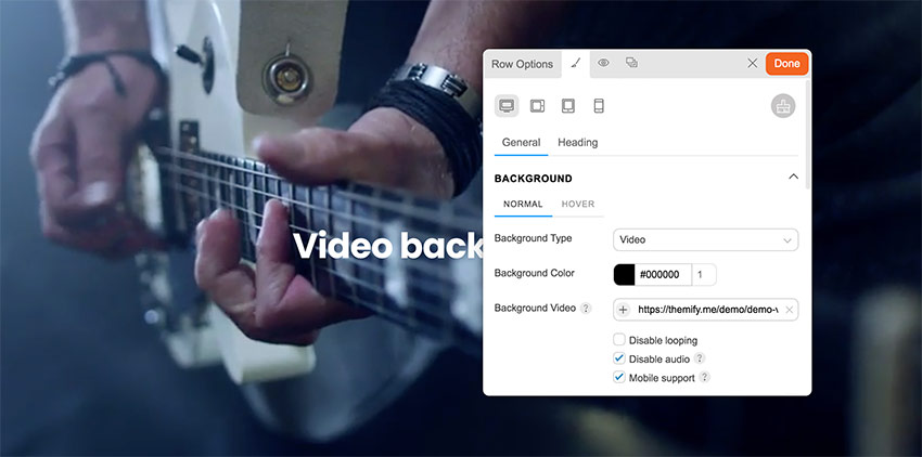
As you may know that mobile devices (iPhone and Android) don't allow auto-play videos when low power mode is enabled. That means the video background will not work on low power mode. We've solved this problem in v7. When the user makes an interaction (tap or scroll) on the page, it will trigger the video background. This feature only available for mp4 video background (not for YouTube and Vimeo).
New Modules
There are several new modules added in the core Builder and Builder Pro.
Table of Content
The new Table of Content module is very useful for creating documentation and tutorial posts. The module is very easy to use. You just need to select the headings (eg. h3, h4) and it will generate a table of content automatically. It has the built-in scrollTo feature which allows users to copy the anchor URL and share it.
Rating Star
Rating Star is a simple module for display rating stars with full customizations. You can select custom star icon, add text before, text after, set the number of stars, spacing, font, color, etc. The similar rating star feature is added in the Testimonials module as well.
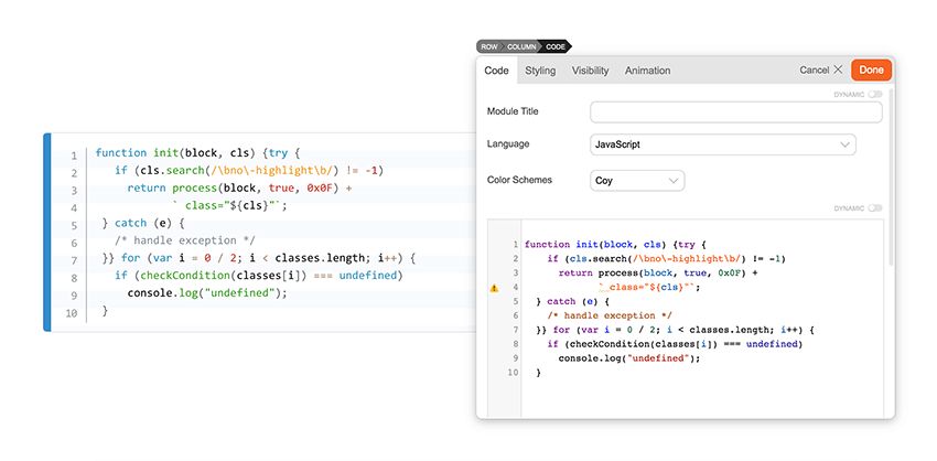
Code
For the coders out there, you would love the new Code module. If you post a lot of code snippets/tutorials on your site, this Code module is extremely useful. Simply paste your code and it will convert the HTML entities such as '<' and '>'. It even has code syntax highlights for various programming languages. You can select a large range of color schemes from light to dark.
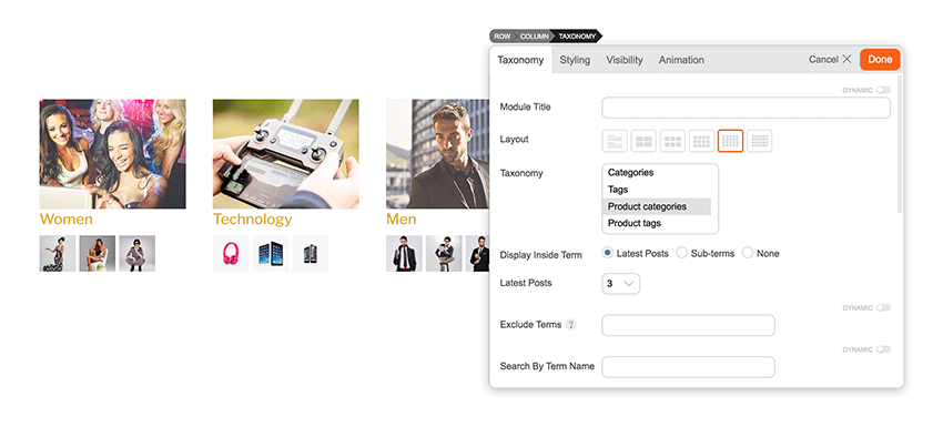
Taxonomy
The Taxonomy module has been requested a few times in the past and we are happy to include it in Builder Pro. It lets you display any custom taxonomy along with the cover image and the recent posts of the terms.
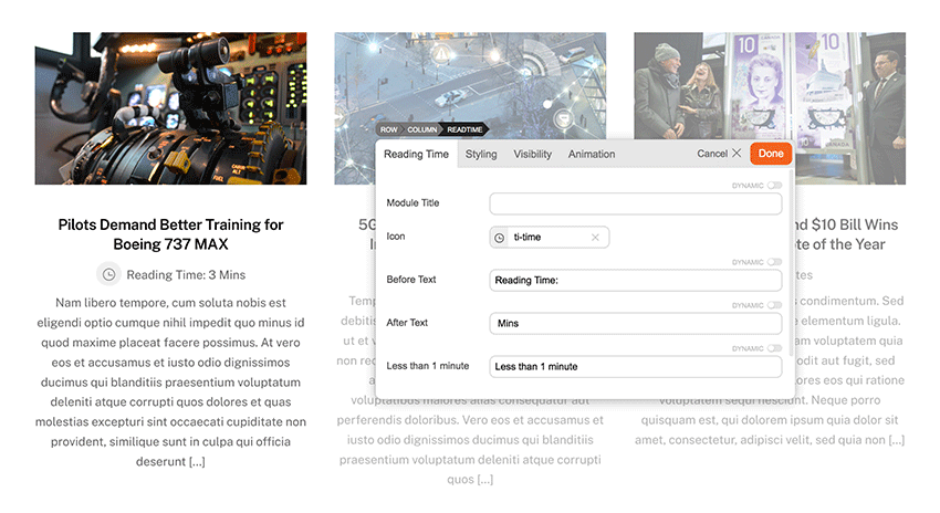
Reading Time
Reading Time is another new module added in Builder Pro. It is for editorial sites to display the reading time of the posts. It scans the length of your post content and estimate the reading time. You can use Reading Time in both archive and single post templates.
Important Changes & Notes
- CSS Grid and Column "%" Padding Change
The previous versions used CSS flexbox to handle the row grid. Now it has been changed to CSS grid. This affects how the browser calculates the column padding with "%" unit measurement ("px" and "em" column padding is fine). When you upgrade the theme and turn on the Builder, it will convert the old column "%" padding to a new value that matches your layout. This is the expected behavior (don't worry). Due to the changes, we highly advise not to downgrade the theme after the upgrade. Test the new version on a staging/development site before you upgrade it. - Body and Column Classes Removal
Some of the body classes (eg. page-loaded, tb_responsive_mode) and column classes (eg. second, third, etc.) are removed. If you have existing custom CSS that targets those CSS classes, they will no longer work. Please contact us or post on our support forum if you need any assistance to update your CSS for the new version. - Removed Click Mode
Since most users prefer to use hover mode, we've decided to remove the click mode to simplify the Builder UI. - Fixed Position on Column
Due to how CSS grid works, if you have custom CSS that set column to be position:fixed, it will affect the column width and the grid. Contact us if you need assistance to fix this. - Avoid Downgrades
Once you upgrade to v7, please avoid downgrading to the previous versions as it might affect your layouts. If you update the theme, edit the Builder layout, then downgrade the theme to the previous versions, the following might/will be affected: - Column "%" padding: Since the new version converts the column "%" padding to new values, the padding will look different if you downgrade to the old versions.
- Column direction, auto column height, and column alignment: The old version doesn't have responsive column direction, auto column height, and column alignment. If you downgrade the theme, they will be reset back to default.
- Column gutter: The old version doesn't have responsive and custom gutter width. If you enter/select the custom gutter width, downgrading the theme will reset them back to default.
- Custom column size: The new version allows you to resize column width for responsiveness. Downgrading the theme will reset them as well.
- More than 6-columns: If you add more than 6 columns with v7, downgrading to the old versions will reset the grid.
Upcoming Features
Below are the upcoming features we've planned for the next main update. If you would like to suggest new features, please post on this post's comment form.
- Lottie Animation
- Paypal Module
- Touch device support (edit Builder content on touch devices such as tablet and mobile)

December 7, 2022 @ 1:36 am
Thank you!
Upgraded my site (no fear!) and everything is fine.
I think this is an amazing upgrade.
Nice work, indeed!
December 7, 2022 @ 1:55 am
YAY!
December 7, 2022 @ 2:06 am
broke down all sites… how can I return to previous version?? :(
December 7, 2022 @ 2:58 am
Please refer to the ticket: https://themify.me/forum/topic/rollback-to-previous-version
The issue is likely caused by WP Rocket. Can you try to disable that plugin or any cache/minify plugin you have?
December 7, 2022 @ 3:55 pm
Just updated Nick, Well done buddy and your team!
Smooth as butter with ULTRA.
Did plugins first, then theme.
Siteground security plugin and Optimised Plugin all working smoothly.
No problems.
Straight 100 across the board on Light house!!!
Im seeing the real difference on lighthouse when testing mobile.
And 100% with a load time of 0.532 seconds on GTMetrix.
NICE!
December 7, 2022 @ 7:53 am
Reordering columns on responsive layouts wasn’t going to be a feature?
December 7, 2022 @ 8:56 am
Awesome! I hope will get Green Score on the mobile version too!
December 7, 2022 @ 1:08 pm
It’s been a long time since we got new modules or builder addons. There’s so many new features showing up in competing theme systems out there.
I would love to see things particles, tilt, animated text, gradient text, etc…
I mean go out there and see what the “other guys” have and bring some of that love to Themify.
December 7, 2022 @ 2:00 pm
You can do all this already.
Except animated text. I know particles you can do but not natively.
December 7, 2022 @ 2:32 pm
Great ! Rewriting things from ground-up is requires stamina, patience and guts. You need to get the whole team on it. Is this the fourth time Themify is doing it?
I hope Slider Pro too get updated with more animations in the future.
December 7, 2022 @ 2:49 pm
I installed the update in a staging site. Looks great! However I had two issues:
1. I still use Themify Shortcodes –to add icons, mostly– and I found out that if I edit a page/post with the Builder, the shortcodes dissapear after saving.
2. Wherever I added a Social Share module it doesn’t load completely. It keeps showing the three loading dots.
December 7, 2022 @ 9:25 pm
OK, forget number 1. It was a styling problem, but number 2 is still an issue 😓
December 9, 2022 @ 3:59 pm
Any chance you guys can take a look at this? Thanks!
December 9, 2022 @ 6:33 pm
We can help you with this. Could you post on our support forum: https://themify.me/forum or contact form: https://themify.me/contact
December 9, 2022 @ 9:33 pm
It seems to be fixed in version 7.0.2. Thank you, Nick!
December 7, 2022 @ 2:58 pm
Hi, i can’t see the v7-update of the builder-plugin?
December 7, 2022 @ 3:22 pm
I noticed that accordions’ style has been stripped away when I upgraded. Also, when I try to apply background color to an accordion’s title, that background color is applied throughout the content area.
December 8, 2022 @ 1:37 am
The Accordion title issue has been fixed in the latest update.
December 11, 2022 @ 10:49 am
Just wanted to report similar thing, yesterday I just updated to Themify Ultra 7.0.2 and just now I updated to Themify Ultra 7.0.3 but the problem still persists.
On the accordion “Title” styling tab, the HEX code is written on “Background Image” instead of “Background Color”.
So far as temporary fix, I’m using CSS code to apply one background colour. I used various colour for that as I got plenty of accordions on my website pages.
December 12, 2022 @ 4:16 pm
I upgraded to the latest version 7.0.4 and am still having the same accordion issue. More specifically, within the accordion element, the style that have been set are:
Title > Background color > value missing from this field and placed in the ‘background image’ field.
When I place color hex code in the background color field, it becomes the background color for the entire accordion element (title area and content area)
December 12, 2022 @ 5:13 pm
Could you post the issue and your site URL (where we can see the issue) on our forum: https://themify.me/forum or contact form: https://themify.me/contact
December 7, 2022 @ 3:48 pm
I did v7-updates on a few more-or-less basic websites and it went good. Sometimes a page refresh was needed. The user interface backoffice feels fresh and fast!
No problems so far. Good job!
December 7, 2022 @ 8:18 pm
Updated smoothly for me, thanks Themify!
December 8, 2022 @ 3:45 am
Best theme ever. You always update what’s best for users. Very glad I bought it.
December 8, 2022 @ 10:06 am
Finally – grid! Nothing could have made me happier. Keep up the excellent work!
December 9, 2022 @ 12:33 am
Go Themify Team!
Great job! :D
December 9, 2022 @ 5:18 am
I updated my theme (Music) and all plugins, including addons, but I cannot see them in the Builder. Some of them, I can only access on the backend builder.
December 9, 2022 @ 11:34 am
Hi
Did the update yesterday on my word press woo commerce website.
Everything works fine apart from my mobile menu?
Can someone please advice what to do?
It does not work on my samsung android device.
December 9, 2022 @ 11:10 pm
Could you post on our support forum: https://themify.me/forum or contact form: https://themify.me/contact
December 9, 2022 @ 2:18 pm
The Events plugin does not work with the new version.
December 9, 2022 @ 11:09 pm
Could you post on our support forum: https://themify.me/forum or contact form: https://themify.me/contact
December 22, 2022 @ 6:46 am
Has the problem with Events Calendar plugin been resolved ?
December 23, 2022 @ 10:50 pm
Are you referring to the “Event” post type registered by the Events Calendar plugin not being recognized in the Builder’s Post module? That is due to the changes in their v6. They have moved the database outside the core WP database and changed the way how the event post is handled. Our Post module can only detect the custom post types registered using the standard WordPress API. To display their events, they have a shortcode now: https://theeventscalendar.com/knowledgebase/k/how-to-add-a-shortcode-in-wordpress/
December 9, 2022 @ 2:19 pm
Great Job!
Waiting for a long time for this fantastic release :-)
Thanks to the Themify team.
December 9, 2022 @ 3:25 pm
Amazing Update!!! Thank you Themify team!!!
It would be amazing to have more WooCommerce modules available in order to customize Profile page, Checkout, and payment pages, just as we are able to modify product pages with Builder Pro :)
December 10, 2022 @ 9:06 am
I updated everything, and the website was destroyed.
That’s how it should be, https://www.sandrapersonaltraining.nl
So it is after the update, please browse the menu. https://www.sandrapersonaltraining.nl/test/
Wim Nengerman
December 10, 2022 @ 10:19 am
Just checked the site you mentioned. It looks fine. Could you give more details of the issue?
December 10, 2022 @ 11:15 am
The correct website is https://www.sandrapersonaltraining.nl/
Click on review in the menu and see what the page looks like.
Go to https://www.sandrapersonaltraining.nl/test/
Click in the menu what the page looks like there.
That doesn’t look like it should.
That is also with blog, gift card, contact form, collaboration
Wim Nengerman
December 11, 2022 @ 2:50 am
Thanks for reporting this. Will log it. The issue is zoom scrolling background image not covering the row container. Meanwhile on mobile breakpoint, you can change the background mode to Fullcover or Parallax Scrolling.
December 10, 2022 @ 9:39 pm
Great additions! Love the new modules. GJ Themify!
December 12, 2022 @ 11:45 pm
Very interesting update! I appreciate the option to download locally the Google fonts to follow GDPR rules, and for the same reason I hope you will add not Google related captcha (as I suggested in the forum, eg. Cloudflare Turnstile).
Tomorrow I’l update 2 websites and see if everything will render fast and fine :-)
December 14, 2022 @ 8:43 pm
I really love this update. Keep up the good work guys!
December 15, 2022 @ 1:06 am
Gotta say this is an impressive update. Updated it on 2 of my client sites, the pagespeed quickly boosted to 95 on desktop, and 91 on mobile (due to DNA, can’t share URLs). Good job guys! Keep up the fantastic work. Got more client referrals because I can get their sites to get high pagespeed. Thanks.
December 19, 2022 @ 10:18 pm
I was a long time Themify user, then switched to Elementor+Astra, but couldn’t get high Pagespeed Insights and GTmetrix. So recently I switched back to Themify. Now I’m getting 98 on desktop and 91 on mobile. Will see if I can optimize my content for mobile to get 95+ and submit to the showcase gallery. Thanks for the v7 update. It is faster than before. I like the little details you guys added such as that notification bar. Kudo!
December 22, 2022 @ 2:47 pm
Hi, loving the updates as always but I must be missing something as I cannot see Taxonomy or Reading Time in the builder modules and I can’t see a step by step guide on how to use them.
Any pointers would be much appreciated
December 22, 2022 @ 4:56 pm
The Taxonomy and Reading Time module is in Builder Pro. You can use them in Pro archive and single template or Builder content.
December 23, 2022 @ 2:45 pm
All my sites are on version older than (V.7). Am I at risk of my website designs breaking?
CSS not working?
December 23, 2022 @ 9:44 pm
V7 would consider stable at this moment. We would recommend to update the theme on a staging site first.
December 27, 2022 @ 11:14 am
Since updated to v7 (Themify Ultra) all of my websites’ Google PageSpeed dropped from 70+ to 90+.
January 2, 2023 @ 10:38 pm
I also switched back from Elementor for the pagespeed concern. Did a quick test run on my site. I’m getting 93 pagespeed compared 85 before. Now time to redesign my layout for the new 2023. Keep up the good work.
January 5, 2023 @ 1:30 pm
Hi , excellent work.
Please work on mobile menu, when you click it takes few seconds to show you, wired.
If you fix this issue, I can say themify is one of the best
January 6, 2023 @ 5:05 pm
This doesn’t sound normal. Could you provide the site URL so we can inspect it?
January 9, 2023 @ 6:18 pm
After upgrading to Themify v7.1.1, Accordion Title backgrounds now show same default colour as fonts, instead of specified colour #497383. How do I fix this? Thanks.
January 13, 2023 @ 4:20 am
It might be related to the wrong styling ID in the previous versions. Could you try to redo the color again?
January 14, 2023 @ 4:04 am
Module Title Background Colour was set to #497383 before installing the latest release. It still shows the same entry even though white background is displayed.
I have just changed it to a different colour, but the title background colour is still white.
I then changed it back to our stadardized colour #497383, but the title background is still white.
So the latest release overrides whatever value I enter into Module Title Background Colour.
January 15, 2023 @ 10:35 pm
Never mind, I figured it out: set Background Colour for Title, not Module Title. Thanks.
Paul