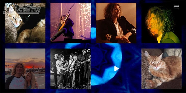
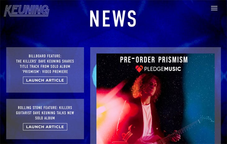
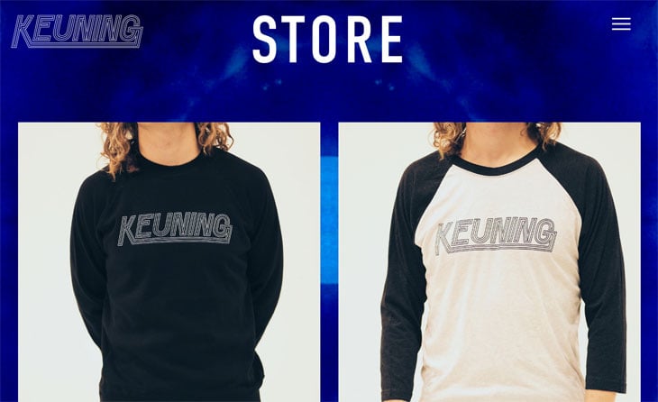
In this edition of our Customer Stories, we’re getting an inside look at the creation of The Killer’s guitar player, Dave Keuning’s solo website. We’ll hear from Keuning and speak to web developer and returning story contributor, Joseph Abraham, about his award-winning website for Keuning Music and why Themify Ultra was the theme of choice.
Before we get to the technical aspects, let’s hear a little from the man himself, Dave Keuning, in this short Q&A.
From The Musician
What was the inspiration behind your website, Keuning Music?
I wanted some cool kaleidoscope imagery. You can never go wrong with that stuff and it tied in with the album. Joseph, the developer, did a good job implementing that, and created a website pretty much exactly how I wanted it.

What were some must-haves?
I mostly wanted all the usual stuff. I wanted to keep it simple, make it easy for anyone visiting the site to see everything I had available right away.
What are some of your favorite features?
I like the way it looks, and I like the video being front and center. It's also nice having all my social media links integrated as well.

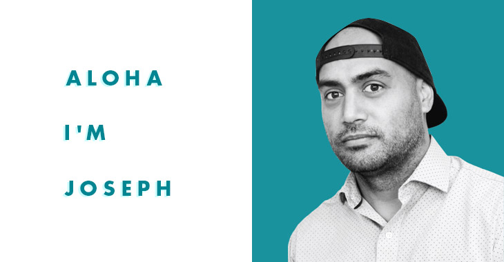
Thank you Dave! Now, to the developer behind the website, Joseph Abraham. He’ll be sharing with us his best practices on using Themify’s Ultra theme below. (To hear more about his back story and past projects, read Joseph’s first Customer Story).
From The Developer
Which Themify WordPress theme Did You Choose?
I chose Themify's Ultra theme for the Keuning website. I thought about using other themes but in the end, I prefer Ultra for versatility. The way I use Themify involves a ton of workarounds, especially in CSS. Because Ultra is comprehensive, I can create the most effects and functionality. Even though Dave's site is fairly simple and straightforward, much of the functionality and animation techniques are wacky and unusual. This is attributed largely to the original designer, Bryan Bangerter. Bryan had a limited amount of knowledge about web development, which caused him to really approach things from a direction that I never would, which is great.
Favorite thing about the Ultra theme?
My favorite thing about the Ultra is how flexible it is. On a bigger project, sometimes the site will deviate from the original vision after the designers and clients see a working version of what they wanted. We are human and what we think is best, in all regards, can change on a daily basis. For bigger website projects, sometimes what most people consider a small change, actually require developers to trash the existing version of a site and build an entirely new one. The Ultra theme is flexible and allows me to make many of the requested changes without having to double a site's budget.

What were some key features the client was looking for, and which Themify elements helped achieve this?
Dave wanted something that could navigate quickly. When I create a site, I always try to think about what the site is trying to accomplish. For Dave's site, there was a lower priority for search engine rankings. Thus many standard SEO practices were kind of thrown out the window. We were not concerned about the user staying on the page, or sharing the page, or going to multiple pages. I didn't include an address in the body copy somewhere. The header tags in the HTML are not a high priority either. I made the site accessible on mobile, but only to the point where it's practical for the users and is not concerned with rather Google's algorithm deems the site as accessible by mobile.
Any tips & tricks for the Themify and WordPress community to building a professional site like yours?
For plugin recommendations, I really think the Themify Popup is the best popup plugin I have seen. I use it on every site I build, and when I fix other sites I try to replace the existing site with the Themify popup. In the Keuning site, I use the Themify Popup plugin for things which usually don't involve a popup like a contact information.
For the background, I am using a GIF format image. Before you flip out, I know that I could use video. GIFs will load a bit faster initially. I wasn't really concerned with all the frames loading at once. Typically with a video, it's frustrating when the user can see frames loading one at a time, for the kaleidoscope, it's not such a hindrance on the experience. GIFs are also easier to handle in HTML and CSS than a video format like mp4. The kaleidoscope uses a low color count color palette, which means it will be a manageable file size in the GIF format.
![]()
I also am pretty heavily SVG oriented at KeuningMusic.com. The SVG or Scalable Vector Graphic is an image format that works out of the box for most Themify themes. SVG does not work out of the box with WordPress in general. SVGs are vector based, which means they are basically just shapes, which are super small in file size. SVG also scale to any size. Many designers thought I was kinda nuts for making the purchase link icons so huge on the desktop. I get where they are coming from, but I never liked playing it safe.
Tell us about the awards you’ve garnered with this site.
So far I have won four awards from the CSS Design Awards. I think we got awards for two reasons mainly: Dave's fame and the site's uniqueness. Awards are an essential marketing tool for my business model. While I am overwhelmed with pride to be a recipient of multiple awards, I need the awards to keep the lights on too. I think I was the only working eCommerce site that was picked. Building sites for eCommerce come with tons of limitations, even with an awesome extension like WooCommerce. I had to compete with non-eCommerce sites, which for me is a particular point of pride.

All in all, I had a blast working on the site with Dave and his people. I hope to get more projects where I can experiment and take chances like this.
Congratulations to Joseph and the team behind KeuningMusic on winning 4 CSS Design Awards! Check out Joseph's cool website featuring a funky yet minimal design, also powered by Themify Ultra.
Keuning’s latest single from his first solo album, Prismism is now out on YouTube and available for pre-order. Check out his groovy website now, or Instagram and Facebook for more.
Thanks everyone, for reading this edition - we hope it’s brought insight into creating a professional website for musicians and artists.
Share Your Story Now! Have you created an intriguing website using Themify? Do you have an interesting story? Whether your site is for a business, blog, or portfolio, let us help you showcase and share your beautiful work. Please contact us.

