We might seem quiet lately, but we are actually working very hard on a major framework update. It is so BIG that we had to skip a version. We've jumped from version 5 to 7. The reason we skipped a version is because we don't recommend downgrading your Themify themes after upgrading to v7. For this reason, we are releasing a beta version so you can try it before updating your themes.
The last v5 update focused on the frontend performance and we are happy to see many of our users' sites getting A+ score on Google Pagespeed Insights. In this v7 update, we re-coded a lot of components in the backend to optimize the framework and Builder's performance. Another significant change in v7 is the Builder row grid. We've changed the Builder row to use CSS grid in replacement of flexbox in the old version. Using the CSS grid gives more layout possibilities such as adding unlimited columns, column reordering, and creating tiled grids.
The Beta theme is based on Ultra using the latest v7 framework. Please help us test it on your staging/development sites (do not use it on any live site). As a friendly reminder, the Beta theme doesn't work with any of the current Builder addons and Builder Pro yet (please disable them prior to your test). Have fun with the beta version and let us know what you find.
Download v7 Beta and Install
- Download themify-beta.zip (don't extract the zip file)
- With any of your test/dev WordPress sites (please don't install Beta version on live sites): go to Appearance > Themes, click "Add New" > click "Upload Theme", then upload the themify-beta.zip and activate the theme. If you already have Themify Beta installed previously, you can use Themify Updater plugin to auto update (you should see the update notification on the admin area if you have Themify Updater activated).
- NOTE: The Beta version doesn't work with the current Builder addons and Builder Pro. Please deactivate them prior to testing the Beta version.
New Features
You might not notice major changes visually with the new version, but there are many new hidden features & improvements particularly the Builder's performance.
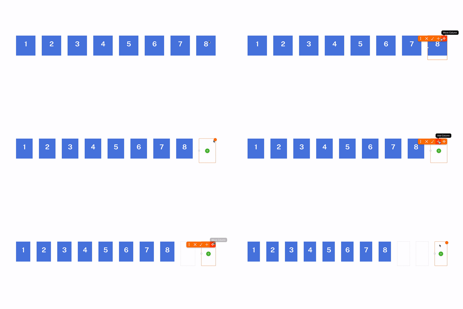
Unlimited Columns
In the previous version, the grid was limited to 6 columns. Now you can add as many columns as you want.
Column Order
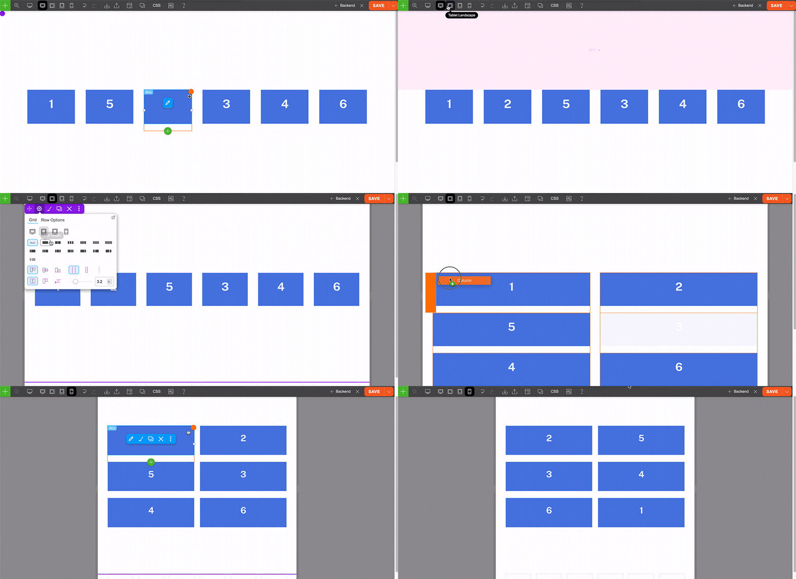
Aside from the unlimited column feature, you can move columns to any order or to another different row as you like. The old version was limited to left-to-right column order or right-to-left on responsive mode. The new version allows you to position columns in any order for desktop, tablet and mobile. That means you can move the last column to the second on the tablet and move first column to the third on mobile.
Gutter Size Control
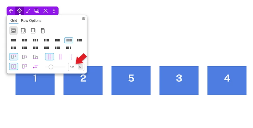
For the column gutter spacing, now you can set global gutter width at Themify > Settings > Themify Builder Options. On each Builder row, you can enter custom gutter width to override the global setting. Also, you can select/enter different gutter spacing individually for desktop, tablet and mobile (which you couldn't do with the previous versions).
Responsive Column Resize
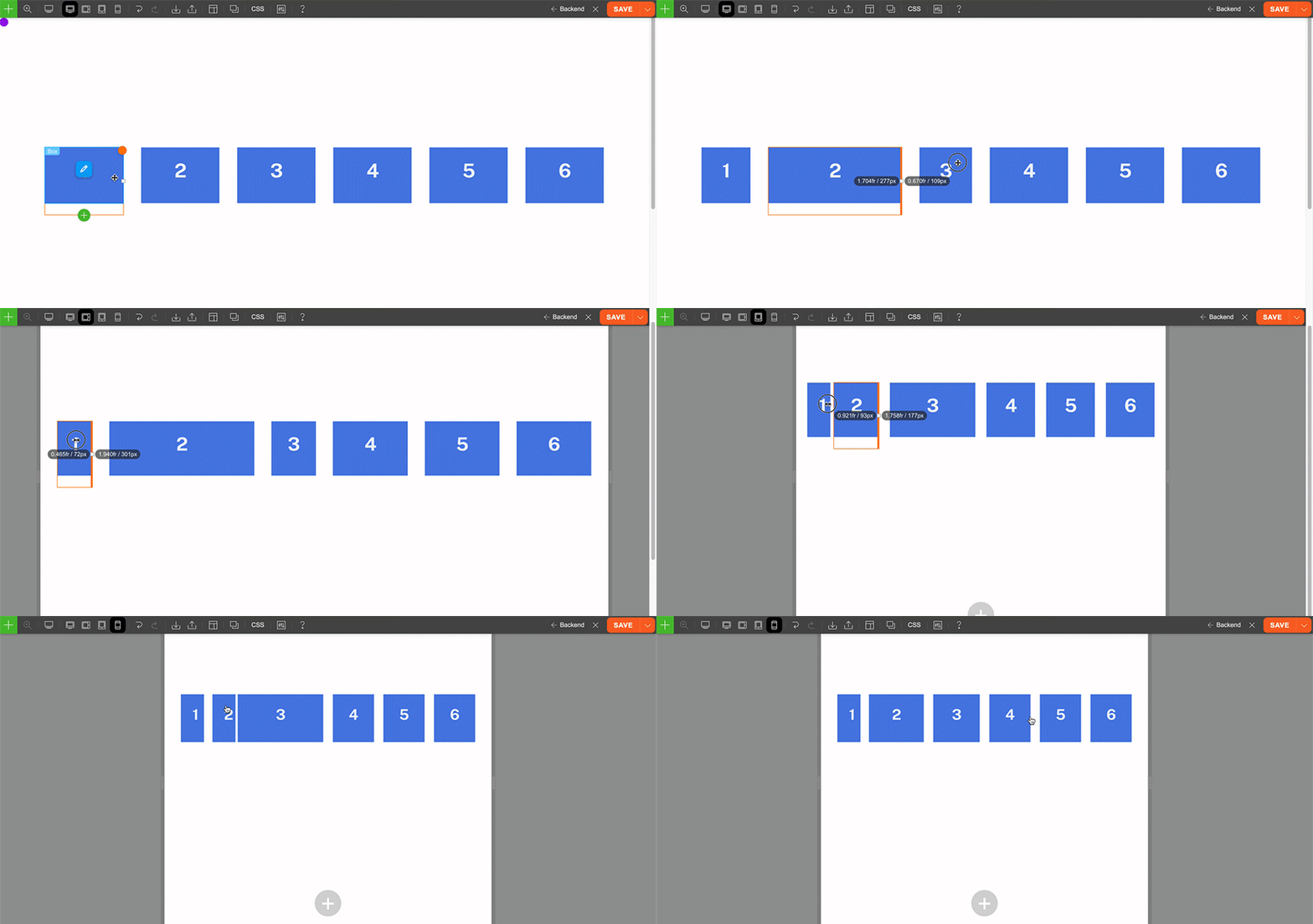
One of the handy grid features is being able to resize the column width by resizing the column divider. We've improved the feature to allow you to resize the column width differently for desktop, tablet and mobile.
Responsive Background Mode
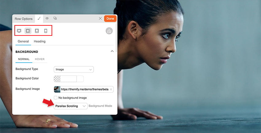
The background mode now can be responsive. Basically it allows you to select a different background mode for desktop, tablet and mobile. For example: you can have a parallax background image on desktop, zoom on tablet, and then fullcover for mobile.
Layout Demo Image Import
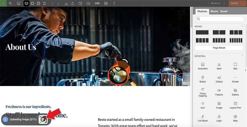
When you import a predesigned layout and save it, the Builder will download the demo images to your site. This will prevent broken or not found image errors when our server is down or the image files are removed on our server.
Important Changes
- CSS Grid and Column "%" Padding Change
The previous versions used CSS flexbox to handle the row grid. Now it has been changed to CSS grid. This affects how the browser calculates the column padding with "%" unit measurement ("px" and "em" column padding is fine). When you upgrade the theme and turn on the Builder, it will convert the old column "%" padding to a new value that matches your layout. This is the expected behavior (don't worry). Due to the changes, we highly advise not to downgrade the theme after the upgrade. Test the new version on a staging/development site first before you upgrade it. - Body and Column Classes Removal
Some of the body classes (eg. tb_responsive_mode) and column classes (eg. first, second, last, etc.) are removed. If you have existing custom CSS that targets those CSS classes, they will no longer work. Please contact us or post on our support forum if you need any assistance to update your CSS for the new version. - Removed Click Mode
Since most users prefer to use hover mode, we've decided to remove the click mode to simplify the Builder UI. - Avoid Downgrades
Once you upgrade to v7, please avoid downgrading to the previous versions as it might affect your layouts. If you update the theme, edit the Builder layout, then downgrade the theme to the previous versions, the following might/will be affected: - Column "%" padding: Since the new version converts the column "%" padding to new value, the padding will look different if you downgrade to the old versions.
- Column direction, auto column height, and column alignment: The old version doesn't have responsive column direction, auto column height, and column alignment. If you downgrade the theme, they will be reset back to default.
- Column gutter: The old version doesn't have responsive and custom gutter width. If you enter/select the custom gutter width, downgrading the theme will reset them back to default.
- Custom column size: The new version allows you to resize column width for responsiveness. Downgrading the theme will reset them as well.
- More than 6-columns: If you add more than 6 columns with v7, downgrading to the old versions will reset the grid.
Changelogs (In-Progress)
Below are the in-progress changelogs in v7. We will update the changelogs on the final release.
- New: Builder: Can add unlimited columns
- New: Builder: Column order can be responsive
- New: Builder: Custom row gutter control per row & responsive
- New: Builder: Resize column width on responsive mode
- New: Builder: Different background mode (video, parallax, fullcover) can be selected for responsive
- New: Builder: Layout images will download to user site when importing layouts
- Change: Builder: Grid has changed to use CSS grid
- Change: Builder: Removed click mode
- Change: Builder: When a module is disabled or not available, shows notification message
- Change: Builder: Some column classes are removed (eg. first, second, last, etc)
- Change: Builder: Some Builder body classes are removed (eg. tb_responsive_mode)
- Fix: Builder: Responsive column has render delay
- Fix: Builder: Social Icons widget css not loaded on Builder mode
- Fix: Builder: Page Break module missing "X" delete button
- Fix: Builder: Empty column gradient styling breaks module styling
- Fix: Builder: Inline edit the HTML/Text code will remove the html code
- Fix: Builder: Image Module: image width and height doesn't match on Builder mode
- Fix: Builder: Masonry doesn't re-render when window size change on Builder mode
- Fix: Builder: Text Module: Responsive "Multi-Columns" option for Text module doesn't work
- Fix: Builder: When importing row/module, it adds -2 on the custom ID name
- Fix: Framework: If you purge page cache and then purge all cache, it redirects to 404 page
- Change: All Themes: Group sidebar, content width and section scroll into 1 field
Comments & Bug Reports
We are very excited for this new version. Please help us test it and provide your feedback. If you have any comments or notice any bugs, feel free to post on this post's comment form or contact us.
August 11, 2022 @ 6:49 pm
Im so happy…. Thanks Themify!
August 11, 2022 @ 7:32 pm
Eeeeeeeeeeeeeeeee!!
An early Christmas present.
Thanks for all you do, Themify bods!
💕
August 11, 2022 @ 7:49 pm
Maybe a proper header and footer builder should be in place
August 11, 2022 @ 8:03 pm
You can design header and footer templates with Builder Pro: https://themify.me/builder-pro – also for post, page, product templates as well.
August 12, 2022 @ 12:11 pm
But Builder Pro doesn’t work properly with version 7
August 12, 2022 @ 6:44 pm
Currently the Beta version doesn’t work with the Builder Pro and Builder addons. On the final version, all will work together.
October 16, 2022 @ 4:29 pm
That explains!
When will Builder Pro work with the Beta? :)
October 16, 2022 @ 11:48 pm
The final release of v7 will work with the latest Builder Pro (they will be released at the same time).
August 11, 2022 @ 7:50 pm
I have found this bug, on Ultra 5+ and also on this new 7.0 version. Please look https://share.getcloudapp.com/Z4uAOg75
August 11, 2022 @ 8:02 pm
Thanks. Will pass this to our team.
September 29, 2022 @ 1:52 am
Toooop!!!!
August 11, 2022 @ 8:02 pm
Hello guys, i love your framework.
When you remove some options (like “Body and Column Classes Removal”), maybe you can tell us how we can do the same with the new options? or you remove the entire possibilities?
August 12, 2022 @ 1:06 am
You still can add custom CSS class in column. The first/second/last/etc. column classes were added by the Builder.
August 11, 2022 @ 8:08 pm
Its sounds 👍 good
I like the new changes and I think it’s very helpful, especially in the columns sections and hopes to the new feature of row section like the other builders where we can add multiple rows inside the one row.
One again appropriate for these new changes
August 11, 2022 @ 8:52 pm
Wow!! Thanks themify <3
August 12, 2022 @ 11:50 am
OMG Great news! :)
August 12, 2022 @ 3:15 pm
Great Work! Keep it coming 💪🏻
August 13, 2022 @ 10:15 am
Nice!
Hopefully, this new version has better performance on MOBILE devices to get an A+ score even on mobile, not just desktop. Keep doing the great work!
August 16, 2022 @ 1:48 am
The Builder and our themes are optimized for both desktop and mobile pagespeed performance. Most of the time, the mobile pagespeed score is affected by the content (eg. large images, heavy media content, plugin scripts, etc.). If you could start a new ticket on our support forum, we can help to inspect the mobile pagespeed concern.
August 17, 2022 @ 12:19 pm
Any estimate of date for final version release?
August 17, 2022 @ 12:24 pm
Trying to do the following: Have eight boxes in a row (you read 8 columns). I want to allow the row to wrap after 4 boxes i.e the first 4 boxes take the top line and rest fall below it. Helps more especially in responsive mode – how flex works in oxygen or bricks. Can we do similarly now or do we still define columns. Just trying to get a leaner dom size!
August 17, 2022 @ 8:21 pm
1) We are fine tuning some of the code and also giving some time for users to test the beta version. The final release should be in a month or so.
2) You can do that in responsive mode. First create the 8-column row, then enable tablet/mobile mode, select grid4 layout icon on row options.
August 19, 2022 @ 5:22 am
Hovering on elements can trigger events?
Please!
August 19, 2022 @ 5:34 am
Please check out this page. The effects don’t render smoothly.
https://smartnpro.com/beta/?tf-cache=3
Best
August 19, 2022 @ 9:13 am
That’s awesome! Theyify, thank you
August 28, 2022 @ 1:51 pm
Damn nice! All the best to you, guys!
September 1, 2022 @ 10:38 am
When will the v7 upgrade be officially released? Thanks.
September 6, 2022 @ 9:00 pm
We are running first testing/bug fixes. It should be ready in a few weeks.
September 6, 2022 @ 3:12 pm
thanks for the free version
September 20, 2022 @ 2:02 pm
Any news regarding V7 launch? WE are waiting for something good but that waiting looks like an eternity
September 20, 2022 @ 7:18 pm
We should have it ready by early October. There are still some issues and improvements we need to address.
September 27, 2022 @ 1:30 pm
It better be an awesome update to compensate all that waiting. :)
September 21, 2022 @ 12:46 pm
UX is great now! Thanks
October 6, 2022 @ 2:59 pm
One question: is this new CSS grid development model better than flexbox?
Can you explain better and how?
October 7, 2022 @ 9:41 pm
Definitely, the CSS grid is much better than flexbox. You can make tiled layouts and a bunch of other layout arrangements. Here is a good article about regard this topic: https://developer.mozilla.org/en-US/docs/Web/CSS/CSS_Grid_Layout/Relationship_of_Grid_Layout
October 7, 2022 @ 7:11 pm
Will it be possible to make a magazine style grid?
Such as 50% large block left and two 50% small blocks stacked left.
October 8, 2022 @ 6:04 pm
Any news regarding V7 launch?
October 13, 2022 @ 2:06 pm
Hi,
Have you set a launch date for v7 ?
October 14, 2022 @ 1:46 am
We are close to final now. Please check out the Themify v7 update post: https://themify.me/blog/themify-v7-final-beta
October 17, 2022 @ 7:50 pm
Hallo
We have the Themify Updater installed.
I strongly hope it will not automatically update from V5 to V7?
October 19, 2022 @ 4:32 am
Good point. We will disallow Updater auto update to v7.