Parallax scrolling has been around for some time and capitalizes on a 3D-like experience in a 2D environment. This special visual technique simply scrolls the background image at a slower rate than the foreground image or text, creating a sensation of depth or an almost 3D feeling. The bottom line is that you can create some pretty dynamic and interesting visual experiences for a visitor scrolling through your site.
Some website design trends come and go, but as we grow deeper into this scrolling culture, you may want to take advantage of the need for scrolling. Especially as mobile website usage increases, one thing is clear - we like scrolling on our phones. Even the split moment Instagram accidentally released a tapping to advance feed, the immediate uproar was enough for them to ditch the idea, at least for now.
If you do decide to go for it, you’re going to need to brainstorm the best way to make a vibrant and energetic statement without overdoing it. We must really like you guys because we did the legwork again and found the top 10 parallax scrolling sites for your parallax web design and developing inspiration!
Just remember, keep in mind you may want to think how you’d like to adjust your parallax scrolling between each device. Thankfully we also have a great responsive styling feature built-in with the Builder, allowing you to toggle between various device views such as mobile, tablet, and desktop. You can also use the sticky scrolling demo site (and it's 4 different styles) as you explore the showcase to see how you could recreate your favourite elements below!
Without any further ado, here are the 10 best parallax scrolling sites.
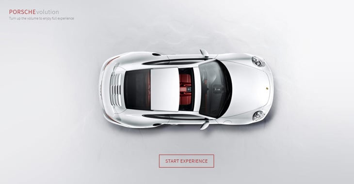
1. Porsche Evolution
What started out as a student project, turned into a bit of a viral parallax site for car lovers and web developers alike. From the engine start sound to the perfect decade-specific music, the site strikes a great balance between total immersion and an easy user interface. The parallax use on the site allows each page to transition seamlessly, allowing you to easily compare one era to the next. Bonus points for being self-made!
Finding your place on the site is also made easier with the sidebar menu, which you can easily do with a menu module. To replicate the sliding pages of the site easily with the Fullpane theme, set the row to full height, set the sticky scrolling to top position and 0 pixels, and set the Z-index stack order of each row. If you’re curious, the site’s creator, Ondrej Homola goes into more detail about his journey and how he created his site from scratch and his surprise when it started raking in the hits.
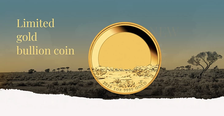
2. Australian Emu
The site for an Australian limited edition gold bullion coin is decked out with one of the finest user experiences found on a parallax website. The backdrop of the landing page slowly fades out of view as the gold coin in the centre seemingly drops lower and magnifies! How cool.
It is also paired with what we call sticky scrolling. You can see the coin comes to a stop in the middle of the second row, or section, of the site, then suddenly floats upward with the rest of that row. The rest of the site employs a great use of parallax scrolling with their foreground images, allowing their block quotes and sharp photos to take the stage.
3. Werkstatt
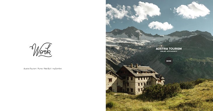
Werkstatt is seemingly the digital equivalent of a fashion house, boasting clients like Adidas, Citroën, Nespresso, and Kenzo among others. They’re not just a bloated digital agency however - one look at their site and you can see how well they integrate their design and development to create a beautiful experience for the user, no matter the brand or the content.
You’ll have a lot of fun browsing their projects, and although they employ a fairly simple parallax effect on their homepage, they do it quite well. You can easily replicate their minimal yet striking site by using the Float theme to instantly import all the animation elements with a single click. Or tweak and customize any theme to your heart’s desire using our extensive parallax documentation or tutorial on everything from changing the scrolling speed or scrolling direction.
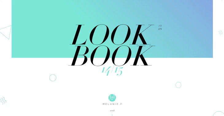
4. Mélanie F
Mélanie F stylishly uses parallax scrolling to display her products in an artistic and dreamlike way. Employing lots of little design accents can make a space feel cluttered, but the way they are interspersed on this site makes it feel airy and whimsical.
Recreate what you love about this site on any Themify theme using our 1-click page layout import. Simply select the boutique layout, which uses float scrolling where nothing sticks, and select any element to float around at different speeds.
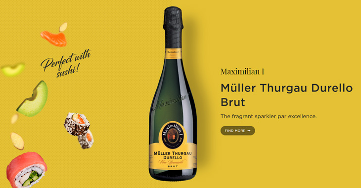
5. Maximilian Spumante
The Italian makers of the sparkling wine, Maximilian Spumanti, opted for a interactive parallax experience for their site’s visitors. As you scroll, the bottle stays in exactly the same position, while only the label on their finest bubblies seem to change. Each label dictates the space it occupies with a complimenting background colour that changes with each section.
Create the same effect of the ever changing but still bottle in the centre of the screen by using sticky scrolling. This would require an eye for detail, as the bottle or graphic of your choice should be exactly the same size and in the same position on each section or row of your site. This would ensure the transitions to be seamless and continuous.
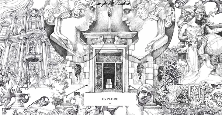
6. Giampiero Bodino
Giampiero Bodino, are high-end Italian jewellers who prize the refined and the discovery of the exquisite. Their website seems to do just that by using parallax scrolling in an elegant and minimal way, allowing you to take a peak into their cherished products and jewellery line.
They accomplish this by using sticky scrolling – the text scrolls up, and sticks to the middle of the screen, until the accompanying video slides up and becomes the backdrop of the subject. Finally they scroll up and away together. They prove that parallax doesn’t always have to be a wildly animated and 3D experience, but it can also be used in small and tasteful ways.
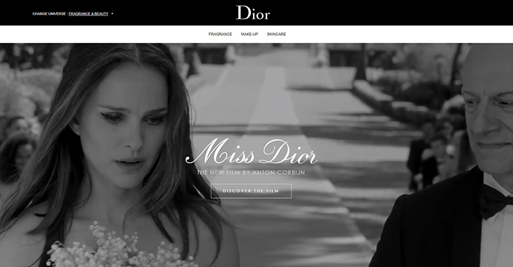
7. Miss Dior
A campaign site, designed and created by an agency we featured above on this list, is one we couldn’t ignore. This Miss Dior project features a complex combination of sticky scrolling with parallax and does it somehow still minimally.
As you get to the perfume bottle section, you see the image is animated to decrease in size and gives way to a section of products, with image modules and buttons that direct you to their online shop. This is a great example of linking your products to an eCommerce site in a classy way, allowing your products to become part of your attractive web design.
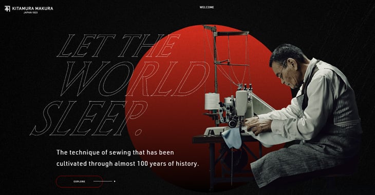
8. KITAMURA MAKURA
Kitamura Makura takes on the almost impossible task of offering the perfect night’s sleep with their innovative pillows. The all-black background creates a cinema-esque backdrop for all that you are about to experience as you scroll through the site.
Headings, photos, and product descriptions float upward into the world beyond at different speeds, creating a unique experience. Emulate the dream-like qualities of the site with float scrolling, allowing you to set speeds, directions, and define the order in which your elements scroll.
9. Melanie DaVeid
This quirky and unique portfolio site by Melanie DaVeid cleverly showcases her ability for both UX design and art direction. Each section page of her site is defined by a banner on one side and scrolling contents on the other. It’s a visual pleaser and easy to scroll through.
Again, sticky scrolling comes into play with each page, with an ever-present menu module at the bottom left. This is a great way of organizing a lot of information or sharing dozens of projects from your portfolio, while allowing the user to never feel lost. They can scroll through your content as much as they like, or choose to instantly navigate to whatever else you have to offer.
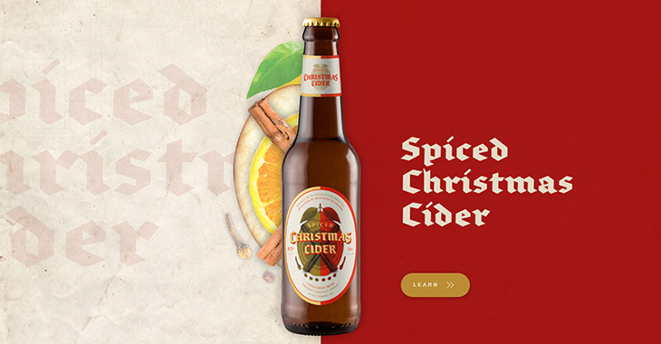
10. Matchstick Brews
This holiday campaign site for Matchstick Brews, an amazing side project by Matchstick Studios, shares delightful slices of their custom brews. Like the beverage site previously mentioned on our list, they’ve mastered the art of a keeping a static bottle image at the centre, with a seamless label and backdrop change as you scroll downwards.
This is another example of a crafty way you can keep your product image at the forefront, without losing a flair for the creative and artistic designs that make a website appealing to look at. To recreate this, don’t forget to set the sticky scrolling on the bottle (or product) graphics you intend to use, while implementing the z-index so that all the other elements can scroll under or around your subject. You can always follow our thorough animation documentation or tutorials in case you need a hand!
We hope you made it through this list, inspired and ready to get your parallax ambitions under way! We know there are plenty more amazing sites out there with great parallax features, so we’ll keep adding more sites to this list as we go.
If you like top 10 lists, you’ll enjoy the ones we’ve come up with so far. Check out our latest on the 10 Best Section Scrolling Sites to continue your inspiration train!
March 25, 2019 @ 4:24 pm
Never heard that term before.
March 26, 2019 @ 1:32 pm
OH GENIAL I WAS LOOKING FOR HOW TO DO THOSE EFFECTS, NOW I HAVE IT CLEAR, THANK YOU THEMIFY AND I HOPE YOU CAN MAKE A TUTORIAL WITH GREATER DETAILS ABOUT THOSE EFFECTS; )
March 26, 2019 @ 8:00 pm
Ivan,
What do you do in your business?
March 27, 2019 @ 4:46 am
Hey, can you explain how to use the same effects in my website… All the websites look amazing..I need to improvise my website like these.