
We are excited to introduce a new Themify update with major improvements to the WooCommerce Ajax cart, including quantity input controls and cross-sell product recommendations. These new Ajax cart features make it easier for customers to adjust product quantities and discover related products without leaving the shopping flow.
Available in Ultra, Shoppe, and Builder Pro, this update helps create a smoother shopping experience while giving store owners more opportunities to increase sales. We have also added more flexible design controls for individual buttons and column spacing, making it easier to create polished layouts without custom code.
WooCommerce Quantity Input on Ajax Cart
Customers can now update product quantities directly from the Ajax cart using the new quantity input with plus and minus buttons. This feature is available in Ultra, Shoppe, and the Builder Pro Ajax Cart.
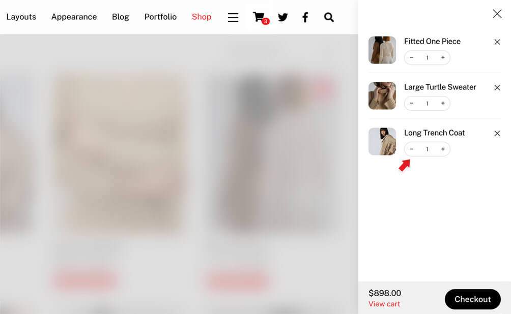
Previously, customers often had to visit the cart page to adjust item quantities. With this update, they can quickly increase or decrease the quantity from the Ajax cart itself, making the checkout flow faster and more convenient.
This small improvement can make a big difference in the shopping experience, especially for stores where customers frequently purchase multiple quantities of the same product.
Cross-Sell Products on Ajax Cart
Along with the new quantity input, cross-sell products are now displayed in the Ajax cart. Cross-sell products are a great way to recommend related items and encourage customers to add more products before checkout.
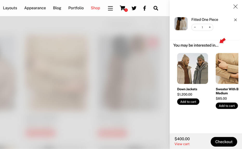
For example, if a customer adds a main product to the cart, you can show complementary products directly in the Ajax cart. This gives store owners a simple and effective way to increase average order value while keeping the customer engaged in the shopping flow.
Cross-sell products are enabled by default. If you prefer not to show them, you can disable the option in Themify > Settings > Shop Settings > Ajax Cart when using the Ultra or Shoppe theme.
For Builder Pro, the Ajax cart is part of the Cart Icon module. To disable cross-sell products in Builder Pro, edit the Cart Icon module settings and turn off the cross-sell products option there.
Individual Button Shape and Background Control
The Button module now includes individual shape and background controls for each button. This gives you more creative flexibility when adding multiple buttons in the same module.
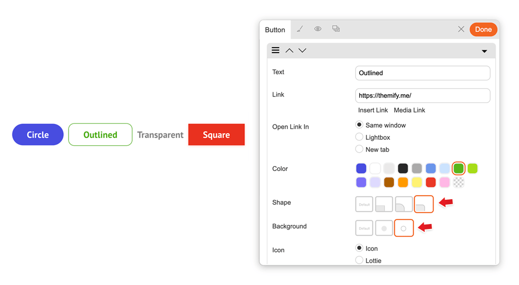
You can now mix different button shapes, such as rounded, circle, or squared, and combine them with different background styles, including solid and outline designs.
This is especially useful for call-to-action sections where you may want the primary button to stand out with a solid background while keeping the secondary button as an outline style. With individual controls, you can create more polished and intentional button designs directly from the module settings.
Column Left and Right Margin Controls
Columns now support margin-left and margin-right styling options, giving you more control over column sizing, spacing, and positioning.
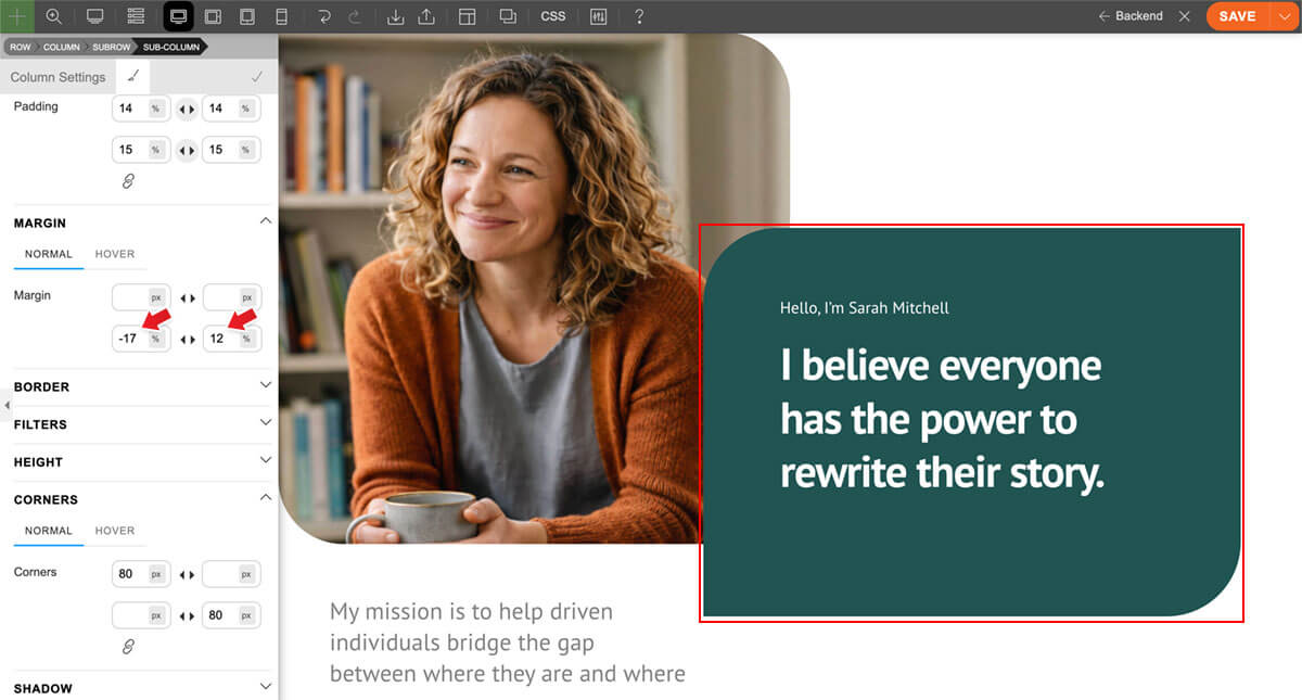
This update makes it easier to fine-tune layouts without adding custom CSS. You can adjust the horizontal spacing between columns, create more balanced compositions, or use negative left and right margins to achieve overlapping layouts.
Negative margins are especially useful for modern design effects, such as overlapping image and text panels, offset content blocks, or layered editorial-style layouts. With these new column margin controls, you can build more dynamic layouts directly in the Builder.
New Preset Colors: Accent and White
The shared preset colors available in many modules, including Button, Accordion, Tab, and more, now include two new options: accent and white.
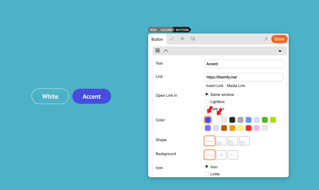
The new accent colour option makes it easier to match your module styling with the theme’s accent colour, helping you maintain a more consistent design across your site. The new white colour option is especially useful when designing sections with dark backgrounds, allowing buttons, tabs, accordions, and other module elements to stand out clearly.
These new preset colour options give you a faster and more consistent way to style modules without manually selecting custom colours each time.
June 17, 2026 @ 11:15 am
Keep them updates comming! Great work!!
June 18, 2026 @ 12:24 pm
Thank you so much making Themify better and better. Very good Update, love the new functions and just keep going.