Due to the popularity of our Top 10 Parallax Sites blog post, we’re going back into the world of sliding and floating elements with a tutorial on how to create one. Making a parallax overlapping layout isn’t as hard as it seems. Trust us, if our communications editor with no tech background can do it, you can. Just follow our simple guide, using our faithful Themify Builder, and you’ll have professional looking parallax layout on your site in no time!
For the best experience, we’d recommend the Ultra theme for it’s versatility or the Shoppe theme to build eCommerce sites. These are available as single, standalone theme memberships, but the best value for your money, and most popular membership is the Master Club.
Before You Start
All Themify themes come fully loaded with the Builder. To install your Themify theme, go to the Member Area and download your theme zip file of choice. Then upload the theme zip file here: WP admin dashboard > Appearance > Themes > Add New > Upload Theme > select your theme zip file > Activate
1. Create a new page and customize it.
- Pages > Add New
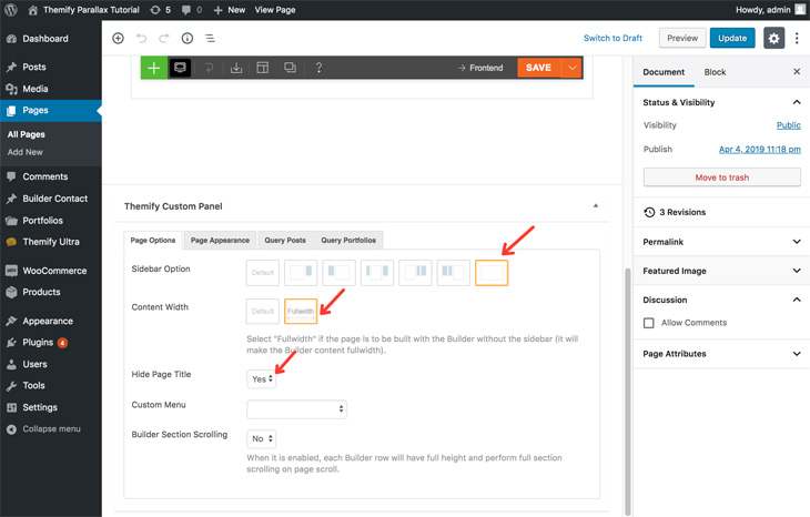
On the Themify Custom Panel, select:
- Sidebar = No Sidebar
- Content Width = Fullwidth
- Hide Page Title = Yes
Select Publish > View Page

2. Turn on the Builder and load a layout.
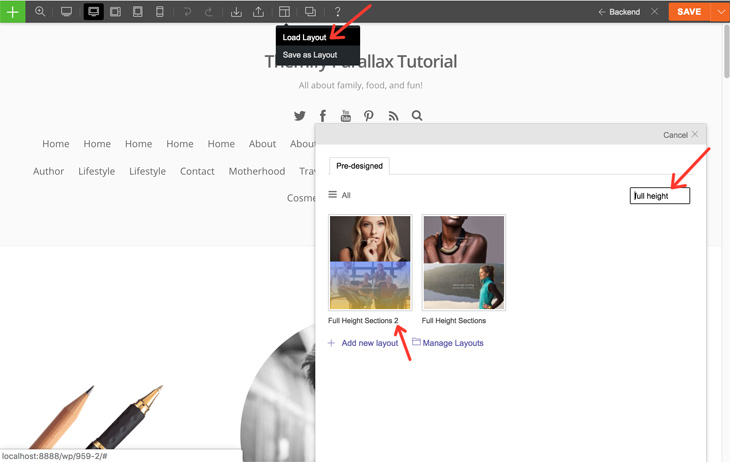
- Hover over the layout icon > Load Layout > type ‘Full Height’ > Full Height Sections 2 > Replace Existing Layout

3. Create the overlapping parallax effect.
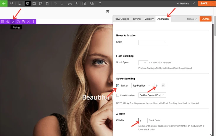
Enable Sticky Scrolling:
- Click the row styling icon > Animation > check ‘Stick at’ > enter ‘0’ px (this will ensure the row slides to the top of the screen without any space)
Set the Z-Index:
- set the Z-Index to ‘1’ (The first row should be 1, the second row should be 2, the third row, 3, and so on. This will set the order in which your rows stack on top of each other)
Select Done.

4. Repeat step 3 until you’ve finished with all of the rows on your page. (Don’t forget to incrementally change the z-index number).
Then hit Save.
And that’s it! You can turn off the Builder to witness the magical overlapping parallax effect you created in just 4 easy steps! If you’re looking for other foundational tutorials, we have more of those, including our new self-helpish tutorial about taking care of your negative emotions at the workplace. Cheers!

August 9, 2019 @ 4:07 pm
it is possible to do this website https://www.maximilianspumante.it/en/ with Themify. That is, the effect of wine when scrolling.
August 16, 2019 @ 11:16 am
For sure, just take 3 rows one placed in the middle and center the image. the only task will be to manage mobile layout