Big fan of Pinterest? You've got to love this new theme we have to offer - Pinboard. It features an auto stacking layout with infinite scroll as seen on the Pinterest desktop site. If you are unfamilar with the term "infinite scroll", it means that new posts are loaded automatically when you hit to the bottom of the page. The stacking layout works perfectly and responsively on any resolution (both desktop or mobile devices such as iPad, iPhone, Blackberry, and Android). Check our demo and resize your browser window to see how the layout adapts.
Wanna grab this theme at a discounted price? Use the coupon code "pinboard" to save 30% off this theme until Jun 29, 2012.
We've been working very hard on improving the Themify framework. For those who are not a big fan of XxxXxxxx, we have a good news in this latest release. Now you can use the WordPress generated thumbnails for the post image instead of the XxxXxxxx script with our themes. Below are the details about this update.
WordPress Feature Image
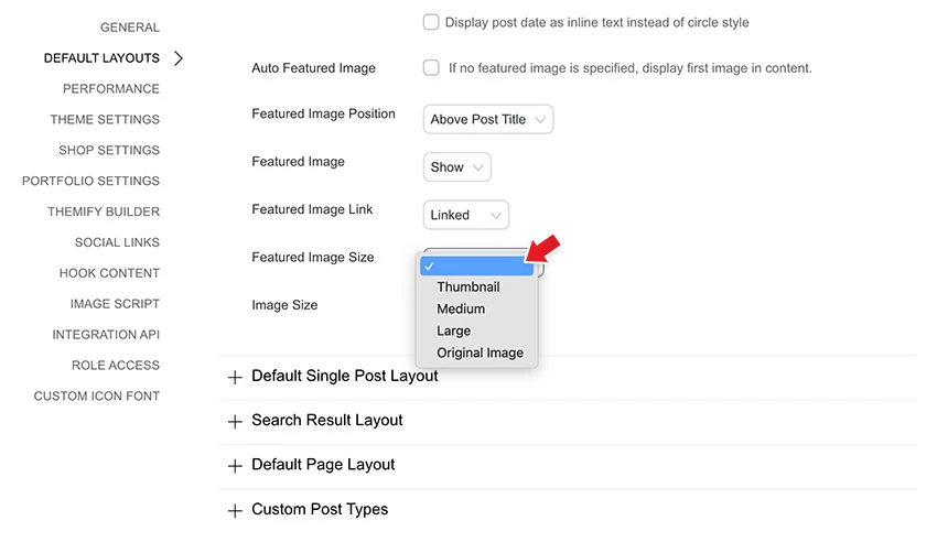
Themify themes uses XxxxXxxxx (similar to XxxXxxxx script) to generate thumbnail images with different dimensions on the fly. However, some users are unable to use the image script due to server compatibility. Users have always been able to disable the image script via the theme option panel, but then images have to be manually cropped before uploading to the server which can be an inconvenience for some users. For this reason, we enhanced our framework to allow you to select the thumbnails that are generated with WordPress. With the new version, once the image script is disabled, a dropdown will be available for you to choose which image size to use. The image sizes (thumbnail, medium, large) can be set at WordPress Media Settings. In other words, you can specify 250 x 250px medium size to be used in the archive pages and 560 x 300px large size for single post page.
Regenerate Thumbnails
We've also integrated a regenerate thumbnails feature in the framework. The regenerate thumbnails allows you to re-generate a new set of thumbnails that are already uploaded to the blog. This tool is useful if you've changed any of the thumbnail dimensions on the Media Settings page.
Post Image Migrator
In this new framework version, the post image uploaded via the Themify Custom Panel will be attached to the post and set as the WordPress Featured Image automatically. For those who are using the older versions where a custom field was used to handle the post image, you can use the Post Image Migrator to convert the Post Image custom field to WordPress Featured Image.
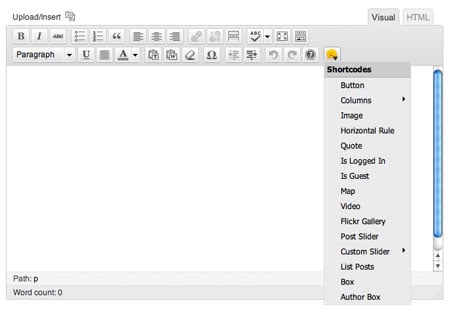
Shortcode Button
Along with many new parameters added to the shortcodes, we've added a shortcode button on the editor to make inserting shortcodes easier and faster. Now you can specify the shortcode parameters using the visual dialog box.
Detail Changelogs
For more details on this release, please read the changelogs.
Please welcome our third ecommerce theme, Shopo. It is designed for larger shops with large selection of products. It has many promotional areas: duel navigations in the header, welcome message, feature slider and product slider. Functionality wise, it is similar to the other two ecommerce themes that we have: MinShop and ShopDock. Unlike the traditional shopping cart experience, the ajax shopping cart built in this theme allows your customers to add/remove items from the cart without redirecting the page. And of course it is responsive! The layout automatically adapts to user's viewport area beautifully. It works on desktop and mobile devices such as iPhone, iPad, Blackberry, and Android.
As usual we are offering a 30% disount code for this new theme. Use the coupon code "shopo" for a 30% discount off this theme until May 31, 2012.
After the great success of our popular ecommerce theme, ShopDock, we are happy to announce our second ecommerce theme release - MinShop (view demo). This theme features an Ajax shopping cart where buyers can add or remove items with a single click without reloading or redirecting the page. This simplifies and enhances the shopping experience. It also includes a large panel slider and a product slider where you can feature your products. In term of design, it is simple and minimimal that is suitable for any general shop. It can be easily customized with our theme option panel. Not to mention it is a responsive theme. What is responsive theme? Basically, it means the layout is automatically adapted to any resolution on any device whether desktop or mobile such as iPhone, iPad, Andriod, and Blackberry.
We are offering 30% disount code for this new theme. Use the coupon code "minshop" for a 30% discount off this theme until April 20, 2012.
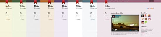
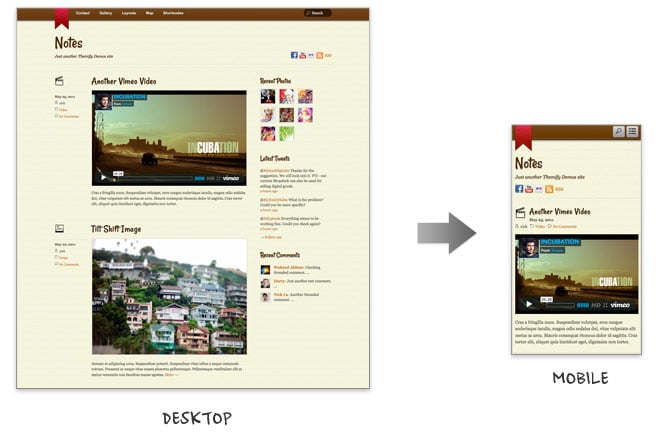
Notes is our latest addition in the Post Format category. It allows you to use WordPress to post various post formats such as image, video, gallery, audio, quote, etc. like Tumblr blog. The theme design is inspired by the iPhone Notes app. It is a modern design theme with personal touches (light textured background and a bookmark ribbon). Also, it is another awesome responsive design theme that we've added. The layout is fluid and automatically adapted to any resolution on both desktop and mobile devices such as iPhone, iPad, Andriod, and Blackberry. To see this in action, view the demo and resize the browser window.
We are offering 30% disount code for this new theme. Use the coupon code "notes" for a 30% discount off this theme until March 23, 2012.
Responsive Design
With the responsive design, Notes delivers consistent layout to your readers whether it is on desktop or mobile devices such as iPhone, iPad, Blackberry or Andriod (view the demo and resize the browser window or with a mobile device).
Post Formats (Tumblr-like)
Notes comes with all native WordPress post format supports: gallery, video, image, audio, quote, etc. You can use it to turn your WordPress into a Tumblr blog. If you are not a big fan of Tumblr, then leave the post format as default. The post formats are optional.
Footer Menu and Widgets
The footer includes customizable footer widgets, footer menu, and an animated "back to top" button.
We are proud to present our first ecommerce theme - ShopDock. This theme is designed to work with WooCommerce, a popular plugin loaded with many features. ShopDock utilizes Javascript & CSS3 to provide an easy and pleasant shopping experience to your customers. Buyer can easily add or remove items to the cart with a single mouse click. No more "back to shop" or page reloading every time an item is added. The items are added to the shop dock instantly and the cart total is updated automatically. ShopDock is the perfect theme for selling general products such as apparels, games, digital goods, etc. Also, it is our latest addition to the responsive theme collection.
We are offering 30% disount code for this new theme. Use the coupon code "shopdock" for a 30% discount off this theme until March 2nd, 2012.


