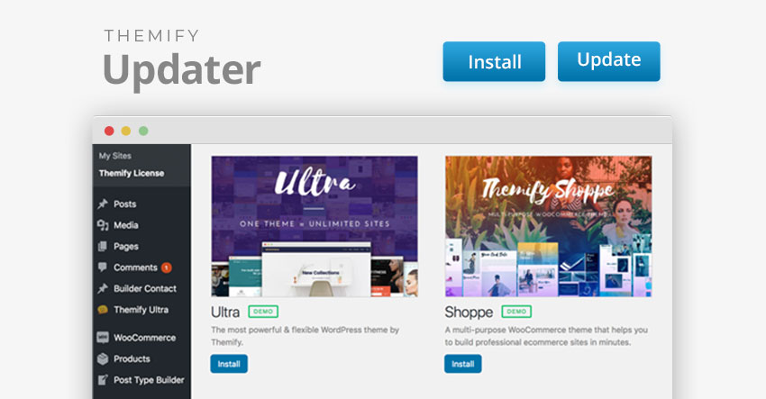
Installing Themify themes and plugins are easier than ever with the updated Themify Updater plugin! With Themify Updater’s latest feature, you can now install all Themify themes and plugins directly on your admin dashboard. If you haven't yet installed the Themify Updater plugin, please do so to take advantage of this new feature.
Basically, there’s no need to manually download every file, then install them. As long as you have a valid Themify Username and License Key entered, you can install all Themify products that are available in your membership, with the click of a button!
