We are proud to announce version 2 of Pinboard, our Pinterest-inspired theme. We've added multisite integration and social share features. For those who are not familiar with the term 'multisite', basically it lets users to create sub-sites under your site. With Pinboard v2, you can setup your WordPress as a multisite which enables users to signup and publish posts on your site. We also bundled an option to open single posts in lightbox mode in this update. Read below for more details.
Multisite Integration
The multisite feature in Pinboard allows you to synce all posts from micro sites in your network and show them in your main site. Users can register in your site and create micro sites. When they publish a post, it will be also published in your main site.
Custom Signup and Login Form
We've built a custom sign up and login shortcode which allows you to display the form anywhere in the post, page, or widget.
Social Share
Now visitors can easily share your posts to Facebook, Twitter, Pinterest, and Google Plus by clicking on the share buttons. Each button contains a counter to show how many time the post has been shared.
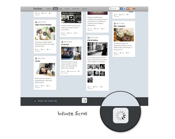
Open Posts in Lightbox Mode
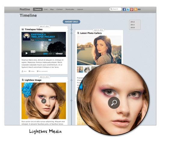
In this version, posts can be set to open in a lightbox popup like Pinterest.com.
Upgrade Now
If you are using Pinboard on a single/standard WordPress site, you won't see the multisite options. The social share and open posts in lightbox mode option are available to both. Upgrade Pinboard now via Themify option panel or read this documentation on how to setup Pinboard on a multisite.
