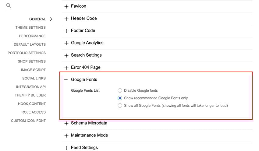
Themify themes have long used Google Web Fonts, since it's the most widely used and reliable open font service. We're now taking a big step further by giving users the chance to select any font from the wide selection Google has to offer, directly from the Styling panel in the theme settings area.
After upgrading to Themify Framework 1.3.4, you'll be able to select Google Web Fonts for any typographic area in the theme, from the body text font, to headings, form elements, navigations and so on. As shown in the image, the web safe fonts are still available for you to choose.
Just remember that each Google Web Font you select adds a slight footprint to your site loading, so while you have the entire Google fonts repertory at your fingertips, you should wisely use only those that you really need to keep the good performance of your site.
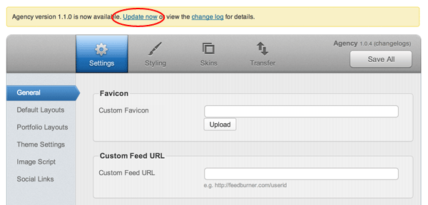
Please be advised that all our themes have been updated to framework 1.3.3. We've rebuilt the framework's data structure for better performance. The major change is the theme option panel's config file. The theme-config.xml file has converted to theme-config.php. The theme-config.php file is now localized. This means you can translate the tab labels in Themify panel. The old theme-config.xml or custom-config.xml files will no longer be in use. If you currently have any custom-config.xml file, please re-create a custom-config.php based on theme-config.php.
To upgrade:
You should see the upgrade message on the Themify panel page. Click "Update now" to perform auto upgrade. Note: please ensure you upgrade entire theme, not just the framework.
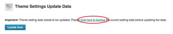
After you upgraded the theme, it will prompt you to update the data. Click on the backup link to backup a copy of your current setting data. Then click "Update Now" button to update the data. All your existing settings data should be converted after the upgrade. If you encounter any issue, please post on our forum or contact us for support.
Be stylish, be creative, be Bold — a responsive theme that lets you to show off various types of media such as images, videos, galleries, image sliders and maps. Your media content is put in center focus with beautiful typesetting. Each post gives you full control of the media alignment, font styles, background color and image. For your convenience, we've packed a number of color presets, font styles, and background images. But if you feel like using your creativity, you may upload custom background image and specify any color using the color picker. No coding skills required to be creative!
We are offering 30% discount code for this new theme. Use the coupon code "bold" to save 30% until Mar 28, 2013.
Our latest theme, Metro, is a wonderfully responsive and bold offering, inspired by the Metro design seen in Windows 8. Whether you’re building a portfolio, or you’re running a blog, Metro has you covered with various layout options and the ability to dynamically organize your content so that it always flows and stacks. The Tile post type offers you the ability to create tiles with all manner of content types - buttons, gallery sliders, images, maps and text with full shortcode support - and display them on any page or post on your site with ease. With a fully responsive layout, options such as infinite scroll, and dynamically arranged content, your site will always look as clear and beautiful as it can no matter what device you are using.
We are offering 30% disount code for this new theme. Use the coupon code "metro" for a 30% discount off this theme until Feb 8, 2013.
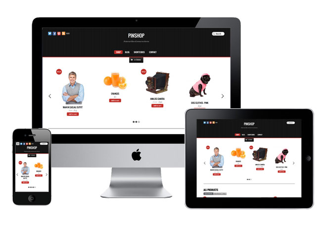
We are pleased to announce our latest theme, Pinshop, an ecommerce theme that functions like the Pinterest site and our popular Pinboard theme. The products load infinitely as you scroll down the page. Not only does it look fantastic, but it also provides a great user experience. Buyers can view all products without having to navigate through multiple pages. All your products are displayed nicely in stacking order. When the page is resized, it automatically re-positions the products. The shop items can be added to the cart instantly without having to go to the product page. All these features work consistently on desktop and mobile browsers.
We are offering 30% disount code for this new theme. Use the coupon code "pinshop" for a 30% discount off this theme until Dec 28, 2012.
Responsive Design
A responsive design that works on all mobile browsers and devices. To see the responsive design in action, view the demo and resize the browser window or view it with a mobile device.
Infinite Scroll
You can choose to use infinite scroll or the traditional page number navigation. The infinite scroll can be set to be automatically loaded or by clicking on the Load More button manually.
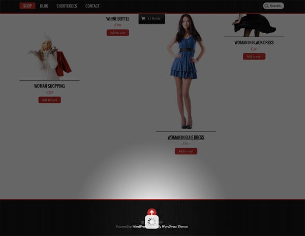
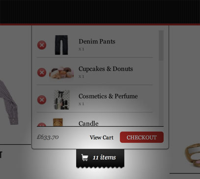
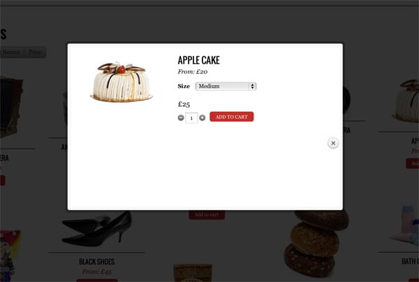
Top Bar Shopping Cart
The fixed top bar and shopping cart provide easy access for navigation. When an item is added, the cart is updated instantly. Buyer can slide down the cart to view all items in the cart. Try it yourself: go to the demo and add some items to the cart.
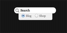
Custom Search Option
We've extended the default WordPress search form by adding an option to search either the blog or shop.
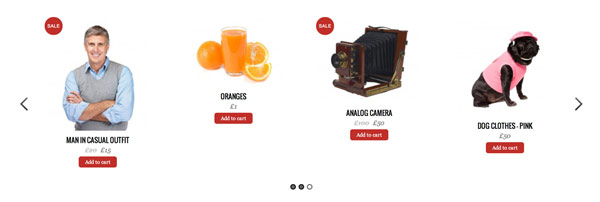
Product Slider
The product slider can be customized to display featured products or any product category of your choice.
Product Variation Lightbox
If the product has variations, a lightbox will be prompted for buyer to choose the variant.
WooCommerce
The WooCommerce is required to run with this theme. It is free for download. There are numbers of extensions for you to extend the shop such as different payment gateways, table rate shipping, importer, wishlist, and more.
Themify has been on a roll lately, releasing WordPress themes that really push the boundaries of responsive design. Today is no different. We are proud to announce Agency, a clean, minimal, and responsive theme meant for design agencies. Agency is packed with a bunch of custom post types: Portfolio, Highlight, Testimonial, and Team. It allows you to beautifully showcase your services, portfolio, and products. Fully customizable using the Themify shortcode convention, allowing complete freedom in how the website behaves and displays itself across any and all devices. See our demo: Home 1, Home 2, and Home 3.
Limited time offer: use the coupon code "agency" to save 30% off the Agency theme. Offer ends on Nov 28, 2012.
Responsive Design
As usual, we have built Agency as a responsive WordPress theme out of the box. This means that you will see the same beautiful Agency WordPress themes, regardless of your monitor size or mobile device, without having to code.
Slider
With Agency, you can create custom slider content using images, videos, captions, and galleries.
Custom Post Types
Agency theme uses WordPress custom post types to manage the portfolio items, highlights, testimonials, and team members so that they are completely separate from the blog posts. Each custom post type has its own custom panel which makes it very simple to manage your content.
Portfolio
With Portfolio posts, you can use a single static featured image, or use multiple images and Agency will automatically create a slider with all of your images. See Portfolio shortcode demo.
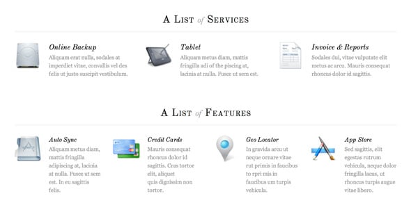
Highlight
Use the Highlight posts to display a short paragraph of text to highlight your agency's feature list or services provided. You can take a look at our Highlight demo to get a better idea of how this works.
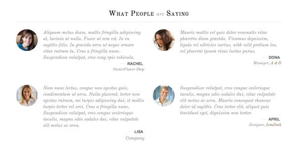
Testimonial
Use customer testimonials to provide social proof for visitors to your agency website and increase lead generation and conversion rates. Take a look at our Testimonial demo to see them in action.
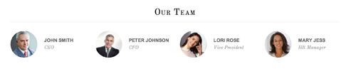
Team
Use Team posts to display a complete list of your team members. Team members can be categorized based on their job title, such as Executive, General, Management, etc. You can take a look at our Team demo to understand how Team posts work.
Full Control of Page Layout with Shortcodes
Agency theme uses custom post types to display any content, anywhere on the page, post, or sidebar widgets. Each post type shortcode has fully customizable parameters which allow you to affect layout style, image size, toggle content, etc. You can also combine any of our existing shortcodes to create unique page layouts. Check out our demo pages: Home 1, Home 2, and Home 3. Be creative with the shortcodes.. mix it with column, slider, map, or any shortcode from plugins.