Notes is our latest addition in the Post Format category. It allows you to use WordPress to post various post formats such as image, video, gallery, audio, quote, etc. like Tumblr blog. The theme design is inspired by the iPhone Notes app. It is a modern design theme with personal touches (light textured background and a bookmark ribbon). Also, it is another awesome responsive design theme that we've added. The layout is fluid and automatically adapted to any resolution on both desktop and mobile devices such as iPhone, iPad, Andriod, and Blackberry. To see this in action, view the demo and resize the browser window.
We are offering 30% disount code for this new theme. Use the coupon code "notes" for a 30% discount off this theme until March 23, 2012.
Responsive Design
With the responsive design, Notes delivers consistent layout to your readers whether it is on desktop or mobile devices such as iPhone, iPad, Blackberry or Andriod (view the demo and resize the browser window or with a mobile device).
Post Formats (Tumblr-like)
Notes comes with all native WordPress post format supports: gallery, video, image, audio, quote, etc. You can use it to turn your WordPress into a Tumblr blog. If you are not a big fan of Tumblr, then leave the post format as default. The post formats are optional.
Footer Menu and Widgets
The footer includes customizable footer widgets, footer menu, and an animated "back to top" button.
We are proud to present our first ecommerce theme - ShopDock. This theme is designed to work with WooCommerce, a popular plugin loaded with many features. ShopDock utilizes Javascript & CSS3 to provide an easy and pleasant shopping experience to your customers. Buyer can easily add or remove items to the cart with a single mouse click. No more "back to shop" or page reloading every time an item is added. The items are added to the shop dock instantly and the cart total is updated automatically. ShopDock is the perfect theme for selling general products such as apparels, games, digital goods, etc. Also, it is our latest addition to the responsive theme collection.
We are offering 30% disount code for this new theme. Use the coupon code "shopdock" for a 30% discount off this theme until March 2nd, 2012.
Hope you had a fantastic holidays and that you've taken a lot of photos over the holidays because we have a new responsive photo theme for you - PhotoTouch. It is a beautiful photo theme designed with mobile devices in mind. It features a gallery/slideshow that mimics the iPhone native Photos app. User can swipe or press arrow keys to go through the photos, double tap, auto play, pinch and expand, etc. Combined with the responsive design and slider, PhotoTouch is the perfect theme to showcase your photo portfolios. Most importantly, it works on both desktop and mobile devices such as iPhone, iPad, Blackberry, and Android phones (view demo).
We are offering 30% disount code for this new theme. Use the coupon code "phototouch" for a 30% discount off this theme until Jan 12, 2012.
Basic is a new free theme suggested by many users. The purpose of the Basic theme is to give you a starter theme so you can be your own designer. It only contains the basic layout styling so you can customize the theme with your own perferences using the Themify option panel. The layout is completely responsive. It works on any resolution on desktop and mobile devices such as iPad, iPhone, Android, and Blackberry. The theme has similar functionalities as all our other themes such as the grid layout options, footer widgets, and social links, etc. Download Basic here.
Responsive Design
To see the responsive layout, view the demo and resize the browser window or view it with a mobile device.
Skins
It includes several additional skins such as dark themed, full wrap, and page style.
Other Features:
Lightbox Gallery
The theme comes with PrettyPhoto plugin that turns the WordPress gallery into a lightbox gallery.
Lightbox Media Link
You can attach a lightbox media link to the post image. The lightbox link can be an image, video (YouTube, Vimeo, etc.), or iFrame URL.
Back to Top Button
It has a scroll to top button at the footer.
Custom Main & Footer Navigation
The theme includes a customizable main menu and an optional footer menu.
Footer Widgets
You can display up to 4 optional footer widgets.
Footer Text
Footer text can be replaced at the Themify option panel.
RSS Icon and Search Form
RSS icon and search form can be excluded as well.
Default Layout Options
The theme offers various list and grid layout options where you can set in the option panel.
Documentation Links
If you are new with WordPress and Themify, here are the documentation links that you might find useful:
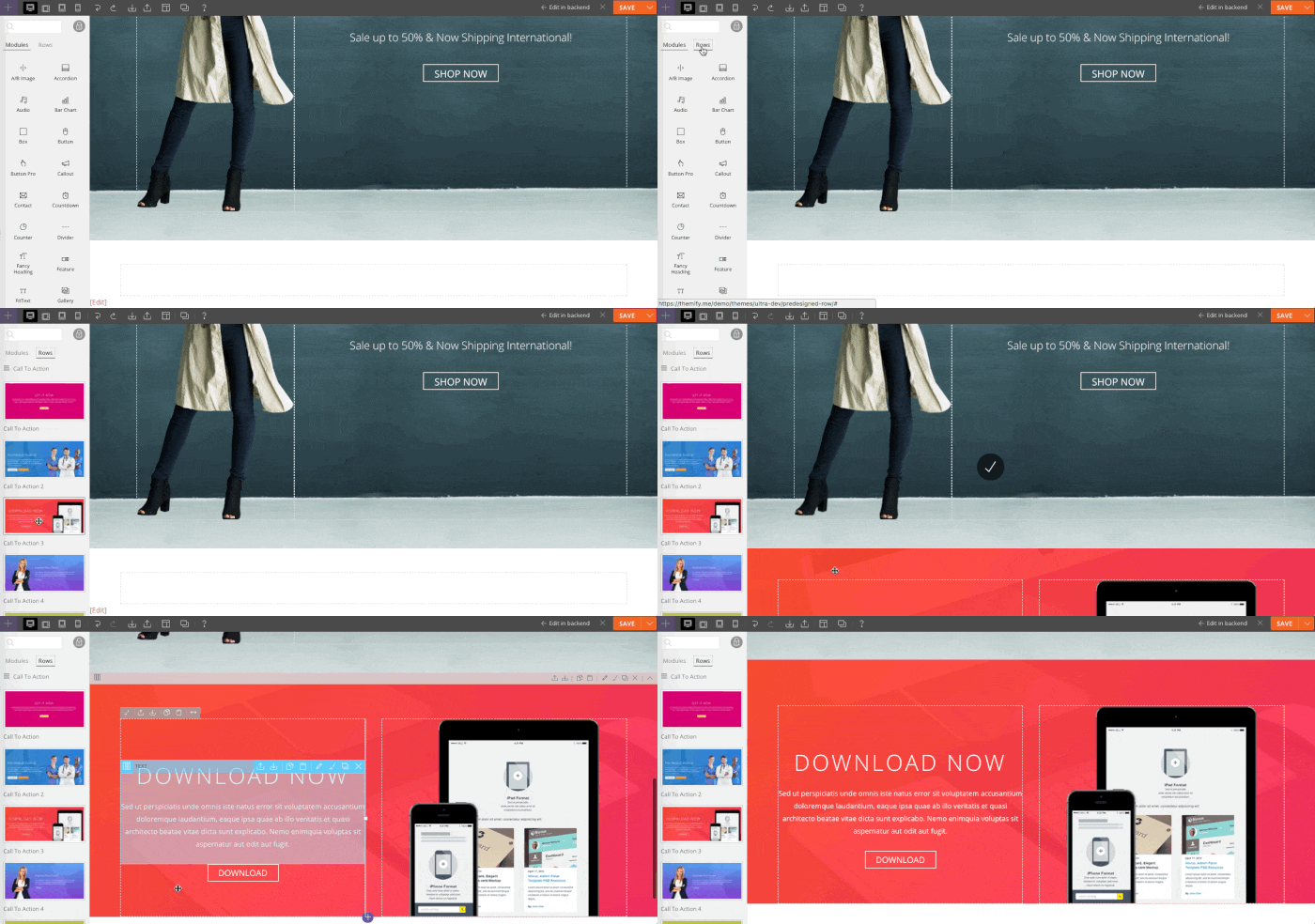
You can pretty much style everything with the Themify option panel. If you are new, don't be afraid to mess around with the Styling and Settings tab. You won't break the theme by changing the options in the panel. You can always go to the Transfer tab to backup or import the panel setting data.
Wireframe
The image below illustrates the main structure of the layout.
Styling Background
Go to Themify > Styling tab. Start by customizing the background of the main layout components: Body (main body of the page), Header Wrap, Middle Wrap, and Footer Wrap. You can choose a custom background color from the color picker and apply a background image. To upload a custom background image, click on the '+ upload' button.
Combination of Skin & Custom Styling
You can apply a skin and use the Styling tab to further customize it. Check the image below to see what can be done. Try it yourself: go to the Skin tab, apply the Page skin, then go to the Styling tab and apply the background images.
Font Style
Now click on the Body Font tab to change the font style and link color. If you want to use Google Web Fonts, read this tutorial on how to incorporate Google Fonts.
Reset Styling & Setting
You can click on the sub tabs to continue styling the theme as you like. At any time, you can reset the Styling or Setting data by clicking on the reset button located next to the save button. Read the documentation for more tutorials.
Responz is a 3-column responsive theme for news and editorial sites. The design is minimal and elegant with great typography. It looks great on any resolution on desktop and mobile devices such as iPad, iPhone, Android, and Blackberry. There are many layout options built in Responz. You can choose from 2 sidebars, 1 sidebar, or fullwidth along with various list view and grid view post layouts. The sidebars can be on the right side or left side. It is very flexible and highly customizable.
We are offering 30% disount code for this new theme. Use the coupon code "responz" for a 30% discount off this theme until Nov 22th, 2011.
Simfo is a minimal responsive theme with a subtle touch of grungy texture. Design-wise, it has tremendous attention to details — great balance of white space and beautiful typography. Functionality-wise, it works on all screen resolution and most browsers including the mobile devices such as iPad, iPhone, Android, and Blackberry. The template includes optional lightbox and post sorting navigation. Simfo is a perfect theme for portfolio and general blog sites. If you like Simfo, you may also like ThemeMin and Elemin. The following themes also have the responsive layout feature: Grido, Tisa, Suco, Elemin, Funki, Minblr, Wumblr, and iTheme2
We are offering 30% disount code for this new theme. Use the coupon code "simfo" for a 30% discount off this theme until October 20th, 2011.
Responsive Layout
To see the responsive layout and stacking posts in action, view the demo and resize the browser window or view it with a mobile device such as iPhone, iPad, Blackberry, or Android.
Post Sorting
It includes an optional post sorting navigation to allow user to sort the posts based on the category.
Lightbox Link
You can insert the optional lightbox link to display a zoom-in image, video or iframe window.
Footer Menu, Logo, and Widgets
The footer includes customizable footer widgets, footer menu, and logo text or image.