Shoppe Documentation
Complete Video Guide
The video below is a complete guide on how to install and use Themify Shoppe.
Table of Content:
- How to install the Themify Shoppe theme - 0:28
- How to install the WooCommerce plugin - 1:15
- How to install the Builder addons - 1:48
- Shoppe Skin & Demos - 2:48
- How to set-up WooCommerce - 4:36
- How to add a new product - 7:30
- Shop settings (how to edit product layout) - 9:12
- General theme settings - 14:26
- Theme Settings - 18:06
- Setting up social links - 23:51
- Themify Builder Settings - 25:32
- Mega Menu - 28:17
- How to use the Themify Builder - 36:58
- How to import Builder Layouts - 42:52
- How to setup widgets - 44:40
- Customize panel - 46:07
- Themify Customization panel - 47:18
Install Required Plugins
If you plan to setup Shoppe theme like our demo, you would need to install the required plugins and addons first.
Install Required WooCommerce Plugin
WooCommerce plugin is comprehensive ecommerce system that allows you to sell anything online. You can use it sell tangible products, digital goods, memberships, etc.
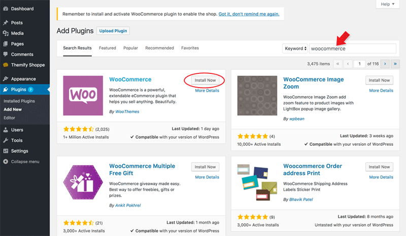
To Install WooCommerce plugin:
- Go to WP Admin > Plugins > Add New.
- Enter "woocommerce" in the plugin search form, click Install Now, and then click Activate button after the installation is done.
- If you are activating WooCommerce first time, you might be prompted to setup WooCommerce. You can click "Not Right Now" to skip it (these settings can be configured later in admin).
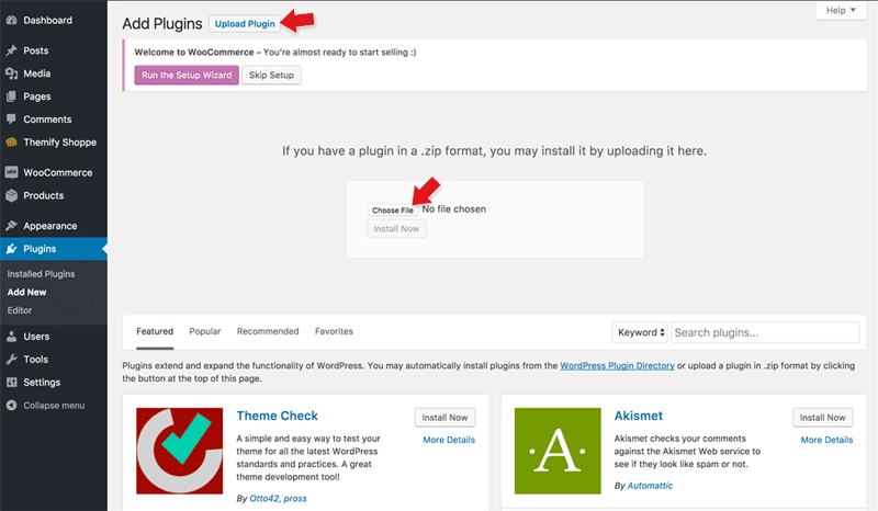
Install Required Builder Addons:
Shoppe theme uses Builder Slider Pro to display the feature slider on the homepage and Builder WooCommerce to display WooCommerce Categories and Products within the Bulider layout.
To install Builder Slider Pro and Builder WooCommerce addon:
- Login to Themify Member Area
- Download the "Builder Slider Pro" addon zip on the member download area, save the file as builder-slider-pro.zip (do not extract it). NOTE: Some browsers (eg. Safari) auto extract zip file, you can right-click on the download link and choose save file as zip on your desktop.
- Then download the "Builder WooCommerce" zip (again, save it as builder-woocommerce.zip file and do not extract it)
- Go back to your site WP Admin > Plugins > Add New, click "Upload Plugin", then browse the 'buider-slider-pro.zip' that you downloaded, click "Install Now", click "Activate Plugin" afterward.
- Then repeat the above step to install 'builder-woocommerce.zip'
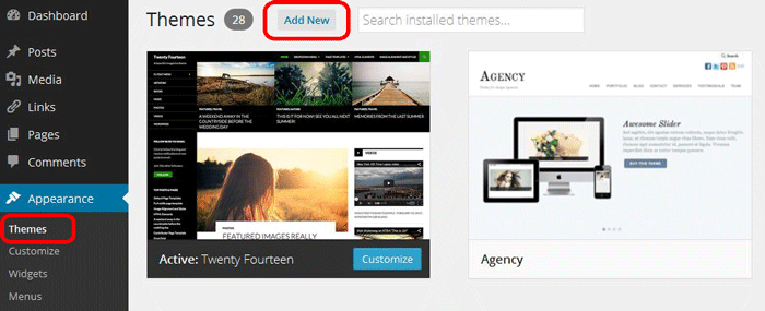
Installing the Theme
To install themes with the WordPress theme uploader:
- Download the "theme.zip" file from the Member Area
- Note: some browsers (eg. Safari) auto extract zip files automatically. Right-click on the download link and select "Save Linked File As". This will allow you to download the theme as a zip file.
- Login to your site's WP Admin.
- Go to Appearance > Themes.
- Click on the "Add New" button, then click on the "Upload Theme" button
- Upload the theme.zip file (note: it is the theme.zip, not the theme-psd.zip that you just downloaded from the Member Area).
- Activate the theme
FYI: You can also install themes with FTP method. Read the Installing Themes tutorial for more info.
Skins and Demo Import
Skins and pre-made demo sites not only transforms the site's design appearance, but can also help setup a real sample site within minutes. With just a single click, you can import the demo setup that includes the theme settings, content, menus, widgets, etc., exactly like our theme demos. This is a time saver for creating client sites. This tutorial shows you how you can access the skins/demos.
To select a skin:
- Go to your site's WP-Admin > Themify panel > Themify Settings > Click on the "Skins & Demos" tab.
- Then select any skin you'd like and click "Save"
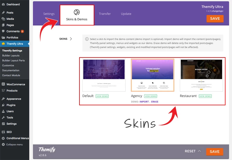
To import demo content:
- Click a skin thumbnail and click on the "Import" button.
- If you have all the required addons and plugins, it will import the demo content data and theme settings.
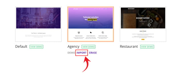
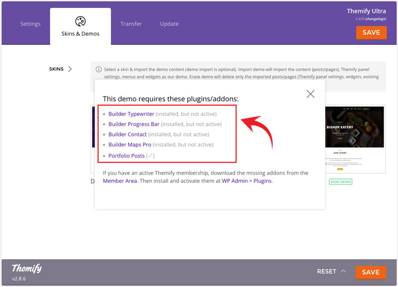
- If your site is missing the required plugins/addons (either not installed or activated), a lightbox will appear notifying you to install and activate them. You can click on the plugin title to redirect to where you can obtain the plugins/addons. If it is a Themify plugin/addon, you can download the missing addons from the Member Area (the other third party plugins are usually free plugins from WordPress.org).
To erase demo content:
- After you import the demo content, you can erase the demo content by clicking the "Erase" link.
- Erase demo will delete all the imported posts/pages. Themify panel settings, widgets, and user's existing content will not be affected.
Site Logo & Tagline
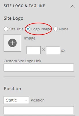
To display a logo image instead of the site name text:
- Go to WP Admin > Appearance > Customize > Site Logo and Tagline.
- Under "Site Logo", select "Logo Image" radio button.
- Upload a logo image.
- Specify the logo image width and height.
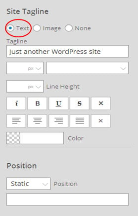
You can also change website Tagline from here:
- Go to WP Admin > Appearance > Customize > Site Logo and Tagline.
- Scroll down and under "Site Tagline" select "Text" radio button.
- Enter your site Tagline.
- Click "Save & Publish".
Main Navigation Menu
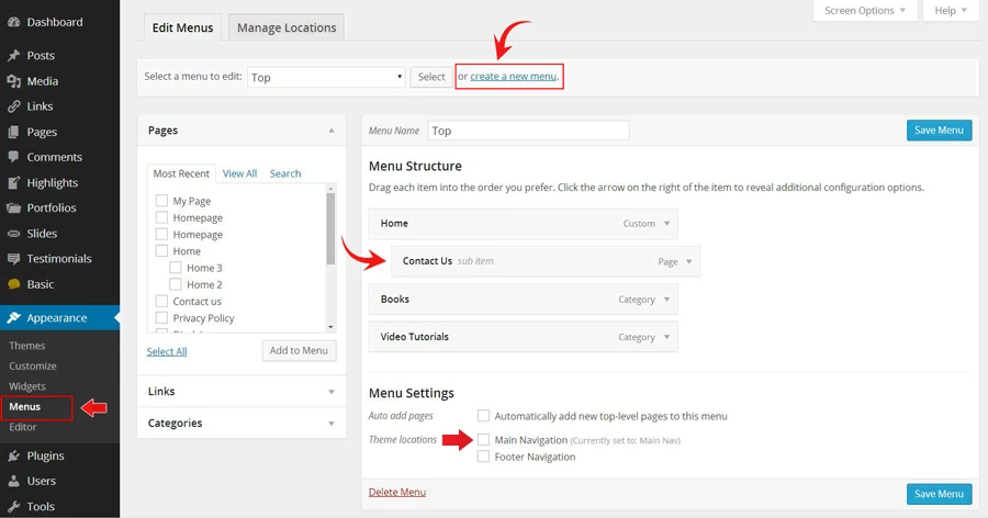
To create a custom navigation menu:
- Go to WP Admin > Appearance > Menus.
- Click on "create a new menu" to create a new menu (eg. Main Menu).
- Add the menu items from the left panels.
- To create a dropdown menu: drag the menu item towards the right (the item(s) will be indented).
- When you are done adding the menu items, click "Save Menu".
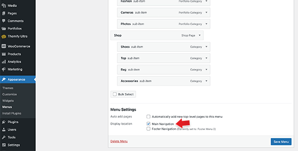
- To assign menu locations:
- Scroll down to the bottom where it says "Theme locations" and tick the menu location checkbox.
- Main Navigation = main menu on the header
- Footer Navigation = footer menu on the footer (Note: some themes might not have Footer Navigation).
TIPS: You can display menus on sidebar widgets, remove the main menu, create empty links, and lightbox links. Read Custom Menus for more detailed tutorial.
Mega Menu
The Mega Menu feature enables you to make the most of the WordPress menu by showcasing featured posts and multi-column dropdowns with various links and widgets.
To use the Mega Menu:
- To make use of the Mega Menu feature, you'll first need to set up the menu at WP-Admin > Appearance > Menus.
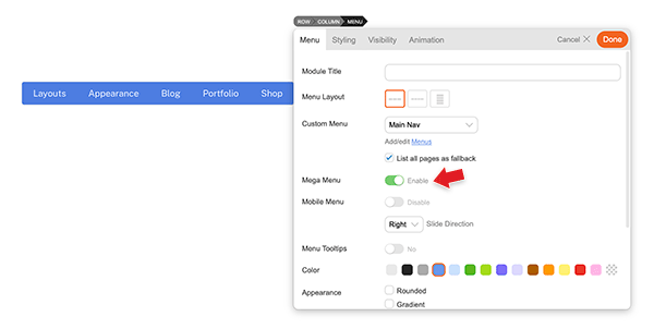
- Once you've created the menu (follow the steps below), you can assign that menu as the 'Main Navigation,' and the mega menu will appear in the primary navigation area of your theme. Note: Mega menu support is available only in the following themes: Ultra, Shoppe, Music, Parallax, Fullpane, Peak, and Magazine. If your theme doesn't support the mega menu feature, you can still use the Builder Menu module to display it.
- You can display the mega menu using the Builder's Menu module. Simply drop in a Menu module, choose the menu you've configured with the mega menu feature, and then enable the "Mega Menu" option.
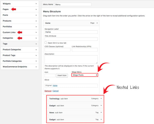
- To create Mega Posts on the mega menu dropdown:
- Go to WP-Admin > Appearance > Menus, add a new menu or edit any existing menu.
- Add a "Pages" or "Custom Links" and select "Mega Posts" on the Mega Menu dropdown option.
- Next, include 'Tags' or 'Categories' as link types in the nested menu. For instance, you would set the Blog page link as the parent link and then nest the categories/tags links. When users hover over the Blog link, they will be able to see the recent posts of the corresponding categories/tags within the mega menu dropdown.
- Note: The nested items must be Tags or Categories. This will display recent posts associated with the chosen tag/category. If the Tags option is not visible, click on the 'Screen Options' located in the top-right corner, and ensure that the 'Tags' option is checked.
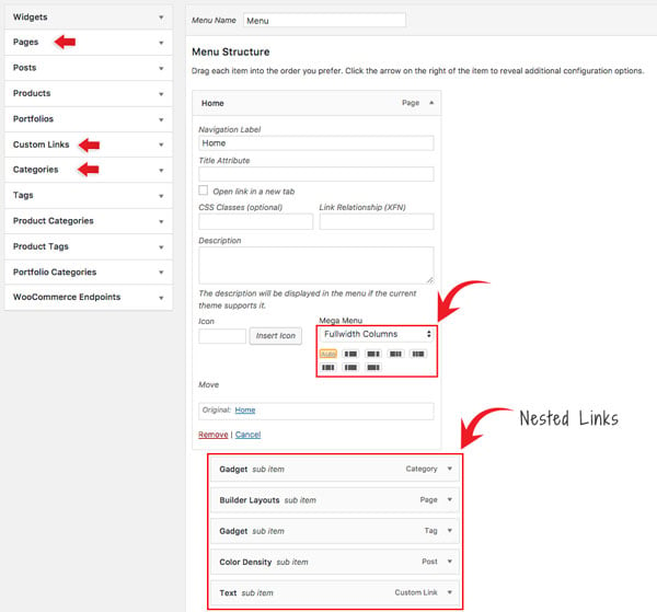
- To set Fullwidth Columns:
- Add a "Pages" or "Custom Links" and select "Fullwidth Columns" on the Mega Menu dropdown option.
- Select the column layout from the preset that appears - Default is set to "Auto",
- Then add any link (Pages, Posts, Custom Links, Tags, Categories) or widgets. This will display nested links in multiple columns.
- Setting Navigation Titles Above Nested Links:
- Utilizing the 'Fullwidth Columns' option, you can also establish header titles that appear above the nested links. To achieve this, simply add an additional layer of nested links beneath the initial set of nested links, as demonstrated in the screenshot below:
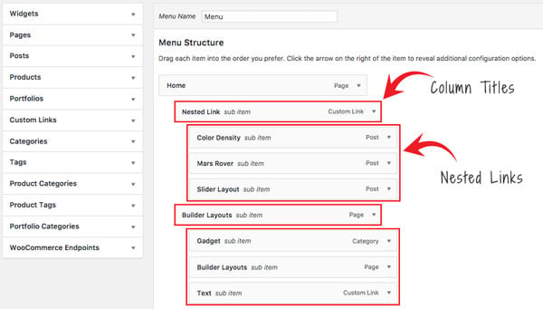
- Utilizing the 'Fullwidth Columns' option, you can also establish header titles that appear above the nested links. To achieve this, simply add an additional layer of nested links beneath the initial set of nested links, as demonstrated in the screenshot below:
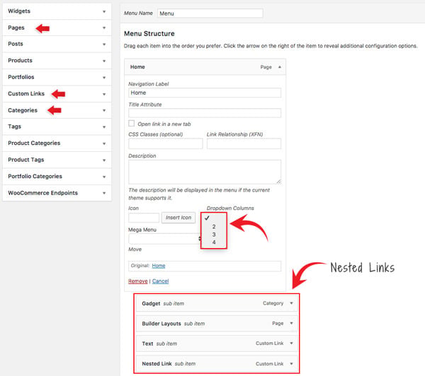
- To set Dropdown Columns:
- Add a "Pages" or "Custom Links", select the "Dropdown Columns" option, and then select the number of columns (2, 3, or 4).
- Then add any link (Pages, Posts, Custom Links, Tags, Categories) or widgets. This will display the nested links in the number of columns as you selected.
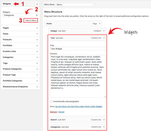
- To add Widgets in the mega menu:
- Select the "Widgets" link type and select the widget from the dropdown menu option.
- Click "Add to Menu" and customize the widget as you like (eg. you can drop in a Text widget and enter your custom text).
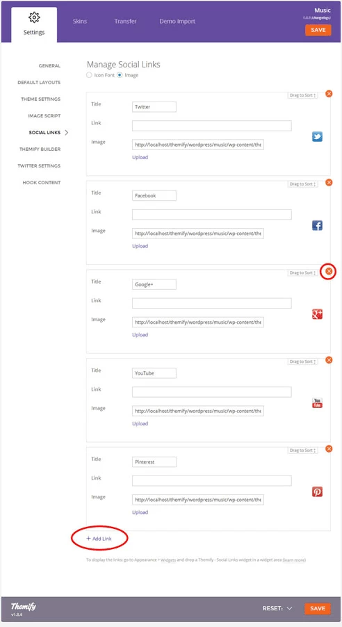
Setting Up the Social Links
Step 1) To set up the social media links:
- Go to WP Admin > Themify > Settings > Social Links tab.
- The theme comes with some pre-filled social links. Simply enter your social profile URL in the Link input field. For example, enter 'https://twitter.com/themify' for the Twitter link.
- You can choose to display either "Icon Font" or "Image".
- If "Icon Font" is selected, click on "Insert Icon" to select an icon (over 320+ icons available).
- If "Image" is selected, you can upload your own graphic icon by clicking on the Upload button.
- To add more links, click on the Add Link button at the bottom.
- To remove a link, click on the delete icon.
- To arrange the display order, drag and drop the link container.
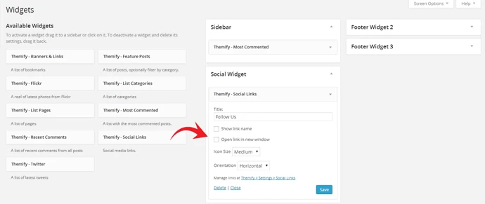
Step 2) Displaying the Social Links:
- Once you have the Social Links setup, go to WP Admin > Appearance > Widgets. Drag and drop the Themify - Social Links from the Available Widgets panel to the Social Widget panel.
- Optional: Customize Widget Title - such as "Follow Us". You can also "Show link name" and adjust icon size.
Hiding the Search Form
To hide the default search form in the header:
- Go to WP Admin > Themify > Settings > Theme Settings.
- Under the "Exclude Search Form", tick the checkbox that says "Check here to exclude search form in the header".
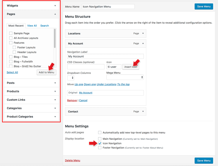
Icon Navigation
Icon Navigation is the icon menu that is placed next to the search icon on the header.
To setup Icon Navigation:
- Go to WP Admin > Appearance > Menus, and click "create a new menu".
- On the left panels, add the links that you want (Pages or Custom Links, etc.).
- Then on the added link item, click "Insert Icon" and select an icon.
- When you are done adding menu links, check "Icon Navigation" checkbox under the "Menu Settings" and save menu.
Theme/Page Appearance
Shoppe theme comes with many design layouts that you can configure either globally or per-page basis.
Theme Appearance V.S. Page Appearance:
- Theme Appearance = Means the settings will apply to the entire site (i.e. on every page)
- Page Appearance = Means the settings in the individual post/page that override the settings in the Themify panel.
- Basically you would use the Themify panel to set the Theme Appearance for the entire site. If you want to have different Page Appearance in the individual post/page, then you would use the post/page's Themify Custom Panel > Page Appearance tab.
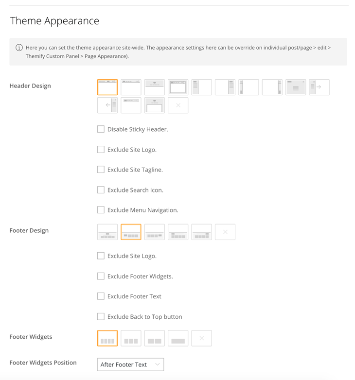
Theme Appearance Options
- To set global Theme Appearance: Go to WP Admin > Themify > Settings > Theme Settings => Theme Appearance. All changes made here will be applied to the entire site.
- You should see the following Theme Appearance Options:
- Header Design = Choose one of the available header layout icons or pick "None" icon to exclude the header entirely.
- Disable Sticky Header = Sticky header is the fixed header occurs when users scroll down the page. You can disable it by checking this option.
- Exclude Site Logo = Check this option to hide the site logo.
- Exclude Site Tagline = Check this option to hide the site tagline.
- Exclude Search Icon = Check this option to hide the search icon.
- Exclude Menu Navigation = Check this option to hide the main menu navigation.
- Footer Design = Choose one of the available footer layout icons or pick "None" icon to exclude the footer entirely.
- Exclude Site Logo = Check this option to hide the logo in the footer.
- Exclude Footer Widgets = Check this option to hide the footer widgets in the footer.
- Exclude Footer Text = Check this option to hide the footer text (that is the footer credit text entered in Themify > Settings > Theme Settings => Footer Text.
- Exclude Back to Top Button = Check this option to hide the back to top button in the footer.
- Footer Widgets = Choose one of the column layouts or pick "None" to have no footer widgets.
- Footer Widgets Position = Choose whether to have footer widgets appear before or after the footer text.
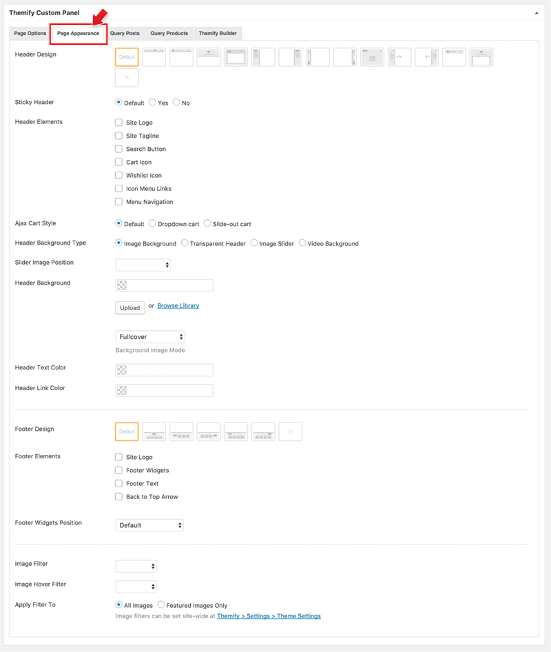
Page Appearance Options
- To set Page Appearance: Add or edit a post/page, on the Themify Custom Panel, click "Page Appearance" sub-tab. The settings in Page Appearance will only apply to the particular page.
- You should see the following Page Appearance options:
- Header Design = Choose one of the available header layout icons or pick "None" icon to exclude the header entirely.
- Sticky Header = Sticky header is the fixed header occurs when users scroll down the page. You can disable it by checking this option.
- Header Elements = Select show/hide the header elements:
- Select "Hide" will hide the element.
- Select "Show" will show the element.
- Select "Theme default" will take settings from Themify > Settings > Theme Settings => Theme Appearance (i.e. if you want to have "Theme default", you don't have to select anything)
- Ajax Cart Style = Select "Default" will use the global "Ajax Cart Style" setting in Themify > Settings > Shop Settings. If you want to have a different Ajax cart style, select one of the available options here.
- Header Background Type
- Image Background = Allows you to pick a background color and upload background image for the header.
- Transparent Background = Header background will be transparent (note: the content container will push to the top of the page to achieve transparent header effect)
- Slider = Allows you insert an image slider in the header.
- Video = Allows you to upload a mp4 video as the header background (note: video background does not play on mobile, background image will be used as fallback background)
- Header Text Color = Custom color for the text in the header.
- Header Link Color = Custom color for the links in the header.
- Footer Design = Choose one of the available footer layout icons or pick "None" icon to exclude the footer entirely.
- Footer Elements = Select show/hide the footer elements:
- Select "Hide" will hide the element.
- Select "Show" will show the element.
- Select "Theme default" will take settings from Themify > Settings > Theme Settings => Theme Appearance (i.e. if you want to have "Theme default", you don't have to select anything)
- Footer Widgets Position = Choose whether to have footer widgets appear before or after the footer text.
- Image Filter = Select the image filter options will affect the image on this particular page. Leave it as default to take settings from Themify > Settings > Theme Settings => Image Filter.
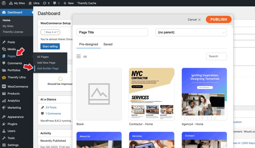
Adding Builder Pages
To use the Builder to design your pages:
- On admin sidebar, hover "Pages" and select "Add Builder Page" (you can also do this on the frontend admin top bar: hover "New" and select "Page > Builder Page").
- Enter the page title and choose whether to start with a blank or predesigned layout.
- It will redirect you to the frontend, where you can edit and design the Builder layout.
- Refer to the Builder documentation for more details on how to the Builder.
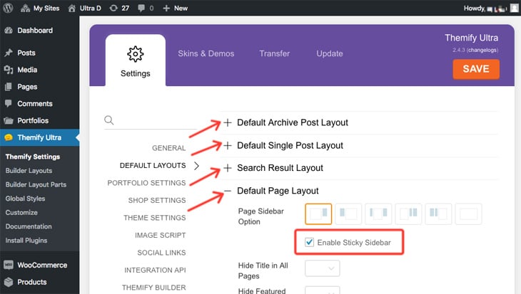
Sticky Sidebar
When enabled, the sticky sidebar feature will make your sidebar stick when users are scrolling on the page. You can enable the sticky sidebar on general page views (posts, pages, archive, etc.) or on individual pages.
To enable the sticky sidebar feature on general page views:
- Go to WP Admin > Themify Shoppe > Default Layouts > expand the layout options > check 'Enable Sticky Sidebar'
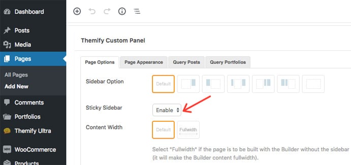
To enable the sticky sidebar feature on individual pages:
- Add or edit a page > scroll down to the Themify Custom Panel > select 'Enable' on the Sticky Sidebar (note: if you select no sidebar layout, the sticky sidebar option will not appear)
Shop Settings
WooCommerce Settings
Below are some general info on how to configure your WooCommerce Settings. For more info about WooCommerce plugin, please refer to their official documentation.
To configure WooCommerce Settings:
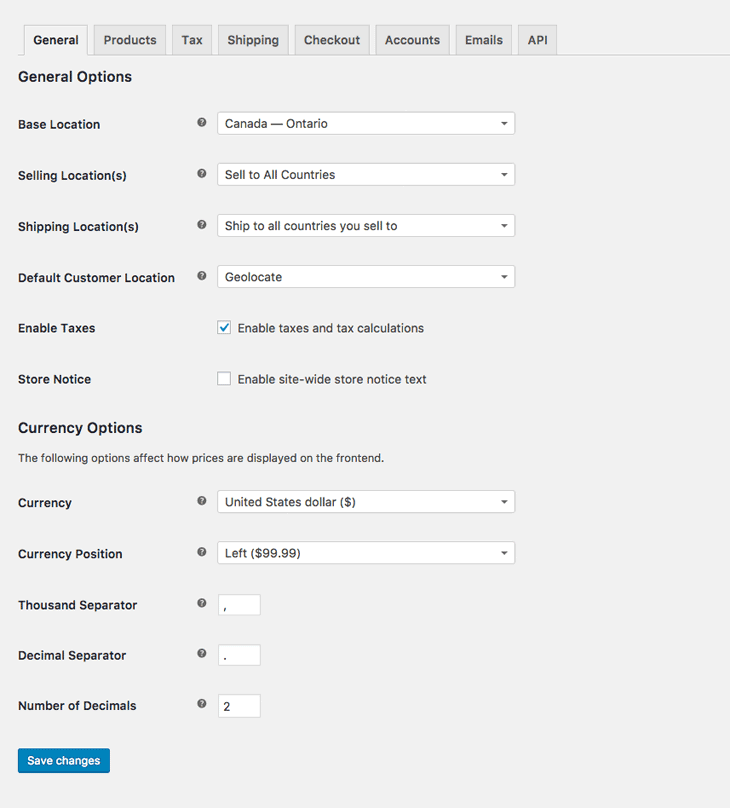
- Go to WP Admin > WooCommerce > Settings
- Under the "General" tab, you should see the following options (see screenshot):
- Base Location = Select the location where your shop is located (it will be used for tax rate purpose).
- Selling Location(s) = This option allows you to limit which countries you are willing to sell to. If you want to sell globally, keep it selected "Sell to All Countries".
- Shopping Location(s) = Select which countries you would ship to. If you don't have any shipping limitation, then select either "Ship to all countries you sell to" or "Ship to all countires".
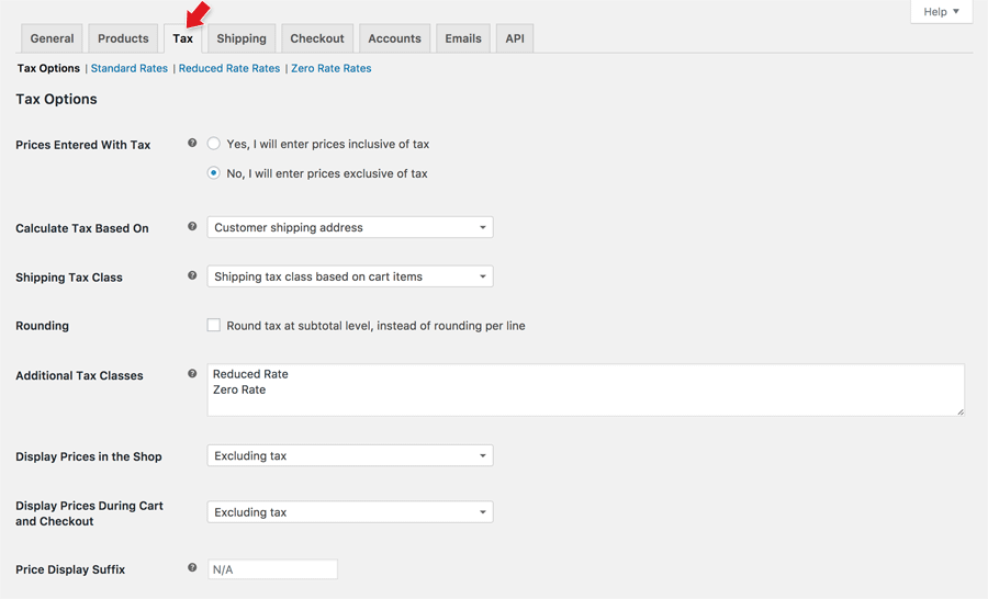
- Enable Taxes = If selling taxes are applicable in your country, check "Enable Taxes" checkbox and then click "Save changes" (if tax is not applicable to your shop, skip this section). After you enable taxes and save settings, you should see a new tab labelled "Tax" at the top.
- Click on the Tax tab to access the Tax Options, you can leave the tax options as default or configure it if you like. (see screenshot)
- Next you would need to click on "Standard Rates" link at the top to add the tax rates for each state/province. To add a tax rate, click "Insert Row", then type in your country code (note that as soon you start typing the code, it shows a dropdown for you to select), then type the state/province code, enter the tax rate, tax name, check whether tax should apply to shipping cost, etc. (see screenshot). Repeat this step for each state/province that tax is applicable. TIPS: If you need to input a lot of tax rates, use the "Import CSV" method to save time.
- If you are not sure about the tax rates/laws, please consult with a local accountant first. For more info on tax settings, refer to WooCommerce documentation.
- Store Notice = If you want to show a text bar notice across your site, enable the store notice and enter the text in the textarea.
- Currency Options = Select the currency that you charge and the currency display on your shop.
- Under the "Products" tab, you should see the following options (see screenshot):
- Measurements = Select the "Weight Unit" and "Dimensions Unit". If you don't sell tangible products, you can skip skip this option.
- Reviews = Select the product rating options. If rating is enabled, users will see the rating stars on the product review form.
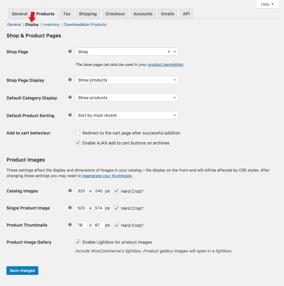
- Next you might want to configure the "Products > Display" options (see screenshot):
- Shop & Product Pages:
- Shop Page = Select the "Shop Page", that is the page where people will see your product archive (ie. that is where WooCommerce directs your shop page to). It is important to select this shop page option because WooCommerce uses it in many areas such as the shop breadcrumbs navigation, the "Return to shop" link, etc.
- Shop Page Display = Select whether to display products, categories, or both on the shop page.
- Default Category Display = Select whether to show products, sub-categories, or both on the product category pages.
- Default Product Sorting = Select the default sorting option for the product sorting (that is the select dropdown located below the page title on product archive view).
- Add to cart behaviour = That is when customers added an item, what action should it do. You can redirect users to the cart page and enable Ajax add to cart buttons (with Ajax enabled, items can be added to cart without reloading the page).
- Product image:
- NOTE: Shoppe theme has its own product image settings that allow you to specify any image sizes. You can skip this step in WooCommerce Settings.
- To specify product image sizes, go to Themify > Shop Settings, then enter the "Image Size" for "Product Archive" and "Single Product Page".
- Shop & Product Pages:
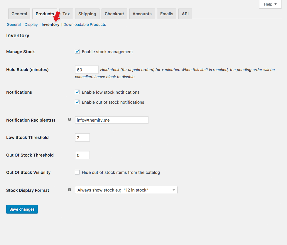
- If you sell tangible products, then you might want to configure the "Products > Inventory" options (see screenshot), otherwise skip this step.
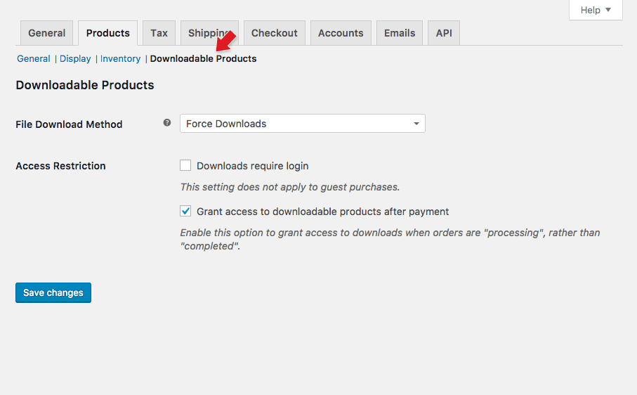
- If you sell digital download products (eg. ebooks, stock photos, songs, PDF files, etc.), you can configure how file downloads are handled at "Products > Downloadable Products" options (see screenshot).
- If you sell tangible products, you are likely need to specify the shipping rates/methods at "Products > Shipping" options (see screenshot). Shipping setting is too complex to cover all in this documentation, please refer to WooCommerce documentation for more details.
- The "Checkout" settings are very important – make sure you configure the payment gateways correctly, else customers might not be able to checkout on your shop.
- Coupons = Check the "Enable the use of coupons" if you want to use allow coupons on the cart and checkout page. If coupon is enabled, go to WP Admin > WooCommerce > Coupons to add/manage coupon codes.
- Checkout Process = Check "Enable guest checkout" checkbox if you allow customers to checkout without signing up an account, otherwise, they will create an account during checkout process.
- Checkout Pages:
- Cart Page = That is where WooCommerce directs the cart page to.
- If your cart page doesn't work, make sure it is selected here and the cart page contains this shortcode: [woocommerce_cart]
- Checkout Page = That is where WooCommerce directs the checkout page to.
- If your checkout page doesn't work, make sure it is selected here and the checkout page contains this shortcode: [woocommerce_checkout]
- Terms and Conditions = That is the terms page link on the checkout form where customers must agree in order to checkout.
- Cart Page = That is where WooCommerce directs the cart page to.
- Checkout Endpoints = They are appended to your page URLs to handle specific actions during the checkout process. Generally it is fine to leave these inputs as default.
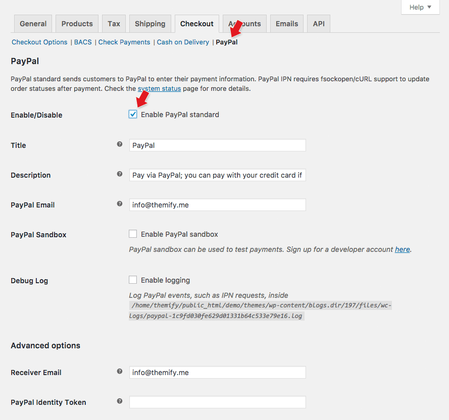
- Payment Gateways = It is very important to configure the payment gateways, otherwise, customers might not be able to checkout.
- Default WooCommerce comes with these options: Direct Bank Transfer, Check Payments, Cash on Delivery, and Paypal (you can add payment gateway extensions).
- To enable the payment gateway: click on the link at the top (eg. PayPal), then check the enable checkbox and fill in the option fields (see screenshot).
- On the "Accounts" tab, you should see the following options:
- My Account Page = That is your customer dashboard (after they login, they will see this page), where they can view their orders, file downloads, update their account details and addresses.
- If the account page is not working as expected on your site, double check this option and make sure the selected page contains this shortcode: [woocommerce_my_account]
- My Account Endpoints = They are appended to your page URLs to handle specific actions on the accounts pages. Generally it is fine to leave these as default.
- My Account Page = That is your customer dashboard (after they login, they will see this page), where they can view their orders, file downloads, update their account details and addresses.
- The "Emails" tab is where you configure the email notifications. The email options allow you to configure basic stuffs like receipient, email subject, heading, etc. If you want to customize the email body content, it can be done by editing the email PHP templates (see their documentation).
- The "API" options are for advanced users and developers. It is fine to leave the API options as default.
Themify Shop Settings
The above section covers almost everything about WooCommerce Settings. This section is about the shop settings that are available specifically in Shoppe theme.
Go to WP Admin > Themify > Settings > Shop Settings to access the following options:
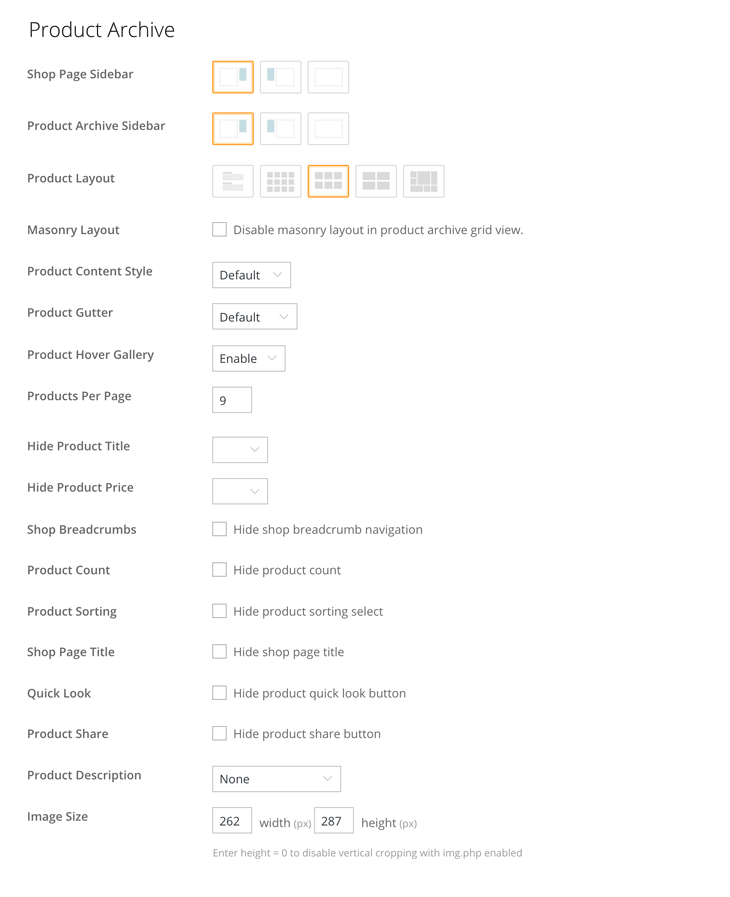
Product Archive
The options here apply to the product archive views such as the shop page, product category pages, product tag pages, etc.
- Shop Page Sidebar = This sidebar option applies to the shop page only.
- Product Archive Sidebar = This sidebar option applies to all product archive pages (product categories, tags, etc.)
- Product Layout = Choose a product layout between list-post, grid4, grid3, grid2, or auto tiles layout.
- Masonry Layout = If masonry layout is enabled, the products will display as they are stacking on top of each other.
- Product Content Style = That is the content design style (polaroid, overlay, etc.).
- Product Gutter = Product gutter is the spacing between each products. Select "No Gutter" will have no spacing between each products.
- Product Hover Gallery = It is the gallery slider appears when user hover the product image on archive view. It uses the product gallery image in the slider.
- Products Per Page = Enter the number of products that you want to show per page.
- Hide Product Title = Choose whether to hide product title.
- Hide Product Price = Choose whether to hide price.
- Shop Breadcrumbs = It is the breadcrumb navigation that appears above the page title on WooCommerce pages (shop, product single view, archive product view, etc.).
- Product Count = That is the total product count that displays under the shop page/category title.
- Product Sorting = It is the select dropdown that appears below the shop page title.
- Shop Page Title = It is the page title on the "WooCommerce Shop" page.
- Quick Look = It is the zoom-in icon that appears on the product. Quick look allows users to view the product details in a lightbox without going to the product single view.
- Product Share = Allows users to share the product to all major social networks (Twitter, Facebook, Pinterest, etc.).
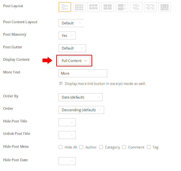
- Product Description = Choose whether to display short/full product description, or none.
- Image Size = Enter image width and height here to display the product image at exact size. The built-in image script will crop the image according to image size entered. NOTE: This feature requires the "Image Script" to be enabled at Themify > Settings > Image Script in order to have dynamic image cropping (default image script is enabled).
Single Product Page
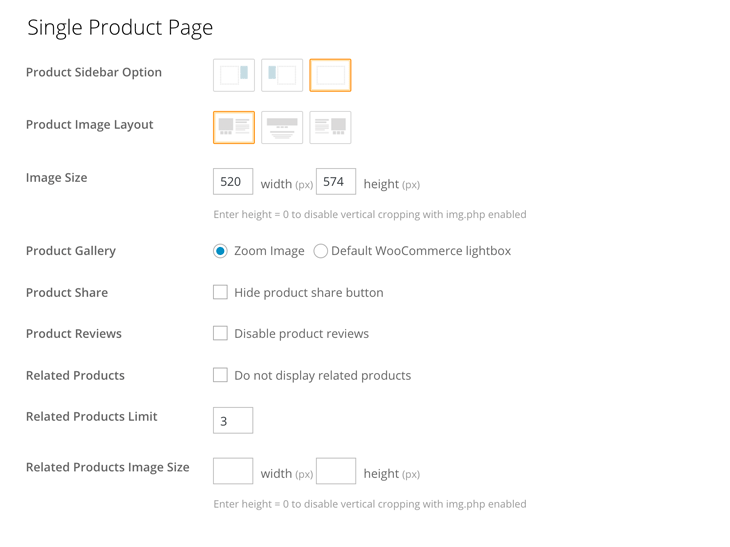
The options here apply to the single product view of all products.
- Product Sidebar Option = This sidebar option applies to the product single view.
- Product Image Layout = Choose the produce image layout whether left, center, or right alignment.
- Image Size = Enter image width and height for the single product view.
- Product Gallery:
- Zoom Image = Product gallery will display as zoom-able image (users can click on the product image to enlarge image and move cursor around to see the large image).
- Default WooCommerce Lightbox = Select this option will use the built-in product gallery lightbox that comes with WooCommerce.
- Product Share = Allows users to share your product to social media (Facebook, Twitter, Pinterest, etc.).
- Product Reviews = Disable product reviews will remove the "Reviews" tab next to the product description tab.
- Related Products = You can hide the related products by checking "Do not display related products" checkbox. Enter the "Related Products Limit" to specific the number of related products to show.
- Related Products Image Size = This is the image size for related products.
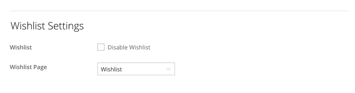
Wishlist Settings
Wishlist is like a bookmark feature that allows users to add products in their favorite list. Signup is not required to add wishlist items. The wishlist items are stored locally on user's browser cookie. Note that if the user clears the browser cookies, the wishlist items will be removed.
To configure Wishlist Settings:
- Go to WP Admin > Themify > Settings > Shop Settings => Wishlist Settings
- Wishlist is enabled by default. You can disable the Wishlist feature by checking the "Disable Wishlist" checkbox. Once Wishlist is disabled, the heart icon on the header and product layout will disappear.
- Select the "Wishlist Page" where you want the heart icon on the header to link to.
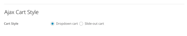
Ajax Cart Style
Ajax cart allows users to add items without having to reload the page. When an item is added, the ajax cart slides out for a second to indicate the item has been added. When users click on the cart icon on the header, it will show the ajax cart. There are 2 Ajax cart styles available: either dropdown or slide-out cart.
To choose the Ajax Cart Style:
- Go to WP Admin > Themify > Settings > Shop Settings => Ajax Cart Style
- Choose either "Dropdown cart" or "Slide-out cart"
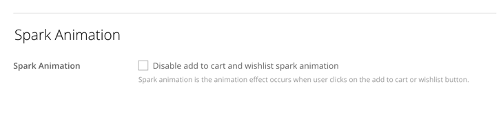
Spark Animation
Spark animation is the animation effect occurs when user clicks on the "Add to cart" button or wishlist icon. You can disable it at WP Admin > Themify > Settings > Shop Settings => Spark Animation.
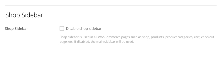
Shop Sidebar
Shoppe has additional widgetized sidebar called "Shop Sidebar", that is used in all WooCommerce pages such as shop, products, product categories, cart, checkout page, etc.
To add widgets in Shop Sidebar:
- Go to WP Admin > Appearance > Widgets and drop widgets in the "Shop Sidebar" panel.
- Themify Product Filter plugin is recommended for the Shop Sidebar area, so visitors can quickly search/filter your products on the shop page.
- To display a product filter in Shop Sidebar:
- Install Themify Product Filter plugin.
- Go to WP Admin > Product Filter > Add New to create a product filter.
- After the product filter is created, copy the product filter shortcode provided (see screenshot).
- Go to Appearance > Widgets, drop a Text widget in "Shop Sidebar" panel, and paste in the product filter shortcode.
To disable Shop Sidebar:
- Go to WP Admin > Themify > Settings > Shop Settings.
- Check the "Disable shop sidebar" checkbox. If it is disabled, the default main sidebar will be used.
Adding Products
This section covers the basics of adding WooCommerce products and the additional product options come with the theme. If you need a complete guide on setting up products, please read the official WooCommerce documentation.
To add Products:
- Go to WP Admin > Products > Add Product
- Enter the product name
- Enter the full product description in the WordPress visual editor (this text will appear in the Description/Review tab on single product view)
- Select product categories on the "Product Categories" meta box (to add new categories, click "+ Add New Product Category")
- Optional: Add product tags in the "Product Tags" meta box if you want to further categorize products by tags.
- On the "Product Image" meta box, click "Set product image", then click "Upload Files" tab to upload a new image. If you already have the image in the Media Library, click "Media Library" tab to select existing image.
- If your product has multiple image: on the "Product Gallery" meta box, click "Add product gallery image", then click "Upload Files" tab to upload new image or click "Media Library" tab to select existing image. This product gallery is also used as the product image slider on product archive archive view.
- On the "Themify Custom Panel", you should see the following tabs:
- Product Options = Generally you can leave them as default (the default settings can be configured at Themify > Settings > Shop Settings => Single Product Page). If you want to override the default settings in this particular product, then choose the options here.
- Page Appearance = The Page Appearance options here will override the global Theme Appearance settings configured at Themify > Settings > Theme Settings. If you don't want to override them, leave everything as default.
- Themify Builder = The drag & drop Builder content entered here will appear on the product single view under the "Description" tab.
- On the "Product Data" meta box:
- Enter the "Regular price" (if you don't enter a price, the "Add to cart" button will not show)
- If the product is on sale, enter the "Sale price". If you want to limit the sale period, click "Schedule" and enter the sale price dates.
- If you sell digital products (eg. music songs, ebooks, videos, etc.), then check the "Downloadable" checkbox. Once "Downloadable" checkbox is checked, you will see these additional options: "Downloadable files", "Download limit", "Download expiry", and "Download type". Click "Add file" to add downloadable files, then enter the file name and click "Choose file" to upload the file. When customers puchase this product, they will have access to download the files uploaded here.
- If you sell tangible products, you might want to go to the "Inventory" and "Shipping" tab to enter the inventory and shipping info.
- On the "Linked Products" tab, you can select the up-sells, cross-sells and grouping products.
- On the "Attributes" tab, you can add product attributes such as sizes, colors, etc.
- On the "Advanced" tab, you can add purchase note to customers, enter menu order, and choose whether to enable product reviews (if you want to disable product reviews in all products, go to Themify > Settings > Shop Settings => and check "Disable product reviews" checkbox.
- On the "Product Short Description" meta box, enter the description text. This text will appear below the product title. Note that the full product description (that is the text entered in the WordPress editor) does not appear in product quick look lightbox (only Short Description will show in quick look lightbox).
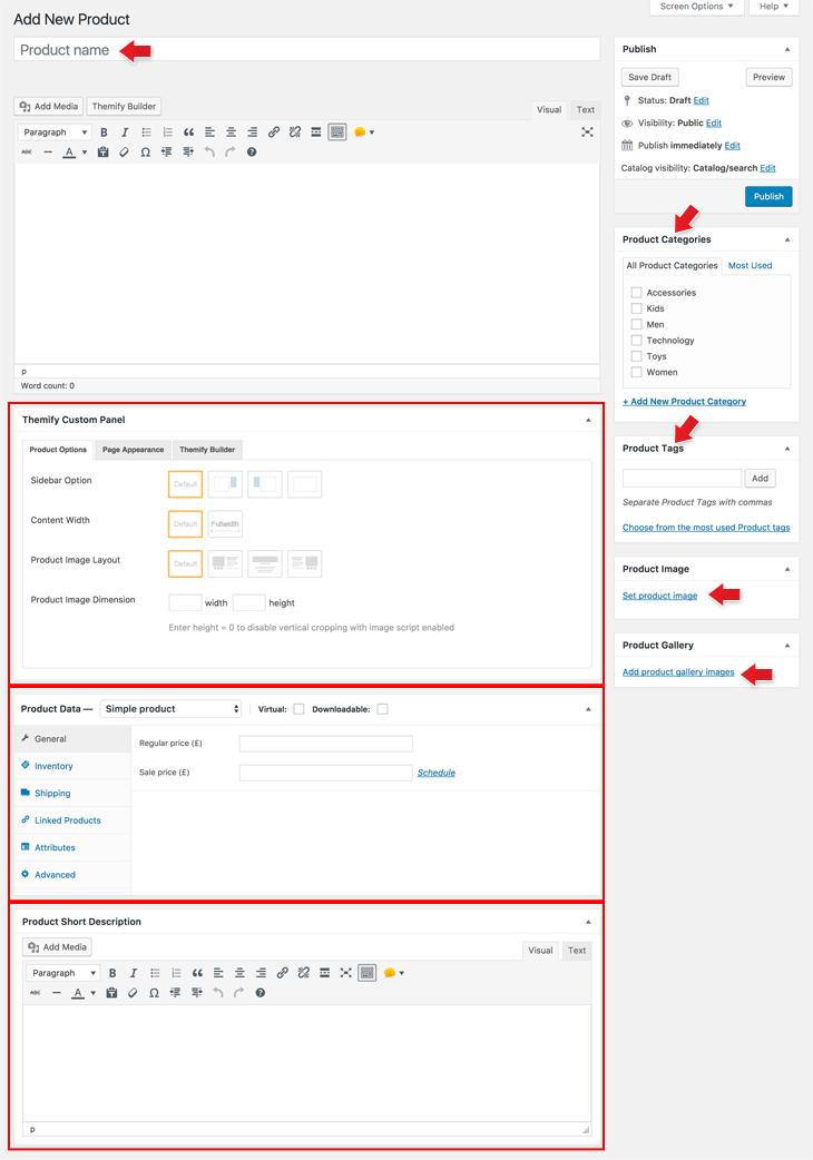
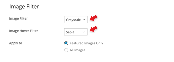
Image Filters
There are 3 different image filters built in the theme: Grayscale, Blur, and Sepia. Note that image filters only apply to the actual image on the page, not background image nor videos. Also, some browsers like Internet Explorer does not support image filter.
To set global Image Filters:
- Go to WP Admin > Themify > Settings > Theme Settings, under the Image Filter options, select:
- Image Filter = Will apply the filter to the image (default is none).
- Image Hover Filter = Will apply the filter when the cursor hovers on the image only.
- Apply to:
- Featured image Only = Will apply to the post featured image only.
- All image = Will apply the filter to all image on the entire page.
- Example: If you want to have grayscale image and show the Sepia image filter on hover, you would select Image Filter = Grayscale and Image Hover Filter = Sepia.
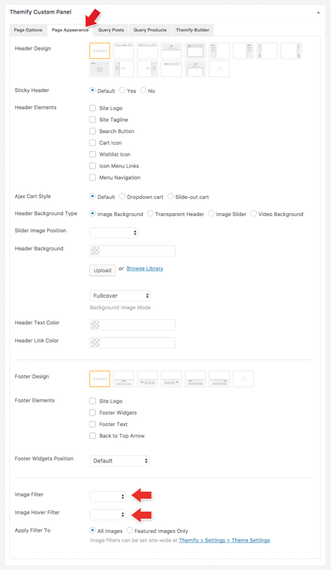
To set the Image Filter per post/page individually:
- Add or edit a post/page, in the Themify Custom Panel > Page Appearance, select the Image Filter and Image Hover Filter
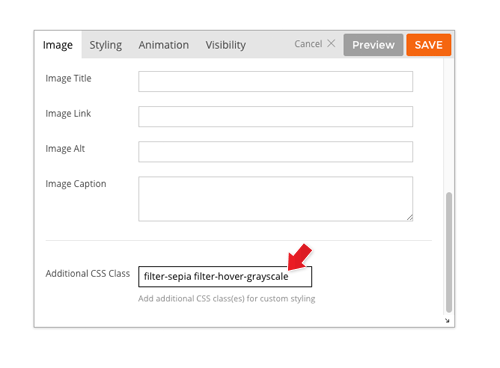
To set the Image Filter in Builder rows and modules:
To set the Image Filter in the Builder rows and modules, you would enter the image filter class name in the "Additional CSS Class" of the row or module options. Read more about Additional CSS Class.
Image Filter class names:
- filter-grayscale
- filter-blur
- filter-sepia
Image Hover Filter class names:
- filter-hover-grayscale
- filter-hover-blur
- filter-hover-sepia
- filter-hover-none = will restore to original (i.e. no filter on hover)
Examples:
- If you want to have grayscale image filter, you would enter 'filter-grayscale' in the "Additional CSS Class"
- If you want to have sepia filter and hover to grayscale, you would enter 'filter-sepia filter-hover-grayscale' in the "Additional CSS Class"
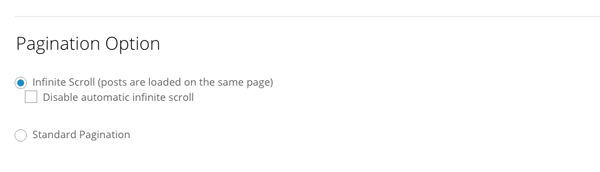
Pagination Options
Default pagination is infinite scroll which show more posts as user scrolls down the page. To change it, go to WP Admin > Themify >Themify Settings > Theme Settings => Pagination Option:
- Infinite Scroll = Load more posts as viewer scrolls down the page.
- Disable automatic infinite scroll = Will show a "Load More" button and viewer must click this button in order to load more posts.
- Standard Pagination = Will disable infinite scroll and show the regular number pagination instead.
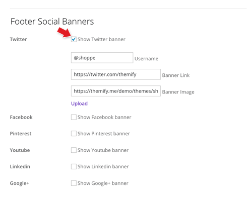
Footer Social Banners
Encourage visitors to follow your shop's social networks by adding the footer social banners.
To add Footer Social Banners:
- Go to WP Admin > Themify > Settings > Theme Settings
- Under the "Footer Social Banners" section, click the checkbox to enable the preset social networks (Twitter, Facebook, Pinterest, etc.), then enter the username, the banner link (which is your social network page URL), and upload the banner image (recommended banner size is 420 x 100px).
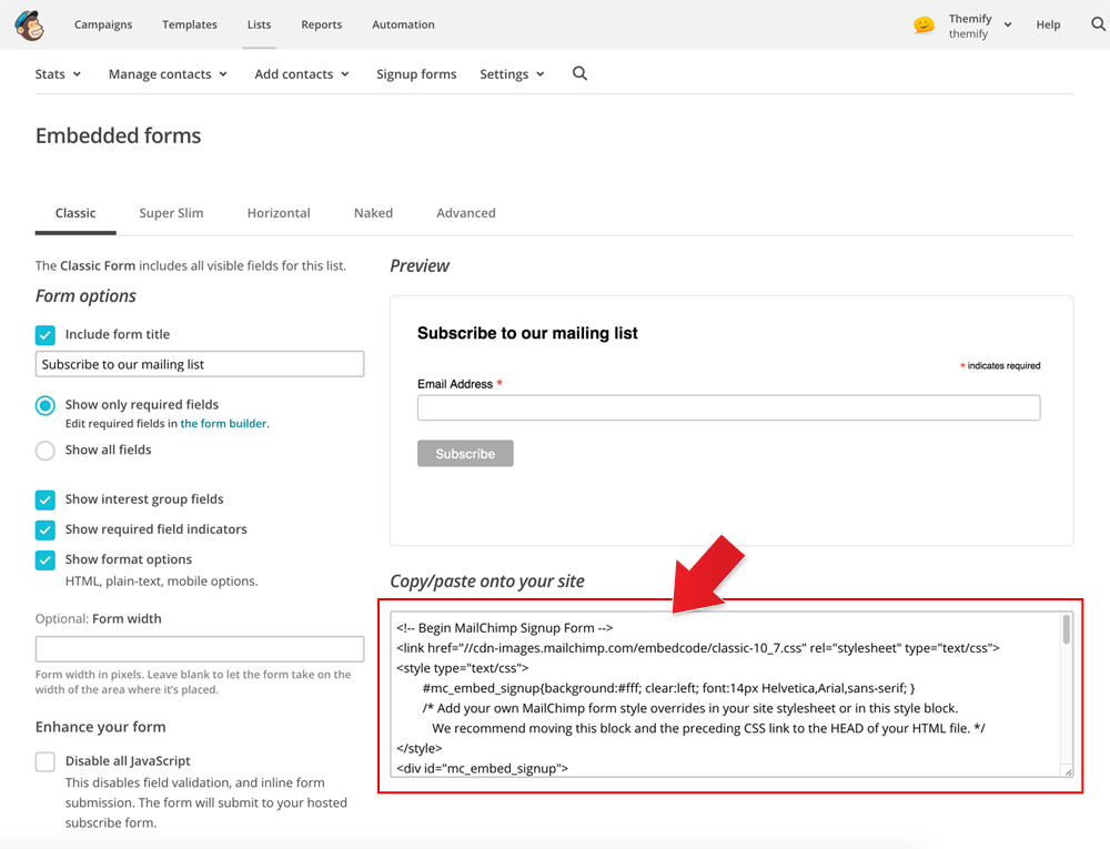
Mailchimp Newsletter Forms
We use Mailchimp newsletter services on our demo. You can sign up for free and it will allow you to send up to 2,000 subscribers.
To Embed the Mailchimp Subscription Forms:
- Login to Mailchimp (if you don't have an account, you can sign up for free)
- After you login, go to "Lists" (if you don't have a list, create a new list), then click the list in which you want to embed the newsletter sign up form.
- Then click on "Embed Forms"
- It will direct you to configure the form options (see screenshot)
- After you are done with the configuration, copy the code provided
- To embed the subscription form in the WordPress editor: first click on the "Text" tab on the editor, then paste in the Mailchimp form code.
- To embed the subscription form via Themify Builder: drop in a "Plain Text" module and then paste in the Mailchimp form code.
Setting Default Post and Page Layouts
Generally, the theme works out of the box. All the sidebar options and image dimensions are pre-defined in the theme. If you need to change the default sidebar options, featured image dimensions, content/except display, post meta, etc., it can be done in the WP Admin > Themify > Settings > Default Layouts.
There are three default layout options under Themify > Settings > Default Layouts:
- Archive Sidebar Option: refers to the default home page, category, search, archive, tag pages, etc.
- Default Post Layout: is the post page direct URL (also known as "Single Post").
- Note: Some themes may only have 4 layouts.
- Default Static Page Layout: is the static page.
FYI: Read Default Layouts documentation for more info.
Creating a Blog Page
To create a blog page:
- First, create a new Page (go to WP Admin > Pages > Add New), name it "Blog" or any page title as you want.
- View the page on the frontend, click "Turn On Builder".
- Drop in a Post module and configure the options as you like.
Setting a Custom Front Page
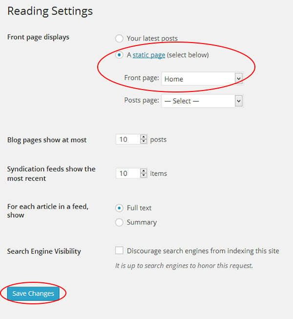
You can set any page as the front (home) page. This means you can use the Builder to design the page and assign it as the front page. To set the Front Page:
- Go to WP Admin > Settings > Reading.
- On the Front page displays, select the "A static page (select below)" option and then select a "Front page".
- Leave the "Posts page" default. If you want to create a custom Blog page, read this tutorial instead of setting the "Posts page".
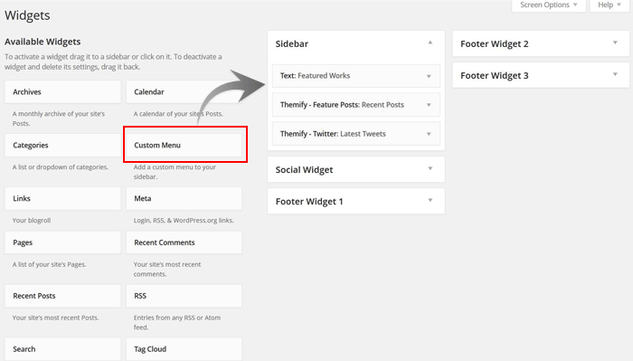
Adding Widgets
To add widgets to widgetized areas (eg. sidebar and footer widgets):
- Go to WP Admin > Appearance > Widgets.
- The big panel on the left side shows all available widgets. The small panels on the right are the widgetized areas.
- To add a widget: drag and drop the widget from the left panel to the right panel.
- To remove the widget: drag the widget back to the left panel (Available Widgets panel). If you want to keep the widget setting for future use, drag it to the Inactive Widgets instead of the Available Widgets panel. It will save your widget settings. To retrieve the widget, drag the widget from Inactive Widgets panel instead of the Available Widgets panel.
TIPS: You can also add widgets in Appearance > Customize panel.
Footer Widgets
- To set the Footer Widget column layout, go to WP Admin > Themify > Settings > Theme Settings.

- To drop the widgets in the Footer Widgets, go to WP Admin > Appearance > Widgets.
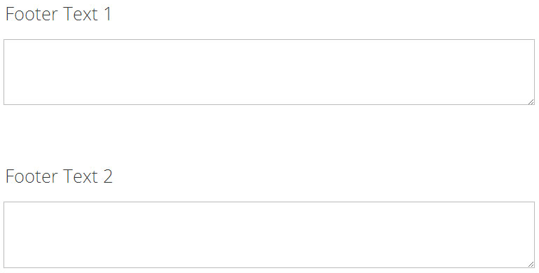
Footer Text
To replace the footer credit links:
- Go to WP Admin > Themify > Settings > Theme Settings and enter the footer text.
- HTML tags are allowed in the Footer Text.
- To have empty footer text, tick the hide footer text checkbox.
FAQs
How to change the theme gold color to another color?
To change the accent color, go to Appearance > Customize > Accent Colors, choose the "Theme Accent Color" as you like.
I've installed the theme on a fresh site, but don't know how to use the Builder.
To use the Builder, you would need to add a page (go to WP Admin > Pages > Add New) and then view the page on the frontend, click "Turn on Builder" to start. For more details, read the Builder documentation.
How to insert Google Analytics or Facebook Pixel tracking code?
If you need to insert additional Javascripts or tracking code in <head> or end of </body>, you can enter them in Themify > Settings > General > Header Code or Footer Code. For Google Analytics code, you can just enter the "Measurement ID" on Themify > Settings > General > Google Analytics.
How to add content to the header, footer, sidebar, post, etc.?
You can use the Hook Content to add content (including advertisement code) on the site without modifying the theme PHP template files.
How to create custom templates for header, footer, blog post, WooCommerce products, etc.?
To create custom templates for header, footer, post, page, products, etc., you would need to use Builder Pro. With Builder Pro installed and activated, create a Pro Theme, then create the Pro Templates. For more info, read the Builder Pro documentation.
How to add custom post types?
To add custom post types and taxonomies, you would need the Post Type Builder (PTB) plugin. Refer to the PTB documentation on how to use it. You can use PTB to create the custom post types and then use Builder Pro to create the templates. Here is a sample tutorial on how to use PTB & Builder Pro to create a dynamic movie review site.
How to restore the handwritten prior v5 update?
The old handwritten font style has been removed since Shoppe 5.0.0 update. You can restore it by creating a custom font.
- Download this Selima font file: https://themify.me/wp-content/uploads/2017/02/selima_-webfont.woff
- Go to Themify > Custom Fonts > Add new
- Enter "Selima" as the font name and upload the font file in WOFF File, publish font
- Then go to Appearance > Customize > Custom CSS, add:
h1 {
	font-family: "selima";
	font-size: 4em;
}
.related.products .fancy-heading{
	font-family: "selima";
}
I updated to Shoppe 5.0+, there are rounded corners on featured images and form inputs/buttons. How do I remove them?
To remove the rounded corners on images and buttons, go to Themify > Settings > Theme Settings > Theme Appearance > Rounded Corners, there are options to reset rounded corners for featured image and general form inputs/buttons.
You can also change the rounded corner value on the theme and Builder elements by adding the CSS below in Appearance > Themify Options > Custom CSS:
:root{
    --theme_rounded:8px;
    --theme_btn_rounded:12px;
    --tb_rounded_corner:8px
}
How can I translate the words output by the theme?
You can translate the theme using a plugin such as Loco plugin, WPML, or Poedit.