Creators of the popular game Mousehunt, HitGrab Inc., shared to us how they were able to redesign their site with a tight deadline with Themify. Using the Parallax theme and Themify Builder, they transformed their site into an one-page design which enables them to showcase their games, as well as, the company profile. Continue reading to see how they did it.
Before: HitGrab Inc. Story
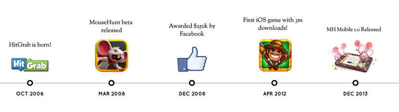
HitGrab Inc. is a gaming company that build games on both social and mobile platforms. They were awarded by Facebook a grant of $250,000, out of the thousands of social application companies. Their leading game, MouseHunt, spearheads their charge in becoming one of the top gaming companies by claiming the title of being the first iOS game with over 3 million downloads in 2012. Aside from their success with their games, HitGrab has developed a corporate culture that's fun, exciting, and "a little weird". Their weird attribute is directly correlated to their deep bond with their players and the way they interact with them through social media. With their Mousehunt Facebook page reaching over 400,000 Likes, HitGrab Inc. has created an active and engaged community. Now they want to translate this corporate culture and success they've amassed over the years onto their company website. This led them to begin their own hunt to redesign their site.
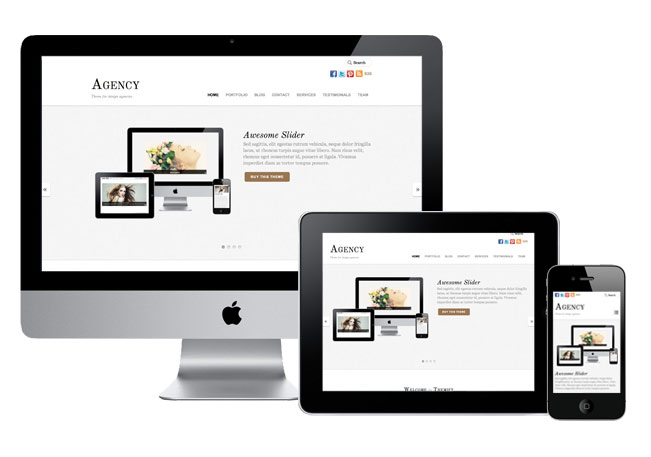
Themify has been on a roll lately, releasing WordPress themes that really push the boundaries of responsive design. Today is no different. We are proud to announce Agency, a clean, minimal, and responsive theme meant for design agencies. Agency is packed with a bunch of custom post types: Portfolio, Highlight, Testimonial, and Team. It allows you to beautifully showcase your services, portfolio, and products. Fully customizable using the Themify shortcode convention, allowing complete freedom in how the website behaves and displays itself across any and all devices. See our demo: Home 1, Home 2, and Home 3.
Limited time offer: use the coupon code "agency" to save 30% off the Agency theme. Offer ends on Nov 28, 2012.
Responsive Design
As usual, we have built Agency as a responsive WordPress theme out of the box. This means that you will see the same beautiful Agency WordPress themes, regardless of your monitor size or mobile device, without having to code.
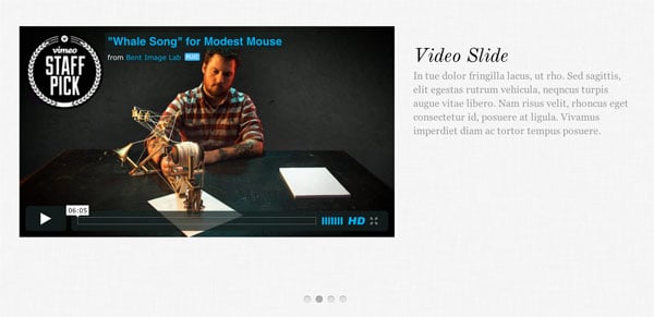
Slider
With Agency, you can create custom slider content using images, videos, captions, and galleries.
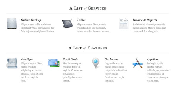
Custom Post Types
Agency theme uses WordPress custom post types to manage the portfolio items, highlights, testimonials, and team members so that they are completely separate from the blog posts. Each custom post type has its own custom panel which makes it very simple to manage your content.
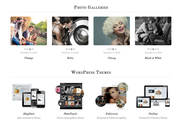
Portfolio
With Portfolio posts, you can use a single static featured image, or use multiple images and Agency will automatically create a slider with all of your images. See Portfolio shortcode demo.
Highlight
Use the Highlight posts to display a short paragraph of text to highlight your agency's feature list or services provided. You can take a look at our Highlight demo to get a better idea of how this works.
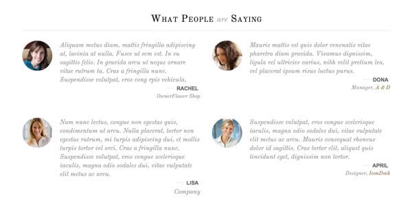
Testimonial
Use customer testimonials to provide social proof for visitors to your agency website and increase lead generation and conversion rates. Take a look at our Testimonial demo to see them in action.
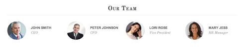
Team
Use Team posts to display a complete list of your team members. Team members can be categorized based on their job title, such as Executive, General, Management, etc. You can take a look at our Team demo to understand how Team posts work.
Full Control of Page Layout with Shortcodes
Agency theme uses custom post types to display any content, anywhere on the page, post, or sidebar widgets. Each post type shortcode has fully customizable parameters which allow you to affect layout style, image size, toggle content, etc. You can also combine any of our existing shortcodes to create unique page layouts. Check out our demo pages: Home 1, Home 2, and Home 3. Be creative with the shortcodes.. mix it with column, slider, map, or any shortcode from plugins.
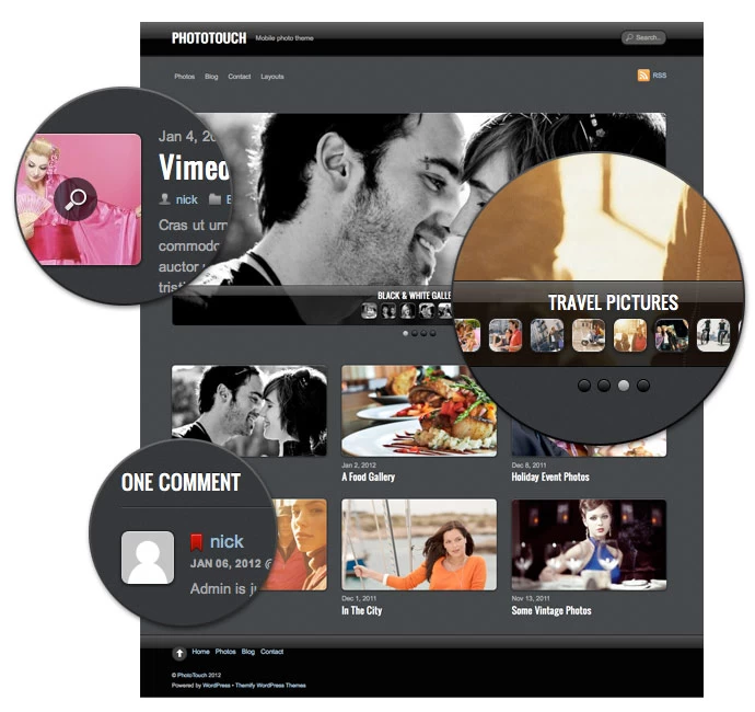
Hope you had a fantastic holidays and that you've taken a lot of photos over the holidays because we have a new responsive photo theme for you - PhotoTouch. It is a beautiful photo theme designed with mobile devices in mind. It features a gallery/slideshow that mimics the iPhone native Photos app. User can swipe or press arrow keys to go through the photos, double tap, auto play, pinch and expand, etc. Combined with the responsive design and slider, PhotoTouch is the perfect theme to showcase your photo portfolios. Most importantly, it works on both desktop and mobile devices such as iPhone, iPad, Blackberry, and Android phones (view demo).
We are offering 30% disount code for this new theme. Use the coupon code "phototouch" for a 30% discount off this theme until Jan 12, 2012.
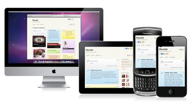
We are please to announce that Wumblr has been updated. We added new modules where you can set the default layout for: Archive (index, search, category, tag pages, etc.), all Pages, and all Posts. As a bonus, we also added a mobile version to it. Wumblr now has the same fluid layout feature as our popular responsive design themes: iTheme2, Minblr, and Funki. What is responsive design? Basically, the layout automatically flows (responds) base on the browser viewport. This means the layout will still look good and consistent when viewed from most modern devices (desktop or mobile) and any screen resolution. To see this in action, visit our demo, resize your browser window to see the fluid layout. Also, don't forget to try it on a mobile device such as iPad, iPhone, Android, and Blackberry.
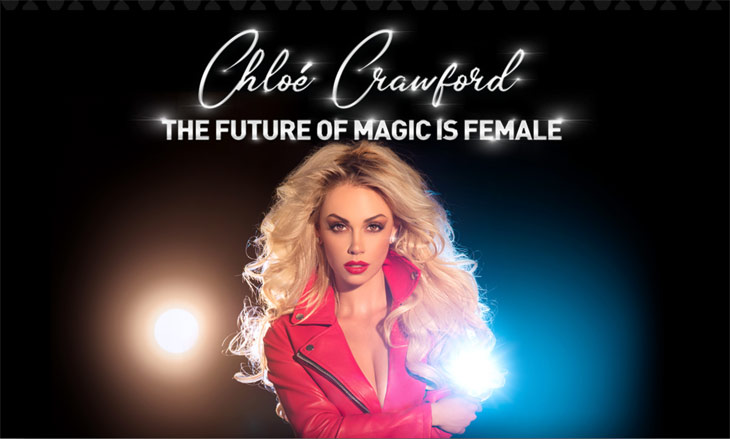
For this month’s customer story, we wanted to feature a web developer’s mystical work behind many prestigious creatives, many of whom have made appearances on ‘Penn & Teller: Fool Us’, ‘Wizard Wars’, and ‘Ripley’s Believe It or Not’. These artists risk life and limb, push the envelope of entertainment, and they trust one man for their online representation. Meet Bizzaro and hear his story!
About Me
Greetings! My name is Bizzaro and I use Themify to make my life easier. Most recently I completed a website for a high-profile client by the name of Chloe Crawford. She was featured on ‘Britain’s Got Talent’, ‘Sports Illustrated SI’, and ‘Playboy’, and you might have never guessed it but Themify was our perfect WordPress theme of choice.
Now before I go into some of my web designing work, allow me to tell you a little bit about what I do on the daily. I am a magician and prop maker in Las Vegas, NV. When I am not performing, I am part of a company called “Test Subjects” that creates and builds escape rooms. (more…)
Responsive WordPress themes and responsive design in general has emerged as a hot topic in the digital world. At Themify, we made the decision to create responsive WordPress themes rather early on, and it has become one of our strongest features and selling points. Because of our extensive knowledge in this domain, we wanted to clear up exactly what you get with a “responsive WordPress theme” and what it means when you buy an awesome WordPress theme from Themify.
What is a “responsive WordPress theme”?
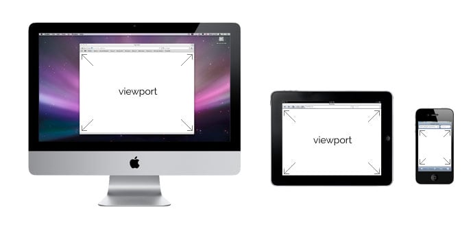
When answering this question, we can also answer the question “What is a responsive design?” A responsive design and responsive WordPress theme utilize CSS and JavaScript to adapt a website’s layout to the user’s “viewport.” For those who don’t know, a “viewport” is essentially the visible portion of the canvas inside a web browser.
We use responsive design to create a consistent user experience for browsers of all shapes and sizes because the digital world doesn’t run on just 4:3 resolutions anymore. We adapt content to viewports of different sizes, including everything from mobile phone browsers all the way up to large television screens.
Many people confuse “responsive design” with “mobile design,” but mobile design targets mobile devices specifically, whereas responsive design includes support for mobile devices and many more.
What does “responsive design” look like?
To get an idea of what responsive design, especially in WordPress, can achieve, take a look at our Elemin theme.
Elemin displays nicely on your standard browser size, but you can change the size of your browser to get an idea of how the layout changes and adapts along with the width of your browser window. The layout never breaks, and the content simply flows to fit with the browser’s viewport.
A viewer can enjoy a website using the Elemin theme on their desktop, their laptop, their notebook, their tablet, their mobile device, and even their television. The layout and experience of the website remains consistent throughout.
Here are some more hand picked responsive WordPress themes from Themify
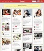
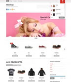
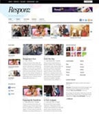
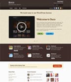
As shown in the examples below, responsive design is not limited to just blog theme. It can be complex grid layout like Pinboard, Ajax shop theme Minshop, 3-column Responz, and corporate theme with responsive slider like Suco. Check our responsive themes collection for more.