17
Jul
2015
/
Accordion
The Accordion module is used to display content in boxes which can be toggled open and closed with an accordion effect.
To use the Accordion module:
- Enter a title for the accordion tab in the "Accordion Title" field
- Drop in modules in the accordion nested subrow for "Accordion Content". You can drop any modules in the accordion nested subrow, select the subrow grid and add styling.
- To add another accordion tab, click the "Add new" button
- To delete or duplicate an accordion tab, hover over the burger menu icon (top left to the accordion title)
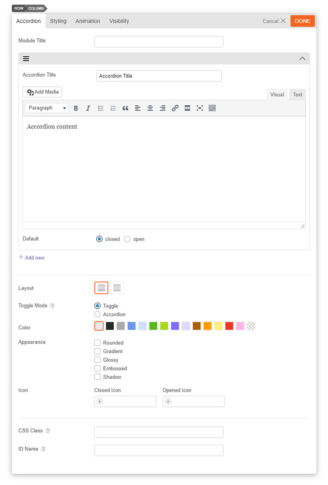
- Module Title This option is used to add the title of your module.
- Accordion Title The title shown in the accordion heading for each accordion tab.
- Default Open/Closed This option determines whether a tab default displays as open or closed.
- Add New This option adds a new accordion tab.
- FAQ Schema Enable this option to use the Accordion as FAQ.
- Title HTML Tag Select the HTML tag for the accordion title element.
- Accordion Layout This option is used to determine the layout and style of the accordion module and will affect how the tabs are shown.
- Option 1 This layout will show the tab headings and content as one block.
- Option 2 This layout will show the tab headings separate from the content in two blocks.
- Toggle Mode This option is used to change what will happen when a user clicks on an accordion heading.
- Toggle When clicking a tab heading, the selected tab will open and other tabs will still remain open.
- Accordion When clicking a tab heading, the selected tab will open and other tabs will be closed.
- Accordion Color This option is used to change the color of the accordion module.
- Accordion Appearance These options provide the ability to toggle various effects for the accordion boxes.
- Rounded Toggles whether the corners of the module's content will be rounded.
- Gradient Toggles whether the module will have a gradient effect applied to it.
- Glossy Toggles whether the content area will have a gloss overlay effect applied to it.
- Embossed Toggles whether the module will have an emboss effect applied to the edges.
- Shadow Toggles whether the module will have a shadow effect applied to it.
- Icon Add an icon that'll appear when your accordion is opened or closed.
- URL Hashtag Enable this for adding hashtag to accordion title (users can copy & paste the URL hashtag to open the accordion).
Alert
The Alert module is used to show a notification or alert on your site. The alert visibility can be scheduled, displayed for a specific number of times, showed to either login/public visitors, and auto closed after a certain number of seconds. It can also be used as an action box. There is an optional action button to display a message or redirect the guest to another page once it is clicked.
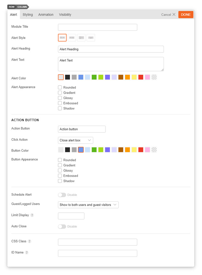
To use the Alert Module:
- Module Title This option is used to add the title of your module.
- Alert Style Choose from 4 different styles: (1) Button Right (2) Button Left (3) Button Bottom, (4) Button Center
- Alert Heading This option is used to set the heading text of the module.
- Alert Text This option is used to set the body text of the module.
- Alert Color This option is used to change the color of the module.
- Alert Appearance These options provide the ability to toggle various effects for the module.
- Action Button Enter the text that will show inside the action button.
- Action Click Action Choose the action that'll occur when you click the button: (1) Close alert box (2) Display a message (3) Go to URL.
- Action Button Color This option is used to change the color of the action button.
- Action Button Appearance These options provide the ability to toggle various effects for the action button.
- Rounded Toggles whether the corners of the module's content will be rounded.
- Gradient Toggles whether the module will have a gradient effect applied to it.
- Glossy Toggles whether the content area will have a gloss overlay effect applied to it.
- Embossed Toggles whether the module will have an emboss effect applied to the edges.
- Shadow Toggles whether the module will have a shadow effect applied to it.
- Schedule Alert Toggle to enable the ability to schedule the alert. Enabling it will allow you to set the start and end time.
- Guest/Logged Users Set to: (1) Show to both users and guest visitors (2) Show only to guest visitors (3) Show only to logged-in users.
- Limit display Enter the number of times the alert appears.
- Auto Close Toggle to show the duration in seconds for how long the alert should appear.
Box
The Box module is used to display a box of content using the standard WordPress WYSIWYG editor. You can also insert shortcodes with the Box module.
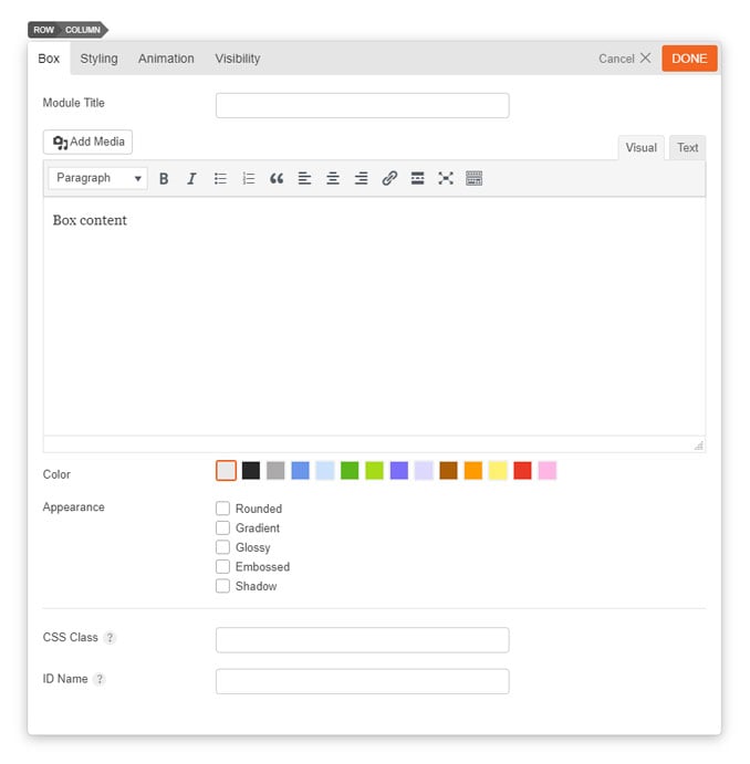
- Module Title This option is used to add the title of your module.
- Editor You can add the content you wish to be displayed in the box module using the WordPress WYSIWYG editor.
- Box Color This option is used to change the color of the box module.
- Appearance These options provide the ability to toggle various effects effects to be applied to the box.
- Rounded Toggles whether the corners of the module's content will be rounded.
- Gradient Toggles whether the module will have a gradient effect applied to it.
- Glossy Toggles whether the content area will have a gloss overlay effect applied to it.
- Embossed Toggles whether the module will have an emboss effect applied to the edges.
- Shadow Toggles whether the module will have a shadow effect applied to it.
The Button module allows you to add a button with custom styling onto your site.
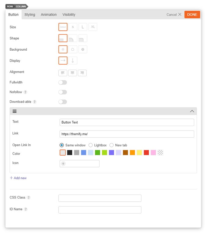
- Size Select the size of the button you would like to use.
- Shape Select the shape of the button you would like to use.
- Button Background Style Choose the background style of the button.
- Display Choose to display your button horizontally or vertically.
- Alignment Choose to display your button to the left, centre, or right.
- Fullwidth Toggle to display your button fullwidth.
- Nofollow Toggle to disable search engines from crawling this link.
- Downloadable Toggle to enable user to download link as file.
- Text Input the text that will appear on the button.
- Link Input the link that the user will be redirected to.
- Open link in: When the user clicks the button, select how your link will appear
- Same Window The link will load and open in the same window.
- Lightbox The link will open inside a lightbox.
- New tab The link will open in a new tab.
- Color Select from pre-selected colors for how you want your button to appear. Font color will change depending on the color preset you select.
- Icon You can select the icon that you would like to insert with your button text. This will appear on the left side.
- Add new Select this to add more than one button.
Callout
The Callout module is used to display a content box with an associated action button.
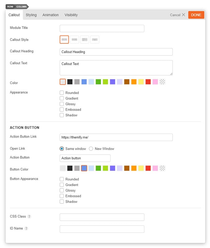
- Module Title This option is used to add the title of your module.
- Callout Style This option is used to determine the style of the callout box and how the callout text and action button are shown.
- Option 1 The callout text will be shown on the left and the action button will be shown on the right.
- Option 2 The callout text will be shown on the right and the action button will be shown on the left.
- Option 3 The callout text will be shown above the action button and the content will be left aligned.
- Option 4 The callout text will be shown above the action button and the content will be center aligned.
- Callout Heading This option is used to set the heading text of the callout box.
- Callout Text This option is used to set the body text of the callout box.
- Callout Color This option is used to change the color of the callout box.
- Callout Appearance These options provide the ability to toggle various effects for the callout box.
- Rounded Toggles whether the corners of the module's content will be rounded.
- Gradient Toggles whether the module will have a gradient effect applied to it.
- Glossy Toggles whether the content area will have a gloss overlay effect applied to it.
- Embossed Toggles whether the module will have an emboss effect applied to the edges.
- Shadow Toggles whether the module will have a shadow effect applied to it.
- Action Button Link This option is used to set the link URL of the action button.
- Action Button Text This option is used to set the text that will show inside the action button.
- Action Button Color This option is used to change the color of the action button.
- Action Button Appearance These options provide the ability to toggle various effects for the action button.
- Rounded Toggles whether the corners of the module's content will be rounded.
- Gradient Toggles whether the module will have a gradient effect applied to it.
- Glossy Toggles whether the content area will have a gloss overlay effect applied to it.
- Embossed Toggles whether the module will have an emboss effect applied to the edges.
- Shadow Toggles whether the module will have a shadow effect applied to it.
Divider
The Divider module is used to add a border divider between elements.

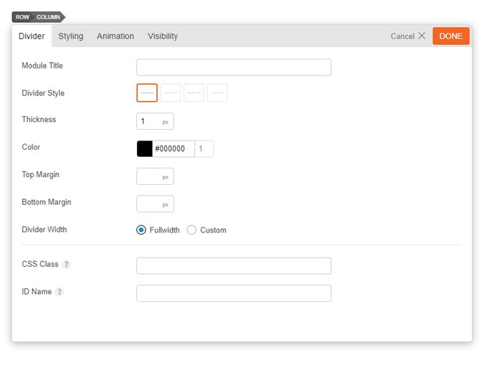
- Module Title This option is used to add the title of your module.
- Divider Style This option is used to determine the line style of the divider.
- Option 1 The divider will be shown as a solid line.
- Option 2 The divider will be shown as small dashes.
- Option 3 The divider will be shown as large dashes.
- Option 4 The divider will be shown as a double line: two lines parallel to one another.
- Stroke Thickness This option is used to set the line thickness of the divider.
- Divider Color This option is used to change the color the divider will show in.
- Top Margin This option is used to set the margin space above the divider.
- Bottom Margin This option is used to set the margin space below the divider.
- Divider Width There are 2 options: (1) Fullwidth or (2) Custom.
Feature
The feature module is used to showcase features or services of your organization with an animated circular progress bar around the icon or any custom image.
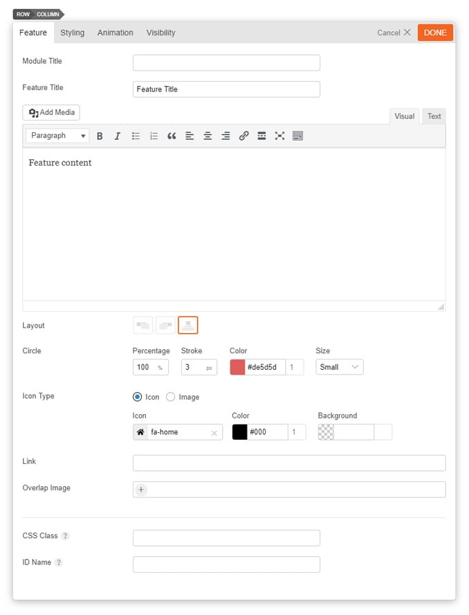
- Module Title This option is used to add the title of your module.
- Feature Title This is the title that appears under the Feature module icon.
- Editor Here you can add the feature content you wish to be displayed under the Feature Title using the WordPress WYSIWYG editor.
- Layout This option is used to set the icon position, it has three options.
- Icon Left Displays the selected icon to the left of the content.
- Icon Right Displays the selected icon to the right of the content.
- Icon Top Displays the selected icon the top of the content.
- Circle Percentage This will set the percentage of the circular progress bar to be filled when animated.
- Circle Stroke This will set the width of the circular progress bar.
- Circle Color This will set the color of the circular bar around the feature icon.
- Circle Size This will set the size of the circle, choose the desired size from the dropdown, "Small," "Medium" or "Large."
- Icon Type Select an icon or image to be used for the feature module using the Font Awesome icon library or upload a custom image.
- Icon This will set the icon to be used for the feature module using the Font Awesome icon library.
- Icon Color This will set the color of the icon to be used for the feature module.
- Icon Background This will set the color of background for the icon to be used for the feature module.
- Link This option is used to link the icon or your custom image and title to a custom URL.
- Same Window This opens the URL in the same window.
- Lightbox This open the URL in a lightbox.
- New tab This opens the URL in a new tab.
- Overlap Image Add an overlap image on the top half of the icon (Tip: This is usually used to showcase the profile image of a person).
- Width/Height: Add a custom image width and height for the overlap image. This only appears when you add an overlap image.
Gallery
The Gallery module is used to add a standard WordPress gallery to your site.
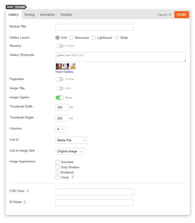
- Module Title This option is used to add the title of your module.
- Gallery Layout Choose to showcase your gallery in Grid, Showcase, Lightboxed, or Slider layout.
- Masonry Toggle to enable masonry, which doesn't have a fixed height.
- Insert Gallery Shortcode This option is used to add the gallery shortcode, either by entering it manually or using the "Insert Gallery" button. Select "Insert Gallery" to setup a gallery with WordPress' "Create Gallery" window as documented here.
- Pagination Toggle to add a pagination when showcasing your images.
- Image Title Toggle to show or hide image titles.
- Image Caption Toggle to show or hide image captions.
- Thumbnail Width Set the gallery thumbnail width.
- Thumbnail Height Set the gallery thumbnail height.
- Columns Select the number of columns for each gallery (1-9 column layout).
- Link to Select the image to link as a media file, attachment page, or none.
- Link to Image Size Select the image size that you would like the image to appear as: Thumbnail, Medium, Large, or Original Image.
- Image Appearance This option provides the ability to toggle various effects to be used on the gallery thumbnails.
- Rounded Toggles whether the corners of the element should be rounded.
- Drop Shadow Toggles a drop shadow effect on the element.
- Bordered Toggles a border around the element.
- Circle Toggles whether the element will be rendered as a circle. (Requires images to be square ratio)
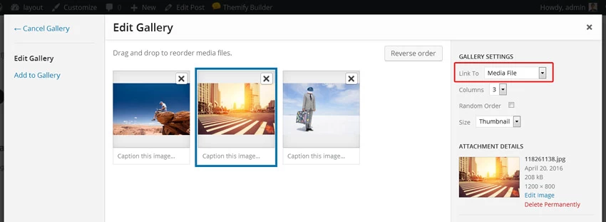
Open images in lightbox
To make the images in gallery grid open in lightbox, make sure to set the Link To option to "Media File" when inserting the gallery:
Icon
The Icon module allows you to add an icon with custom styling to your site.
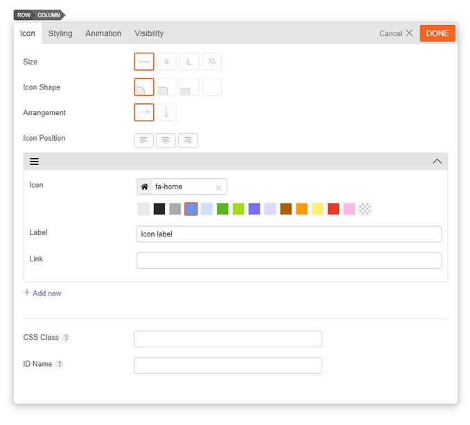
- Size Select the size of the icon you would like to use.
- Icon Shape Choose the style of the icon shape you prefer.
- Arrangement Select to showcase the icons horizontally or vertically.
- Icon Position Set the icon position to left, centre, or right.
- Icon You can select the icon that you would like to insert.
- Select from the colour for your icon from pre-selected colors.
- Label Input the text that will appear with your icon.
- Link Input the link that the user will be redirected to.
- Same window Open link in the same window.
- Lightbox This will link the icon or custom image to open a URL in a lightbox.
- New tab This will open the URL in a new tab.
- Add new Select this to add more another icon.
Image
The Image module is used to add an image with a title and caption on your site.
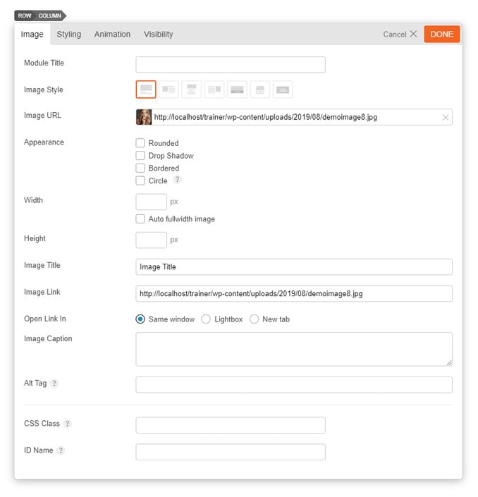
- Module Title This option is used to add the title of your module.
- Image Style This option is used to determine the layout of the image and any title and caption.
- Option 1 Image is shown on top and title/caption is shown underneath.
- Option 2 Image will be shown on the left and title/caption is shown on the right.
- Option 3 Image will be shown in the centre, and title/caption is shown underneath.
- Option 4 Image will be shown on the right and title/caption will be shown on the left.
- Option 5 Title/caption will be shown in an overlay on top of the image.
- Option 6 Image and title/caption will be shown in a box.
- Option 7 Title/caption will be shown as an overlay on the image.
- Image URL This option is used to set/upload an image URL to use for the module, or alternatively you can select an image from your website's media library by clicking the thumbnail, then selecting "Browse Library".
- Image Appearance These options provide the ability to toggle various effects to be applied to the image.
- Rounded Toggles whether the corners of the element should be rounded.
- Drop Shadow Toggles a drop shadow effect on the element.
- Bordered Toggles a border around the element.
- Circle Toggles whether the element will be rendered as a circle. (Requires images used be square ratio)
- Width This option sets the width of the image output.
- Height This option sets the height of the image output.
- Image Title This option is used to set the title of the image.
- Image Link This option is used to set the URL that is linked to by the image being added.
- Same window open link on the same window.
- Lightbox This option is used to link the icon or custom image and title to open a URL in lightbox.
- New tab If checked this will open the URL into a new tab.
- Image Caption This option is used to set a caption for the image being added.
Lottie Animation
Lottie is a lightweight, interactive, and scalable motion graphic format that renders smoothly on all devices (desktop, tablet, and mobile).
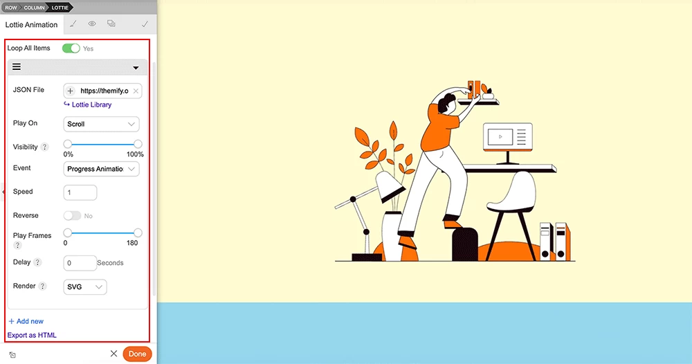
To use Lottie Animation:
- Create/edit any page and turn on the Builder on the frontend
- Add/drop in a "Lottie Animation" module
- If you want to have multiple chain-able Lottie animation in one module, click "+ Add new" to insert them.
- Each Lottie item has the following options:
- JSON File = That is the Lottie .json file. You can upload your own JSON file or click "Lottie Library" to insert it. On the Lottie Library, there are thousands of free Lottie animations available. You can choose to download the files to your own server or use external source hosted on lottiefiles.com.
- Play On = Choose an event to trigger the animation:
- OnLoad = Play animation when it is loaded.
- Click = Play animation when it is clicked. You can target the click action on another element by entering the element's "CSS Selector". Example: if you have a Button module with custom CSS class 'action-button', you would enter '.'action-button .builder_button' as the CSS Selector to trigger the Lottie animation.
- Hover = Play animation when it is hovered. Similar as the Click event, you can enter the "CSS Selector" of another element to trigger the animation.
- Hover & Reverse = Play animation on hover and reverse animation on mouseout.
- Hover & Pause = Play animation on hover and pause animation on mouseout.
- Progress Animation = Progress the animation when you move cursor on the Lottie container.
- Scroll = Play animation as you scroll on the page.
- You can choose the additional options with Scroll option:
- Visibility = Visibility of the element in the viewport. It triggers the "Event" option when the selected visibility range is active.
- Progress Animation = Progress the animation as you scroll on the page (the animation will progress as you scroll down and reverse as you scroll up).
- Play = Play animation
- Product add cart = Play the animation when a WooCommerce product is added to the cart.
- Do not play = Don't play the animation (it will be like a static image).
- Speed = Speed of the animation.
- Reverse = Play the animation in reverse order.
- Play Frames = Play specific frame range of the animation timeline.
- Delay = Delay option is only applicable when you have multiple chain-able Lotties in the same module. It allows to delay the Lottie animation before starting the next one in the chain.
- Render = Render the Lottie animation in either SVG, Canvas, or HTML format. Some features in the Lottie file might not be supported in certain format. Select the format according to your Lottie file. See this table of the supported features in different formats.
- Loop All Items = This option is only applicable when you have multiple Lotties in the same module. It controls the looping of all items.
- Export as HTML = Export the Lottie module as HTML code which you can paste on any page to display it (eg. you can paste the code in sidebar Text widget to display it). NOTE: It requires the Themify framework in order to render the Lottie HTML code.
- Control Lottie sizing: Lottie animation is scalable and responsive. It is fluid width (always fullwidth within the container).
- To control the canvas sizing: on Lottie Animation > Styling > Margin or Padding, you would add margin or padding left/right to control the sizing.
- To control the animation sizing within the canvas: on Lottie Animation > Styling > Aspect Ratio, enter the aspect ratio. Example: "16 : 9" would have a landscape ratio and "1 : 1" would have a square ratio.
Map
The Map module is used to add an interactive Google map to the page. To display a Google Map, enter the full address and configure the available options.
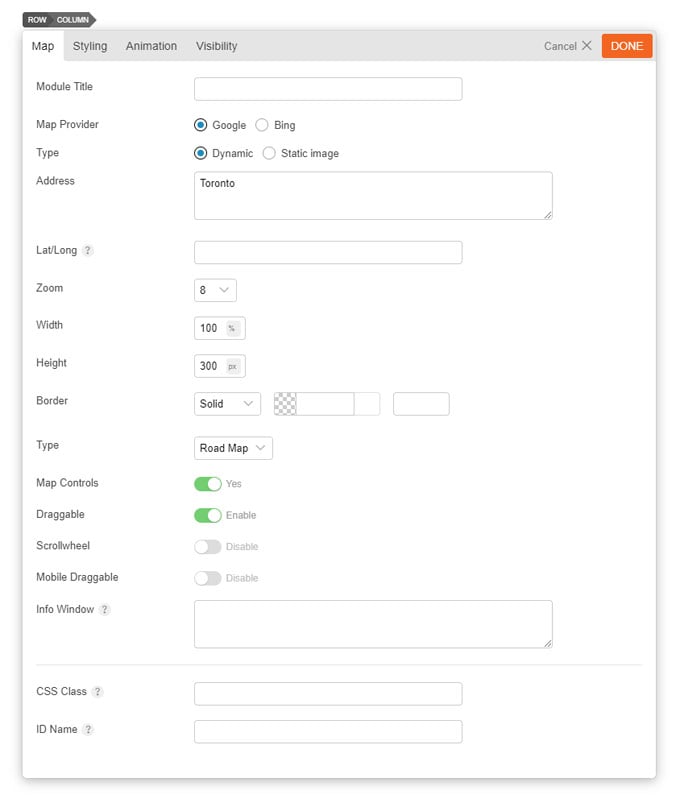
- Module Title This option is used to add the title of your module.
- Map Provider Select which provider you'd like to use to display your map.
- Type Select to showcase the map as Dynamic or a Static Image.
- Address Enter the address you'd like to appear on the map.
- Lat/Long Use Lat/Long coordinates instead of inputting an address.
- Zoom This option sets the zoom level of the map.
- Width This option sets what width the map should be displayed at.
- Height This option sets what height the map should be displayed at.
- Border This options sets the styling of a border around the map element.
- Type This option set the type of map you want to display, you can choose from the dropdown, "Road Map," "Satellite," "Hybrid" and "Terrain".
- Map Controls Toggle to enable or disable the user's access to map controls.
- Draggable Toggle to enable or disable the Draggable feature in the map.
- Scrollwheel Toggle to enable or disable the scrollwheel on the map.
- Mobile Draggable Toggle to enable or disable the draggable feature on the map in mobile mode.
- Info Window Input text that'll appear on the text tooltip when user clicks it on the map.
The Menu module is used to add a custom WordPress menu to the page. To display a custom menu, you have to first create the menu in WordPress > Appearance > Menus. Once you create a menu, they will automatically appear in the "Custom Menu" select dropdown.
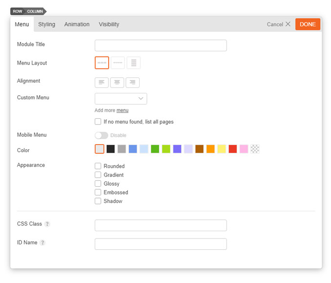
- Module Title This option is used to add the title of your module.
- Menu Layout This option is used to determine the layout of the menu with the following options:
- Option 1 The menu will be shown as a horizontal menu stretching only as far as the menu entries.
- Option 2 The menu will be shown as a horizontal menu stretching the width of the column.
- Option 3 The menu will be shown as a vertical menu.
- Custom Menu Select one of your custom WordPress menus from the dropdown. To createa custom WordPress menu, go to WordPress Admin > Appearance > Menus, as documented here.
- Menu Color This option is used to select the color of the menu.
- According Styles These options provide the ability to toggle various effects to be applied to the menu.
- Rounded Toggles whether the corners of the module's content will be rounded.
- Gradient Toggles whether the module will have a gradient effect applied to it.
- Glossy Toggles whether the content area will have a gloss overlay effect applied to it.
- Embossed Toggles whether the module will have an emboss effect applied to the edges.
- Shadow Toggles whether the module will have a shadow effect applied to it.
Post
The Post module is used to show blog posts.
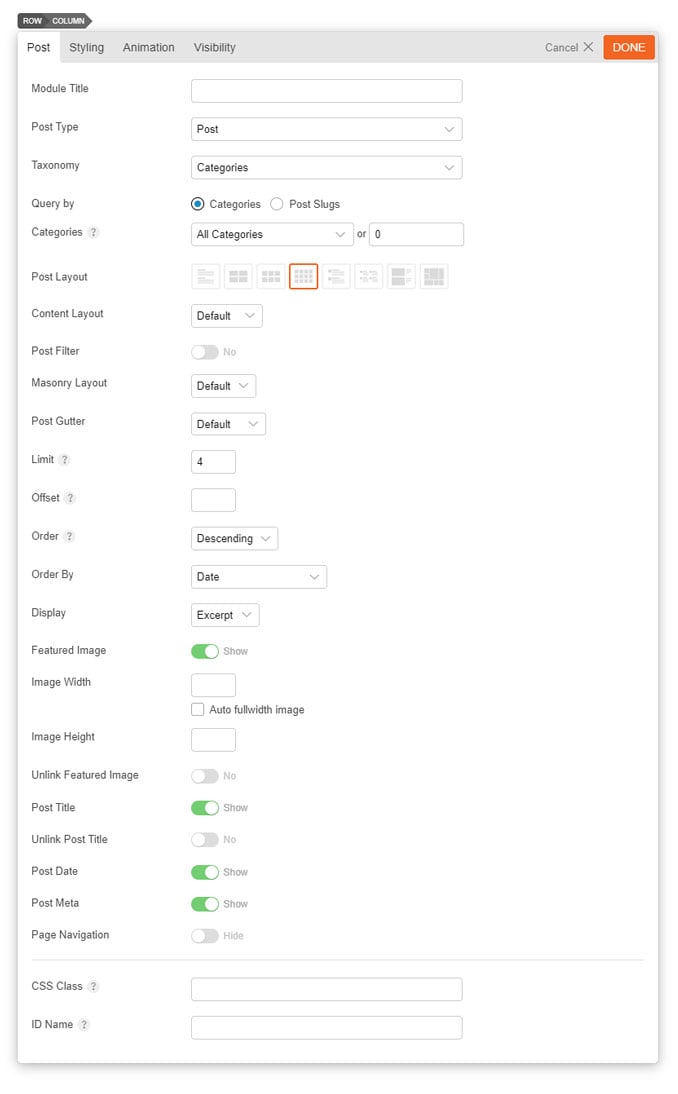
- Module Title This option is used to add the title of your module.
- Post Type Select the post type you would like displayed: Post, Product, Event, or Portfolio.
- Taxonomy Select the taxonomy you would like to display: Categories or Tags.
- Query by Select how you would like to query your posts by: Categories or Post Slugs.
- Categories This option is used to select which categories of posts will be displayed.
- Post Layout This option is used to determine the layout of the posts and how they will be arranged.
- Grid 4 Posts will be arranged in a four column layout.
- List Post Posts will be arranged in a standard one column list.
- Grid 2 Posts will be arranged in a two column layout.
- Grid 3 Posts will be arranged in a three column layout.
- Grid 4 Posts will be arranged in a four column layout.
- List Thumb Image Posts will be arranged in a standard one column list with the post thumbnail.
- Grid 2 Thumb Posts will be arranged in a two column layout with the post thumbnail.
- List Large Image Posts will be arranged in a standard one column list with a large post image.
- Auto Tiles Post will be arranged in a masonry fashion.
- Content Layout Select how you would like the layout of the post's content displayed: Default, Stacking, Overlay, Polaroid, Boxed, Flip.
- Post Filter Toggle to enable or disable filtering your posts by categories or tags.
- Masonry Layout Select if you would like the masonry layout enabled.
- Post Gutter Select your preference of gutter space between your posts.
- Limit This option sets the limit of the number of posts shown.
- Offset This option sets how many posts should be skipped before the first one is displayed.
- Order This option sets whether the posts will be ordered in ascending or descending order.
- Order By This option sets what data the posts order will be based on.
- Display This option sets what content will be output (full content, excerpt or none).
- Featured Image Toggle whether or not the featured image for the posts will be shown.
- Image Width This option sets the width of the featured image output.
- Image Height This option sets the height of the featured image output.
- Unlink Featured Image Toggle to enable or disable whether the featured image will be a link.
- Post Title Toggle to enable or disable whether the post title will be shown.
- Unlink Post Title Toggle to enable or disable whether the post title will be a link.
- Post Date Toggle to enable or disable whether or not the post date will be shown.
- Post Meta Toggle to enable or disable whether or not the post meta will be shown.
- Post Navigation Toggle to enable or disable whether or not navigation links to view more posts will be shown.
Slider
The Slider module is used to add a custom slider of various content types.
To use the Slider module:
- Select a radio button with the content you want to display: Blog Posts, Images, Videos, Text, Portfolio, or Testimonials.
- This will toggle different options according to your selection (e.g. Posts radio button will give you options to display WordPress posts along with its layout options)
- You can then configure the slider options below such as slider layout, slider navigation, and effects
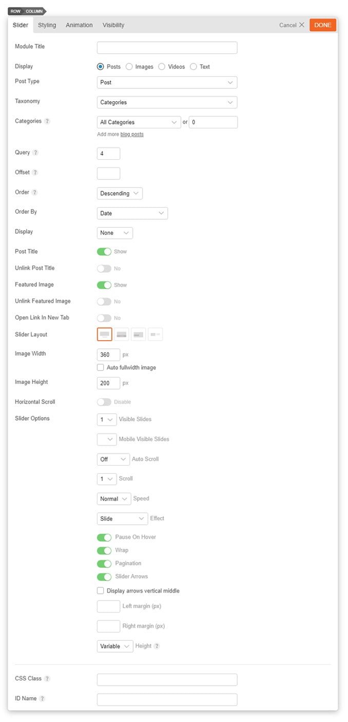
- Module Title This option is used to add the title of your module.
- Display This option allows you to set the type of content the slider will display.
- Post Type Select the post type you would like displayed: Post, Product, Event, or Portfolio.
- Taxonomy Select the taxonomy you would like to display: Categories or Tags.
- Categories This option is used to select which categories of posts will be displayed.
- Query This option sets how many posts to show.
- Offset This option sets how many posts should be skipped before the first one is displayed.
- Order This option sets whether the posts will be ordered in ascending or descending order.
- Order By This option sets what data the posts order will be based on.
- Display This option sets what content will be output (full content, excerpt or none).
- Post Title Toggle to enable or disable whether the post title will be shown.
- Unlink Post Title Toggle to enable or disable whether the post title will be a link.
- Featured Image Toggle whether or not the featured image for the posts will be shown.
- Unlink Featured Image Toggle to enable or disable whether the featured image will be a link.
- Open Link in New Tab Select this option to open link in a new tab.
- Slider Layout This option is used to determine the layout of the slider.
- Image Width This option sets the width of the slider image output.
- Image Height This option sets the height of the slider image output.
- Horizontal Scroll Toggle to enable or disable for the slider to scroll horizontally.
- Slider Options A list of various options available to customize the behavior of the slider:
- Visible Slides Sets number of slides visible at once.
- Mobile Visible Slides Sets number of slides visible at once on mobile.
- Auto Scroll Sets how long before slider will automatically scroll.
- Scroll Sets number of slides to scroll at a time.
- Speed Sets speed of transition effect.
- Effect Sets the transition effect used.
- Pause On Hover Sets whether the slider will pause when you hover over it.
- Wrap Sets whether the slides will repeat from the beginning when scrolled through.
- Pagination Sets whether to display the slider page navigation buttons.
- Slider Arrows Sets whether to display the slider arrow navigation buttons.
- Left Margin Space Sets how much of a margin to add to the left side of individual slides.
- Right Margin Space Sets how much of a margin to add to the right side of individual slides.
Blog Posts, Slider Posts, and Portfolio Slider Options:
- Category This option is used to select which categories of posts will be displayed.
- Limit This option sets the number of posts shown.
- Offset This option sets how many posts should be skipped before the first one is displayed.
- Order This option sets whether the posts will be ordered in ascending or descending order.
- Order By This option sets what data the posts order will be based on.
- Display This option sets what content will be output (full content, excerpt or none).
- Hide Featured Image This option sets whether or not the featured image for the posts will be shown.
- Unlink Featured Image This option sets whether the featured image will be a link.
- Hide Post Title This option sets whether or not the post title will be shown.
- Unlink Post Title This option sets whether the post title will be a link.
Image Slider Options:
- Image URL This option is used to set/upload an image URL to use for the module, or alternatively you can select an image from the site's media library.
- Image Title This option is used to set the title of the image being added.
- Image Link This option is used to set the URL that is linked to by the image being added.
- Image Caption This option is used to set a caption for the image being added.
- Add New Used to add a new slide to the slider.
Video Slider Options:
- Video URL This option is used to set the video URL to use for the module.
- Video Title This option is used to set the title of the video being added.
- Video Title Link This option is used to set the URL that is linked to by the title.
- Video Caption This option is used to set a caption for the video being added.
- Video Width This option is used to set the width of the video player.
- Add New Used to add a new slide to the slider.
Text Slider Options:
- Editor You can use the WYSIWYG editor to add any content required in each slide.
- Add New Used to add a new slide to the slider.
Tab
The Tab module is used to add a content box where the content can be switched with the tab buttons.
To use the Tab module:
- Enter Tab Title
- Drop in modules in the accordion nested subrow for "Tab Content". You can drop any modules in the tab nested subrow, select the subrow grid and add styling.
- To delete/duplicate a Tab: hover over the row menu icon (top left burger menu icon)
- To add a Tab: just click on the "Add new" button
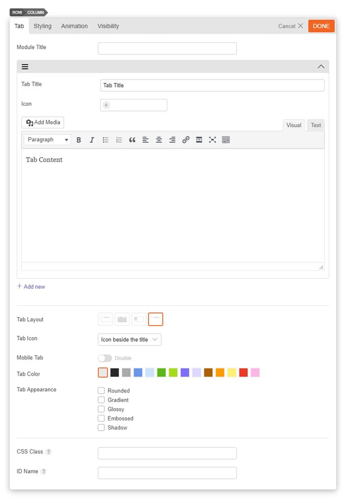
- Module Title This option is used to add the title of your module.
- Tab Title The title shown in the tab button.
- Icon Add an icon that appear on a tab.
- Tab Content The content shown when the tab is selected.
- Add New Used to add a new tab to the module.
- Tab Layout This option is used to determine the layout of the tabs and content.
- Option 1 Tabs will be shown horizontally with tab titles and content shown as one block with borders around the content.
- Option 2 Tabs will be shown horizontally with tab titles and content shown as two separate blocks with borders around the content.
- Option 3 Tabs will be shown vertically with content in a box.
- Option 4 Tabs will be shown horizontally without borders around the content.
- Tab Icon Select where the icon will be placed on the tab. You can choose from the following: Icon beside the title, Just above the title, Just icons.
- Tab Color This option is used to select the color of the module.
- Tab Appearance These options provide the ability to toggle various effects for the tab buttons and content area.
- Rounded Toggles whether the corners of the module's content will be rounded.
- Gradient Toggles whether the module will have a gradient effect applied to it.
- Glossy Toggles whether the content area will have a gloss overlay effect applied to it.
- Embossed Toggles whether the module will have an emboss effect applied to the edges.
- Shadow Toggles whether the module will have a shadow effect applied to it.
Testimonials
The Testimonials module is used to showcase testimonials in a slider layout type.
To use the Testimonials module:
- Enter Module Title
- Testimonial Layout - Select to have the image at the top, bottom, or encased in a bubble
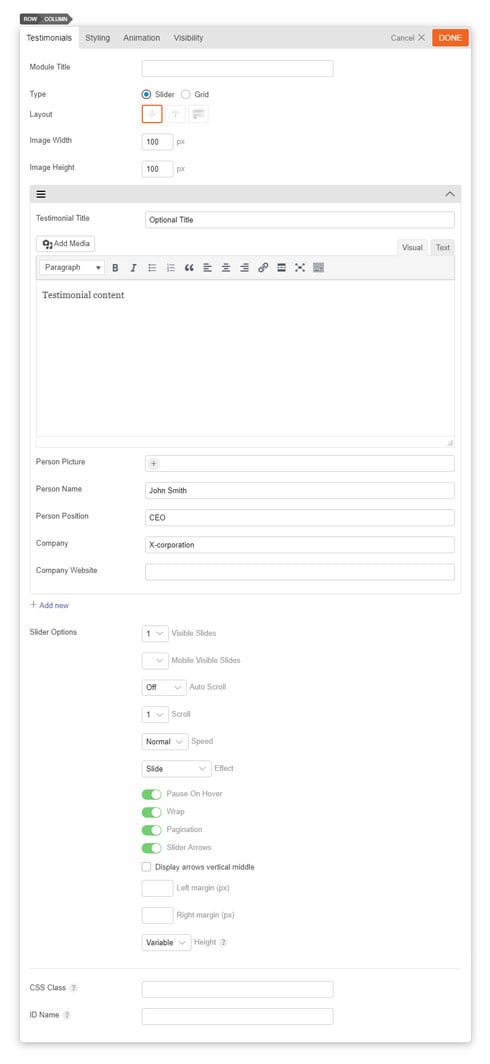
- Module Title This option is used to add the title of your module.
- Type Select either a Slider or Grid testimonial type.
- Layout Select to have the image at the top, bottom, or encased in a bubble
- Image Width This option is used to set the width of the testimonial.
- Image Height This option is used to set the height of the video player.
- Text Editor You can use the WYSIWYG editor to add any content required to be shown in the module.
- Person Picture Input the image of the person you are quoting for the testimonial.
- Person Name Input the name of the person you are quoting for the testimonial.
- Person Position Input the position/title of the person.
- Company Input the company where the person works.
- Company Website Input the company site where the person works.
- Add New Used to add a new testimonial to your testimonials.
- Slider Options A list of various options available to customize the behavior of the slider.
- Visible Slides Set the number of slides you would like visible at once.
- Mobile Visible Set the number of testimonial slides you would like visible at once on mobile.
- Auto Scroll Enable or disable an auto scroll of your testimonials and set how long before each slide will automatically scroll.
- Scroll Sets number of slides to scroll at a time.
- Speed Sets speed of transition effect.
- Effect Sets the transition effect used.
- Pause On Hover Select if you'd like to pause the slider on hover.
- Wrap Sets whether the slides will repeat from the beginning when scrolled through.
- Pagination Sets whether to display the slider page navigation buttons.
- Slider Arrows Sets whether to display the slider arrow navigation buttons.
- Left Margin Space Sets how much of a margin to add to the left side of individual slides.
- Right Margin Space Sets how much of a margin to add to the right side of individual slides.
- Height Set to "Auto" measures the highest slide and all other slides will be set to the same size. Or "Variable" makes every slide have its own height.
Text
The Text module is used to add a text area to the page. You can use the visual editor to enter any rich format text including images, videos, links, heading, etc. Shortcodes are supported with the Text module, therefore, you can insert any shortcode as you do on a post/page content.
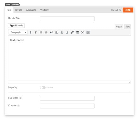
- Module Title This option is used to add the title of your module.
- Editor You can use the WYSIWYG editor to add any content required to be shown in the module.
Video
The Video module is used to show a video embed (YouTube, Vimeo, etc.).
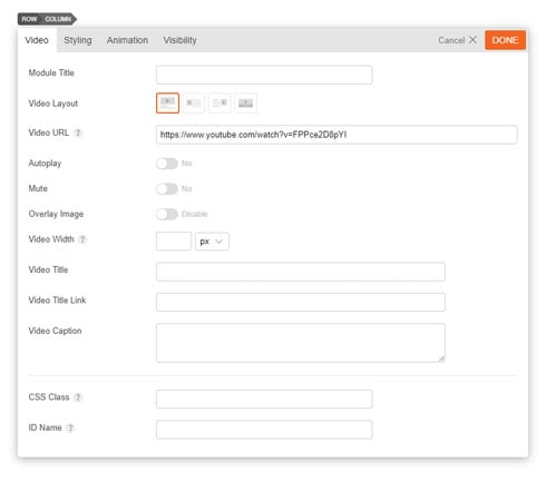
- Module Title This option is used to add the title of your module.
- Video Layout This option is used to set the layout of the video and any title and caption.
- Option 1 The title/caption will be shown below the video.
- Option 2 The title/caption will be shown to the right of the video.
- Option 3 The title/caption will be shown to the left of the video.
- Option 4 The title/caption will be shown as an overlay on top of the video.
- Video URL This option is used to set the video URL to use for the module.
- Autoplay Toggle to enable or disable your video to be autoplayed.
- Mute Toggle to enable or disable your video to be muted.
- Overlay Image Toggle to enable or disable an image overlay.
- Video Width This option is used to set the width of the video player.
- Video Title This option is used to set the title of the video.
- Video Title Link This option is used to set the URL that is linked to the title.
- Video Caption This option is used to set a caption for the video.
The Widget module allows you to add a widget.
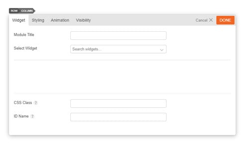
- Module Title This option is used to add the title of your module.
- Select Widget This option is used to select the desired widget from the list of all the available widgets.
The Widgetized module is used to add a widgetized area (widgetized areas also often refer to sidebars, widget area/region).
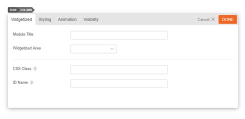
- Module Title This option is used to add the title of your module.
- Widgetized Area This option is used to select the desired widget area from the list of all the available widget areas of your site.
Read More
18
Jun
2015
/
This tutorial will show you how to code your own custom addons/modules for Themify Builder.
Let's Get Started
Each module in the Builder consists of three files, a module-*.php file (only registers the module to Builder), and a template-*.php file (handles the display of the module), and a JavaScript file that does most everything else: controls the options displayed when editing the module, how data is saved for the module, renders the live preview, etc. For the default modules in Builder, the module PHP files are located in themify-builder/modules directory inside the Builder, the template files can be found in the themify-builder/templates and the JS files can be found in themify-builder/js/editor/modules folder.
We can add new modules via a plugin, or include them in the theme.
Example 1: Hello World module
Let's start by creating a simple module that displays a Hello World message. First under wp-content/plugins/ directory of your WordPress installation create a new folder (you can name this folder anything that you would like). This folder will hold all of the files required for the module. Inside that folder create a file named "init.php" and paste this inside:
<?php
/*
Plugin Name:  Hello World
Version:      2.0
Author:       Themify
Description:  Sample Builder module to greet the world!
*/

defined( 'ABSPATH' ) or die;
This is all that is needed for WordPress to identify the plugin, now if you head over to the Plugins manager in admin dashboard, you can activate it.
Now let's add the codes to load our module PHP file:
function hello_world_register_module() {
    Themify_Builder_Model::add_module( plugin_dir_path( __FILE__ ) . 'modules/module-hello-world.php' );
}
add_action( 'themify_builder_setup_modules', 'hello_world_register_module' );
This tells the Builder that when needed, load the modules/module-helloworld.php file inside the plugin. So let's create "module-hello-world.php" file inside the modules folder:
<?php

class TB_HelloWorld_Module extends Themify_Builder_Component_Module {

    public static function get_module_name():string{
        add_filter( 'themify_builder_active_vars', [ __CLASS__, 'builder_active_enqueue' ] );
        return __( 'Hello World', 'hello-world' );
    }
    public static function builder_active_enqueue( array $vars ):array {
        $url = plugin_dir_url( dirname( __FILE__ ) ) . 'assets/active.js';
        $version = '1.0';
        $vars['addons'][ $url ] = $version;

        return $vars;
    }
}
Note the "TB_" prefix and "_Module" suffix for our module's classname. This is the naming convention that you must follow in order for Builder to recognize the module. The "get_module_name" method returns the name of the module (this shows up in the editor interface), but also adds a filter to load an script file named "active.js" when Builder is active. As mentioned, this JavaScript file is where the module is actually defined. So next step, let's create that file:
((api,createElement,themifyBuilder ) => {
    'use strict';
    api.ModuleHelloWorld = class extends api.Module {

        constructor(fields) {
            super(fields);
        }

        static getOptions() {
            return [];
        }

        static default(){
            return {};
        }

        static builderSave(settings){
            super.builderSave(settings);
        }
    };
})(tb_app,tb_createElement,themifyBuilder);
The script creates a class named "ModuleHelloWorld" that extends "tb_app.Module". Note the "Module" prefix for the module name, this is required. The getOptions() method returns an array of options to show when you're editing the module, the "default()" method return an object of option_name : option_value pairs that define the default values those options will have, and the builderSave() method which is called when the module is saved, this can be useful if you want to validate or cleanup the module data before saving.
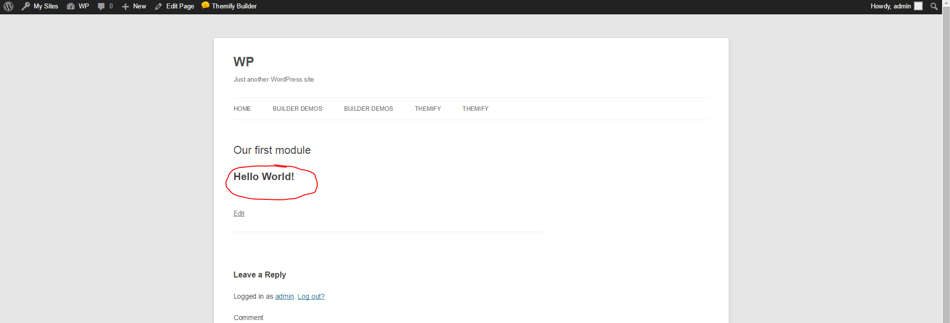
Now our module is ready. You can open the Builder editor and add this to your page:
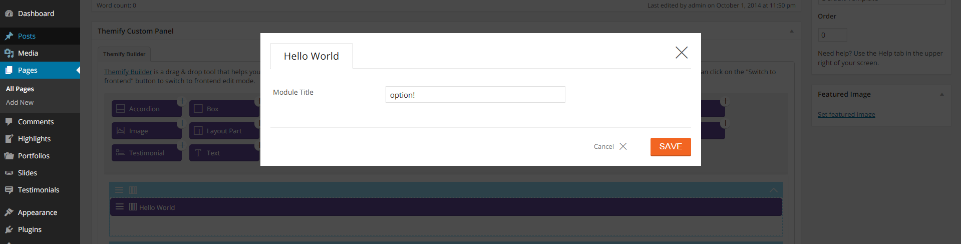
So what does the module display on the front end? At the moment, nothing. We haven't add the template file for the module that will actually render it, to do that create "template-hello-world.php" file inside the /templates folder and paste this in:
<h1> Hello World! </h1>
Viola! Now if add the module to a page and view that page on front end, you can see the output:
Showing the same HTML snippet each time we add the module might be what we need, however often you want to add options to the module that dynamically changes it's output, so let's change the getOptions method to show an option where we can change who we want to say hello to:
static getOptions() {
    return [
        {
            id : 'say_hello',
            type : 'text',
            label : 'Hello Text'
        }
    ];
}
In the module's template file the options are accessible using the $args['mod_settings'] array, every key of this array is an option saved for the module, so now change the template file:
<?php
$say_hello = isset( $args['mod_settings']['say_hello'] ) ? $args['mod_settings']['say_hello'] : '';
?>
<div class="module module-<?php echo $args['mod_name']; ?>">
    <h1> Hello <?php echo $say_hello; ?>! </h1>
</div>
Congratulations, you just made your first Builder module. You can download the complete code here.
Example 2: Quotes module
Now let's dig deeper and create a more practical module. Let's say our client runs a heavy-content website and regularly posts quotes, so to pimp up the pages let's design a quote style module that our client can use:
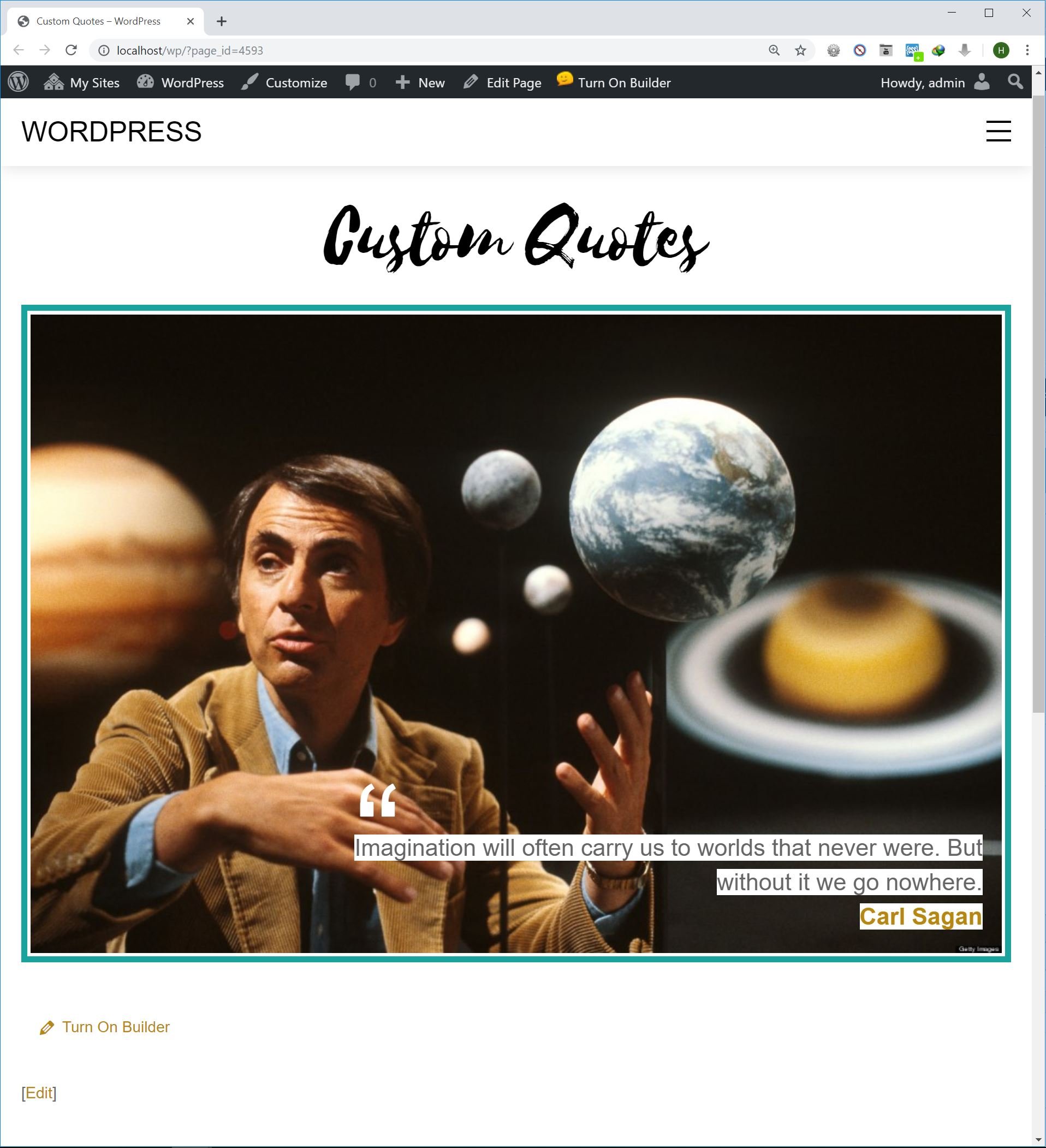
Custom Quotes module sample
The quote style consists of an image, the quote text itself and the name of it's author. The only problem is this requires a specific bit of HTML to make. Handing a txt file to the client to copy and paste, then change the bits and pieces is not very practical. An option is to create a shortcode that outputs the quote, however shortcodes are not user friendly either. Your client will have to remember the exact shortcode and parameters used to replicate the same output.
First step like our Hello World module, create a directory inside the wp-content/plugins/ folder, add an init.php file inside it and paste this in:
<?php
/*
Plugin Name:  Custom Quotes
Plugin URI:   https://themify.me/
Version:      2.0
Author:       Themify
Description:  Custom Quotes
*/

defined( 'ABSPATH' ) or die( '-1' );

function custom_quotes_register_module() {
	Themify_Builder_Model::add_module( plugin_dir_path( __FILE__ ) . 'modules/module-quotes.php' );
}
add_action( 'themify_builder_setup_modules', 'custom_quotes_register_module' );
Same as before, we just point Builder to the file where the module PHP is registered. Now activate the plugin in the Plugins manager.
Next create "module-quotes.php" file inside the the /modules folder and paste this in:
<?php
if ( ! defined( 'ABSPATH' ) ) exit; // Exit if accessed directly
class TB_Quotes_Module extends Themify_Builder_Component_Module {

    public static function get_module_name():string {
        add_filter( 'themify_builder_active_vars', [ __CLASS__, 'builder_active_enqueue' ] );
        return __( 'Quote', 'custom-quotes' );
    }

    public static function get_module_icon():string {
        return 'quote-right';
    }

    public static function get_js_css():array {
        return array(
            'css' => plugin_dir_url( dirname( __FILE__ ) ) . 'assets/style.css'
        );
    }

    public static function builder_active_enqueue( array $vars ):array {
        $url = plugin_dir_url( dirname( __FILE__ ) ) . 'assets/active.js';
        $version = '1.0';
        $vars['addons'][ $url ] = $version;

        return $vars;
    }
}
The get_js_css() method n module returns an array which defines what files to load when the module is used on the page. In our case, we only need an stylesheet for customizing the design of the quote, so the method returns the path to an style.css file. Also the get_module_icon() is used to display an icon (from Themify icon set) for this module.
Next, create a folder named "assets" inside the plugin and add the "active.js" file in it:
((api,createElement,themifyBuilder ) => {
    'use strict';
    api.ModuleQuotes = class extends api.Module {

        constructor(fields) {
            super(fields);
        }

        static getOptions() {
            return [
                {
                    id : 'quote_text',
                    type : 'textarea',
                    label : 'Text'
                },
                {
                    id : 'quote_image',
                    type : 'image',
                    label : 'Image'
                },
                {
                    id : 'quote_author',
                    type : 'text',
                    label : 'Quote Author'
                },
                {
                    id : 'quote_link',
                    type : 'url',
                    label : 'Link'
                },
                {
                    type : 'custom_css_id'
                }
            ];
        }

        static default() {
            return {};
        }

        static builderSave(settings){
            super.builderSave(settings);
        }
    };
})(tb_app,tb_createElement,themifyBuilder);
Here we add four options in the module, three text options to put the quote text, the name of its author, and the link to the quote author's website, and an option to put the image. Now when you add the module you can see the options:
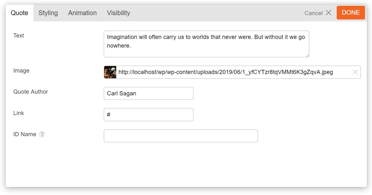
Perfect! Now for the module's template, create "template-quotes.php" in the /templates folder and add:
<?php
if ( ! defined( 'ABSPATH' ) ) exit; // Exit if accessed directly
/**
 * Template Quotes
 *
 * Access original fields: $args['mod_settings']
 */

$fields_default = array(
	'quote_text' => '',
	'quote_image' => '',
	'quote_author' => '',
	'quote_link' => '',
	'animation_effect' => ''
);

$fields_args = wp_parse_args( $args['mod_settings'], $fields_default );
unset( $args['mod_settings'] );

$container_class = apply_filters( 'themify_builder_module_classes', array(
		'module', 'module-' . $args['mod_name'], $args['module_ID'], self::parse_animation_effect( $fields_args['animation_effect'] )
	), $args['mod_name'], $args['module_ID'], $fields_args );
if ( ! empty( $args['element_id'] ) ) {
	$container_class[] = 'tb_' . $args['element_id'];
}
if ( ! empty( $fields_args['global_styles'] ) && Themify_Builder::$frontedit_active === false ) {
	$container_class[] = $fields_args['global_styles'];
}
$container_props = apply_filters( 'themify_builder_module_container_props', array(
	'id' => $args['module_ID'],
	'class' => implode(' ', $container_class),
), $fields_args, $args['mod_name'], $args['module_ID'] );
?>

<div <?php echo self::get_element_attributes( $container_props, $fields_args ); ?>>
	<?php $container_props=$container_class=null;?>
	<?php do_action( 'themify_builder_before_template_content_render' ); ?>
	<div class="quote-wrap">

		<?php if( '' !== $fields_args['quote_image'] ) : ?>
			<img class="quote-image" src="<?php echo esc_url( $fields_args['quote_image'] ); ?>" alt="<?php echo $fields_args['quote_author']; ?>" />
		<?php endif; ?>

		<div class="quote-content">

			<div class="quote-text">
				<span><?php echo $fields_args['quote_text']; ?></span>
			</div>

			<div class="quote-author">
				<?php if ( '' ===$fields_args['quote_link']  ) : ?>
					<span><?php echo $fields_args['quote_author']; ?></span>
				<?php else : ?>
					<a href="<?php echo $fields_args['quote_link']; ?>"><span><?php echo $fields_args['quote_author']; ?></span></a>
				<?php endif; ?>
			</div>

		</div>

	</div>

	<?php do_action( 'themify_builder_after_template_content_render' ); ?>
</div><!-- .module-<?php echo $args['mod_name']; ?> -->
The snippet is pretty straight forward, we just check if some options in the module are set and if so output the proper markup.
NOTE: To set the default options for the module we use wp_parse_args function and pass it two things: $args['mod_settings'] array that holds the saved settings of the module, and an array of defaults, this way we'll have a default value. Also the extract function is used to turn each of the options into a separate variable, this makes working with them easier.
The rest of the code is just spitting out the proper markup we need to show the quote.
Last step is to add the CSS codes that style the quote, if you recall in TB_Quotes_Module class we used the get_js_css() to set a path for an stylesheet, so in the "assets" folder create a file named "style.css" add the CSS codes. You can get that from the this link.
You can download the finished plugin here which includes an alternative layout for quotes, and also sets up the Styling options for the module.
Field Types
The Builder has a variety of field types you can use to create the options for the modules, the table below lists some of available field types:
| Type |
Description |
* Repeatable? |
| text |
General text box to input texts. You can set the "colorpicker" parameter to true to turn the text box into a color picker field. |
Yes |
| icon |
Icon picker, user can choose from the icons included in the Builder. For an example of this check the Feature module. |
Yes |
| image |
Image uploader, user can upload images or select one from the Media Library. |
Yes |
| textarea |
Multi-line text input. |
Yes |
| wp_editor |
Shows the TinyMCE editor to input formatted texts. |
Yes |
| radio |
Multiple choice option where only one can be chosen. |
Yes |
| checkbox |
Multiple choice option where none or any number of the choices can be chosen. |
Yes |
| builder |
"builder" field can be used to create repeatable rows of data (for example Accordion and Tabs modules use this feature), field types that in this table are highlighted as Repeatble can be used in the "builder" field type. |
|
* whether the field type is repeatable and can be used in "builder" fields.
Override module templates in themes
The built-in Builder modules are also customizable, where you can change the look using the options provided by the module. However sometimes you need to change how the modules structure its output, and in such cases overriding the template files of the modules comes very handy. To achieve this first navigate to <theme_root>/themify/themify-builder/templates/ directory, here you can find the template files used by various modules. Now copy the template file for the module you want to change and paste it in <child_theme_root>/themify-builder/ directory and customize it.
Read More