To install themes with the WordPress theme uploader:
Download the "theme.zip" file from the Member Area
Note: some browsers (eg. Safari) auto extract zip files automatically. Right-click on the download link and select "Save Linked File As". This will allow you to download the theme as a zip file.
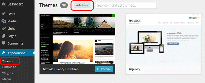
Login to your site's WP Admin.
Go to Appearance > Themes.
Click on the "Add New" button, then click on the "Upload Theme" button
Upload the theme.zip file (note: it is the theme.zip, not the theme-psd.zip that you just downloaded from the Member Area).
Activate the theme
FYI: You can also install themes with FTP method. Read the Installing Themes tutorial for more info.
Demo Import
If you are starting a fresh site, importing the demo content will help you understand how the theme demo is built. The Demo Import feature will import the contents (posts, pages, comments, etc.), Themify panel settings, menus, and widgets setup from our demo to your site. You can erase the demo content afterward.
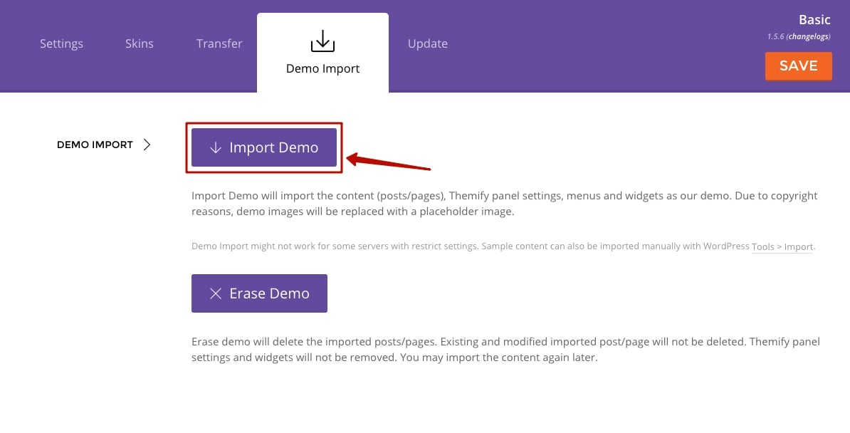
To import the demo setup:
Go to WP Admin > Themify > Settings > Demo Import and click "Import Demo" button.
Note that the featured images will be replaced with an image placeholder for copyright reasons.
To erase the demo setup:
On the Demo Import tab, click on the "Erase Demo" button which will then remove the demo content.
FYI: If the Demo Import does not work on your site, you can use the WP Admin > Tools > Import tool to import the demo content manually.
Site Logo & Tagline
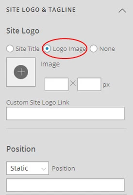
To display a logo image instead of the site name text:
Go to WP Admin > Appearance > Customize > Site Logo and Tagline.
Under "Site Logo", select "Logo Image" radio button.
Upload a logo image.
Specify the logo image width and height.
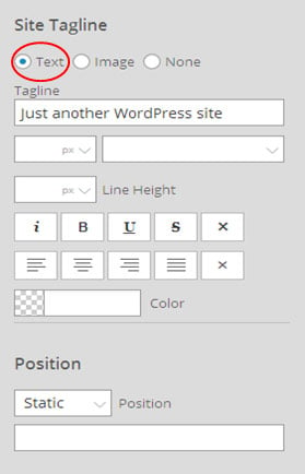
You can also change website Tagline from here:
Go to WP Admin > Appearance > Customize > Site Logo and Tagline.
Scroll down and under "Site Tagline" select "Text" radio button.
Enter your site Tagline.
Click "Save & Publish".
Main Navigation Menu
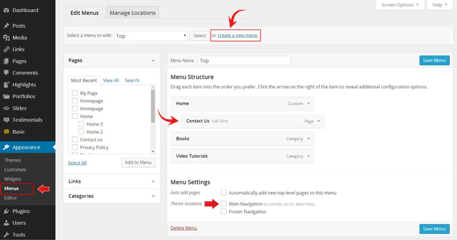
To create a custom navigation menu:
Go to WP Admin > Appearance > Menus.
Click on "create a new menu" to create a new menu (eg. Main Menu).
Add the menu items from the left panels.
To create a dropdown menu: drag the menu item towards the right (the item(s) will be indented).
When you are done adding the menu items, click "Save Menu".
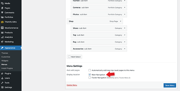
To assign menu locations:
Scroll down to the bottom where it says "Theme locations" and tick the menu location checkbox.
Main Navigation = main menu on the header
Footer Navigation = footer menu on the footer (Note: some themes might not have Footer Navigation).
TIPS: You can display menus on sidebar widgets, remove the main menu, create empty links, and lightbox links. Read Custom Menus for more detailed tutorial.
Mega Menu
The Mega Menu feature enables you to make the most of the WordPress menu by showcasing featured posts and multi-column dropdowns with various links and widgets.
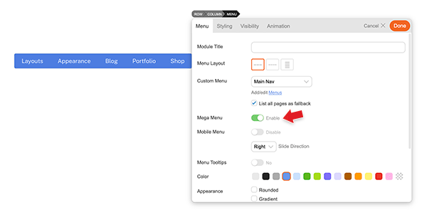
To use the Mega Menu:
To make use of the Mega Menu feature, you'll first need to set up the menu at WP-Admin > Appearance > Menus.
Once you've created the menu (follow the steps below), you can assign that menu as the 'Main Navigation,' and the mega menu will appear in the primary navigation area of your theme. Note: Mega menu support is available only in the following themes: Ultra, Shoppe, Music, Parallax, Fullpane, Peak, and Magazine. If your theme doesn't support the mega menu feature, you can still use the Builder Menu module to display it.
You can display the mega menu using the Builder's Menu module. Simply drop in a Menu module, choose the menu you've configured with the mega menu feature, and then enable the "Mega Menu" option.
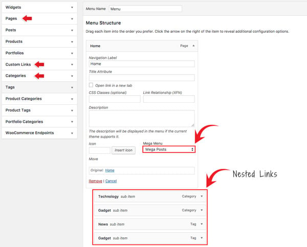
To create Mega Posts on the mega menu dropdown:
Go to WP-Admin > Appearance > Menus, add a new menu or edit any existing menu.
Add a "Pages" or "Custom Links" and select "Mega Posts" on the Mega Menu dropdown option.
Next, include 'Tags' or 'Categories' as link types in the nested menu. For instance, you would set the Blog page link as the parent link and then nest the categories/tags links. When users hover over the Blog link, they will be able to see the recent posts of the corresponding categories/tags within the mega menu dropdown.
Note: The nested items must be Tags or Categories. This will display recent posts associated with the chosen tag/category. If the Tags option is not visible, click on the 'Screen Options' located in the top-right corner, and ensure that the 'Tags' option is checked.
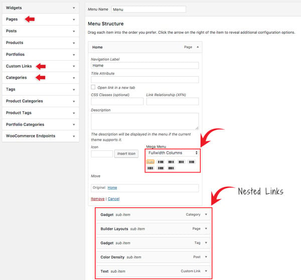
To set Fullwidth Columns:
Add a "Pages" or "Custom Links" and select "Fullwidth Columns" on the Mega Menu dropdown option.
Select the column layout from the preset that appears - Default is set to "Auto",
Then add any link (Pages, Posts, Custom Links, Tags, Categories) or widgets. This will display nested links in multiple columns.
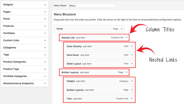
Setting Navigation Titles Above Nested Links:
Utilizing the 'Fullwidth Columns' option, you can also establish header titles that appear above the nested links. To achieve this, simply add an additional layer of nested links beneath the initial set of nested links, as demonstrated in the screenshot below:
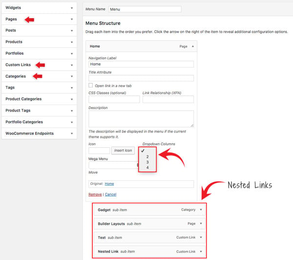
To set Dropdown Columns:
Add a "Pages" or "Custom Links", select the "Dropdown Columns" option, and then select the number of columns (2, 3, or 4).
Then add any link (Pages, Posts, Custom Links, Tags, Categories) or widgets. This will display the nested links in the number of columns as you selected.
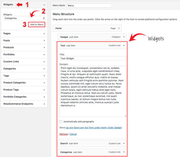
To add Widgets in the mega menu:
Select the "Widgets" link type and select the widget from the dropdown menu option.
Click "Add to Menu" and customize the widget as you like (eg. you can drop in a Text widget and enter your custom text).
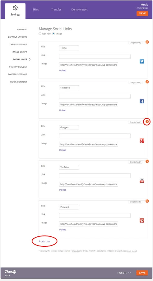
Setting Up the Social Links
Step 1) To set up the social media links:
Go to WP Admin > Themify > Settings > Social Links tab.
The theme comes with some pre-filled social links. Simply enter your social profile URL in the Link input field. For example, enter 'https://twitter.com/themify' for the Twitter link.
You can choose to display either "Icon Font" or "Image".
If "Icon Font" is selected, click on "Insert Icon" to select an icon (over 320+ icons available).
If "Image" is selected, you can upload your own graphic icon by clicking on the Upload button.
To add more links, click on the Add Link button at the bottom.
To remove a link, click on the delete icon.
To arrange the display order, drag and drop the link container.
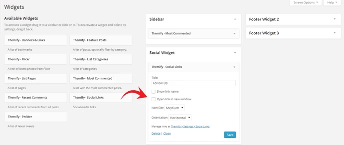
Step 2) Displaying the Social Links:
Once you have the Social Links setup, go to WP Admin > Appearance > Widgets. Drag and drop the Themify - Social Links from the Available Widgets panel to the Social Widget panel.
Optional: Customize Widget Title - such as "Follow Us". You can also "Show link name" and adjust icon size.
Hiding the RSS Icon
To hide the default RSS icon in the header:
Go to WP Admin > Themify > Settings > Theme Settings.
Under the "Exclude RSS Link", tick the checkbox that says "Check here to exclude RSS icon/button in the header".
Hiding the Search Form
To hide the default search form in the header:
Go to WP Admin > Themify > Settings > Theme Settings.
Under the "Exclude Search Form", tick the checkbox that says "Check here to exclude search form in the header".
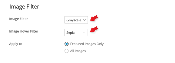
Image Filters
There are three different image filters built in the theme: Grayscale, Blur, and Sepia.
To set global Image Filters:
Go to WP Admin > Themify > Settings > Theme Settings, under the Image Filter options, select:
Image Filter = will apply the filter to the image (default is none)
Image Hover Filter = will apply the filter when the cursor hovers on the image only
Apply to:
Featured Images Only = will apply to the post featured images only
All Images = will apply the filter to all images on the entire page
Example: if you want to have grayscale images, and show the sepia image filter on hover, you would select Image Filter = Grayscale and Image Hover Filter = Sepia.
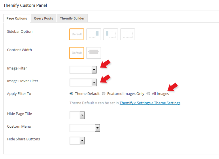
To set the Image Filter per post/page individually:
To add or edit a post/page, in the Themify Custom Panel, select the Image Filter and Image Hover Filter.
To set the Image Filter in Builder rows and modules:
To set the Image Filter in the Builder rows and modules, you would enter the image filter class name in the "Additional CSS Class" of the row or module options > Styling tab. Read more about Additional CSS Class.
Image Filter class names:
image-filter-grayscale
image-filter-blur
image-filter-sepia
Image Hover Filter class names:
filter-hover-grayscale
filter-hover-blur
filter-hover-sepia
filter-hover-none = will restore to original (i.e. no filter on hover)
Examples:
If you want to have a grayscale image filter, you would enter 'image-filter-grayscale' in the "Additional CSS Class"
If you want to have sepia filter and hover to grayscale, you would enter 'image-filter-sepia filter-hover-grayscale' in the "Additional CSS Class"
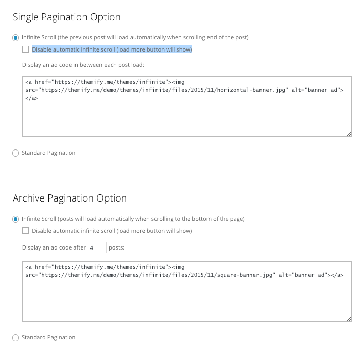
Infinite Scroll (Ad Placement)
The Infinite theme comes with an infinite scroll feature for both single post or archive view.
To disable infinite scroll in single/archive post:
Go to your WP Admin > Themify Setting > Theme settings > Check the option "Disable automatic infinite scroll (load more button will show)".
To display an ad on single/archive post:
To access this option, go to your WP Admin > Themify Setting > Theme Settings
Single Post - You can display an ad in between each post. You can insert the ad code in the text box
Archive Post - You can display an ad after a certain number of posts
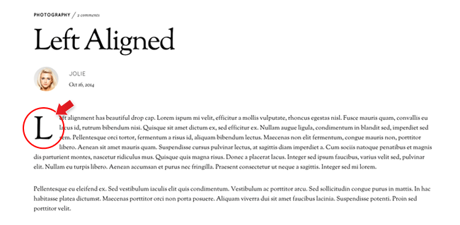
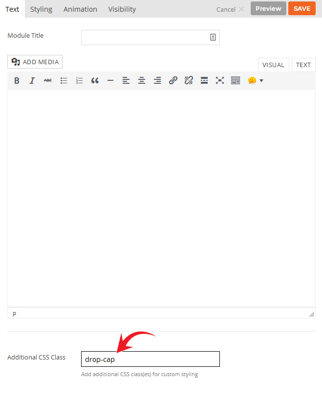
Drop Cap
This is a default feature that's automatically applied when you query posts on a page or module. Because drop cap does not work well with center aligned text, the drop cap styling only appears on the single post that has left Content Alignment. You can also apply drop cap styling to any Builder Text module.
To apply drop cap on a Text module:
On the Text module > Styling tab: enter 'drop-cap' in the "Additional CSS Class" and it will apply drop cap styling to the first letter of the text module (whether it is a paragraph or heading tags such as h1 to h6)
To disable drop cap:
Simply go to your WP Admin > Themify Settings > Theme Settings > Under Drop Cap options > Check the option "Disable Drop Cap styling that appears in the first paragraph of post content/excerpt
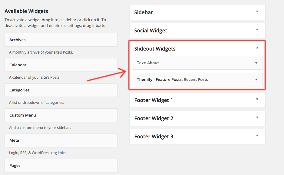
Slide-out widget
This is a default feature that's automatically applied when you create a post or a page. This panel allows you to drop in any widget you'd like. To do this, go to your WP Admin > Appearance > Widgets. There you'll see the slide-out widget option where you can drag and drop widgets that'll appear on your slider-out widget panel.
Setting Default Post and Page Layouts
Generally, the theme works out of the box. All the sidebar options and image dimensions are pre-defined in the theme. If you need to change the default sidebar options, featured image dimensions, content/except display, post meta, etc., it can be done in the WP Admin > Themify > Settings > Default Layouts.
There are three default layout options under Themify > Settings > Default Layouts:
Archive Sidebar Option: refers to the default home page, category, search, archive, tag pages, etc.
Default Post Layout: is the post page direct URL (also known as "Single Post").
First, create a new Page (go to WP Admin > Pages > Add New), name it "Blog" or any page title as you want.
View the page on the frontend, click "Turn On Builder".
Drop in a Post module and configure the options as you like.
Setting a Custom Front Page
You can set any page as the front (home) page. This means you can use the Builder to design the page and assign it as the front page. To set the Front Page:
Go to WP Admin > Settings > Reading.
On the Front page displays, select the "A static page (select below)" option and then select a "Front page".
Leave the "Posts page" default. If you want to create a custom Blog page, read this tutorial instead of setting the "Posts page".
Adding Widgets
To add widgets to widgetized areas (eg. sidebar and footer widgets):
Go to WP Admin > Appearance > Widgets.
The big panel on the left side shows all available widgets. The small panels on the right are the widgetized areas.
To add a widget: drag and drop the widget from the left panel to the right panel.
To remove the widget: drag the widget back to the left panel (Available Widgets panel). If you want to keep the widget setting for future use, drag it to the Inactive Widgets instead of the Available Widgets panel. It will save your widget settings. To retrieve the widget, drag the widget from Inactive Widgets panel instead of the Available Widgets panel.
Go to WP Admin > Themify > Skins, select a skin by clicking on the thumbnail and click Save.
Styling The Theme
To style the theme frontend appearance:
Go to WP Admin > Appearance > Customize.
It will take you to the Customize panel with live preview where you can style the appearance of the theme design (ie. color, background, font, spacing, border, etc.).
FYI: Refer to Customize documentation for more info.
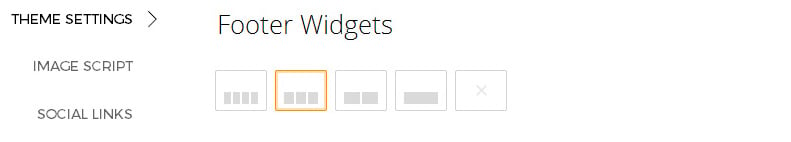
Footer Widgets
To set the Footer Widget column layout, go to WP Admin > Themify > Settings > Theme Settings.
To drop the widgets in the Footer Widgets, go to WP Admin > Appearance > Widgets.
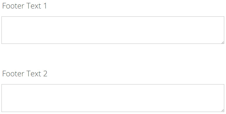
Footer Text
To replace the footer credit links:
Go to WP Admin > Themify > Settings > Theme Settings and enter the footer text.
HTML tags are allowed in the Footer Text.
To have empty footer text, tick the hide footer text checkbox.
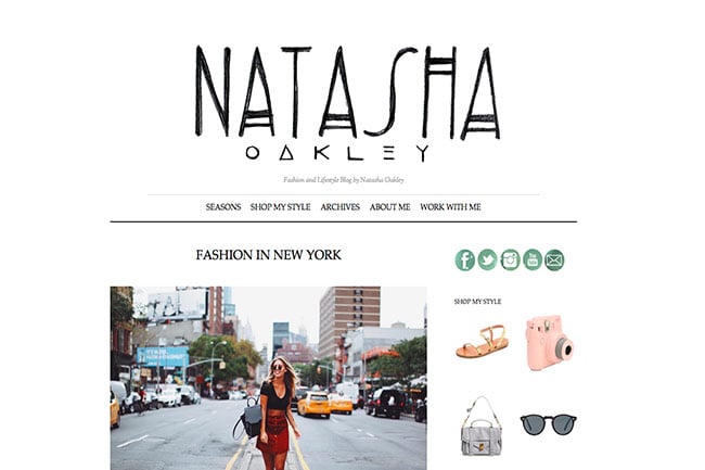
Are you a fashion blogger? Or aspiring to be one? We're seeing a growing trend with many of users who're starting to design fashion focused blogs. Many of these site are beautifully designed, have a minimalist layout, and is heavily integrated with social media. With the hope of inspiring all of you aspiring to start your own fashion blog, we've decided to share 8 of our favourite fashion blogs powered by Themify.
This site features the fashion and lifestyle blog of Natasha Oakley. Made because of her ever-growing social media following, this site showcases a simple yet elegant style. Using the Elemin theme as her base theme, she uses a plain white background so that her images and text are always the main focus of her users.
To install themes with the WordPress theme uploader:
Download the "theme.zip" file from the Member Area
Note: some browsers (eg. Safari) auto extract zip files automatically. Right-click on the download link and select "Save Linked File As". This will allow you to download the theme as a zip file.
Login to your site's WP Admin.
Go to Appearance > Themes.
Click on the "Add New" button, then click on the "Upload Theme" button
Upload the theme.zip file (note: it is the theme.zip, not the theme-psd.zip that you just downloaded from the Member Area).
Activate the theme
FYI: You can also install themes with FTP method. Read the Installing Themes tutorial for more info.
Demo Import
If you are starting a fresh site, importing the demo content will help you understand how the theme demo is built. The Demo Import feature will import the contents (posts, pages, comments, etc.), Themify panel settings, menus, and widgets setup from our demo to your site. You can erase the demo content afterward.
To import the demo setup:
Go to WP Admin > Themify > Settings > Demo Import and click "Import Demo" button.
Note that the featured images will be replaced with an image placeholder for copyright reasons.
To erase the demo setup:
On the Demo Import tab, click on the "Erase Demo" button which will then remove the demo content.
FYI: If the Demo Import does not work on your site, you can use the WP Admin > Tools > Import tool to import the demo content manually.
Site Logo & Tagline
To display a logo image instead of the site name text:
Go to WP Admin > Appearance > Customize > Site Logo and Tagline.
Under "Site Logo", select "Logo Image" radio button.
Upload a logo image.
Specify the logo image width and height.
You can also change website Tagline from here:
Go to WP Admin > Appearance > Customize > Site Logo and Tagline.
Scroll down and under "Site Tagline" select "Text" radio button.
Enter your site Tagline.
Click "Save & Publish".
Main Navigation Menu
To create a custom navigation menu:
Go to WP Admin > Appearance > Menus.
Click on "create a new menu" to create a new menu (eg. Main Menu).
Add the menu items from the left panels.
To create a dropdown menu: drag the menu item towards the right (the item(s) will be indented).
When you are done adding the menu items, click "Save Menu".
To assign menu locations:
Scroll down to the bottom where it says "Theme locations" and tick the menu location checkbox.
Main Navigation = main menu on the header
Footer Navigation = footer menu on the footer (Note: some themes might not have Footer Navigation).
TIPS: You can display menus on sidebar widgets, remove the main menu, create empty links, and lightbox links. Read Custom Menus for more detailed tutorial.
Setting Up the Social Links
Step 1) To set up the social media links:
Go to WP Admin > Themify > Settings > Social Links tab.
The theme comes with some pre-filled social links. Simply enter your social profile URL in the Link input field. For example, enter 'https://twitter.com/themify' for the Twitter link.
You can choose to display either "Icon Font" or "Image".
If "Icon Font" is selected, click on "Insert Icon" to select an icon (over 320+ icons available).
If "Image" is selected, you can upload your own graphic icon by clicking on the Upload button.
To add more links, click on the Add Link button at the bottom.
To remove a link, click on the delete icon.
To arrange the display order, drag and drop the link container.
Step 2) Displaying the Social Links:
Once you have the Social Links setup, go to WP Admin > Appearance > Widgets. Drag and drop the Themify - Social Links from the Available Widgets panel to the Social Widget panel.
Optional: Customize Widget Title - such as "Follow Us". You can also "Show link name" and adjust icon size.
Hiding the RSS Icon
To hide the default RSS icon in the header:
Go to WP Admin > Themify > Settings > Theme Settings.
Under the "Exclude RSS Link", tick the checkbox that says "Check here to exclude RSS icon/button in the header".
Hiding the Search Form
To hide the default search form in the header:
Go to WP Admin > Themify > Settings > Theme Settings.
Under the "Exclude Search Form", tick the checkbox that says "Check here to exclude search form in the header".
How to Make Split Scrolling Pages
When split scrolling is enabled, the Builder rows/columns will display in full height and perform a vertical split transition on page scroll. NOTE: On tablet devices, the split scrolling will have full section scrolling effect for better performance.
To create the split scrolling pages:
Go to WP Admin > Pages > Add New
On Themify Custom Panel, select "Split Scrolling = Yes" (Sidebar, page title, and comments will be disabled in this mode)
Click Publish and view page frontend
Click "Turn On Builder"
Now you would use the Builder the construct the page layout
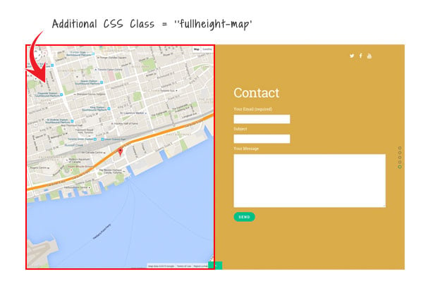
Full Height Map
To make the Builder Map to display full height within the split scrolling section:
On the Map module options > Styling tab, enter 'fullheight-map' in Additional CSS Class
How to Import Split Scrolling layouts
To import a pre-designed split scrolling layout:
Add a new Page.
On the page's Themify Custom Panel > Page Options, select:
Split Scrolling = Yes
This will disable the sidebar, preset the content width, and hide the page title automatically.
Optional: on the Themify Custom Panel, click on "Page Appearance" tab to set the design appearance of this particular page.
On the Discussion panel, uncheck "Allow discussion" checkbox (this will disable the comments on the page).
Publish and view the page frontend.
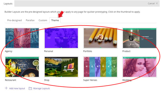
Turn on the Builder on frontend, on the top admin bar, select Themify Builder > Layouts > Load Layouts.
A lightbox window will appear where you'll be able to toggle between Pre-designed, Parallax, Custom Builder, or Theme layouts. Click on "Theme" tab and click on a thumbnail image to import.
Pre-design tab consists of all Layouts in the Builder.
Parallax tab consists of all Layouts that have parallax scrolling effect.
Custom tab is where you find your own custom Layouts.
Theme tab consists of the layouts built specifically for this theme.
When it asks to replace or append the layout, click "Replace Existing Layout".
Now you may replace the images and text as you like.
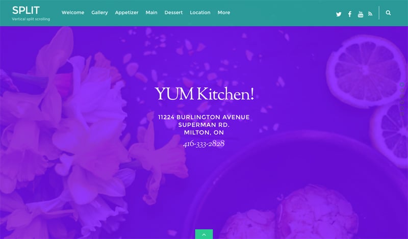
How to Design Custom Split Layouts
In the following tutorial, we will show you how to create a split layout using this Restuarant demo page as a reference design. If you want to see the final result first, create a new page then import it from Themify Builder > Layouts > Load Layouts > Theme tab and select "Restaurant" thumbnail.
To design a custom split layout from scratch:
Add a new Page.
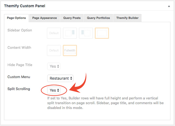
On the Themify Custom Panel, select the following options (view screenshot):
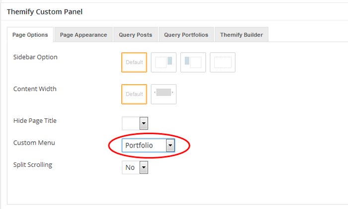
Custom Menu: Select a custom menu that you've created for this page layout. For more detail on how to do this, go to the ScrollTo Row Anchor section of this documentation.
Split scrolling: Yes
Optional: on the Themify Custom Panel, click on "Page Appearance" tab to set the design appearance of this particular page.
On the Discussion panel, uncheck "Allow discussion" checkbox (this will disable the comments on the page).
Publish and view the page frontend.
Turn on the Builder on frontend.
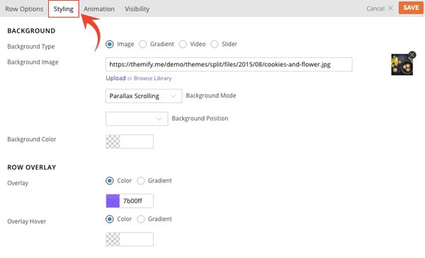
Hover your mouse on the first row top bar, then click on the brush icon to open styling options on the row and select the following parameters (view screenshot):
Background Type: Image
Background Image: Upload a background image, we recommend the size to be 1400x800px
Background Mode: Parallax Scrolling
Row Overlay: Color - #7b00ff
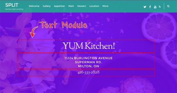
Drop in Text modules as like this screenshot. If you are new with Themify Builder, watch this starter video on how to use the general interface.
Now that you've done the first row, open a new browser window/tab; view the page that you are working on to see the result. Keep the Builder edit mode active on the other browser window/tab (so one window to work on, another one to see the result).
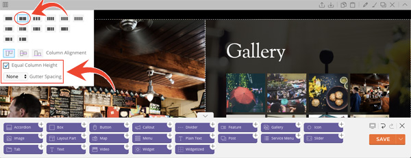
Let's create the second row now. On row grid dropdown, select (view screenshot):
Select 2-column grid
Column Alignment = top alignment icon
Check the "Equal Column Height" option
Gutter Spacing = None
On the left column, add a column background image. To do this, click on the column brush icon (view screenshot), and input the following parameteres
Background Type: Image
Background Image: Upload a background image, we recommend the size to be 800x800px
Background Mode: Fullcover
Top padding: 250px
On the right column, input the following column styling:
Background Type: Image
Background Image: Upload a background image, we recommend the size to be 800x800px
Background Mode: Fullcover
Overlay: Color - #00000 with middle opacity
Font & Link Color: Set to white #fffff
Padding: 5%
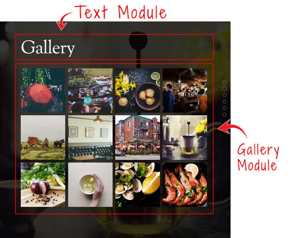
On the right column, drop in a Text and Gallery module as per this screenshot.
Now switch back to the viewing browser tab. Reload the page to see the result.
We will end the tutorial here. You can follow the similar steps and technique to create the remaining part of the layout.
ScrollTo Row Anchor Menu (Single-Page Menu)
To achieve scrollTo row anchor:
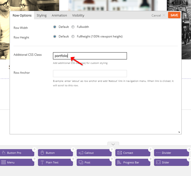
Step 1) First enter the Row Anchor name in Builder > Row > Options (e.g. "portfolio").
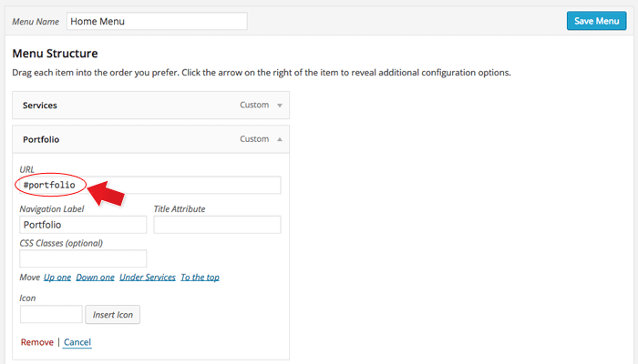
Step 2) Then in the WordPress menu link (WP Admin > Appearance > Menu), insert the anchor name as link URL = "#portfolio" (basically add # in front of the anchor name).
Step 3) On the page where you want to have the single page menu, select the menu in Themify Custom Panel (the Themify Custom Panel is located below the content editor when you add/edit the page).
Result: When the #portfolio link is clicked or when users go the URL with the #portfolio anchor (eg. http://yoursite.com#portfolio), it will scroll to the row where it specified Row Anchor = "portfolio".
Note: The Row Anchor text will be used as the split scroll pagination labels (the circles on the right edge). If you enter 'my-blog' in Row Anchor, it will display label as "My Blog".
Portfolio Post Type
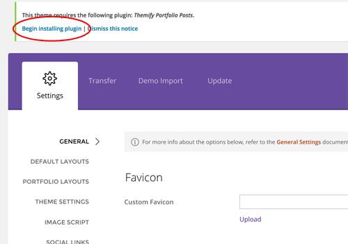
The theme comes with Portfolio post type as an optional plugin (you don't need to install the Portfolio plugin if you don't intend to have a portfolio on your site).
To install the Portfolio Posts plugin:
Go to your WP Admin > Themify panel
On the Themify panel, click "Begin installing plugin"
Then on the "Install Required Plugins" page, click "Install" under the "Themify Portfolio Posts"
Once the plugin is installed, click "Return to Required Plugins Installer"
Now click "Activate" to activate the installed plugin
Adding Portfolio Posts:
To create a Portfolio post, select "Add New" under the "Portfolios" admin menu
Enter the portfolio title and content
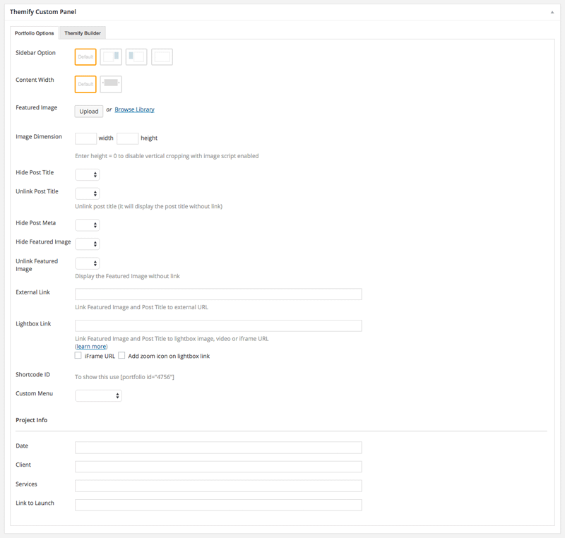
In the Themify Custom Panel, enter the options as you like:
Featured Image = Upload or select an image from the media library for the project
Image Dimensions = This image dimensions will be used for the featured image in the single post view (leave blank will have the default dimensions)
Hide Post Title = This option is used to set whether the post title will be displayed in the single post view
Unlink Post Title = This option is used to set whether the post title will be linked in the single post view
Hide Post Date = This option is used to set whether the post date will be displayed in the single post view
Hide Post Meta = This option is used to set whether the post meta will be displayed in the single post view
Hide Featured Image = This option is used to set whether the featured image will be displayed in the single post view
Unlink Featured Image = This option is used to set whether the featured image will be linked in the single post view
External Link = This option is used to link the post featured image and title to a custom URL
Lightbox Link = This option is used to link the post featured image and title to open a URL in a lightbox. This defaults to expecting an image URL
iFrame URL = If checked, this will open the URL as an iFrame within the lightbox. This can be used to open external URLs such as other pages or sites
Add zoom icon on lightbox link = This option sets whether a zoom icon will be shown on the featured image when set to a lightbox link
Shortcode ID = Use the shortcode provided here to show this individual post
Project Info = (Optional) Input information you would like to appear with your portfolio post
Date = Input any date you would like
Client = Input who your client is
Services = Input what services you did for the client
Link to Launch = Input the link of the actual site where your content was used
Displaying Portfolio Posts on Pages:
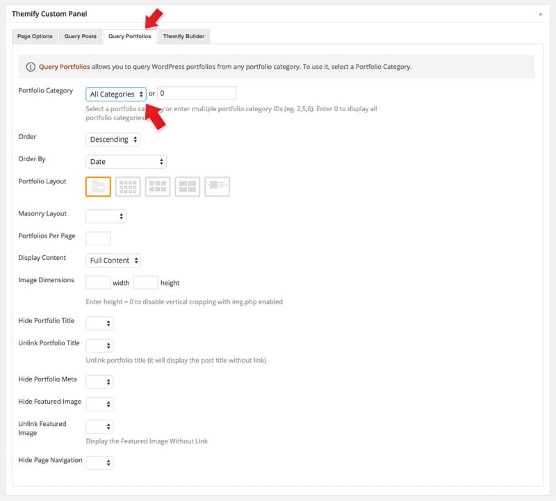
First create a new Page (in admin, select "Add New" under the "Pages" admin menu)
In Themify Custom Panel, click "Query Portfolios" tab, select either "All Categories" or a Portfolio category, and select the other options as you like:
Portfolio Category = This option is used to set which categories will be included or excluded in the post list
Order = This option is used to set whether posts will be ordered in ascending or descending order
Order By = This option is used to set the attribute that posts will be ordered
Portfolio Layout = This option is used to set the layout of portfolio posts, such as grid columns, list posts, etc.
Portfolios Per Page = This option is used to set the number of portfolio posts shown per page
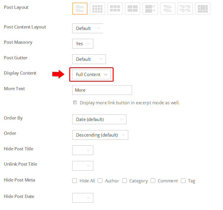
Display Content = This option is used to set what content is output for each portfolio post (None, Excerpt, or Full Content)
Image Dimensions = This option is used to set the dimensions the portfolio images will be displayed at
Hide Portfolio Title = This option is used to set whether the post title will be displayed
Unlink Portfolio Title = This option is used to set whether the post title will operate as a link
Hide Portfolio Date = This option is used to set whether the post date will be displayed
Hide Portfolio Meta = This option is used to set whether the post meta will be displayed
Hide Featured Image = This option is used to set whether the featured image will be displayed
Unlink Featured Image = This option is used to set whether the featured image will operate as a link
Hide Page Navigation = This option is used to set whether the page navigation for portfolio posts will be displayed
Displaying Portfolio Posts using shortcodes:
You can use the [themify_portfolio_posts] shortcode to display the Portfolio posts anywhere in the content editor, Text widget, and the Builder Text module.
Below are some sample portfolio shortcodes using different parameters:
= display latest Portfolio posts from portfolio categories Web Design and Illustration, given that their text slugs are "web-design" and "illustration"
Available parameters:
limit = number of post to query/show
category = category ID number or category name (default = all categories)
image = show post image or not (yes or no)
image_w = featured image width
image_h = featured image height
title = show post title (yes or no)
display = display whether full content, excerpt or none (content, excerpt, or none)
post_meta = display post meta (yes or no)
post_date = display postdate (yes or no)
style = layout style (grid4, grid3, grid2). You may also add custom css class in here (e.g. style="grid4 custom-class"). Custom CSS class is only required for developers to apply styling
order = specifies ascendant or descendant order (ASC or DESC)
orderby = criteria used to order posts (author, comment_count, date, menu_order, and title)
unlink_image = remove the link on featured image (yes or no)
unlink_title = remove the link on the post title (yes or no)
more_link = display a custom more link after the posts
more_text = text that will appear in more_link
Designing Portfolio with the Builder
You can use the Builder to design any page and post including the custom post type like Portfolio on the demo. The Builder helps you to make rich media layouts easier by drag and drop elements on the page. Below is a sample portfolio single we designed:
To create a Portfolio single with the Builder:
In admin dashboard, select "Add New" under the "Portfolios" admin menu
Then publish and view the portfolio post on frontend
From the top admin bar, select Themify Builder > Turn On Builder
Now you can use the Builder to add modules on the page
Setting the Portfolio Layouts
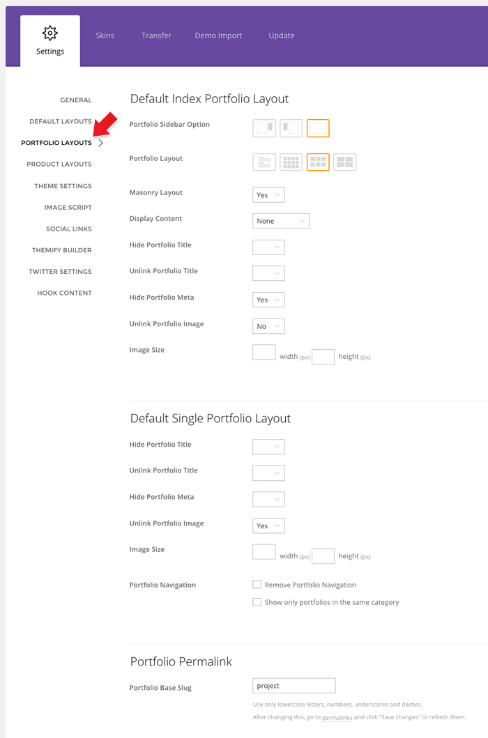
To set the Portfolio layout options, go to WP Admin > Themify > Settings > Portfolio Settings
Default Index Portfolio Layout = refers to the Portfolio archive view (i.e. Portfolio posts queried with shortcodes, Query Portfolio pages, Portfolio category pages, etc.)
Default Single Portfolio Layout = refers to the single post view of the portfolio (project)
Portfolio Permalink = set base slug for single Portfolio URL (default is 'project')
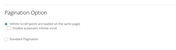
Infinite Scroll
Infinite scroll is enabled by default. To change it, go to WP Admin > Themify theme >Themify Settings > Theme Settings > Pagination Option:
Infinite Scroll = load more posts as viewer scroll down the page.
Disable automatic infinite scroll = it will show a "load more" button and viewer must click this button in order to load more posts.
Standard Pagination = will disable infinite scroll and show the regular number pagination instead.
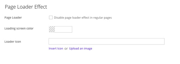
Page Loader Effect
Page loader effect is the transition effect that appears when navigating within the site. It is enabled by default. To disable or customize the page loader, go to WP Admin > Themify theme > Themify Settings > Theme Settings > Page Loader Effect and you'll see the following options:
Page Loader = Check option to "Disable page loader effect in regular pages".
Loading Screen Color = Select any color you'd like the appear as your pages load.
Loader Icon = Insert your own image, or select from our icons the loader icon that'll appear as your page loads.
Setting Default Post and Page Layouts
Generally, the theme works out of the box. All the sidebar options and image dimensions are pre-defined in the theme. If you need to change the default sidebar options, featured image dimensions, content/except display, post meta, etc., it can be done in the WP Admin > Themify > Settings > Default Layouts.
There are three default layout options under Themify > Settings > Default Layouts:
Archive Sidebar Option: refers to the default home page, category, search, archive, tag pages, etc.
Default Post Layout: is the post page direct URL (also known as "Single Post").
First, create a new Page (go to WP Admin > Pages > Add New), name it "Blog" or any page title as you want.
View the page on the frontend, click "Turn On Builder".
Drop in a Post module and configure the options as you like.
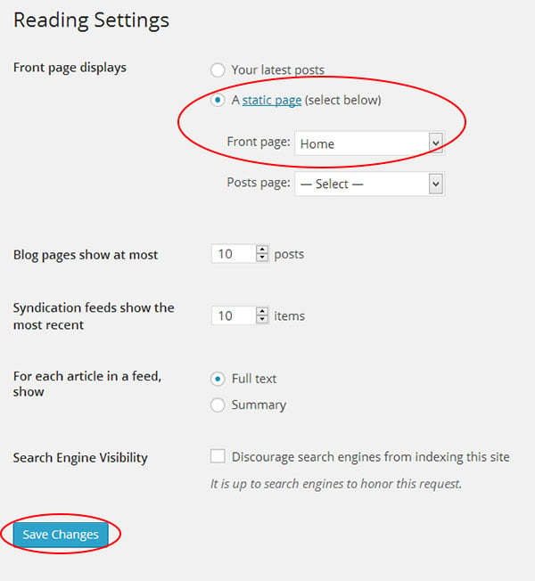
Setting a Custom Front Page
You can set any page as the front (home) page. This means you can use the Builder to design the page and assign it as the front page. To set the Front Page:
Go to WP Admin > Settings > Reading.
On the Front page displays, select the "A static page (select below)" option and then select a "Front page".
Leave the "Posts page" default. If you want to create a custom Blog page, read this tutorial instead of setting the "Posts page".
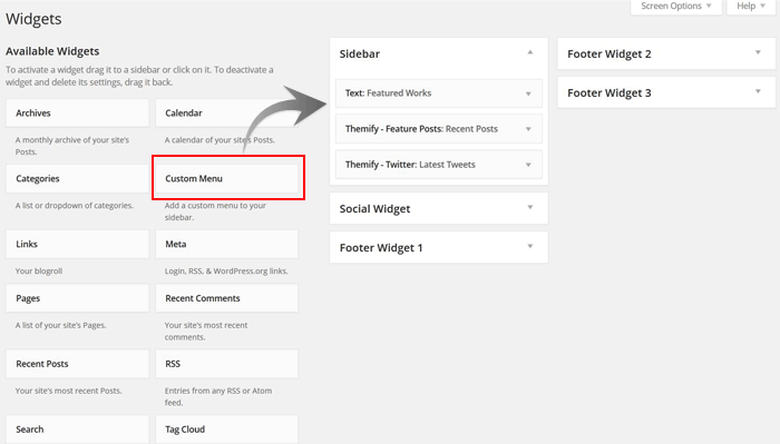
Adding Widgets
To add widgets to widgetized areas (eg. sidebar and footer widgets):
Go to WP Admin > Appearance > Widgets.
The big panel on the left side shows all available widgets. The small panels on the right are the widgetized areas.
To add a widget: drag and drop the widget from the left panel to the right panel.
To remove the widget: drag the widget back to the left panel (Available Widgets panel). If you want to keep the widget setting for future use, drag it to the Inactive Widgets instead of the Available Widgets panel. It will save your widget settings. To retrieve the widget, drag the widget from Inactive Widgets panel instead of the Available Widgets panel.
Go to WP Admin > Themify > Skins, select a skin by clicking on the thumbnail and click Save.
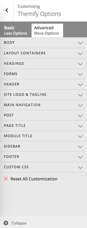
Styling The Theme
To style the theme frontend appearance:
Go to WP Admin > Appearance > Customize.
It will take you to the Customize panel with live preview where you can style the appearance of the theme design (ie. color, background, font, spacing, border, etc.).
FYI: Refer to Customize documentation for more info.
Footer Widgets
To set the Footer Widget column layout, go to WP Admin > Themify > Settings > Theme Settings.
To drop the widgets in the Footer Widgets, go to WP Admin > Appearance > Widgets.
Footer Text
To replace the footer credit links:
Go to WP Admin > Themify > Settings > Theme Settings and enter the footer text.
HTML tags are allowed in the Footer Text.
To have empty footer text, tick the hide footer text checkbox.
The Extra Field addon is a WordPress plugin that works together with the Post Type Builder (PTB). It adds new meta box fields when you build custom post types. Below are the following fields that are included:
First, you will need to download the plugin zip file from the Member Area on the Themify site.
Note: Some browsers (e.g. Safari) may auto-extract zip files. Right-clicking on the download link and selecting "Save Linked File As" will allow you to download the ZIP version.
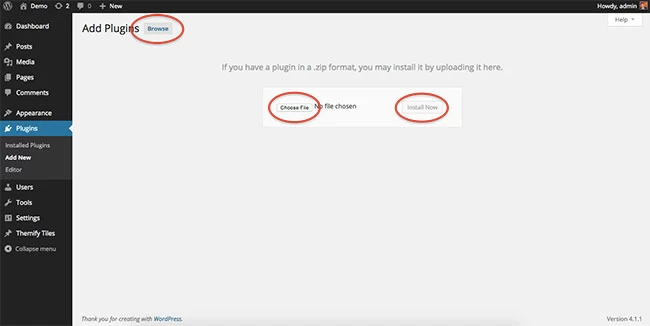
Then go to your WP Admin > Plugins > Add New > Upload Plugin.
Now upload the plugin zip file and click "Install Now".
After the plugin is installed, click "Activate Plugin" to activate the plugin.
FYI: If you can't install the plugin using WordPress plugin installer, you may also use a FTP software to install the plugin. To install plugins with an FTP method: extract the plugin zip on your local computer then upload the plugin folder to your FTP server where you installed WordPress > wp-content > plugins folder. Then login to your WP Admin > Plugins to activate the plugin.
How It Works:
Note: This plugin will not work without the Post Type Builder (PTB) plugin installed.
Install and activate the Extra Fields addon on your site.
Go to your WP Admin > Post Type Builder > Post Types. Choose any custom post type you've created with the PTB, or create a new post type.
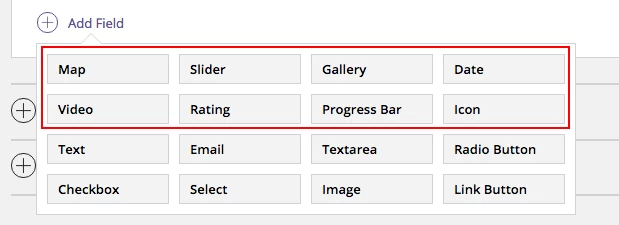
Scroll down to the Meta Box Builder, and click "Add Field". Here you will see all your new modules. Click any of them to add them to your post type.
Video
The Video module supports Youtube, Vimeo, or any MP4 video.
To add the Video module to your post type. Go to your WP Admin > Post Type Builder > Post Types > and choose the custom post type, or add a new one > scroll down to the Meta Box Builder > Add Field, then select "video".
Add a name and description for the module.
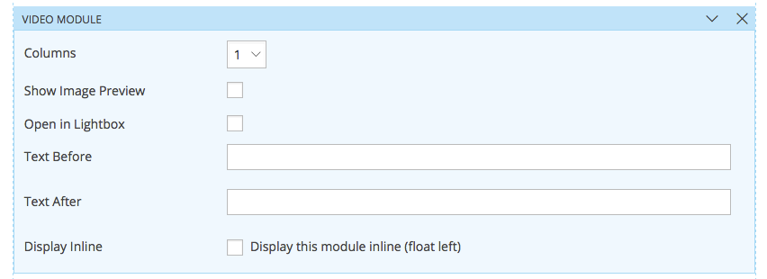
On the template of your custom post type, you'll see the name of the video module you've just added to your Meta Box Builder. Drag and drop this anywhere on your template, and then you'll see the following options:
Column = Choose the number of columns that you would like to display your videos. Options range from 1-4 columns.
Show Image Preview = This option allow your videos to display only the image thumbnail of your video. This option is very useful, especially if your showcasing a lot of videos, as this will allow your page to load faster.
Open in Lightbox = This option allows users to view your videos in a lightbox
Link to post permalink (Archive template only) = This allows users when they click on the video to be redirected to the post instead of directly to the video.
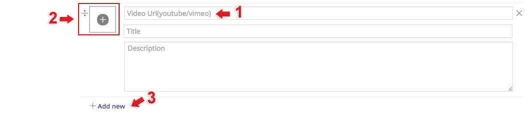
Post Type Options:
1) Insert any Youtube/Vimeo Link that you would like
2) Click on the "+" icon to insert an MP4 video from your media library
3) Click "Add new" to insert a new video.
Rating
The Rating module allows you to choose from over 320+ icons to showcase the rating of your post.
To add the Rating module to your post type. Go to your WP Admin > Post Type Builder > Post Types > and choose the custom post type, or add a new one > scroll down to the Meta Box Builder > Add Field, then select "rating".
Add a name and description for the module.
Rating Count = Select the number of icon (star) that you would like to appear where users/admin will be able to rate it out off.
Who can rate:
Admin/Editor = Only users who have Admin/Editor access will be able to rate the post
Public Visitors = All users will be able to rate the post, by clicking on the backend. Users will be tracked based on their IP Address.
The count will be shown at the backend of the post. The number of voters, total number of votes, and the average will be shown at the backend of each post. Note: Admin/Editor's will be able to view and change these figure.
On the template of your custom post type, you'll see the name of the rating module you've just added to your Meta Box Builder. Drag and drop this anywhere on your template, and then you'll see the following options:
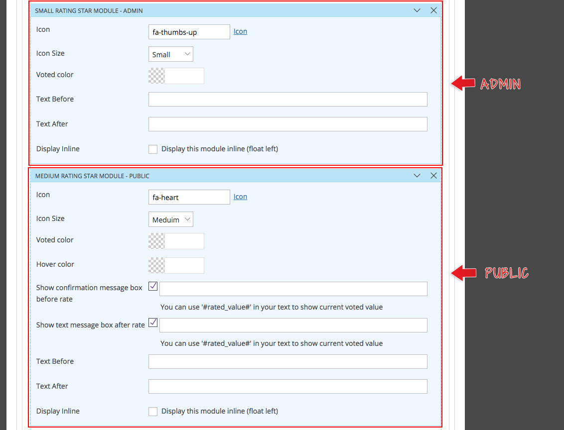
Rating - Admin/Editor:
Icon = Choose an icon that you would like to showcase this rating
Icon Size = Choose how big you would like to display the icon
Voted Color = Choose the color that the icon will appear after the admin/editor inputs the rating
Rating - Public Visitors
Icon = Choose an icon that you would like to showcase this rating
Icon Size = Choose how big you would like to display the icon
Voted Color = Choose the color that the icon will appear after the admin/editor votes
Hover Color = Choose the color that'll appear when the hovers their cursor as they are about to vote
Show confirmation message box before rate = When checked, the text inputed will appear before the user rates the post
Show text message box after rate = When checked, the text inputed will appear after the user rates the post
Post Type Option - Admins:
Simply input the rating for the post
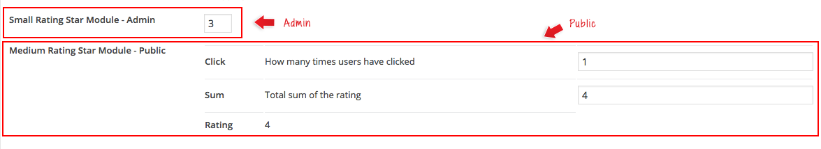
Post Type Option - Public Visitors:
Click = This shows you the total number of users that rated your post
Sum = This shows the sum of all the ratings that were given this post
Rating = This shows the average rating based on the Sum divided by the total number of Click
Map
The Map module allows you to showcase a map on your post. This module also allows you to place a map pointer with text on the map.
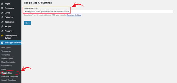
Before you can use the Map module, you'll first need to input a Google Map Key. To do this go to your WP Admin > Post Type Builder > Google Map > Input your Google API key > Then click "Save".
To add the Map module to your post type. Go to your WP Admin > Post Type Builder > Post Types > and choose the custom post type, or add a new one > scroll down to the Meta Box Builder > Add Field, then select "map".
Add a name and description for the module.
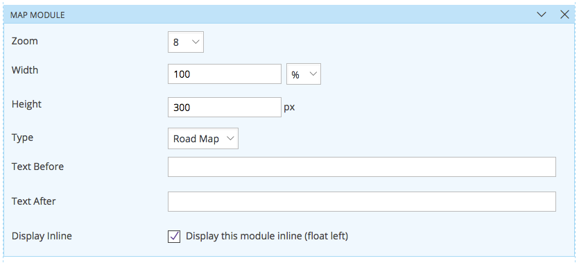
On the template of your custom post type, you'll see the name of the map module you've just added to your Meta Box Builder. Drag and drop this anywhere on your template, and then you'll see the following options:
Zoom = Choose how zoomed-in you want your users to view your map. It ranges from 8-17 zoom-in.
Width = Input the width in either % or px of your map
Height = Select the height in px of you map
Type = Select the type of map that you would like your map to appear as. There are 4 options of map types.
Post Type Option:
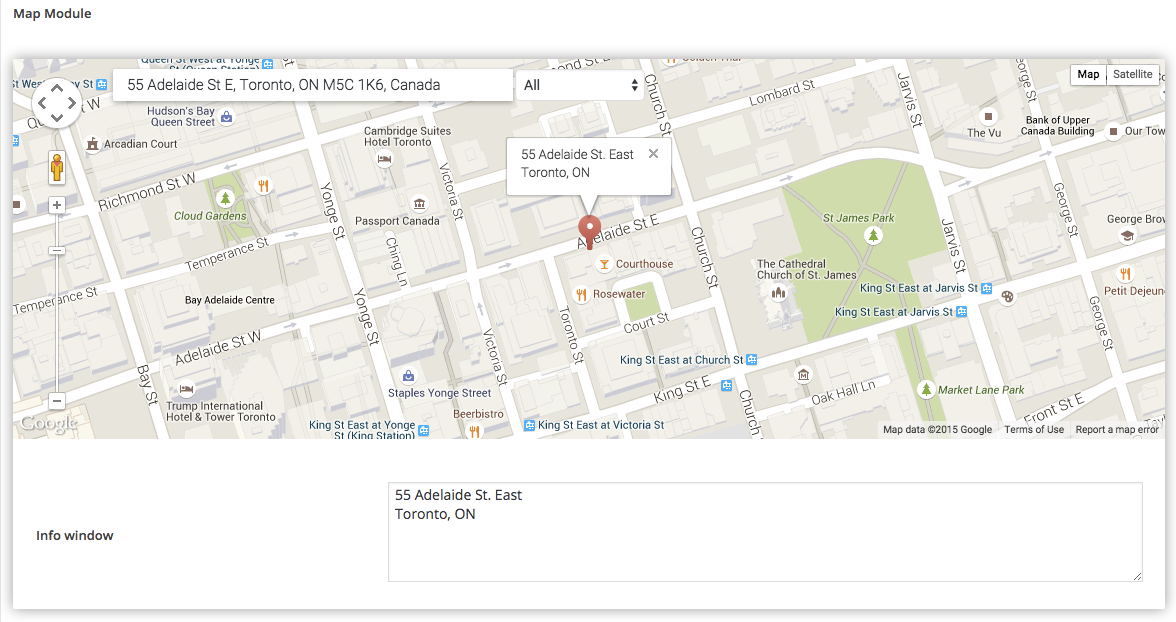
A Google map preview is shown as a preview for you to see how your map will look like on the frontend. Input the address that you would like to showcase on the top (1) address bar.
Info Window = The text inputed in this window will appear at the top of the map pointer where you've set your address.
Date
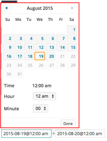
The Date module allows you to showcase your date anywhere on your site in any format that you would like. Users can use a calendar to pick their times and times.
To add the Date module to your post type. Go to your WP Admin > Post Type Builder > Post Types > and choose the custom post type, or add a new one > scroll down to the Meta Box Builder > Add Field, then select "date".
Add a name and description for the module.
Show as Range = Check if you would like the date to have a start and end date with it.
Date Format = Choose the format you would like your date to appear as
Time Format = Choose the format you would like your time to appear as
Time Separator = This will divide the time and date.
On the template of your custom post type, you'll see the name of the Date module you've just added to your Meta Box Builder. Drag and drop this anywhere on your template.
Post Type Option:
Click on the bar and a calendar picker will appear. Choose the date and time that you would like to show on this post.
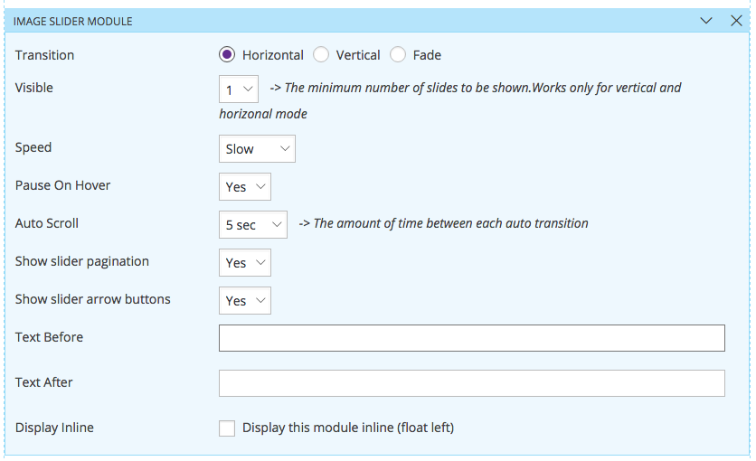
Slider
The Slider module allows you to showcase both your images and videos (Youtube, Vimeo, MP4), in a slider layout.
To add the Slider module to your post type. Go to your WP Admin > Post Type Builder > Post Types > and choose the custom post type, or add a new one > scroll down to the Meta Box Builder > Add Field, then select "slider".
Add a name and description for the module.
On the template of your custom post type, you'll see the name of the Slider module you've just added to your Meta Box Builder. Drag and drop this anywhere on your template, and then you'll see the following options:
Transition = Choose to either have a horizontal, vertical, or fade transition effect for your image/videos
Visible = Set the number of slides that will appear at a time. This option only works on the vertical and horizontal transition.
Speed = Choose the speed of the transition of your slider
Pause On Hover = Choose if you would like your slider to pause when cursor hover of it
Auto Scroll = Choose the number of seconds that you would like each slide to transition, or turn it off by selecting the "Off" option
Show Slider Pagination = Choose if you would like to display the pagination or not
Show Slider Arrow Buttons = Choose if you would like to display the left and right arrows of your slide
Post Type Option:
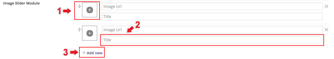
1) Select an image/video from your media gallery
2) Input the title of your image/video. You can also leave this blank if you would like.
3) Add an additional image/video slider
Note: All Youtube, Vimeo, and MP4 videos work with the slider.
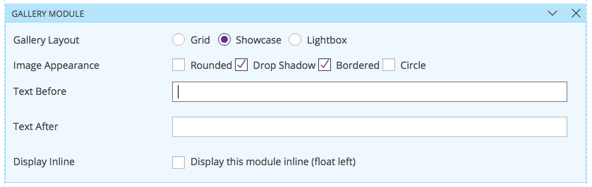
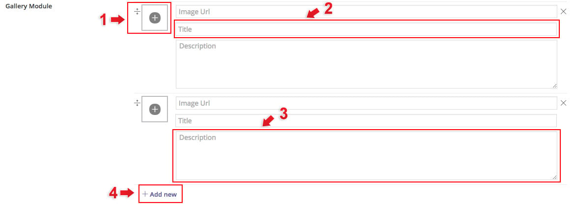
Gallery
The Gallery module allows you to showcase your images in grid, showcase, or lightbox layout.
To add the Gallery module to your post type. Go to your WP Admin > Post Type Builder > Post Types > and choose the custom post type, or add a new one > scroll down to the Meta Box Builder > Add Field, then select "gallery".
Add a name and description for the module.
On the template of your custom post type, you'll see the name of the Gallery module you've just added to your Meta Box Builder. Drag and drop this anywhere on your template, and then you'll see the following options:
Gallery Layout = Choose to showcase your image in either grid, showcase, or lightbox
Columns = Select the number of columns that you would like the images to appear
Image Appearance= Select how you would like your images to appear. Note: If you would like to create a circle image make sure that your image size has the same height and width (i.e. 400 x 400)
Post Type Option:
1) Select an image from your media gallery
2) Input the title of your image. You can also leave this blank if you would like.
3) Feel free to input a description for your images
4) Add an additional image
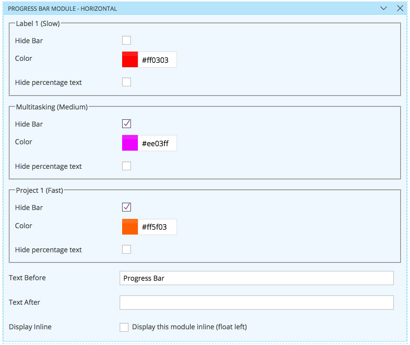
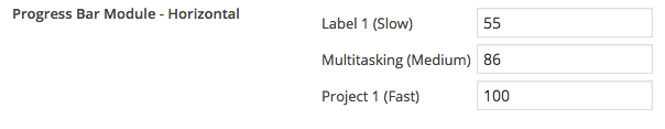
Progress Bar
The Progress Bar module allows you to showcase your skills, in-progress projects, in a cool animated progress bar.
To add the Progress Bar module to your post type. Go to your WP Admin > Post Type Builder > Post Types > and choose the custom post type, or add a new one > scroll down to the Meta Box Builder > Add Field, then select "progress bar".
Add a name and description for the module.
Orientation = Choose either to display your progress in a horizontal or vertical orientation
Labels = At the text that you would like to appear on the each progress bar. Click "Add new" to add more progress bar.
On the template of your custom post type, you'll see the name of the Progress Bar module you've just added to your Meta Box Builder. Drag and drop this anywhere on your template, and then you'll see the following options:
Each label that you've set on the post type has it own set of options:
Hide Bar = You can choose to hide the bar, if you would like
Color = Choose a color from the color picker
Hide Percentage Text = Check this to hide the percentage animation that'll appear when your progress bar is loading.
Post Type Option:
Input the percentage out of 100 of each label.
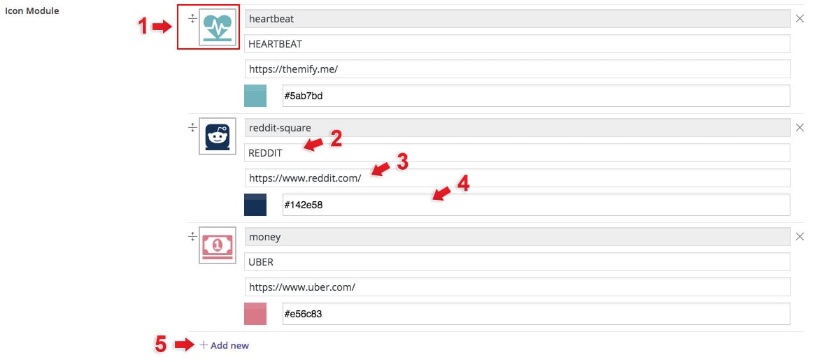
Icon
The Icon module allows you to choose from over 320+ icons and display it anywhere on your post with a custom link, color, and label.
To add the Icon module to your post type. Go to your WP Admin > Post Type Builder > Post Types > and choose the custom post type, or add a new one > scroll down to the Meta Box Builder > Add Field, then select "icon".
Add a name and description for the module.
On the template of your custom post type, you'll see the name of the Icon module you've just added to your Meta Box Builder. Drag and drop this anywhere on your template, and then you'll see the following options:
Size = Choose the size you would like the icon to appear
Open in = Choose to open the link to showcase the link in a lightbox, new window, or no (no is default)
Post Type Option:
1) Select the icon you would like to use
2) Input the label of the icon. You can leave this blank if you would just like to showcase the icon
3) Input the link you would like to redirect users when they click on the icon/label
4) Select the color that you would like to use with the icon.
5) Add another icon
Audio
The Audio module allows you to upload your own audio tracks into the custom post type. You can insert an unlimited number of tracks and set the column (1-4) design on how the audio track will appear.
To add the Audio module to your post type. Go to your WP Admin > Post Type Builder > Post Types > and choose the custom post type, or add a new one > scroll down to the Meta Box Builder > Add Field, then select "audio".
Add a name and description for the module.
On the template of your custom post type, you'll see the name of the Audio module you've just added to your Meta Box Builder. Drag and drop this anywhere on your template, and then you'll see the following options:
Columns = Select the number of columns where the audio tracks will be displayed
Post Type Option:
1) Select/upload the audio file that you would like to showcase on the track
2) Input the label of the audio. You can leave this blank if you would just like to showcase the audio track
3) Add a description of the audio if you'd like
4) Add another audio
File
The File module allows you to upload files into your custom post type where your users can download the files. This module allows you to insert an unlimited number of files.
To add the Files module to your post type. Go to your WP Admin > Post Type Builder > Post Types > and choose the custom post type, or add a new one > scroll down to the Meta Box Builder > Add Field, then select "file".
Add a name and description for the module.
On the template of your custom post type, you'll see the name of the File module you've just added to your Meta Box Builder. Drag and drop this anywhere on your template, and then you'll see the following options:
Open in = Choose to open the link to showcase the link in a lightbox, new window, or no (no is default)
Show file icons = There are preset icons for each file type. On the image above you'll see the icon for a PDF file
Color = Select the color of the file. The color will apply to both the icon and the file name
Show as = Select if you'd like to show the file in a list format or block format
Post Type Option:
1) Select/upload the file that you would like to showcase on the track
2) Input the label of the file
3) Add another file
Email
The Email module allows you to add an email address on your post type. This email address is very useful when you create a contact page and would like to input the email of the person. When this is clicked it will automatically allow the user to send an to the email address.
To add the Files module to your post type. Go to your WP Admin > Post Type Builder > Post Types > and choose the custom post type, or add a new one > scroll down to the Meta Box Builder > Add Field, then select "email".
Add a name and description for the module.
On the template of your custom post type, you'll see the name of the File module you've just added to your Meta Box Builder. Drag and drop this anywhere on your template, and then you'll see the following options:
Show Gravatar= Check to allow the gravatar of the user to appear
Gravatar Size = Select the size of the email gravatar that'll appear (i.e. 16x16, 64x64, 256x256, 512x512)
Post Type Option:
1) Input the email address. If you've checked gravatar option on the template it'll automatically grab the gravatar of the email and showcase it on the post
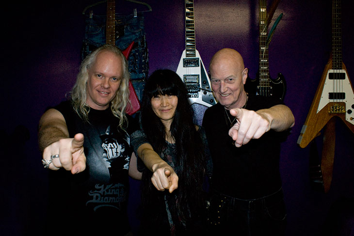
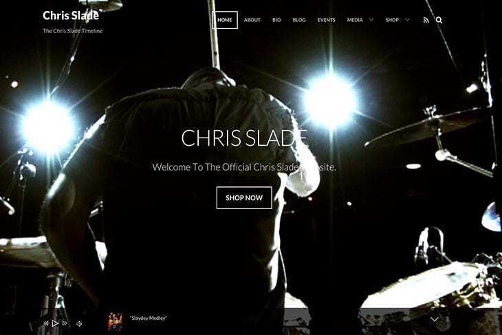
For this customer story, we're featuring Sean Lee and how he was able to redesign AC/DC Drummer Chris Slade's site in just 3 days; just in time before Chris Slade had to play in the 2015 Grammy Awards. Using our Music theme and the import demo feature, Sean Lee was able to create a responsive, awesome looking site which showcased Chris Slade's events, video performances, images, and so much more! Read more about it below:
About Sean Lee
I am a musician, singing teacher, producer, editor and web developer. I have also had a music school in Hollywood, CA for the past 20 years called The Voice Mechanic. I have been building websites professionally for the last 10 or so years and the Themify Builder plugin on a WordPress installation is by far my favorite way to build a website. It is very easy to take control of the page and build it the way you want. The Themify builder plugin is very logical and intuitive with a drag and drop workflow, or I can choose one of the many pre-built themes available from Themify. They are all completely customizable and can have many different looks just by switching the sample pages that they give you in the template's sample content. Themify also has great deals on membership plans, so you can download any theme you want and use it for yourself or any of your clients websites that you build. I chose the lifetime membership because Themify has given me great support without delay anytime I needed it. I feel that this company is in for the long haul so they are not going to disappear one night or stop updating their products which is always a fear when using other theme builders because I always do the updates, even though a lot of people don't. When I update WordPress to the latest version, I expect the tools that I'm using to be updated and compatible as well.
My favorite website that I have built so far is Chris Slade's website and I used Themify to do it. I play guitar in a band with Chris called MIWA. We had recorded a full length album and three music videos until one day it happend... Chris got the call from AC/DC to join them on their world tour and we couldn't be happier for him. I was given only 3 days to rebuild Chris's website into something really cool before AC/DC played the 2015 Grammy Awards in Los Angeles. I chose the Music theme by Themify. It had everything I needed to make a fantastic music website. I simply imported the demo layout, and swaped the content. I had filmed a drum solo of Chris a few years earlier and couldn't wait to make it the video background of the Music Theme homepage. I was able to get the whole website up and running within the three days in time for the Grammys and it turned out great! You can see Chris Slade's website here www.ChrisSlade.com. I highly recommend Themify and all of their excellent products and support.
How have you used Themify for your site? Whether it's for your business site, personal blog, or portfolio, we'd love to hear your story and share it with other people! Please contact us.
For this customer story meet Matteo Corradini, an Italian children's book writer, who shared with us how he was able to connect his creativity from paper to web design with the help of Themify. Read his story, and see how he was able to do this.
Matteo Corradini
Hi! My name is Matteo Corradini and I’m an Italian children's book writer, and a web designer. When I first started writing, my only tools were a pen and a paper. And even today, I still rely on them to write my stories. However, in today's time and age, I realized that for me to be able to share my work, books, or even workshops that I've done with kids, I needed to create an online platform for it to be accessible. With the help of Themify, I was able to do this. Themify provided a platform that's very easy to use, but at the same time, gave me the flexibility I needed to create amazing layout designs. This inspired me to continue to learn more about web design, which inevitably led me to become a web designer. Being a writer and a web desinger worked hand-in-hand, as I was able to create both the content and graphic needed for my own personal, and client sites. I was able to take on different types of projects such as site designs for institutions and museums. Themify made me realize that I didn't need a platform that gave me 10,000 themes, but rather, a few unique and special ones could go a long way. (more…)


