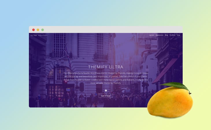
2 New Skin Demos + 9 Bonus Addons + New Stripe Header + 10+ Parallax Layouts!
Mangoes, because of their sweet flavor, are the perfect fruit to satisfy any sweet-tooth craving. Tasting the best during the spring and summer seasons, we wanted to bring you one last summer treat as we cap off the last few days of summer.
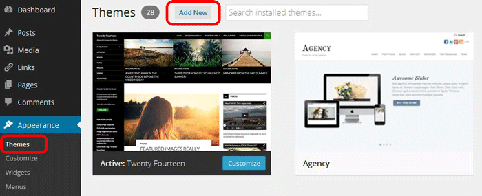
To install themes with the WordPress theme uploader:
Download the "theme.zip" file from the Member Area
Note: some browsers (eg. Safari) auto extract zip files automatically. Right-click on the download link and select "Save Linked File As". This will allow you to download the theme as a zip file.
Login to your site's WP Admin.
Go to Appearance > Themes.
Click on the "Add New" button, then click on the "Upload Theme" button
Upload the theme.zip file (note: it is the theme.zip, not the theme-psd.zip that you just downloaded from the Member Area).
Activate the theme
FYI: You can also install themes with FTP method. Read the Installing Themes tutorial for more info.
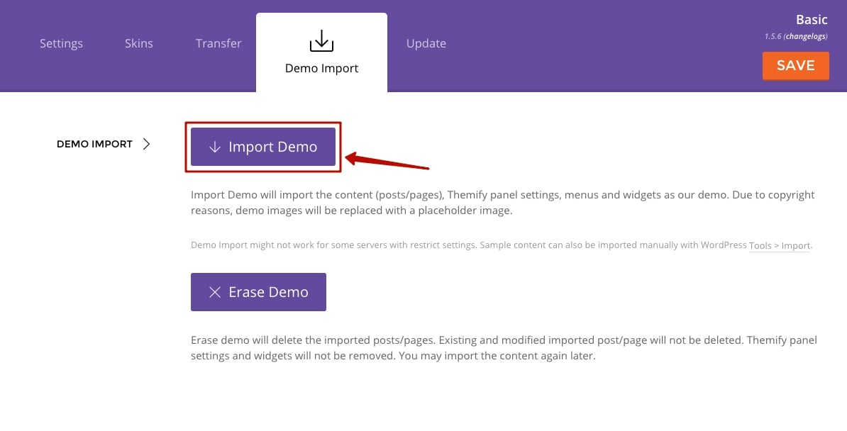
Demo Import
If you are starting a fresh site, importing the demo content will help you understand how the theme demo is built. The Demo Import feature will import the contents (posts, pages, comments, etc.), Themify panel settings, menus, and widgets setup from our demo to your site. You can erase the demo content afterward.
To import the demo setup:
Go to WP Admin > Themify > Settings > Demo Import and click "Import Demo" button.
Note that the featured images will be replaced with an image placeholder for copyright reasons.
To erase the demo setup:
On the Demo Import tab, click on the "Erase Demo" button which will then remove the demo content.
FYI: If the Demo Import does not work on your site, you can use the WP Admin > Tools > Import tool to import the demo content manually.
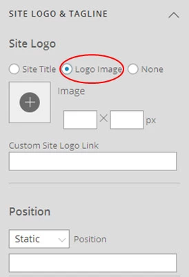
Site Logo & Tagline
To display a logo image instead of the site name text:
Go to WP Admin > Appearance > Customize > Site Logo and Tagline.
Under "Site Logo", select "Logo Image" radio button.
Upload a logo image.
Specify the logo image width and height.
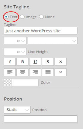
You can also change website Tagline from here:
Go to WP Admin > Appearance > Customize > Site Logo and Tagline.
Scroll down and under "Site Tagline" select "Text" radio button.
Enter your site Tagline.
Click "Save & Publish".
Main Navigation Menu
To create a custom navigation menu:
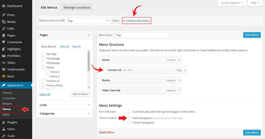
Go to WP Admin > Appearance > Menus.
Click on "create a new menu" to create a new menu (eg. Main Menu).
Add the menu items from the left panels.
To create a dropdown menu: drag the menu item towards the right (the item(s) will be indented).
When you are done adding the menu items, click "Save Menu".
To assign menu locations:
Scroll down to the bottom where it says "Theme locations" and tick the menu location checkbox.
Main Navigation = main menu on the header
Footer Navigation = footer menu on the footer (Note: some themes might not have Footer Navigation).
TIPS: You can display menus on sidebar widgets, remove the main menu, create empty links, and lightbox links. Read Custom Menus for more detailed tutorial.
Setting Up the Social Links
Step 1) To set up the social media links:
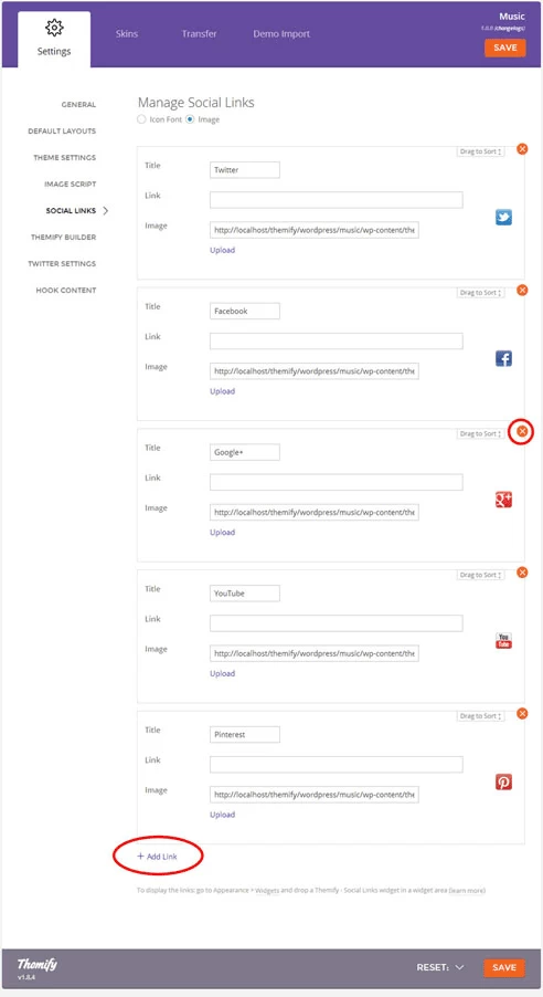
Go to WP Admin > Themify > Settings > Social Links tab.
The theme comes with some pre-filled social links. Simply enter your social profile URL in the Link input field. For example, enter 'https://twitter.com/themify' for the Twitter link.
You can choose to display either "Icon Font" or "Image".
If "Icon Font" is selected, click on "Insert Icon" to select an icon (over 320+ icons available).
If "Image" is selected, you can upload your own graphic icon by clicking on the Upload button.
To add more links, click on the Add Link button at the bottom.
To remove a link, click on the delete icon.
To arrange the display order, drag and drop the link container.
Step 2) Displaying the Social Links:
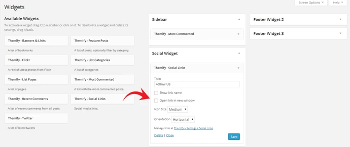
Once you have the Social Links setup, go to WP Admin > Appearance > Widgets. Drag and drop the Themify - Social Links from the Available Widgets panel to the Social Widget panel.
Optional: Customize Widget Title - such as "Follow Us". You can also "Show link name" and adjust icon size.
Hiding the RSS Icon
To hide the default RSS icon in the header:
Go to WP Admin > Themify > Settings > Theme Settings.
Under the "Exclude RSS Link", tick the checkbox that says "Check here to exclude RSS icon/button in the header".
Hiding the Search Form
To hide the default search form in the header:
Go to WP Admin > Themify > Settings > Theme Settings.
Under the "Exclude Search Form", tick the checkbox that says "Check here to exclude search form in the header".
How to Import Parallax Layouts
To import a pre-designed parallax layout:
Add a new Page.
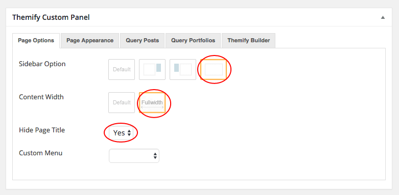
On the page's Themify Custom Panel > Page Options, select:
Sidebar Option = sidebar-none icon
Content Width = fullwidth icon
Hide Page Title = Yes
Optional: on the Themify Custom Panel, click on "Page Appearance" tab to set the design appearance of this particular page (read Page Appearance section below for more details).
On the Discussion panel, uncheck "Allow discussion" checkbox (this will disable the comments on the page).
Publish and view the page frontend.
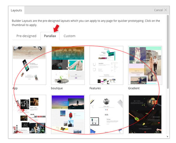
Turn on the Builder on frontend, on the top admin bar, select Themify Builder > Layouts > Load Layouts.
A lightbox window will appear where you'll be able to toggle between Pre-designed, Parallax, or Custom Builder layouts. Click on "Parallax" tab and click on a thumbnail image to import.
Pre-design tab consists of all Layouts in the Builder.
Parallax tab consists of all Layouts that have parallax scrolling effect.
Custom tab is where you find your own custom Layouts.
Theme tab consists of the layouts built specifically for this theme.
When it asks to replace or append the layout, click "Replace Existing Layout".
Now you may replace the images and text as you like.
To adjust the parallax effect:
Edit any existing module, then click "Animation" tab on the option lightbox, and select the "Scroll Speed". The higher the speed, the faster the scroll (i.e. speed 10 means it will scroll very fast off the viewing area).
To produce parallax and overlapping effect, select different scroll speeds on different modules.
When modules overlapping each other on scroll, you can use the "Z-Index" to control their stack order. Module with greater stack order is always in front of a module with a lower stack order (ie. module with z-Index 2 will overlap modules with z-index 1).
How to Design Custom Parallax Layouts
In the follow tutorial, we will show you how to create a parallax layout using this Profile demo page as a reference design. If you want to see the final result first, create a new page then import it from Themify Builder > Layouts > Load Layouts > Parallax and select "Profile" thumbnail.
To design a custom parallax layout from scratch:
Add a new Page.
On the Themify Custom Panel, select the following options (view screenshot):
Sidebar Option = sidebar-none icon
Content Width = fullwidth icon
Hide Page Title = Yes
Optional: on the Themify Custom Panel, click on "Page Appearance" tab to set the design appearance of this particular page (read Theme Appearance section below for more details).
On the Discussion panel, uncheck "Allow discussion" checkbox (this will disable the comments on the page).
Publish and view the page frontend.
Turn on the Builder on frontend.
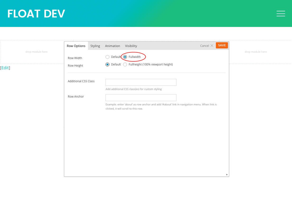
Hover your mouse on the first row top bar, then click on the pencil icon to open row options and select "Row Width = Fullwidth" (view screenshot):
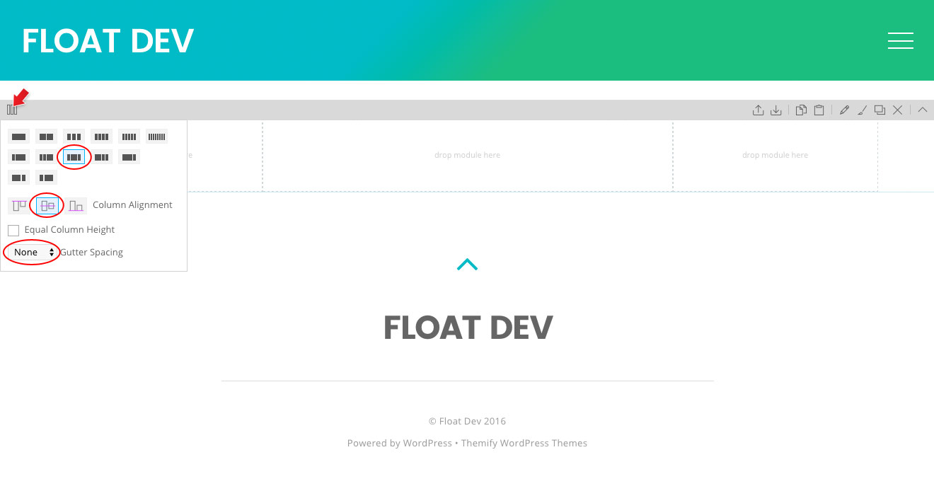
On the row grid dropdown, select (view screenshot):
Select 3-column grid
Column Alignment = middle alignment icon
Gutter Spacing = None
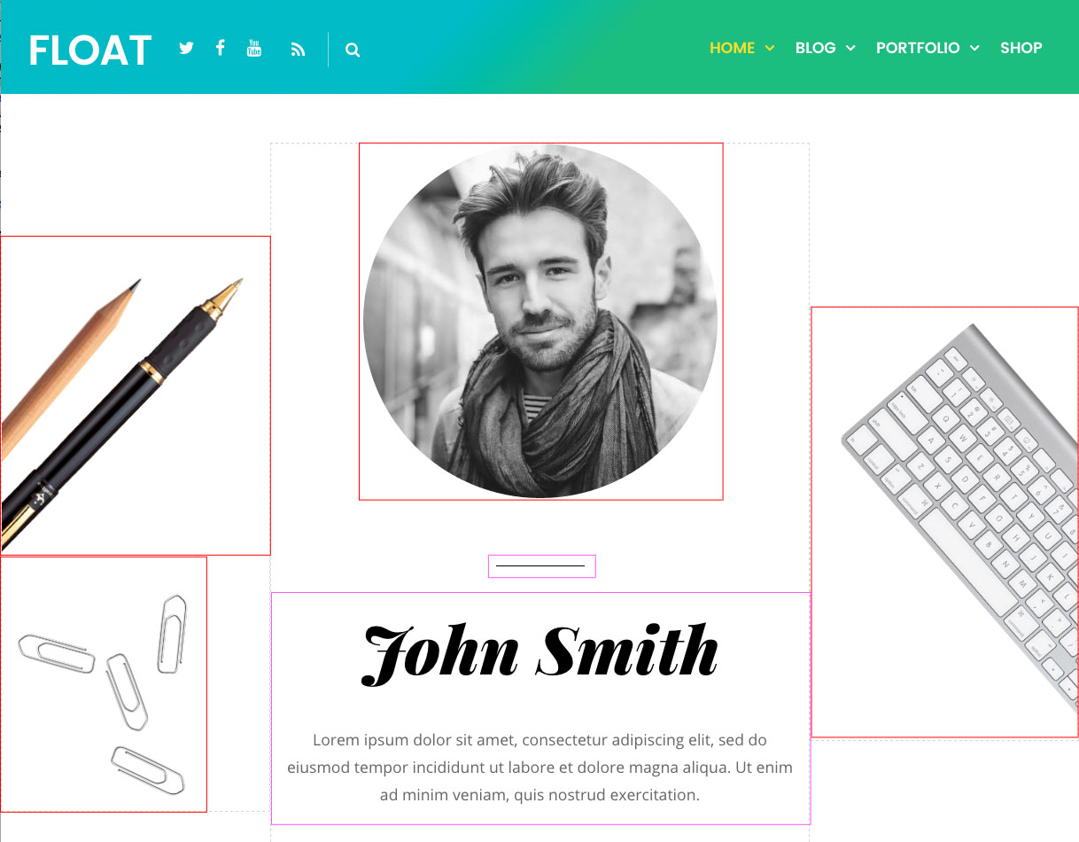
Drop in some Image and Text modules as like this screenshot. If you are new with Themify Builder, watch this starter video on how to use the general interface.
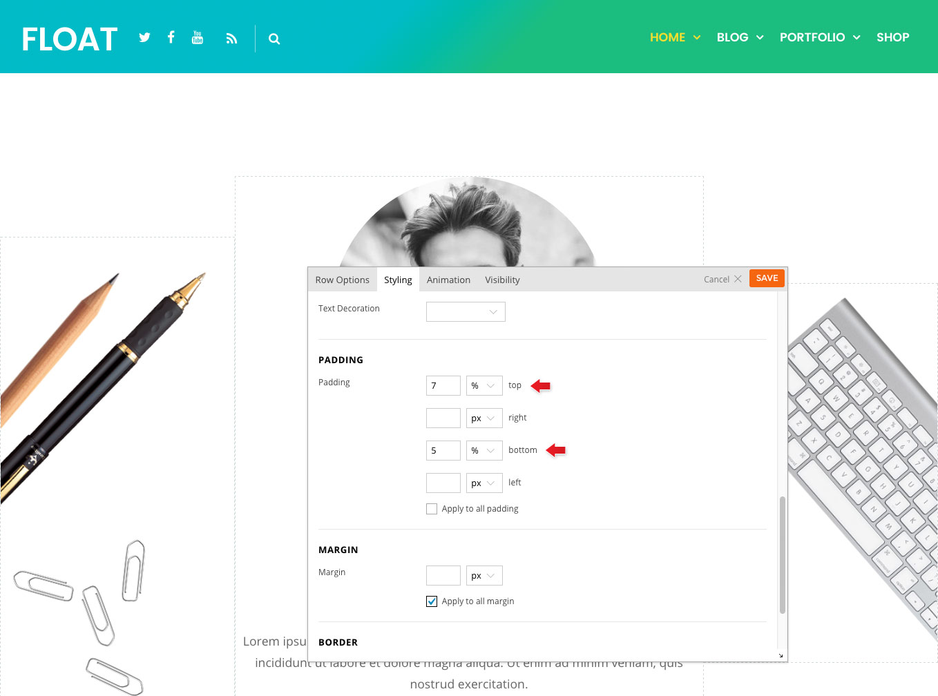
Let's add some top and bottom padding to the row and give some separation in between rows. To add padding, hover the row top bar, click the brush icon to open row styling panel, then add 7% top padding and 5% bottom padding (view screenshot).
Now that you've done the first row, open a new browser window/tab; view the page that you are working on to see the result. Keep the Builder edit mode active on the other browser window/tab (so one window to work on, another one to see the result).
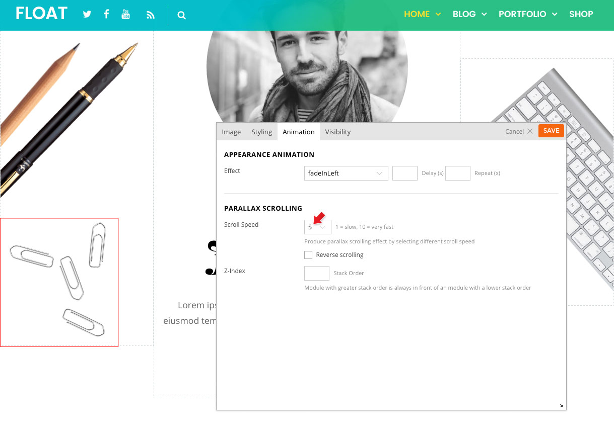
To add parallax effect: edit the first image module (the pencil and pen image), click "Animation" tab, and select "Scroll Speed = 1" (view screenshot). The higher the speed, the faster the scroll (i.e. speed 10 means it will scroll very fast off the viewing area).
Then edit the second image module (the paper clips image), and on the Animation tab, select "Speed Speed = 5" (view screenshot).
Switch back to the viewing browser tab that has the same page opened. Reload the page to see the result.
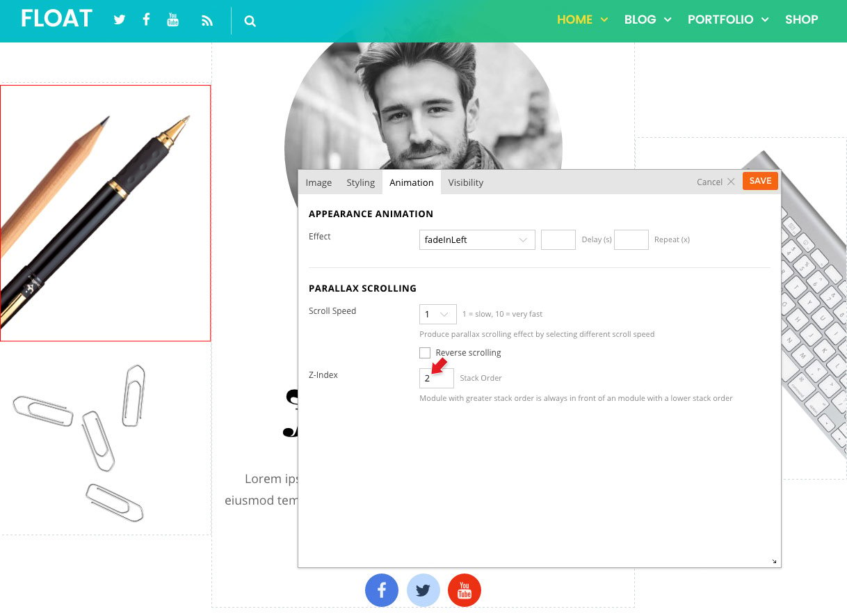
You should notice that the paper clips image is overlapping (above) the pencil and pen image. If you want the pencil and pen image to be above the paper clips image, then add Z-Index on the image module. Z-index allows you to change the module stack order (higher z-index will stay above).
To add z-index: edit the pen and pencil Image module, click Animation tab, then enter "2" in Z-index. Default z-index is zero (0), so adding z-index 2 will have this image overlap everything else that doesn't have any z-index input (view screenshot).
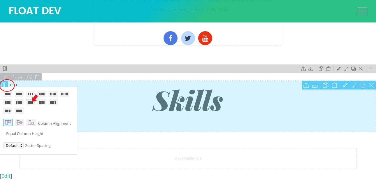
Let's create the second row now. Drop in a Text module and enter "Skills" heading 1 text.
To create a sub-row: hover the Text module and select 3-column grid (view screenshot) and, then drag the Text module to the middle column.
Then drop a Divider module above the Text module, select "Divider Width = Custom, Width = 100, and Alignment = Center" (view screenshot).
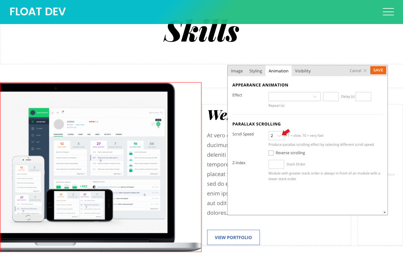
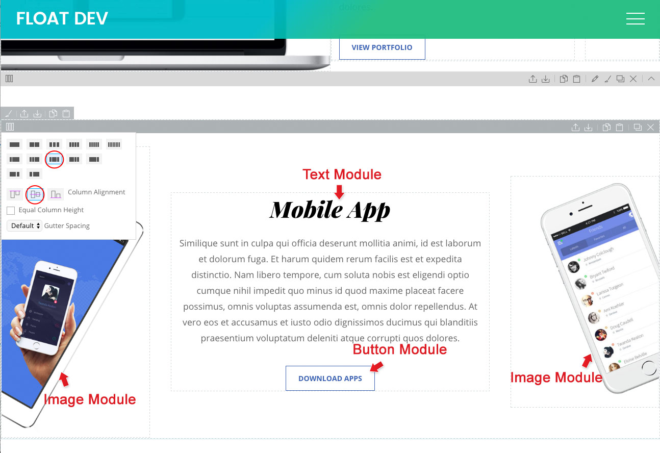
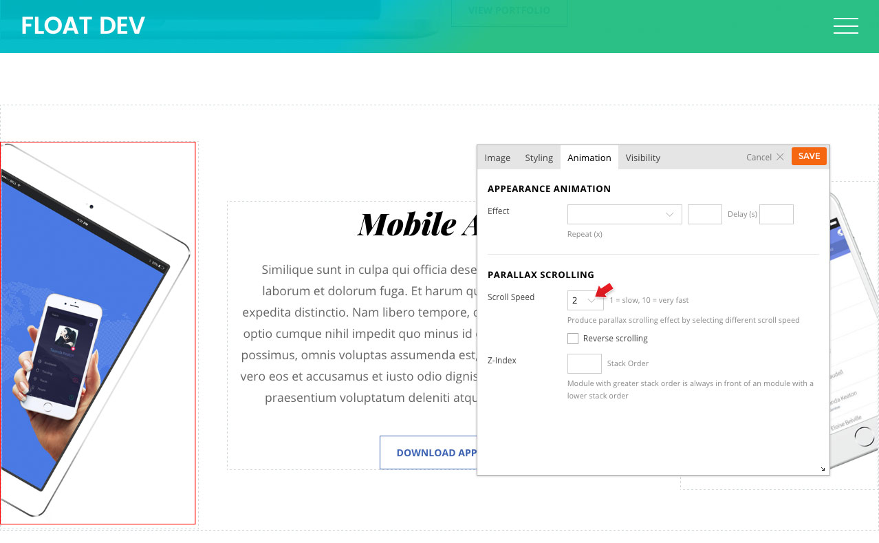
On the next row, select the 2-column grid with middle column alignment and then drop in an Image, Text, and Button module as per this screenshot.
Edit the Image module on the left column, click "Animation" tab and enter "Scroll Speed = 2" (view screenshot).
On the next row, select the 3-column grid with middle column alignment, then drop in 2 Image modules, a Text, and a Button module as per this screenshot.
On the left column Image module, apply "Scroll Speed = 2" (view screenshot).
On the right column Image module, apply "Scroll Speed = 6" (view screenshot).
Now switch back to the viewing browser tab. Reload the page to see the result.
We will end the tutorial here. You can follow the similar steps and technique to create the remaining part of the layout. TIPS: The trick of creating parallax layout is to design the general layout structure first, then select parallax scroll speed after.
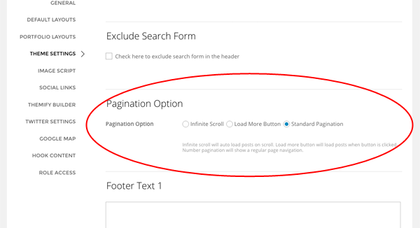
Infinite Scroll / Pagination
Float theme comes with the ability for you to enable the infinite scroll feature. This allows users to view your posts in a continuous flow without having to click on the pagination.
To enable infinite scroll in archive view:
Go to your WP Admin > Themify Setting > Theme Settings
Scroll down and select the option "Infinite Scroll". You'll also see the option for you to select "Standard pagination" or "Load More Button".
Infinite Scroll = auto load posts on page scroll.
Load More Button = load posts when load more button is clicked.
Standard Pagination = show a regular numbered page navigation.
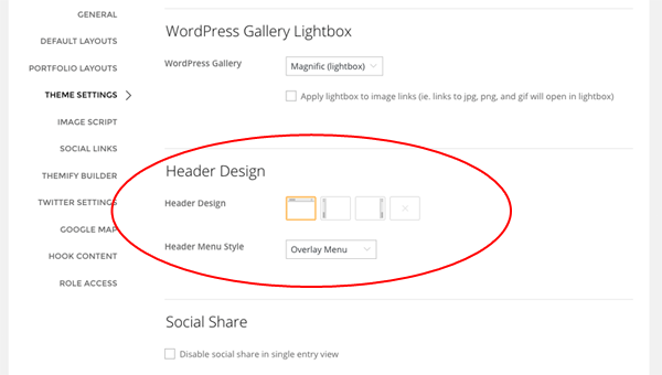
Header Design / Page Appearance
To set header design option site-wide:
Go to WP Admin > Themify Settings > Theme Settings
Header Design:
Header Top Bar = Minimal header with just the site logo and menu.
Header Left Pane = Header will be in a fixed position on the left side.
Header Right Pane = Header will be in a fixed position on the right side.
None = The entire header will be excluded.
Menu Style = This option is only available when header top bar layout is selected. You can select to have the menu in fullscreen overlay or the standard horizontal menu.
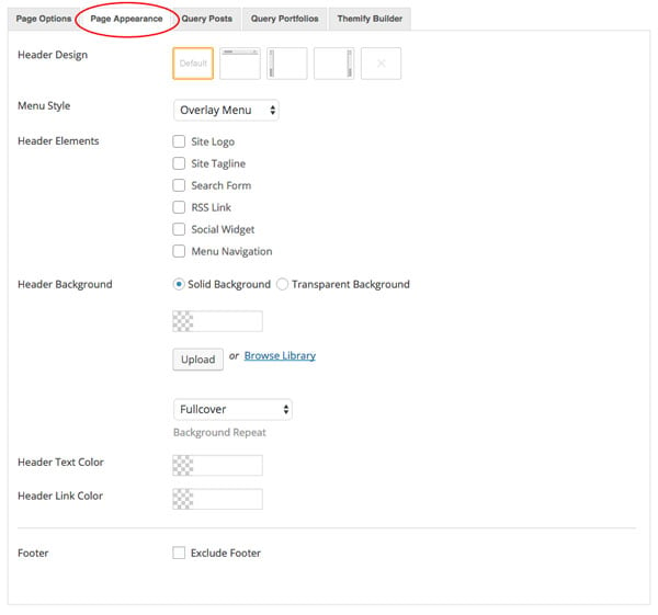
Page Appearance
The header design can be override in each individual post/page.
To override the header design in each individual post/page:
Add or edit any post/page
On the Themify Custom Panel > Page Appearance, you should see these options:
Header Design:
Default = Theme default will take the settings from Themify > Settings > Theme Settings > Header Design).
Header Top Bar = Minimal header with just the site logo and menu.
Header Left Pane = Header will be in a fixed position on the left side.
Header Right Pane = Header will be in a fixed position on the right side.
None = The entire header will be excluded.
Menu Style = This option is only available when header top bar layout is selected. You can select to have the menu in fullscreen overlay or the standard horizontal menu.
Header Elements = Select show/hide the header elements:
select "Hide" will hide the element
select "Show" will show the element
select "Theme default" will take settings from Themify > Settings > Theme Settings => Theme Appearance (i.e. if you want to have "Theme default", you don't have to select anything)
Header Background
Solid Background = Allows you to pick background color and upload background image for the header
Transparent Background = Header background will be transparent (note: the content container will push to the top of the page to achieve transparent header effect)
Header Text Color = Color for the text in the header
Header Link Color = Color for the links in the header
Footer = Check "Exclude Footer" will remove the footer
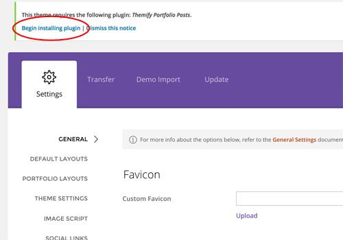
Portfolio Post Type
The theme comes with Portfolio post type as an optional plugin (you don't need to install the Portfolio plugin if you don't intend to have a portfolio on your site).
To install the Portfolio Posts plugin:
Go to your WP Admin > Themify theme
On the Themify panel, click "Begin installing plugin"
Then on the "Install Required Plugins" page, click "Install" under the "Themify Portfolio Posts"
Once the plugin is installed, click "Return to Required Plugins Installer"
Now click "Activate" to activate the installed plugin
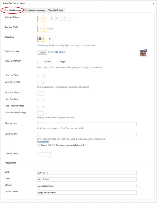
Adding Portfolio Posts:
To create a Portfolio post, select "Add New" under the "Portfolios" admin menu
Enter the Portfolio title and content
In the Themify Custom Panel, enter the options as you like:
Sidebar Option = Select it if you'd like to have a sidebar or have no-sidebar
Content Width = Select how you'd like your content to be displayed
Block Size = Select the block size either in regular or large size. This is only for archive view, select larger block to highlight the project when showcased in archive view
Featured Image = Upload or select an image from the media library for the project
Image Dimensions = This image dimensions will be used for the featured image in the single post view (leaving it blank will have the default dimensions)
Hide Post Title = This option is used to set whether the post title will be displayed in the single post view
Unlink Post Title = This option is used to set whether the post title will be linked in the single post view
Hide Post Date = This option is used to set whether the post date will be displayed in the single post view
Hide Post Meta = This option is used to set whether the post meta will be displayed in the single post view
Hide Featured Image = This option is used to set whether the featured image will be displayed in the single post view
Unlink Featured Image = This option is used to set whether the featured image will be linked in the single post view
External Link = This option is used to link the post featured image and title to a custom URL
Lightbox Link = This option is used to link the post featured image and title to open a URL in a lightbox. This defaults to expecting an image URL
iFrame URL = If checked, this will open the URL as an iFrame within the lightbox. This can be used to open external URLs such as other pages or sites
Add zoom icon on lightbox link = This option sets whether a zoom icon will be shown on the featured image when set to a lightbox link
Custom Menu = (Optional) Select a custom menu that'll appear when users view this post
Project Info = You can also input some additional info about your project on this section (i.e. Date, Client, Service provided, and the link to launch)
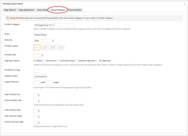
Displaying Portfolio Posts on Pages:
First, create a new Page (in admin, select "Add New" under the "Pages" admin menu)
In Themify Custom Panel, click "Query Portfolios" tab, select either "All Categories" or a Portfolio category, and select the other options as you like:
Portfolio Category = This option is used to set which categories will be included or excluded in the post list
Order = This option is used to set whether posts will be ordered in ascending or descending order
Order By = This option is used to set the attribute that posts will be ordered
Portfolio Layout = This option is used to set the layout of portfolio posts, such as grid columns, list posts, etc.
Portfolio Filter = Set to enable or disable the ability to filter by category for your portfolio posts
Pagination Option = Select how you would like to show more posts. You can choose from the theme default, infinite scroll, load more button, standard pagination, or no pagination
Portfolios Per Page = This option is used to set the number of portfolio posts shown per page
Display Content = This option is used to set what content is output for each portfolio post (None, Excerpt, or Full Content)
Image Dimensions = This option is used to set the dimensions the portfolio images will be displayed at
Hide Portfolio Title = This option is used to set whether the post title will be displayed
Unlink Portfolio Title = This option is used to set whether the post title will operate as a link
Hide Portfolio Date = This option is used to set whether the post date will be displayed
Hide Portfolio Meta = This option is used to set whether the post meta will be displayed
Hide Featured Image = This option is used to set whether the featured image will be displayed
Unlink Featured Image = This option is used to set whether the featured image will operate as a link
Displaying Portfolio Posts using shortcodes:
You can use the [themify_portfolio_posts] shortcode to display the Portfolio posts anywhere in the content editor, Text widget, and the Builder Text module. Below are some sample portfolio shortcodes using different parameters:
= display latest Portfolio posts from portfolio categories Web Design and Illustration, given that their text slugs are "web-design" and "illustration"
Available parameters:
limit = number of post to query/show
category = category ID number or category name (default = all categories)
image = show post image or not (yes or no)
image_w = featured image width
image_h = featured image height
title = show post title (yes or no)
display = display whether full content, excerpt or none (content, excerpt, or none)
post_meta = display post meta (yes or no)
post_date = display postdate (yes or no)
style = layout style (grid4, grid3, grid2). You may also add custom css class in here (e.g. style="grid4 custom-class"). Custom CSS class is only required for developers to apply styling
order = specifies ascendant or descendant order (ASC or DESC)
orderby = criteria used to order posts (author, comment_count, date, menu_order, and title)
unlink_image = remove the link on featured image (yes or no)
unlink_title = remove the link on the post title (yes or no)
more_link = display a custom more link after the posts
more_text = text that will appear in more_link
Designing Portfolio with the Builder
You can use the Builder to design any page and post including the custom post type like Portfolio on the demo. The Builder helps you to make rich media layouts easier by drag and drop elements on the page. Below is a sample portfolio single we designed.
To create a Portfolio single with the Builder:
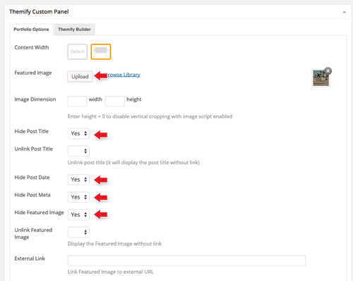
In admin, select "Add New" under the "Portfolios" admin menu
In the Themify Custom Panel:
Featured Image = Upload or select an image from the library
Hide Post Title = Yes
Hide Post Date = Yes
The above will hide the elements in the Portfolio single because we will use the Builder to layout the content
Then publish and view the portfolio post on the frontend
From the top admin bar, select Themify Builder > Turn On Builder
Now you can use the Builder to add modules on the page (this process is very similar like the one above on how to build pages with the Builder)
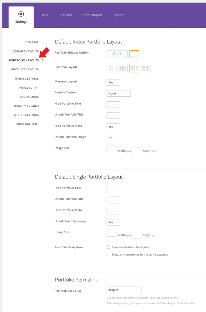
Setting the Portfolio Layouts
To set the portfolio layout options, go to WP Admin > Themify > Settings > Portfolio Settings
Default Archive Portfolio Layout = refers to the Portfolio archive view (i.e. Portfolio posts queried with shortcodes, Query Portfolio pages, Portfolio category pages, etc.)
Default Single Portfolio Layout = refers to the single post view of the Portfolio (project)
Load More Button
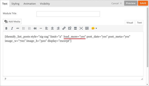
Load More Button in Shortcodes
To display load more button in blog and portfolio shortcode:
Enter load_more="yes" attribute in either [themify_list_posts] or [themify_portfolio_posts] shortcode.
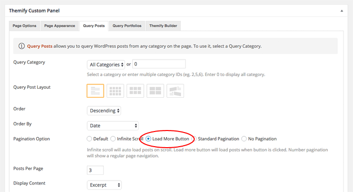
Load More Button in Query Posts/Portfolios
To display load more button in Query Posts and Query Portfolio pages:
Edit or add a Page.
On Themify Custom Panel > Query Posts (or Query Portfolios) tab, select a Query Category to query posts.
On the "Pagination Option", select "Load More Button" to have load more instead of infinite scroll or the standard pagination.
Setting Default Post and Page Layouts
Generally, the theme works out of the box. All the sidebar options and image dimensions are pre-defined in the theme. If you need to change the default sidebar options, featured image dimensions, content/except display, post meta, etc., it can be done in the WP Admin > Themify > Settings > Default Layouts.
There are three default layout options under Themify > Settings > Default Layouts:
Archive Sidebar Option: refers to the default home page, category, search, archive, tag pages, etc.
Default Post Layout: is the post page direct URL (also known as "Single Post").
First, create a new Page (in admin, select "Add New" under the "Pages" admin menu).
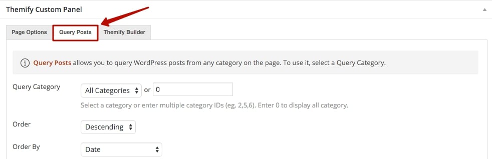
In Themify Custom Panel, click "Query Posts" tab, select either "All Categories" or a Post category and select the other options as you like:
Order = This option is used to set whether posts will be ordered in ascending or descending order.
Order By = This option is used to set the attribute that the order of the post will be based on.
Query Post Layout = This option is used to set the layout of posts such as grid columns, list posts, etc.
Post Per Page = This option is used to set the number of posts shown per page.
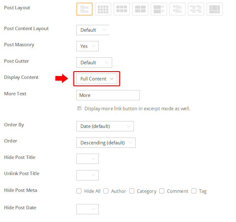
Display Content = This option is used to set what content is output for each post (None, Excerpt, or Full Content).
Image Dimensions = This option is used to set the dimensions the posts images will be displayed at.
Hide Post Title = This option is used to set whether the post title will be displayed.
Unlink Post Title = This option is used to set whether the post title will operate as a link.
Hide Post Date = This option is used to set whether the post date will be displayed.
Hide Post Meta = This option is used to set whether the post meta will be displayed.
Hide Featured Image = This option is used to set whether the featured image will be displayed.
Unlink Featured Image = This option is used to set whether the featured image will operate as a link.
Hide Page Navigation = This option is used to set whether the page navigation for posts will be displayed.
Setting a Custom Front Page
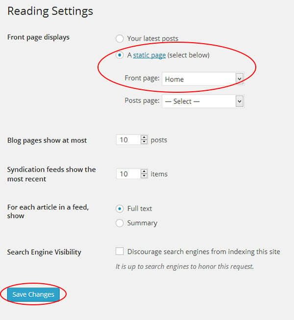
You can set any page as the front (home) page. This means you can use the Builder to design the page and assign it as the front page. To set the Front Page:
Go to WP Admin > Settings > Reading.
On the Front page displays, select the "A static page (select below)" option and then select a "Front page".
Leave the "Posts page" default. If you want to create a custom Blog page, read this tutorial instead of setting the "Posts page".
Adding Widgets
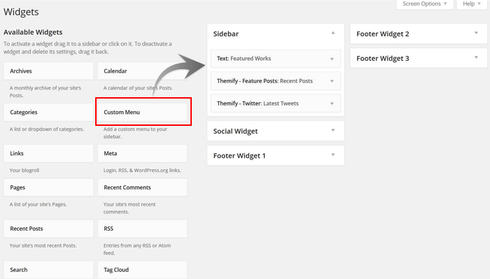
To add widgets to widgetized areas (eg. sidebar and footer widgets):
Go to WP Admin > Appearance > Widgets.
The big panel on the left side shows all available widgets. The small panels on the right are the widgetized areas.
To add a widget: drag and drop the widget from the left panel to the right panel.
To remove the widget: drag the widget back to the left panel (Available Widgets panel). If you want to keep the widget setting for future use, drag it to the Inactive Widgets instead of the Available Widgets panel. It will save your widget settings. To retrieve the widget, drag the widget from Inactive Widgets panel instead of the Available Widgets panel.
Go to WP Admin > Themify > Skins, select a skin by clicking on the thumbnail and click Save.
Styling The Theme
To style the theme frontend appearance:
Go to WP Admin > Appearance > Customize.
It will take you to the Customize panel with live preview where you can style the appearance of the theme design (ie. color, background, font, spacing, border, etc.).
FYI: Refer to Customize documentation for more info.
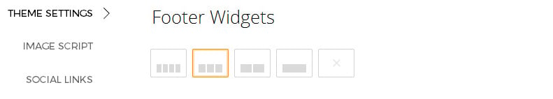
Footer Widgets
To set the Footer Widget column layout, go to WP Admin > Themify > Settings > Theme Settings.
To drop the widgets in the Footer Widgets, go to WP Admin > Appearance > Widgets.
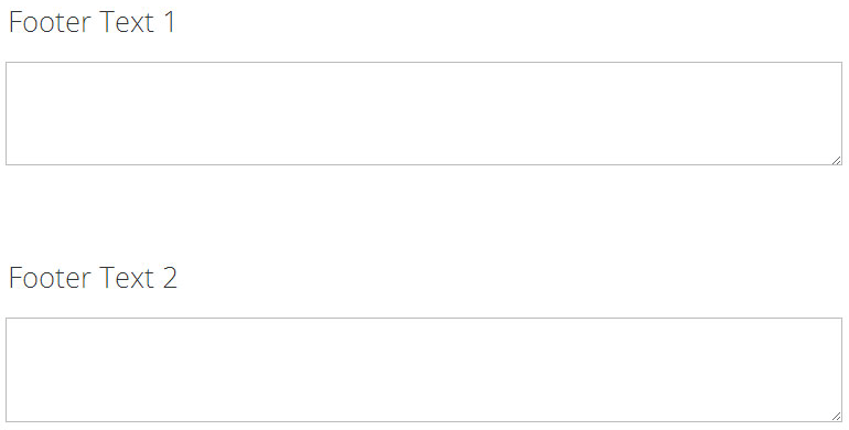
Footer Text
To replace the footer credit links:
Go to WP Admin > Themify > Settings > Theme Settings and enter the footer text.
HTML tags are allowed in the Footer Text.
To have empty footer text, tick the hide footer text checkbox.
Installing Builder Addons is exactly the same as installing WordPress plugins.
To install the addon:
Firstly, download the addon zip file from the link provided in your Themify Member Area.
NOTE: some browsers (eg. Safari) auto extract zip files automatically. Right-click on the download link and select "Save Linked File As" and it will allow you to download as a zip file.
Login to your site's admin area.
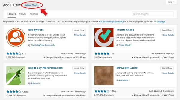
Navigate to WP Admin > Plugins > Add New.
Now, click the "Upload Plugin" link.
Select "Browse" and navigate to the plugin zip file which you downloaded in the first step and then select the "Install Now" button.
This will initiate the plugin installation process, and once finished, you can then activate the plugin.
Importing the addon demo layout
Each addon zip file contains a sample Builder data file which you can import to your site. It helps you to understand how the addon demo is created.
To import the addon demo data:
First, extract addon zip file to your local computer
You should have a folder of the addon. Inside there is a folder named "sample", and inside that folder there is a Builder data file in a zip format (eg. "addon_name_sample-builder-layout.zip").
To import the Builder layout, login to admin and then go to the page frontend where you want to import the Builder layout. From the top admin bar > select Themify Builder > Import / Export > Import, upload the sample zip file.
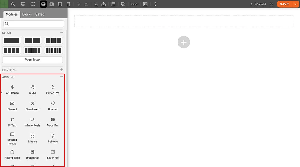
Using the Infinite Posts Addon
Once the addon is installed, you will find it on the Themify module panel. The module is available in both backend and frontend edit mode (just like all standard modules). In the backend, you will find the module in the Themify Custom Panel. On the frontend, you can see the modules after turning on the Builder from top admin bar > Themify Builder > Turn On Builder.
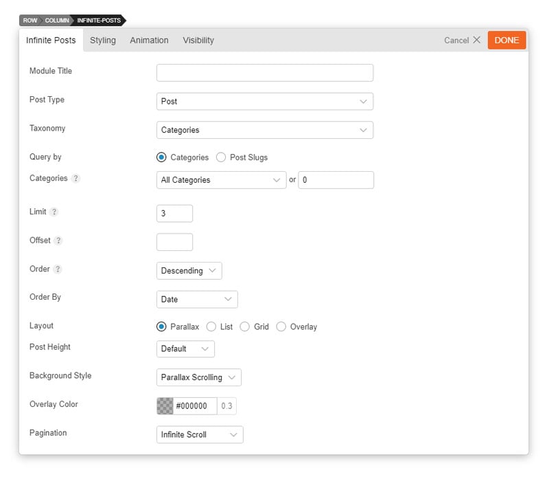
Drag and drop an Infinite Posts module in a row
The options below will appear:
Module Title = This option is used to add the title of your module
Post Type = This is the type of post that you would like to query (i.e. Portfolio)
Query By = Set to query by category, tags, or slug
Categories = This option is used to select which categories of posts will be displayed
Limit = This option sets the number of posts shown
Offset = This option sets how many posts should be skipped before the first one is displayed
Order = This option sets whether the posts will be ordered in ascending or descending order
Order By = This option sets what data order the posts will be based on
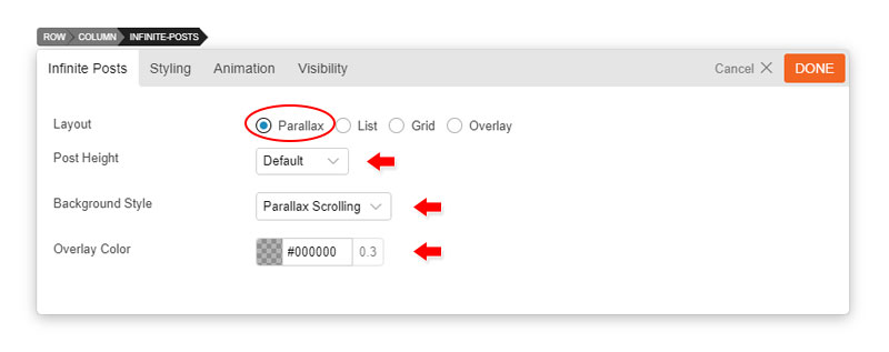
Layout = Select the type of layout that you would like to use to query your posts
Parallax:
Post Height = Set to fullheight or default
Background Style = Set to parallax scrolling or fullcover
Overlay color = Set the overlay color and adjust the opacity
List:
Image Width and Height = Set the image height & width of the featured images
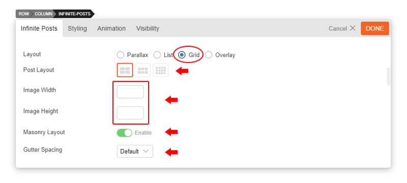
Grid and Overlay:
Post Layout = This option is used to determine the layout of the posts and how they will be arranged
Grid 4 = Posts will be arranged in a four column layout
Grid 3 = Posts will be arranged in a three column layout
Grid 2 = Posts will be arranged in a two column layout
Image Width and Height = Refer to the List option above
Masonry Layout = Enable or disable the masonry layout
Gutter Spacing = Set the gutter spacing to default, narrow, or none
Pagination = Set the type of pagination that you would like to use (Infinite Scroll, Pagination links, Load More Button, No pagination)
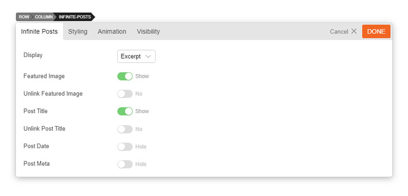
Display = This option sets what content will be the output (full content, excerpt or none)
Hide Post Title = This option sets whether or not the post title will be shown
Unlink Post Title = This option sets whether the post title will be a link
Hide Post Date = This option sets whether or not the post date will be shown
Hide Post Meta = This option sets whether or not the post meta will be shown
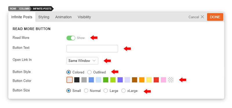
Read More Button:
Hide Read More Button = Select to hide or show the "Read More" button after each post
Button Text = Input the text that you would like to be the button text
Open Link in = Select to either open the post in a lightbox, new window, or the same window
Button Style = Select to set the button in regular colored or outline only
Button Color = Set the preset button colors
Button Size = Set the button size that you'd like
Additional CSS Class = This option allows you to add any custom CSS classes you wish to be the output with the module
Installing Builder Addons is exactly the same as installing WordPress plugins.
To install the addon:
Firstly, download the addon zip file from the link provided in your Themify Member Area.
NOTE: some browsers (eg. Safari) auto extract zip files automatically. Right-click on the download link and select "Save Linked File As" and it will allow you to download as a zip file.
Login to your site's admin area.
Navigate to WP Admin > Plugins > Add New.
Now, click the "Upload Plugin" link.
Select "Browse" and navigate to the plugin zip file which you downloaded in the first step and then select the "Install Now" button.
This will initiate the plugin installation process, and once finished, you can then activate the plugin.
Importing the addon demo layout
Each addon zip file contains a sample Builder data file which you can import to your site. It helps you to understand how the addon demo is created.
To import the addon demo data:
First, extract addon zip file to your local computer
You should have a folder of the addon. Inside there is a folder named "sample", and inside that folder there is a Builder data file in a zip format (eg. "addon_name_sample-builder-layout.zip").
To import the Builder layout, login to admin and then go to the page frontend where you want to import the Builder layout. From the top admin bar > select Themify Builder > Import / Export > Import, upload the sample zip file.
Using the Typerwriter Addon
Once the addon is installed, you will find it on the Themify module panel. The module is available in both backend and frontend edit mode (just like all standard modules).
In the backend: you will find the Typewriter module in the Themify Custom Panel.
On the frontend: you can see the modules after turning on the Builder from top admin bar > Themify Builder > Turn On Builder.
Drag and drop a Typewriter module in a row
The options below will appear
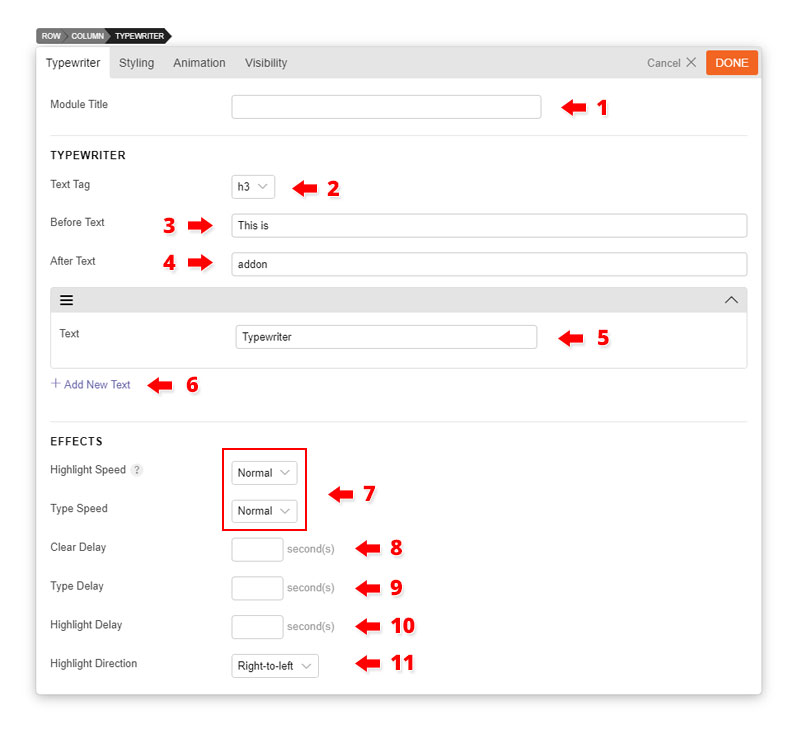
1) Module Title = Insert the module title that will appear at the top of the module
2) Text Tag = Select the HTML tag that you would like to apply on all text
3) Before Text = Text that will appear before the text
4) After Text = Text that will appear after the text
5) Text = This is the text that will appear with the typing and highlight animation
Note: In order for the typing animation to loop, you'll need to add more than 1 text. Adding only 1 text will only show the typing animation once
6) Add New Text = You can add an unlimited number of texts. Each added text will overlap with the previous text, and enable the looping animation effect.
In addition to the above features, you can also set the animation effect speed
7) Highlight & Type Speed = Set the speed to fast, slow, or normal
8) Clear Delay = Set how fast the text will disappear
9) Type Delay = Set how fast the next text starts
10) Highlight Delay = Set how fast before the text is highlighted
11) Additional CSS Class = Add additional CSS class for custom styling.
To install themes with the WordPress theme uploader:
Download the "theme.zip" file from the Member Area
Note: some browsers (eg. Safari) auto extract zip files automatically. Right-click on the download link and select "Save Linked File As". This will allow you to download the theme as a zip file.
Login to your site's WP Admin.
Go to Appearance > Themes.
Click on the "Add New" button, then click on the "Upload Theme" button
Upload the theme.zip file (note: it is the theme.zip, not the theme-psd.zip that you just downloaded from the Member Area).
Activate the theme
FYI: You can also install themes with FTP method. Read the Installing Themes tutorial for more info.
Demo Import
If you are starting a fresh site, importing the demo content will help you understand how the theme demo is built. The Demo Import feature will import the contents (posts, pages, comments, etc.), Themify panel settings, menus, and widgets setup from our demo to your site. You can erase the demo content afterward.
To import the demo setup:
Go to WP Admin > Themify > Settings > Demo Import and click "Import Demo" button.
Note that the featured images will be replaced with an image placeholder for copyright reasons.
To erase the demo setup:
On the Demo Import tab, click on the "Erase Demo" button which will then remove the demo content.
FYI: If the Demo Import does not work on your site, you can use the WP Admin > Tools > Import tool to import the demo content manually.
Site Logo & Tagline
To display a logo image instead of the site name text:
Go to WP Admin > Appearance > Customize > Site Logo and Tagline.
Under "Site Logo", select "Logo Image" radio button.
Upload a logo image.
Specify the logo image width and height.
You can also change website Tagline from here:
Go to WP Admin > Appearance > Customize > Site Logo and Tagline.
Scroll down and under "Site Tagline" select "Text" radio button.
Enter your site Tagline.
Click "Save & Publish".
Main Navigation Menu
To create a custom navigation menu:
Go to WP Admin > Appearance > Menus.
Click on "create a new menu" to create a new menu (eg. Main Menu).
Add the menu items from the left panels.
To create a dropdown menu: drag the menu item towards the right (the item(s) will be indented).
When you are done adding the menu items, click "Save Menu".
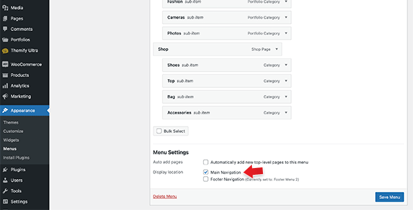
To assign menu locations:
Scroll down to the bottom where it says "Theme locations" and tick the menu location checkbox.
Main Navigation = main menu on the header
Footer Navigation = footer menu on the footer (Note: some themes might not have Footer Navigation).
TIPS: You can display menus on sidebar widgets, remove the main menu, create empty links, and lightbox links. Read Custom Menus for more detailed tutorial.
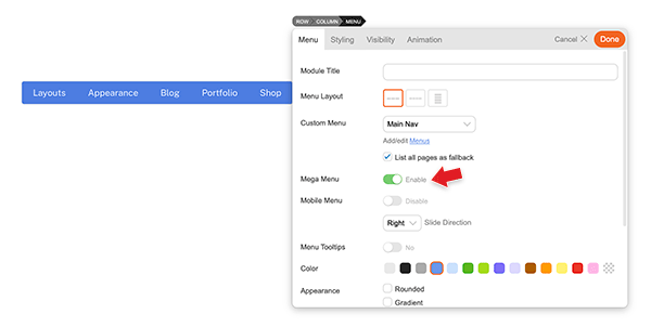
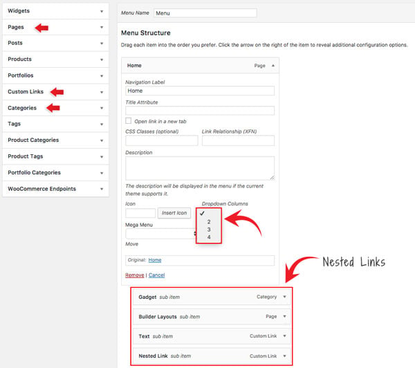
Mega Menu
The Mega Menu feature enables you to make the most of the WordPress menu by showcasing featured posts and multi-column dropdowns with various links and widgets.
To use the Mega Menu:
To make use of the Mega Menu feature, you'll first need to set up the menu at WP-Admin > Appearance > Menus.
Once you've created the menu (follow the steps below), you can assign that menu as the 'Main Navigation,' and the mega menu will appear in the primary navigation area of your theme. Note: Mega menu support is available only in the following themes: Ultra, Shoppe, Music, Parallax, Fullpane, Peak, and Magazine. If your theme doesn't support the mega menu feature, you can still use the Builder Menu module to display it.
You can display the mega menu using the Builder's Menu module. Simply drop in a Menu module, choose the menu you've configured with the mega menu feature, and then enable the "Mega Menu" option.
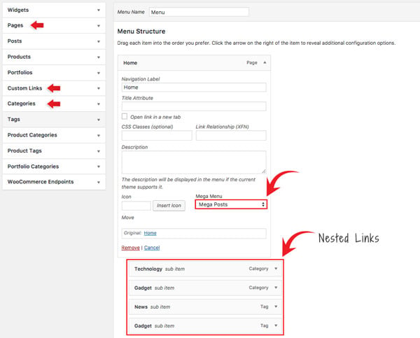
To create Mega Posts on the mega menu dropdown:
Go to WP-Admin > Appearance > Menus, add a new menu or edit any existing menu.
Add a "Pages" or "Custom Links" and select "Mega Posts" on the Mega Menu dropdown option.
Next, include 'Tags' or 'Categories' as link types in the nested menu. For instance, you would set the Blog page link as the parent link and then nest the categories/tags links. When users hover over the Blog link, they will be able to see the recent posts of the corresponding categories/tags within the mega menu dropdown.
Note: The nested items must be Tags or Categories. This will display recent posts associated with the chosen tag/category. If the Tags option is not visible, click on the 'Screen Options' located in the top-right corner, and ensure that the 'Tags' option is checked.
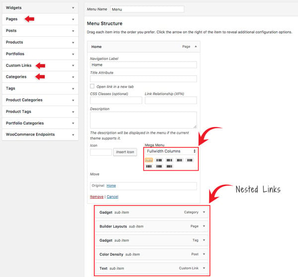
To set Fullwidth Columns:
Add a "Pages" or "Custom Links" and select "Fullwidth Columns" on the Mega Menu dropdown option.
Select the column layout from the preset that appears - Default is set to "Auto",
Then add any link (Pages, Posts, Custom Links, Tags, Categories) or widgets. This will display nested links in multiple columns.
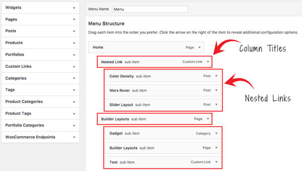
Setting Navigation Titles Above Nested Links:
Utilizing the 'Fullwidth Columns' option, you can also establish header titles that appear above the nested links. To achieve this, simply add an additional layer of nested links beneath the initial set of nested links, as demonstrated in the screenshot below:
To set Dropdown Columns:
Add a "Pages" or "Custom Links", select the "Dropdown Columns" option, and then select the number of columns (2, 3, or 4).
Then add any link (Pages, Posts, Custom Links, Tags, Categories) or widgets. This will display the nested links in the number of columns as you selected.
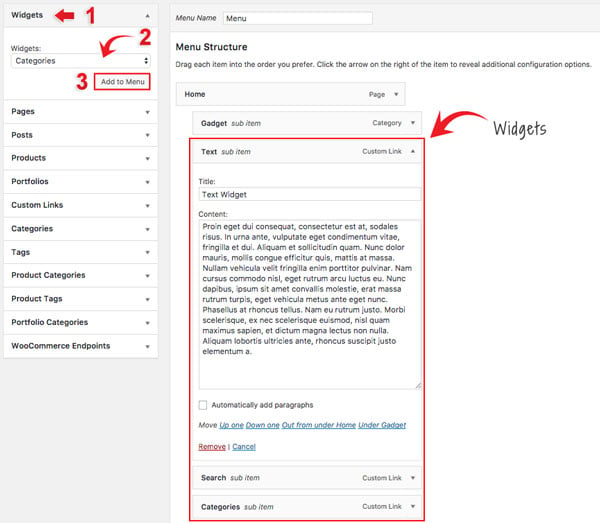
To add Widgets in the mega menu:
Select the "Widgets" link type and select the widget from the dropdown menu option.
Click "Add to Menu" and customize the widget as you like (eg. you can drop in a Text widget and enter your custom text).
Setting Up the Social Links
Step 1) To set up the social media links:
Go to WP Admin > Themify > Settings > Social Links tab.
The theme comes with some pre-filled social links. Simply enter your social profile URL in the Link input field. For example, enter 'https://twitter.com/themify' for the Twitter link.
You can choose to display either "Icon Font" or "Image".
If "Icon Font" is selected, click on "Insert Icon" to select an icon (over 320+ icons available).
If "Image" is selected, you can upload your own graphic icon by clicking on the Upload button.
To add more links, click on the Add Link button at the bottom.
To remove a link, click on the delete icon.
To arrange the display order, drag and drop the link container.
Step 2) Displaying the Social Links:
Once you have the Social Links setup, go to WP Admin > Appearance > Widgets. Drag and drop the Themify - Social Links from the Available Widgets panel to the Social Widget panel.
Optional: Customize Widget Title - such as "Follow Us". You can also "Show link name" and adjust icon size.
Hiding the RSS Icon
To hide the default RSS icon in the header:
Go to WP Admin > Themify > Settings > Theme Settings.
Under the "Exclude RSS Link", tick the checkbox that says "Check here to exclude RSS icon/button in the header".
Hiding the Search Form
To hide the default search form in the header:
Go to WP Admin > Themify > Settings > Theme Settings.
Under the "Exclude Search Form", tick the checkbox that says "Check here to exclude search form in the header".
How to Import Builder layouts
To import a pre-designed Builder layout:
Add a new Page.
On the page's Themify Custom Panel > Page Options,
select the options as you like
We recommend setting to fullwidth, no sidebar, and hide page title
Optional: on the Themify Custom Panel, click on "Page Appearance" tab to set the design appearance of this particular page.
On the Discussion panel, uncheck "Allow discussion" checkbox (this will disable the comments on the page).
Publish and view the page frontend.
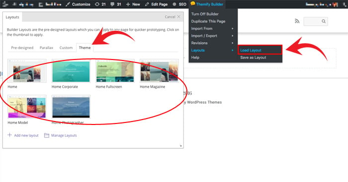
Turn on the Builder on frontend, on the top admin bar, select Themify Builder > Layouts > Load Layouts.
A lightbox window will appear where you'll be able to toggle between Pre-designed, Parallax, Custom Builder, or Theme layouts. Click on "Theme" tab and click on a thumbnail image to import.
Pre-design tab consists of all Layouts in the Builder.
Parallax tab consists of all Layouts that have parallax scrolling effect.
Custom tab is where you find your own custom Layouts.
Theme tab consists of the layouts built specifically for this theme.
When it asks to replace or append the layout, click "Replace Existing Layout".
Now you may replace the images and text as you like.
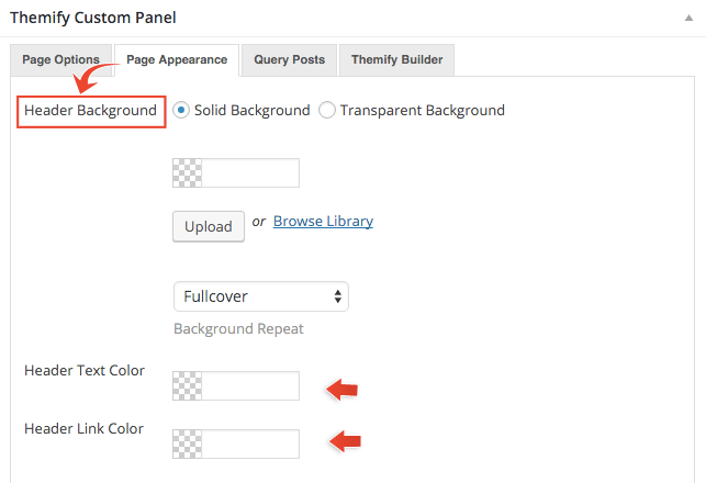
Header Background
You can customize different header background in each individual post/page. These options can be accessed when you edit a page/post > scroll down to the Themify Custom Panel > Click on the Page Appearance tab.
Below are the following Header Background options:
Solid Background = Allows you to pick a background color and upload background image for the header
Transparent Background = Header background will be transparent (Note: The content container will push to the top of the page to achieve transparent header effect)
Header Text Color = Color that'll be applied on any text on the header (Note: The color selected will also be applied on the menu icons)
Header Link Color = Color that'll be applied on any links on the header (Note: The color selected will also be applied on the menu icons)
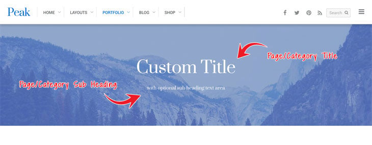
Unique Page Title Header
The theme comes with a unique page title header styling, allowing you to customize the header image, text, and overlay color. This can be applied to both categories and pages on your site.
To set up page unique header:
Edit page > Scroll down to your Themify Custom Panel > Click on the Page Options tab
Page Sub Heading = Sub text that'll appear underneath the page title
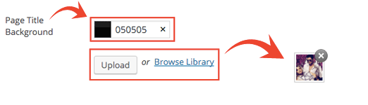
Edit page > Scroll down to your Themify Custom Panel > Click on the Page Appearance tab
Page Title Background = Set color overlay that'll appear on your unique page header. Also, add an image that you'd like to appear as a background image on your header
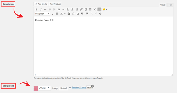
To set up category unique header:
WP Admin > Posts > Categories > Edit a category
Description = The content added here will appear as a sub heading to the categories title
Background = Set color overlay that'll appear on your unique page header, also add an image that you'd like to appear as a background image on your header
Post Style Classes
If you are using themify_list_posts or themify_portfolio_posts to display the posts, you may use the "style" parameter to specify the post styles.
Post Tiles
auto_tiles = posts will display in a masonry tiles layout that is perfectly aligned top and bottom in the grid
load_more = display load more button which allows viewer to load more posts on the same page
post_filter = display a category filter at the top which allows viewer to toggle the post visibility by post category
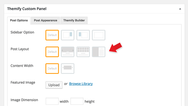
In the Themify Custom Panel, select the Post Layout icon
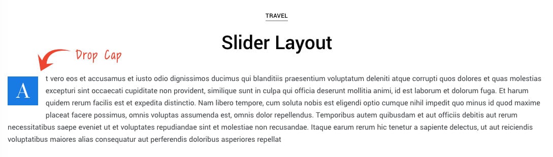
Drop Cap
This is a default feature that's automatically applied when you query posts on a page or module. Because drop cap does not work well with center aligned text, the drop cap styling only appears on the single post that has left Content Alignment. You can also apply drop cap styling to any Builder Text module.
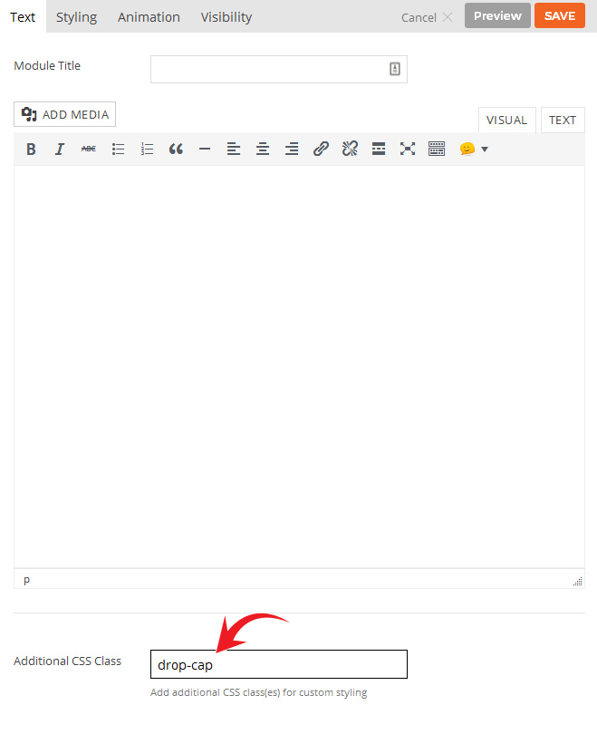
To apply drop cap on a Text module:
On the Text module > Styling tab: enter 'drop-cap' in the "Additional CSS Class" and it will apply drop cap styling to the first letter of the text module (whether it is a paragraph or heading tags such as h1 to h6)
To disable drop cap:
Simply go to your WP Admin > Themify Settings > Theme Settings > Under Drop Cap options > Check the option "Disable Drop Cap styling that appears in the first paragraph of post content/excerpt
Slide-out widget
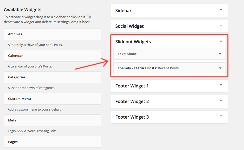
This is a default feature that's automatically applied when you create a post or a page. This panel allows you to drop in any widget you'd like. To do this, go to your WP Admin > Appearance > Widgets. There you'll see the slide-out widget option where you can drag and drop widgets that'll appear on your slider-out widget panel.
Setting Default Post and Page Layouts
Generally, the theme works out of the box. All the sidebar options and image dimensions are pre-defined in the theme. If you need to change the default sidebar options, featured image dimensions, content/except display, post meta, etc., it can be done in the WP Admin > Themify > Settings > Default Layouts.
There are three default layout options under Themify > Settings > Default Layouts:
Archive Sidebar Option: refers to the default home page, category, search, archive, tag pages, etc.
Default Post Layout: is the post page direct URL (also known as "Single Post").
First, create a new Page (in admin, select "Add New" under the "Pages" admin menu).
In Themify Custom Panel, click "Query Posts" tab, select either "All Categories" or a Post category and select the other options as you like:
Order = This option is used to set whether posts will be ordered in ascending or descending order.
Order By = This option is used to set the attribute that the order of the post will be based on.
Query Post Layout = This option is used to set the layout of posts such as grid columns, list posts, etc.
Post Per Page = This option is used to set the number of posts shown per page.
Display Content = This option is used to set what content is output for each post (None, Excerpt, or Full Content).
Image Dimensions = This option is used to set the dimensions the posts images will be displayed at.
Hide Post Title = This option is used to set whether the post title will be displayed.
Unlink Post Title = This option is used to set whether the post title will operate as a link.
Hide Post Date = This option is used to set whether the post date will be displayed.
Hide Post Meta = This option is used to set whether the post meta will be displayed.
Hide Featured Image = This option is used to set whether the featured image will be displayed.
Unlink Featured Image = This option is used to set whether the featured image will operate as a link.
Hide Page Navigation = This option is used to set whether the page navigation for posts will be displayed.
Setting a Custom Front Page
You can set any page as the front (home) page. This means you can use the Builder to design the page and assign it as the front page. To set the Front Page:
Go to WP Admin > Settings > Reading.
On the Front page displays, select the "A static page (select below)" option and then select a "Front page".
Leave the "Posts page" default. If you want to create a custom Blog page, read this tutorial instead of setting the "Posts page".
Adding Widgets
To add widgets to widgetized areas (eg. sidebar and footer widgets):
Go to WP Admin > Appearance > Widgets.
The big panel on the left side shows all available widgets. The small panels on the right are the widgetized areas.
To add a widget: drag and drop the widget from the left panel to the right panel.
To remove the widget: drag the widget back to the left panel (Available Widgets panel). If you want to keep the widget setting for future use, drag it to the Inactive Widgets instead of the Available Widgets panel. It will save your widget settings. To retrieve the widget, drag the widget from Inactive Widgets panel instead of the Available Widgets panel.
Go to WP Admin > Themify > Skins, select a skin by clicking on the thumbnail and click Save.
Styling The Theme
To style the theme frontend appearance:
Go to WP Admin > Appearance > Customize.
It will take you to the Customize panel with live preview where you can style the appearance of the theme design (ie. color, background, font, spacing, border, etc.).
FYI: Refer to Customize documentation for more info.
Footer Widgets
To set the Footer Widget column layout, go to WP Admin > Themify > Settings > Theme Settings.
To drop the widgets in the Footer Widgets, go to WP Admin > Appearance > Widgets.
Footer Text
To replace the footer credit links:
Go to WP Admin > Themify > Settings > Theme Settings and enter the footer text.
HTML tags are allowed in the Footer Text.
To have empty footer text, tick the hide footer text checkbox.