Installing Builder Addons is exactly the same as installing WordPress plugins.
To install the addon:
Firstly, download the addon zip file from the link provided in your Themify Member Area.
NOTE: some browsers (eg. Safari) auto extract zip files automatically. Right-click on the download link and select "Save Linked File As" and it will allow you to download as a zip file.
Login to your site's admin area.
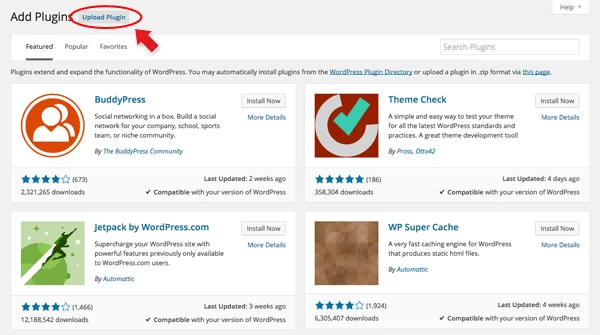
Navigate to WP Admin > Plugins > Add New.
Now, click the "Upload Plugin" link.
Select "Browse" and navigate to the plugin zip file which you downloaded in the first step and then select the "Install Now" button.
This will initiate the plugin installation process, and once finished, you can then activate the plugin.
Importing the addon demo layout
Each addon zip file contains a sample Builder data file which you can import to your site. It helps you to understand how the addon demo is created.
To import the addon demo data:
First, extract addon zip file to your local computer
You should have a folder of the addon. Inside there is a folder named "sample", and inside that folder there is a Builder data file in a zip format (eg. "addon_name_sample-builder-layout.zip").
To import the Builder layout, login to admin and then go to the page frontend where you want to import the Builder layout. From the top admin bar > select Themify Builder > Import / Export > Import, upload the sample zip file.
Using the Timeline Addon
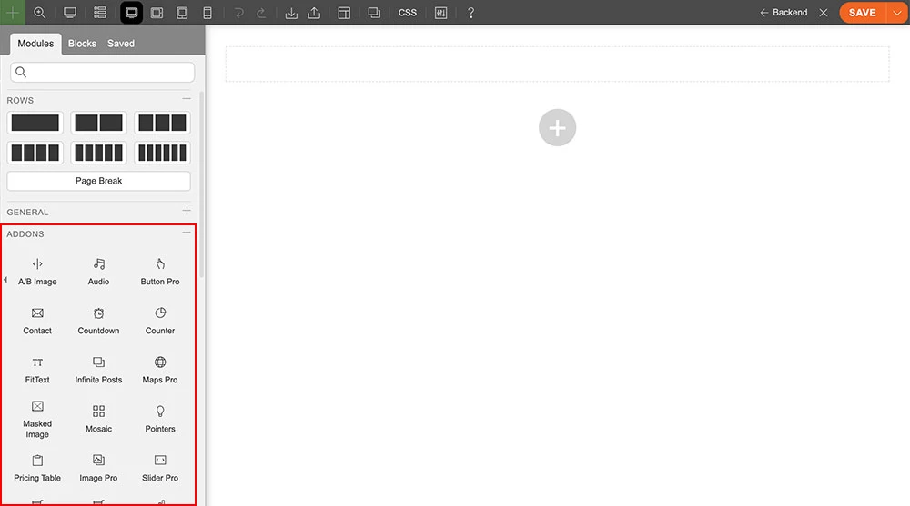
Once addon is installed, you will find the Timeline addon module in the Themify module panel. The module is available in both backend and frontend edit mode (just like all standard modules).
In the backend: you can find the Timeline module in the Themify Custom Panel.
On the frontend: you can see the modules after turning on the Builder from top admin bar > Themify Builder > Turn On Builder.
Drag and drop a Timeline module in a row.
Timeline Options
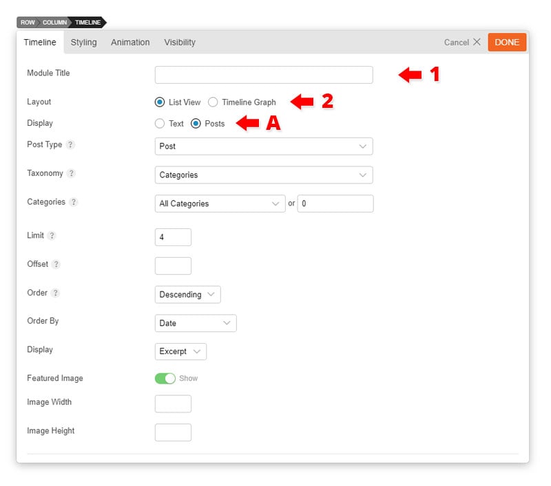
1) Module Title = Insert the module title that will appear at the top of the module. It will appear left aligned, upper-case, in H3 format.
2) Timeline Layout = Choose how you want to display your timeline. Either timeline graph or list view.
A) Posts = Display your posts in a timeline or list view style.
Category = Choose which category you would like to showcase.
Limit = Input the maximum number of posts you would like to show.
Offset = Input the number of post to displace or pass over. The main purpose of this is to avoid showing the same products on multiple rows.
Order By = Choose the order of your products, either by date, price, sales, ID, title, or random. The title will arrange it based on the alphebetical order.
Order = Choose either ascending or descending. Descending will show newer posts first.
Diplay = Choose to either display your content as excerpts, content, or not display anything.
Hide Featured Image = Choose to either show or hide your featured images.
Image Size = Adjust image width and height as you like.
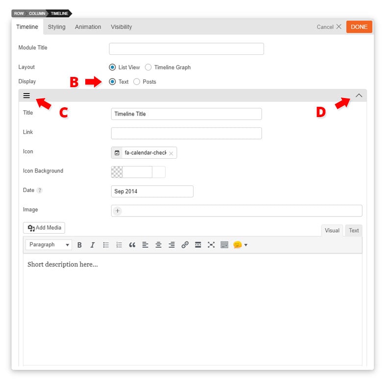
B) Text = Display text in a timeline layout.
Title = Enter title as you like
Link = Enter link that will redirect users when title is clicked.
Icon = Choose what kind of icon type from over 320+ icon list
Icon Color = Choose an "Icon Color" from the color picker
Date = Insert the date that will appear on the left side of the timeline.
Image = Insert a image URL from your media folder or upload it directly.
Text Editor = Enter text in content editor (shortcodes are supported).
C) Row Option = Click the option panel on at the upper left corner of the row and choose to either delete or duplicate the row.
D) Minimize Arrow = Press this button to minimize the row. This is useful when you're uploading multiple audio file in one module, and you want to view how many audio files you've inputed already
Installing Builder Addons is exactly the same as installing WordPress plugins.
To install the addon:
Firstly, download the addon zip file from the link provided in your Themify Member Area.
NOTE: some browsers (eg. Safari) auto extract zip files automatically. Right-click on the download link and select "Save Linked File As" and it will allow you to download as a zip file.
Login to your site's admin area.
Navigate to WP Admin > Plugins > Add New.
Now, click the "Upload Plugin" link.
Select "Browse" and navigate to the plugin zip file which you downloaded in the first step and then select the "Install Now" button.
This will initiate the plugin installation process, and once finished, you can then activate the plugin.
Importing the addon demo layout
Each addon zip file contains a sample Builder data file which you can import to your site. It helps you to understand how the addon demo is created.
To import the addon demo data:
First, extract addon zip file to your local computer
You should have a folder of the addon. Inside there is a folder named "sample", and inside that folder there is a Builder data file in a zip format (eg. "addon_name_sample-builder-layout.zip").
To import the Builder layout, login to admin and then go to the page frontend where you want to import the Builder layout. From the top admin bar > select Themify Builder > Import / Export > Import, upload the sample zip file.
Using the Contact Addon
Once addon is installed, you will find the Contact addon module in the Themify module panel. The module is available in both backend and frontend edit mode (just like all standard modules).
In the backend: you can find the Contact module in the Themify Custom Panel.
On the frontend: you can see the modules after turning on the Builder from top admin bar > Themify Builder > Turn On Builder.
Drag and drop a Contact module in a row.
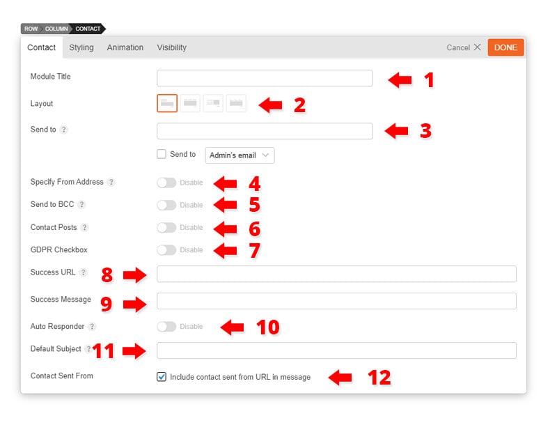
Contact Options
1) Module Title = Insert the module title that will appear at the top of the module. It will appear left aligned, upper-case, in H3 format.
2) Layout = Select from 4 different Contact layouts.
3) Sent to = Enter the email address you would like the contact form after filled by user to sent to.
Enable Submissions as Contact posts = Creates and stores all submitted messages in the database by creating a contact post type. Note: Enabling this will showcase the following options:
Assign "send to" email address as post author = Sets post author to where the message is being sent to.
Show required consent checkbox to comply with GDPR = Allows you to input a consent form that user data is being store and collected. This is to comply to the GDPR regulation.
4) Success URL = Redirect to this URL when the form is successfully sent.
5) Success Message = Input text that will appear when form is successfully sent.
6) Default Subject = Input the default subject of each email sent.
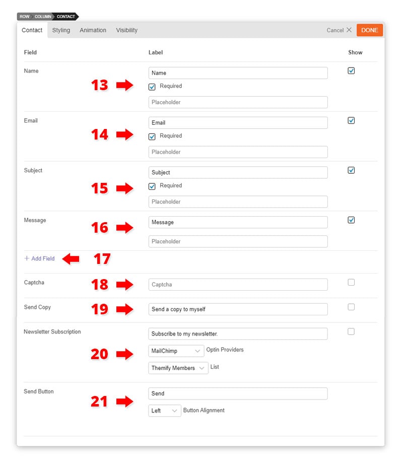
7) Label = Insert text on how you want your fields to appear. Defualt text are the fields.
8) Placeholder = Input the text that'll appear inside the input field (Note: Don't add placeholder text when selecting the "Animated Label" layout)
9) Add Field = Select the type of field that you'd like to add. Choose from: Text, Textarea, Upload File, Radio, Select, Checkbox, and Static Text.
Static Text = This allows you to add text/HTML or run any shortcodes in the contact form.
Upload File = Supports files PDF, JPEG, and .docx files.
10) Captcha = This is used to distinguish human from machine input which deters spam. A box will appear that will require users to answer correctly in order to send the contact form. Make sure to configure the reCAPTCHA settings first for this to work.
Click the "Get reCAPTCHA" button. You may need to log in to your google account in order for this to work.
On the register a new site box:
Enter label as you like to appear
Enter the Domains that you would like to get the ReCaptcha Public & Private Key
Once you've entered the Domains you'll be redirected to a new page with your Site key and Secret Key. Place the Site key on the public ReCaptcha Public Key and the Secret key on your ReCaptcha Private Key.
Click "Save Changes"
11) Send Copy = Check the "Show" checkbox, to allow users to receive a copy of the form they've just submitted.
12) Send Button = Change the text that you'd like to appear on the send button.
Button Alignment = Set alignment to appear left, right, and center.
Additional CSS Class = This option allows you to add any custom CSS classes you wish to be the output with the module
Installing Builder Addons is exactly the same as installing WordPress plugins.
To install the addon:
Firstly, download the addon zip file from the link provided in your Themify Member Area.
NOTE: some browsers (eg. Safari) auto extract zip files automatically. Right-click on the download link and select "Save Linked File As" and it will allow you to download as a zip file.
Login to your site's admin area.
Navigate to WP Admin > Plugins > Add New.
Now, click the "Upload Plugin" link.
Select "Browse" and navigate to the plugin zip file which you downloaded in the first step and then select the "Install Now" button.
This will initiate the plugin installation process, and once finished, you can then activate the plugin.
Importing the addon demo layout
Each addon zip file contains a sample Builder data file which you can import to your site. It helps you to understand how the addon demo is created.
To import the addon demo data:
First, extract addon zip file to your local computer
You should have a folder of the addon. Inside there is a folder named "sample", and inside that folder there is a Builder data file in a zip format (eg. "addon_name_sample-builder-layout.zip").
To import the Builder layout, login to admin and then go to the page frontend where you want to import the Builder layout. From the top admin bar > select Themify Builder > Import / Export > Import, upload the sample zip file.
Using the Button Addon
Once addon is installed, you will find the Button addon module in the Themify module panel. The module is available in both backend and frontend edit mode (just like all standard modules).
In the backend: you can find the Button module in the Themify Custom Panel.
On the frontend: you can see the modules after turning on the Builder from top admin bar > Themify Builder > Turn On Builder.
Drag and drop a Button module in a row.
Button Options
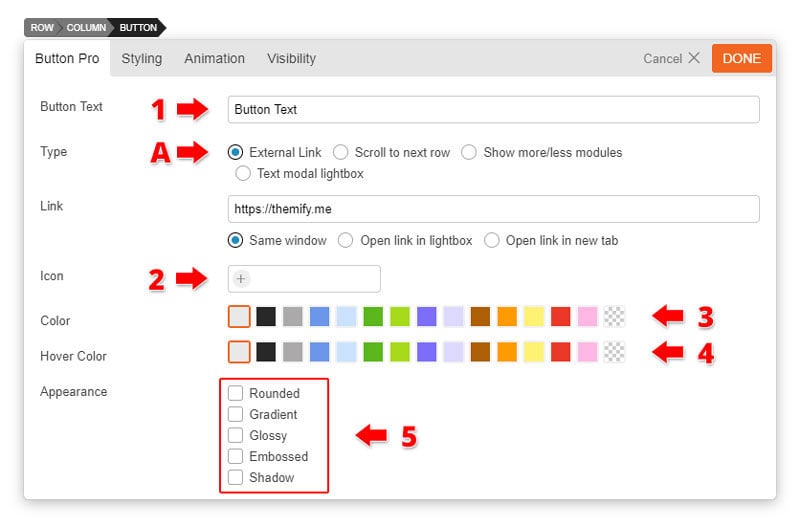
1) Button Text = Enter any text you would like to appear inside the button. Default is centered.
2) Button Icon = Choose from over 300+ icon by clicking the "Insert Icon" to place an icon on your button.
3) Button Color = Choose from our set of popular button colors. If you want a custom color you can do so on the styling panel.
4) Button Hover Color = Choose from our preset of popular button colors.
5) Appearance = Choose from 5 different types of custom appearances for the button.
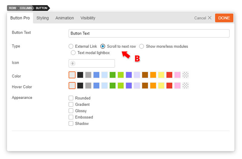
Type = Choose from 4 different types of buttons.
A) External Link = The ability to insert a link only appears when the external link type is selected.
Link = Enter any link that you would like too redirect users when they click the button.
Open as a lightbox = Open link in a lightbox
Open in a new tab = Open link in a new tab
B) Scroll to next row = When button is clicked it will automatically move the user to the next row.
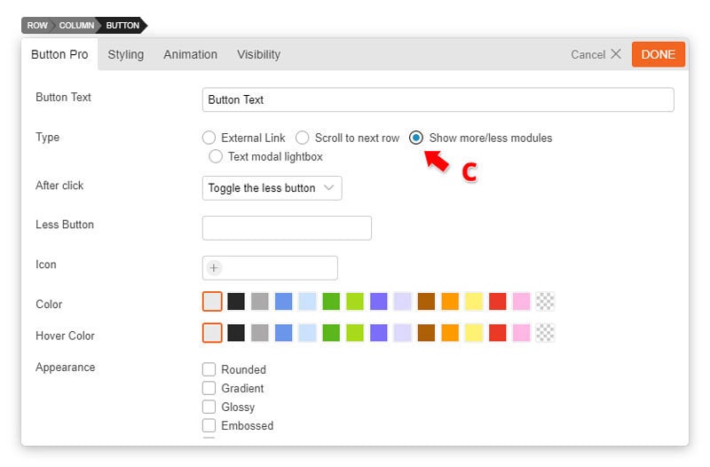
C) Show more/less = This will allow your users to toggle your content by showing more or less.
After Click = Choose to either "toggle the less button" (this will leave the button to appear allowing users to toggle between showing more or less of your content) or "hide the button" (when button is clicked it will show more of your content. Users will not be able to toggle between showing more or less).
Less button text = Choose what users will see after clicking the show more button. (i.e. Show less)
Note: The content that will appear when showing more is the content underneath the button.
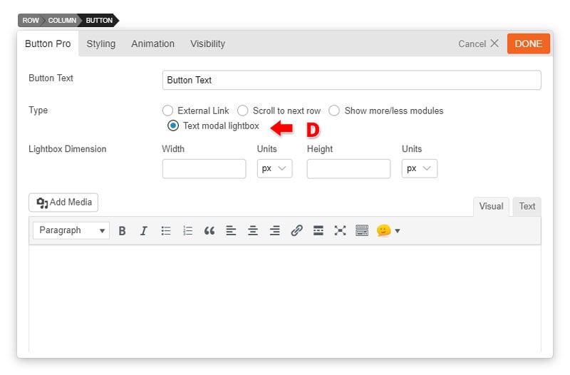
D) Text modal = Text that will appear on a lightbox. Insert Image or even shortcodes on the text editor. For quick reference click shortcodes listto see the shortcodes it supports.
Installing Builder Addons is exactly the same as installing WordPress plugins.
To install the addon:
Firstly, download the addon zip file from the link provided in your Themify Member Area.
NOTE: some browsers (eg. Safari) auto extract zip files automatically. Right-click on the download link and select "Save Linked File As" and it will allow you to download as a zip file.
Login to your site's admin area.
Navigate to WP Admin > Plugins > Add New.
Now, click the "Upload Plugin" link.
Select "Browse" and navigate to the plugin zip file which you downloaded in the first step and then select the "Install Now" button.
This will initiate the plugin installation process, and once finished, you can then activate the plugin.
Importing the addon demo layout
Each addon zip file contains a sample Builder data file which you can import to your site. It helps you to understand how the addon demo is created.
To import the addon demo data:
First, extract addon zip file to your local computer
You should have a folder of the addon. Inside there is a folder named "sample", and inside that folder there is a Builder data file in a zip format (eg. "addon_name_sample-builder-layout.zip").
To import the Builder layout, login to admin and then go to the page frontend where you want to import the Builder layout. From the top admin bar > select Themify Builder > Import / Export > Import, upload the sample zip file.
Using the Progress Bar Addon
Once addon is installed, you will find the Progress Bar addon module in the Themify module panel. The module is available in both backend and frontend edit mode (just like all standard modules).
In the backend: you can find the Progress Bar module in the Themify Custom Panel.
On the frontend: you can see the modules after turning on the Builder from top admin bar > Themify Builder > Turn On Builder.
Drag and drop a Progress Bar module in a row.
Progress Bar Options
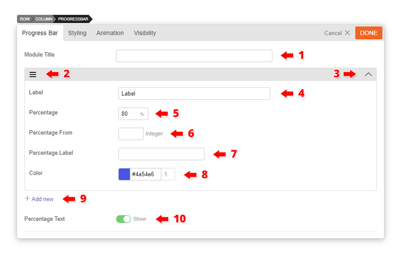
1) Module Title = Insert the module title that will appear at the top of the module. It will appear aligned to the left, upper-case, in H3 format.
2) Row Option = Click the option panel on at the upper left corner of the row and choose to either delete or duplicate the row.
3) Minimize Arrow = Press this button to minimize the row. This is useful when you want to see how many rows you have in one module.
4) Label = Input the title of the progress that will appear at the top of the progress bar (Default it will appear on the left).
5) Percentage = Input the percentage you would like the animated bar to fill the line bar. The percentage will have a bar animation effect each time the page is refreshed.
6) Percentage From = Input the percentage you would like to start from.
7) Percentage label = Input the label of the percentage.
8) Color = Use the color picker to choose a color for the bar animation.
9) Add New Row = Click this to add another row where you can insert another audio file
10) Percentage Text = Choose whether or not to show the percentage text that appears during the bar animation effect. This number also animates as the bar animation occurs.
Installing Builder Addons is exactly the same as installing WordPress plugins.
To install the addon:
Firstly, download the addon zip file from the link provided in your Themify Member Area.
NOTE: some browsers (eg. Safari) auto extract zip files automatically. Right-click on the download link and select "Save Linked File As" and it will allow you to download as a zip file.
Login to your site's admin area.
Navigate to WP Admin > Plugins > Add New.
Now, click the "Upload Plugin" link.
Select "Browse" and navigate to the plugin zip file which you downloaded in the first step and then select the "Install Now" button.
This will initiate the plugin installation process, and once finished, you can then activate the plugin.
Importing the addon demo layout
Each addon zip file contains a sample Builder data file which you can import to your site. It helps you to understand how the addon demo is created.
To import the addon demo data:
First, extract addon zip file to your local computer
You should have a folder of the addon. Inside there is a folder named "sample", and inside that folder there is a Builder data file in a zip format (eg. "addon_name_sample-builder-layout.zip").
To import the Builder layout, login to admin and then go to the page frontend where you want to import the Builder layout. From the top admin bar > select Themify Builder > Import / Export > Import, upload the sample zip file.
Using the A/B Image Addon
Once addon is installed, you will find the A/B Image addon module in the Themify module panel. The module is available in both backend and frontend edit mode (just like all standard modules).
In the backend: you can find the A/B Image module in the Themify Custom Panel.
On the frontend: you can see the modules after turning on the Builder from top admin bar > Themify Builder > Turn On Builder.
Drag and drop a A/B Image module in a row.
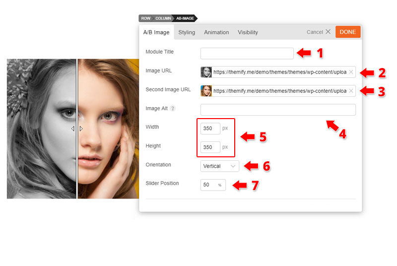
A/B Image Options
1) Module Title = Insert the module title that will appear at the top of the module. It will appear aligned to the left, upper-case, in H3 format.
2) Image URL = Upload or select an image from your media folder. The image uploaded here will appear on the left side and only show half of the image.
3) Second Image URL = Upload or select an image from your media folder. The image uploaded here will appear on the left side and only show half of the image.
4) Image Alt = (Optional) The image alt is the image "alt" attribute. Primarily used for SEO describing the image.
5) Image Dimension = Adjust the width and height of the image as you like.
6) Orientation = Choose how you want to the slider cursor to slide on the image. Either horizontal or vertical. Horizontal will display a portrait look, while the vertical will display a landscape look, for your images.
Installing Builder Addons is exactly the same as installing WordPress plugins.
To install the addon:
Firstly, download the addon zip file from the link provided in your Themify Member Area.
NOTE: some browsers (eg. Safari) auto extract zip files automatically. Right-click on the download link and select "Save Linked File As" and it will allow you to download as a zip file.
Login to your site's admin area.
Navigate to WP Admin > Plugins > Add New.
Now, click the "Upload Plugin" link.
Select "Browse" and navigate to the plugin zip file which you downloaded in the first step and then select the "Install Now" button.
This will initiate the plugin installation process, and once finished, you can then activate the plugin.
Importing the addon demo layout
Each addon zip file contains a sample Builder data file which you can import to your site. It helps you to understand how the addon demo is created.
To import the addon demo data:
First, extract addon zip file to your local computer
You should have a folder of the addon. Inside there is a folder named "sample", and inside that folder there is a Builder data file in a zip format (eg. "addon_name_sample-builder-layout.zip").
To import the Builder layout, login to admin and then go to the page frontend where you want to import the Builder layout. From the top admin bar > select Themify Builder > Import / Export > Import, upload the sample zip file.
Tiles Demo Video
NOTE: The video below is based on a Themify theme. If you use a third party theme, you might not see the Page Options "Themify Custom Panel". However, the Builder and Tiles addon work the same.
Using the Tiles Addon
Once addon is installed, you will find the Tiles addon module in the Themify module panel. The module is available in both backend and frontend edit mode (just like all standard modules).
In the backend: you can find the Tiles module in the Themify Custom Panel.
On the frontend: you can see the modules after turning on the Builder from top admin bar > Themify Builder > Turn On Builder.
Drag and drop a Tiles module in a row.
Tiles Options
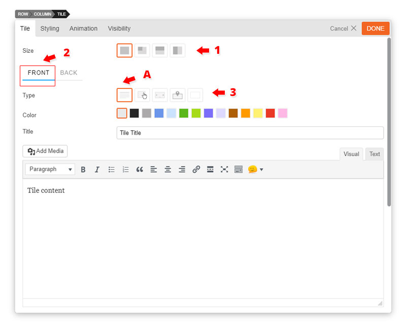
1) Size = There are 4 tile sizes.
Large = large square block
Square = small square block
Landscape = horizontal half block
Portrait = vertical half block
2) Front Tile tab = Click the front tab to edit the front of the tile.
3) Type = Choose from 5 different types of tiles.
A) Text = Display text content in Tile.
Enter "Title" (optional)
Enter text in content editor (shortcodes are supported).
Enter "Action Button Text" this will appear at the bottom left corner of your tile.
Enter "Action Button Link" this link will redirect users when they click the action button text.
Open as a lightbox = Open link in a lightbox
Open in a new tab = Open link in a new tab
Custom Style = Below are some color options that you can customize
Background Color = Use the color picker to pick a color for the background of the tile.
Text Color = Use the color picker to pick a color for all the text on the tile.
Link Color = Use the color picker to pick a color for all text links on the tile.
Add a background image by inserting a image URL from your media folder or upload it directly.
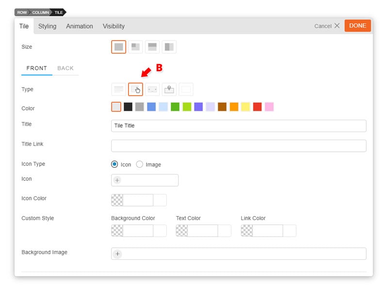
B) Button = Create a clickable button type tile
Enter "Title" (optional)
Enter "Title Link" which will allow your title to open an external link
Image = insert a image URL from your media folder or upload it directly. The image will appear at the center of the tile.
Custom Style = Below are some color options that you can customize
Background Color = Use the color picker to pick a color for the background of the tile.
Text Color = Use the color picker to pick a color for all the text on the tile.
Link Color = Use the color picker to pick a color for all text links on the tile.
Add a background image by inserting a image URL from your media folder or upload it directly.
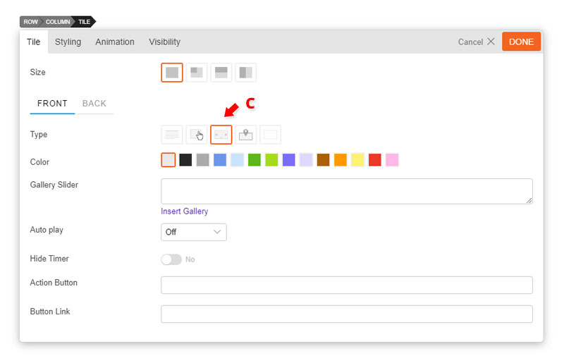
C) Gallery = Create a gallery type tile
Insert a "Gallery Slider" by clicking "Insert Gallery". Choose images from your media library or upload new images.
Choose the amount of second you would like your gallery to "Auto play" or turn it off by selecting "Off" on the drop down menu.
Choose to hide or display the timer.
Enter "Action Button Text" this will appear at the bottom left corner of your tile.
Enter "Action Button Link" this link will redirect users when they click the action button text.
Open as a lightbox = Open link in a lightbox
Open in a new tab = Open link in a new tab
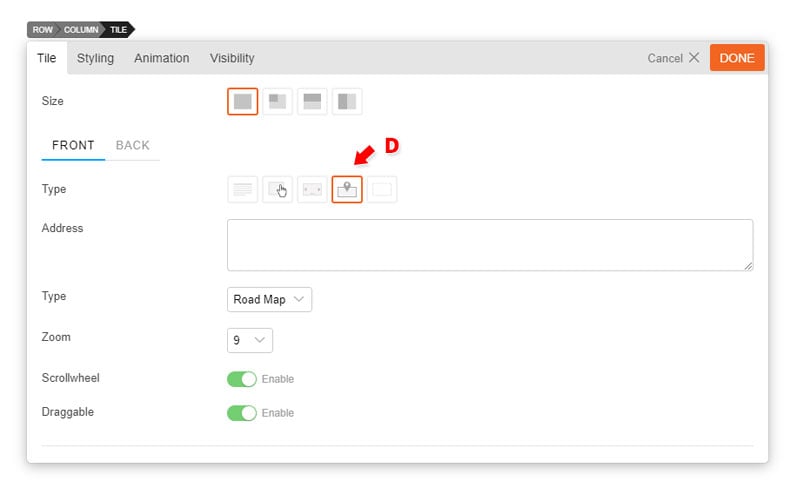
D) Map = Display where you are with the map type tile.
Enter "Address" as you like.
Choose which map "Type" you would like to display - Road Map, Satellite, Hybrid, or Terrain.
Choose to enable or disable the "Scrollwheel".
Choose to make the map "Draggable" when users drag the click on a certain part of the map.
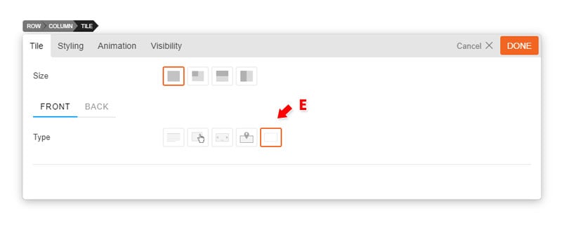
E) Blank = Display nothing at the front of at the back of your tile.
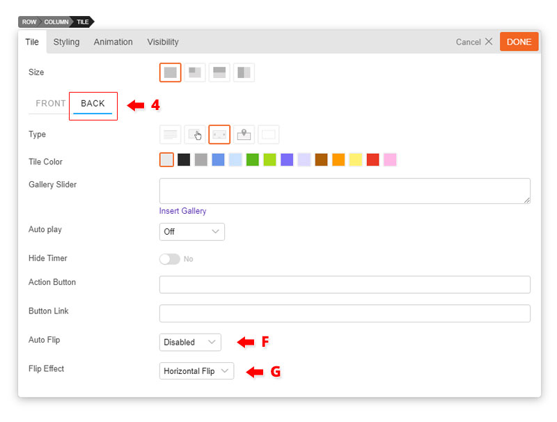
4) Back Tile tab = Click the back tab to edit the back of the tile.
The back tile can be edited just like the Front tile but with some additional features highlighted below:
F) Auto Flip = Disable or choose the amount of second you would your tile to flip automatically.
G) Flip Effect = Choose from 10 different flip effects. We highlight all the flip effects on our Tiles demo page.
Adjust the Number of Tiles at Certain Breakpoints
Since the tiles are responsive, the number of tiles per row is automatically adjusted depending on the viewport width. If you want to change them, you can add following code in the child theme functions.php file (if you don't have a child theme, first create a child theme and a functions.php file in the child theme):
<?php

function custom_builder_tiles_script_vars( $vars ) {
	$vars['fluid_tile_rules'] = array(
		array( 'query' => 'screen and max-width(600px)', 'size' => 2 ),
		array( 'query' => 'screen and max-width(601px) and max-width(1024px)', 'size' => 3 ),
		array( 'query' => 'screen and min-width(1025px)', 'size' => 4 ),
	);
	return $vars;
}
add_filter( 'builder_tiles_script_vars', 'custom_builder_tiles_script_vars' );
The code snippet above specifies 2 small tiles per row on mobile, 3 small tiles on tablet and 4 small tiles on desktop. Note that the large tile size is double size of the small tile (ie. 1 large tile is equal to 2 small tiles).
Registering New Tile Size
The Builder Tiles addon comes with a preset of sizes. If you want to register new tile size option, add this snippet to your child theme's functions.php file: