Installing Builder Addons is exactly the same as installing WordPress plugins.
To install the addon:
Firstly, download the addon zip file from the link provided in your Themify Member Area.
NOTE: some browsers (eg. Safari) auto extract zip files automatically. Right-click on the download link and select "Save Linked File As" and it will allow you to download as a zip file.
Login to your site's admin area.
Navigate to WP Admin > Plugins > Add New.
Now, click the "Upload Plugin" link.
Select "Browse" and navigate to the plugin zip file which you downloaded in the first step and then select the "Install Now" button.
This will initiate the plugin installation process, and once finished, you can then activate the plugin.
Importing the addon demo layout
Each addon zip file contains a sample Builder data file which you can import to your site. It helps you to understand how the addon demo is created.
To import the addon demo data:
First, extract addon zip file to your local computer
You should have a folder of the addon. Inside there is a folder named "sample", and inside that folder there is a Builder data file in a zip format (eg. "addon_name_sample-builder-layout.zip").
To import the Builder layout, login to admin and then go to the page frontend where you want to import the Builder layout. From the top admin bar > select Themify Builder > Import / Export > Import, upload the sample zip file.
Using the Map Pro Addon
Note: Google limits the number of maps and markers on each page. You only add 9 markers and 5 maps on each page.
Once addon is installed, you will find the Map Pro addon module in the Themify module panel. The module is available in both backend and frontend edit mode (just like all standard modules).
In the backend: you can find the Map Pro module in the Themify Custom Panel.
On the frontend: you can see the modules after turning on the Builder from top admin bar > Themify Builder > Turn On Builder.
Drag and drop a Map Pro module in a row
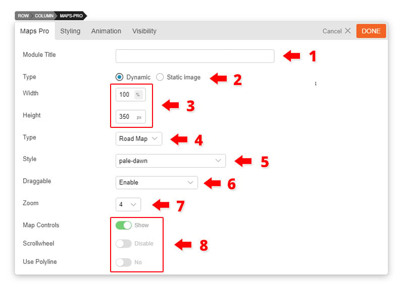
Map Pro Options
1) Module Title = Insert the module title that will appear at the top of the module. It will appear left-aligned, in H3 format.
2) Map Type = Choose map display types you like, dynamic or static image.
3) Map Dimension = Adjust the width and height of the maps as you like.
4) Type = Choose from 4 different types of maps (Road Map, Satellite, Hybrid, Terrain)
5) Style = Choose from over 40 styles to customize the look of your map.
6) Draggable = Enable, disable, or enable only with desktops the ability to allow users to drag your map by clicking on it.
7) Zoom = Choose how you much you want to zoom in the map, as it initially loads and appears on your site.
8) Map Controls
Disable Map Control = This allows you to enable or disable the map controls that appear on the left side of the map.
Scrollwheel = Enable or disable the ability for users to be able to zoom and out of your map by scrolling either up or down.
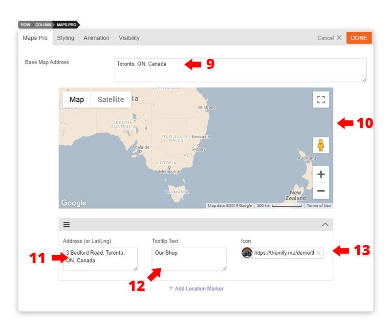
9) Base Map Address = Input the area where you want your map to focus on (i.e. Toronto).
10) This box give you a live preview on how your map will appear once you add the marker, choose the type, style, and zoom level.
11) Marker options: Add any address you would like the marker to appear
12) Tooltip text = add any text you would like to appear when the marker is clicked.
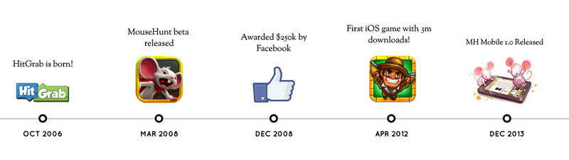
Creators of the popular game Mousehunt, HitGrab Inc., shared to us how they were able to redesign their site with a tight deadline with Themify. Using the Parallax theme and Themify Builder, they transformed their site into an one-page design which enables them to showcase their games, as well as, the company profile. Continue reading to see how they did it.
Before: HitGrab Inc. Story
HitGrab Inc. is a gaming company that build games on both social and mobile platforms. They were awarded by Facebook a grant of $250,000, out of the thousands of social application companies. Their leading game, MouseHunt, spearheads their charge in becoming one of the top gaming companies by claiming the title of being the first iOS game with over 3 million downloads in 2012. Aside from their success with their games, HitGrab has developed a corporate culture that's fun, exciting, and "a little weird". Their weird attribute is directly correlated to their deep bond with their players and the way they interact with them through social media. With their Mousehunt Facebook page reaching over 400,000 Likes, HitGrab Inc. has created an active and engaged community. Now they want to translate this corporate culture and success they've amassed over the years onto their company website. This led them to begin their own hunt to redesign their site.
To install themes with the WordPress theme uploader:
Download the "theme.zip" file from the Member Area
Note: some browsers (eg. Safari) auto extract zip files automatically. Right-click on the download link and select "Save Linked File As". This will allow you to download the theme as a zip file.
Login to your site's WP Admin.
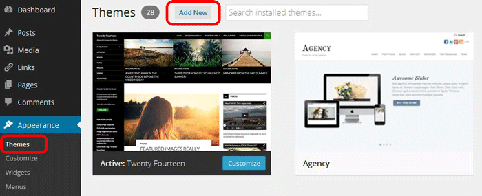
Go to Appearance > Themes.
Click on the "Add New" button, then click on the "Upload Theme" button
Upload the theme.zip file (note: it is the theme.zip, not the theme-psd.zip that you just downloaded from the Member Area).
Activate the theme
FYI: You can also install themes with FTP method. Read the Installing Themes tutorial for more info.
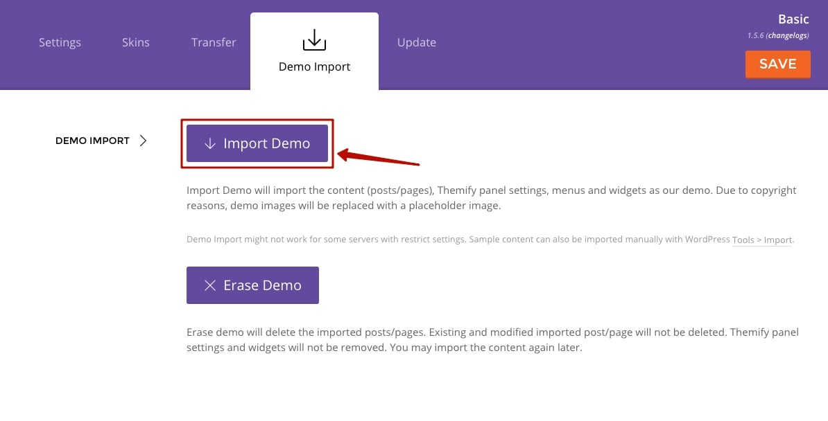
Demo Import
If you are starting a fresh site, importing the demo content will help you understand how the theme demo is built. The Demo Import feature will import the contents (posts, pages, comments, etc.), Themify panel settings, menus, and widgets setup from our demo to your site. You can erase the demo content afterward.
To import the demo setup:
Go to WP Admin > Themify > Settings > Demo Import and click "Import Demo" button.
Note that the featured images will be replaced with an image placeholder for copyright reasons.
To erase the demo setup:
On the Demo Import tab, click on the "Erase Demo" button which will then remove the demo content.
FYI: If the Demo Import does not work on your site, you can use the WP Admin > Tools > Import tool to import the demo content manually.
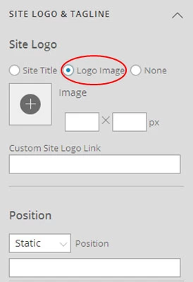
Site Logo & Tagline
To display a logo image instead of the site name text:
Go to WP Admin > Appearance > Customize > Site Logo and Tagline.
Under "Site Logo", select "Logo Image" radio button.
Upload a logo image.
Specify the logo image width and height.
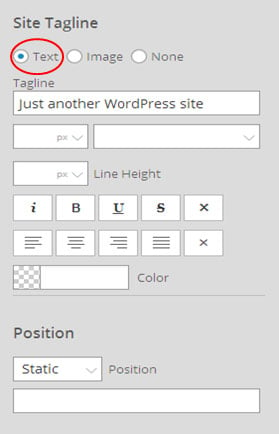
You can also change website Tagline from here:
Go to WP Admin > Appearance > Customize > Site Logo and Tagline.
Scroll down and under "Site Tagline" select "Text" radio button.
Enter your site Tagline.
Click "Save & Publish".
Main Navigation Menu
To create a custom navigation menu:
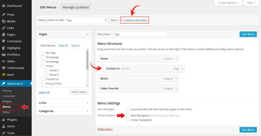
Go to WP Admin > Appearance > Menus.
Click on "create a new menu" to create a new menu (eg. Main Menu).
Add the menu items from the left panels.
To create a dropdown menu: drag the menu item towards the right (the item(s) will be indented).
When you are done adding the menu items, click "Save Menu".
To assign menu locations:
Scroll down to the bottom where it says "Theme locations" and tick the menu location checkbox.
Main Navigation = main menu on the header
Footer Navigation = footer menu on the footer (Note: some themes might not have Footer Navigation).
TIPS: You can display menus on sidebar widgets, remove the main menu, create empty links, and lightbox links. Read Custom Menus for more detailed tutorial.
Setting Up the Social Links
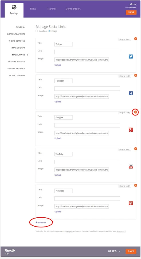
Step 1) To set up the social media links:
Go to WP Admin > Themify > Settings > Social Links tab.
The theme comes with some pre-filled social links. Simply enter your social profile URL in the Link input field. For example, enter 'https://twitter.com/themify' for the Twitter link.
You can choose to display either "Icon Font" or "Image".
If "Icon Font" is selected, click on "Insert Icon" to select an icon (over 320+ icons available).
If "Image" is selected, you can upload your own graphic icon by clicking on the Upload button.
To add more links, click on the Add Link button at the bottom.
To remove a link, click on the delete icon.
To arrange the display order, drag and drop the link container.
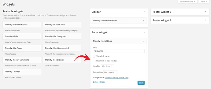
Step 2) Displaying the Social Links:
Once you have the Social Links setup, go to WP Admin > Appearance > Widgets. Drag and drop the Themify - Social Links from the Available Widgets panel to the Social Widget panel.
Optional: Customize Widget Title - such as "Follow Us". You can also "Show link name" and adjust icon size.
Hiding the RSS Icon
To hide the default RSS icon in the header:
Go to WP Admin > Themify > Settings > Theme Settings.
Under the "Exclude RSS Link", tick the checkbox that says "Check here to exclude RSS icon/button in the header".
Hiding the Search Form
To hide the default search form in the header:
Go to WP Admin > Themify > Settings > Theme Settings.
Under the "Exclude Search Form", tick the checkbox that says "Check here to exclude search form in the header".
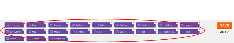
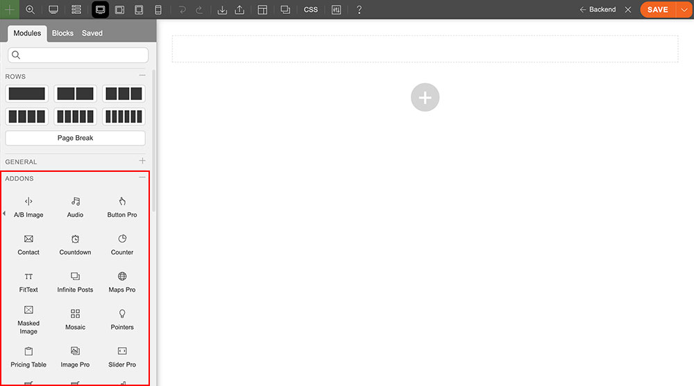
Using the Tiles Addon
Once addon is installed, you will find the Tiles addon module in the Themify module panel. The module is available in both backend and frontend edit mode (just like all standard modules).
In the backend: you can find the Tiles module in the Themify Custom Panel.
On the frontend: you can see the modules after turning on the Builder from top admin bar > Themify Builder > Turn On Builder.
Drag and drop a Tiles module in a row.
Tiles Options:
Size = There are 4 tile sizes.
Large = large square block
Square = small square block
Landscape = horizontal half block
Portrait = vertical half block
Front Tile tab = Click the front tab to edit the front of the tile.
Type = Choose from 5 different types of tiles.
Test, Button, Gallery, Map, and Blank
Back Tile tab = Click the back tab to edit the back of the tile.
The back tile can be edited just like the Front tile but with some additional features highlighted below:
Auto Flip = Disable or choose the amount of second you would your tile to flip automatically.
Flip Effect = Choose from 10 different flip effects.
For more in-depth tutorial on how to use the Tiles Addon, with detailed step-by-step guide click here.
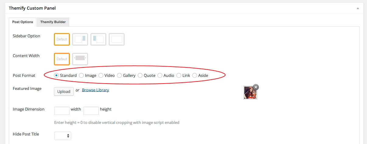
Post Formats
There are 8 different post types/formats built in the theme: Standard, Image, Video, Gallery, Quote, Audio, Link, and Aside. Each post format has a slight different layout, default post background, and post icon to represent it. When viewed as an archive all posts will appear in masonry layout.
To add a post with Post Format:
Add a new post
In the Themify Custom Panel >Post Options > Post Format, choose which post format you would like:
Standard - This is default blog post format.
Enter post title
Enter the content in the editor
Upload or select a Featured Image
Image - Similar as Standard format, but just different post icon.
Enter post title
Enter the content in the editor
Upload or select a Featured Image
Video - For displaying video embeds such as YouTube, Vimeo, etc.
Enter post title
Enter the content in the editor
Paste in the Video URL embed (eg. YouTube or Vimeo video URL)
Gallery - To display an image gallery
Enter post title
Enter the content in the editor
Choose images you want to appear on the gallery by pressing "insert gallery".
Customize the image mode by setting it to Fullcover or best fit.
Auto play: Choose how many seconds you want each image transition. You can choose to disable this.
Transition Speed: adjust the speed of how your image will transition.
Choose to either hide or display the timer. The timer is set to appear as a animated bar that fills to the set time of the auto play. Default is to show the timer.
Upload or select a Featured Image (Optional)
Quote - To display quotes
Enter post title
Enter the content in the editor
Quote Author: (Optional) Feel free to insert the author of the quote your used.
Quote Author Link: (Optional) Insert a site URL you would like your author name when pressed to link too.
Audio - To display your audio files. An audio toggle will appear, where users can play and pause, or skip to a certain part of your audio.
Enter post title
Enter the content in the editor
Upload or select a Featured Image (Optional)
Add audio URL
Link - When tile title becomes the link that will redirect users to another page or lightbox.
Enter post title
Enter the content in the editor
Add link URL, either as an external link or lightbox link (Required action)
Aside - Similar as Standard format, but without featured image option.
Enter post title
Enter the content in the editor
Post Style in Archive Views - It allows you customize each post background and color in the archive view. These are optional as the theme has default post styling.
Background = Background color/image of the post container
Background Repeat = Background repeat mode of the background image
Text Color = This color will apply to all text color within the post container
Link Color = This color will apply to all the link within the post container
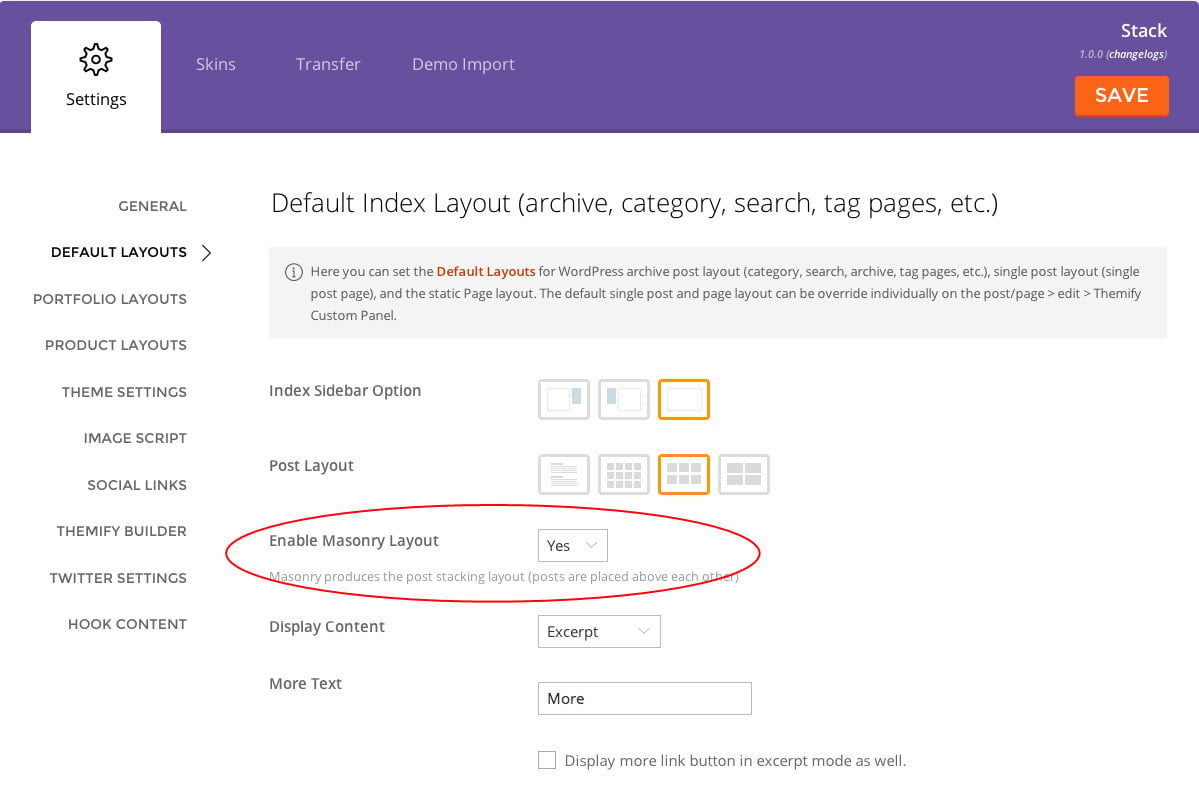
Masonry / Grid Layouts
Masonry post layout (the post stacking layout) is enabled by default. Note that masonry layout only applies to grid4, grid3, and grid2 layouts.
To disable default masonry layout:
Go to WP Admin > Themify > Settings > Default Layouts, under the "Default Index Layout", check "Disable masonry layout". Doing so, will disable the masonry layout in post archive.
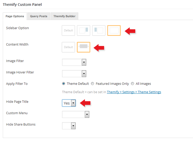
Designing Pages with the Builder
Step 1) To create the demo pages using our Builder as shown on our demo:
In WP Admin, go to Pages > Add New
Enter page title
On Themify Custom Panel:
Sidebar Option = No Sidebar
Content Width = Fullwidth
Hide Page Title = Yes
On Discussion panel, uncheck "Allow comments" to disable comments on this page
Publish the page and click "View Page" to view the page on frontend
Step 2) Using the Builder to construct the page content and layout:
From top WP Admin bar: select Themify Builder > Turn On Builder
Note: If you're not sure where or what a row or module is, refer here for details and to see a screenshot
Now you can drop any module on the page to construct the layout
Here are some basic Builder tips:
To start, drag & drop a module on the Builder grid.
Working with rows/columns:
To split the fullwidth row to multiple columns: hover on the right edge of the row (you will see a blue vertical bar) and drag towards the left to create different number of columns (ie. dragging to the most left will create 4-column).
Dragging the column dividers left/right can rearrange the column span/width.
Dragging the top bar of the row up/down can reposition the row
Each row can be styled differently:
To style the row: hover on the row menu icon (located on the upper left corner of the row) and select "Options"
Row background can be customized with background color, background image (either repeat, parallax scrolling, or fullcover), image slider, or a background video loop
Use padding or margin to control the spacing between rows (padding = spacing inside the row and margin = spacing outside the row)
When specifying the font, color, and link color in row styling, it will effect the appearance of all modules dropped in the row
Each module can be styled individually as well:
To style the module: double-click on the module to bring up the module option lightbox, then click on "Styling" tab
When specifying module styling, it will effect the individual module
You can export the Builder layout from the top Admin bar > Themify Builder > Import/Export > Export (it will prompt you to download a zip file which you may import to any post/page using the Import option)
The video below shows how to use the Builder such as dropping modules, controlling the grid, etc.:
FYI: There are more features available in the Builder. Please refer to the Builder documentation for more info.
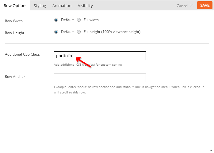
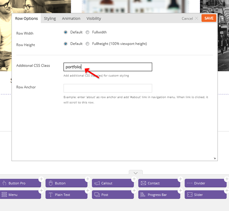
ScrollTo Row Anchor
To achieve scrollTo row anchor:
First enter the Row Anchor name in Builder > Row > Options (e.g. "portfolio")
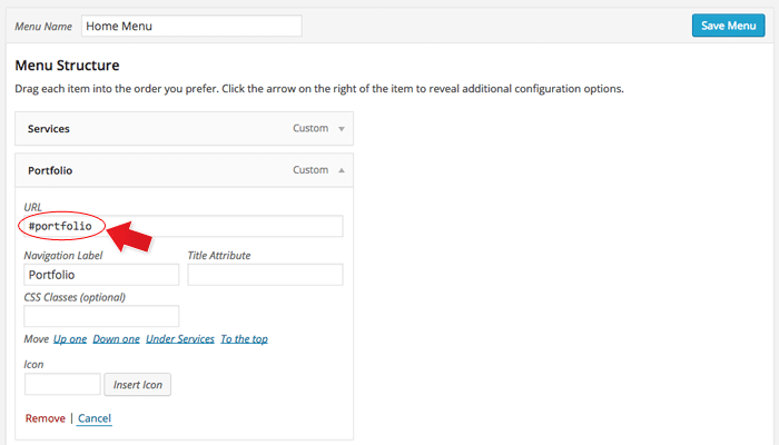
Then in the WordPress menu link (WP Admin > Appearance > Menu), insert the anchor name as link URL = "#portfolio" (basically add # in front of the anchor name)
When the #portfolio link is clicked or when users go the URL with the #portfolio anchor (eg. http://yoursite.com#portfolio), it will scroll to the row where it specified Row Anchor = "portfolio"
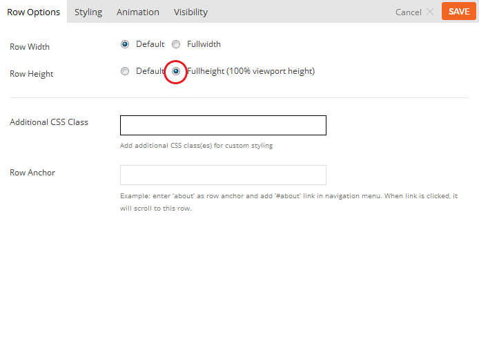
Full Height Builder Row
Full height row will set the height of the row in 100% viewport height and the row content will automatically align in the middle vertically.
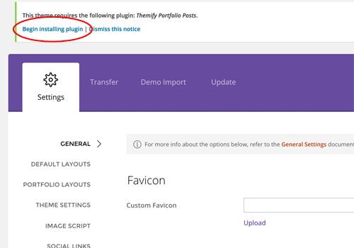
The theme comes with Portfolio post type as an optional plugin (you don't need to install the Portfolio plugin if you don't intend to have a portfolio on your site).
To install the Portfolio Posts plugin:
Go to your WP Admin > Themify theme
On the Themify panel, click "Begin installing plugin"
Then on the "Install Required Plugins" page, click "Install" under the "Themify Portfolio Posts"
Once the plugin is installed, click "Return to Required Plugins Installer"
Now click "Activate" to activate the installed plugin
To add a Postfolio post:
Select "Add New" under the "Portfolios" admin menu
Enter the portfolio title and content
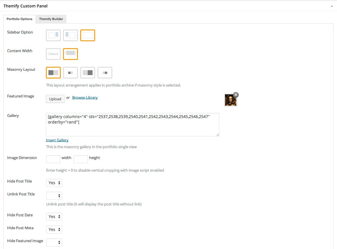
In the Themify Custom Panel, enter the options as you like:
Masonry Layout = Choose where you would like your image and size of tile to appear in archive view.
Options: Large-tile image right or left and Small-tile image right or left
Will only work if masonry style is enabled (defualt setting)
Featured Image = Upload or select an image from the media library for the project.
Gallery = Click "insert gallery" and choose images that you would like to appear in masonry gallery in the portfolio single view.
Image Dimensions = This image dimensions will be used for the featured image in the single post view (leave blank will have the default dimensions)
Hide Post Title = This option is used to set whether the post title will be displayed in the single post view.
Unlink Post Title = This option is used to set whether the post title will be linked in the single post view.
Hide Post Date = This option is used to set whether the post date will be displayed in the single post view.
Hide Post Meta = This option is used to set whether the post meta will be displayed in the single post view.
Hide Featured Image = This option is used to set whether the featured image will be displayed in the single post view.
Unlink Featured Image = This option is used to set whether the featured image will be linked in the single post view.
External Link = This option is used to link the post featured image and title to a custom URL.
Lightbox Link = This option is used to link the post featured image and title to open a URL in a lightbox. This defaults to expecting an image URL.
iFrame URL = If checked this will open the URL as an iFrame within the lightbox, this can be used to open external URLs such as other pages or sites.
Add zoom icon on lightbox link = This option sets whether a zoom icon will be shown on the featured image when set to a lightbox link.
Shortcode ID = Use the shortcode provided here to show this individual post.
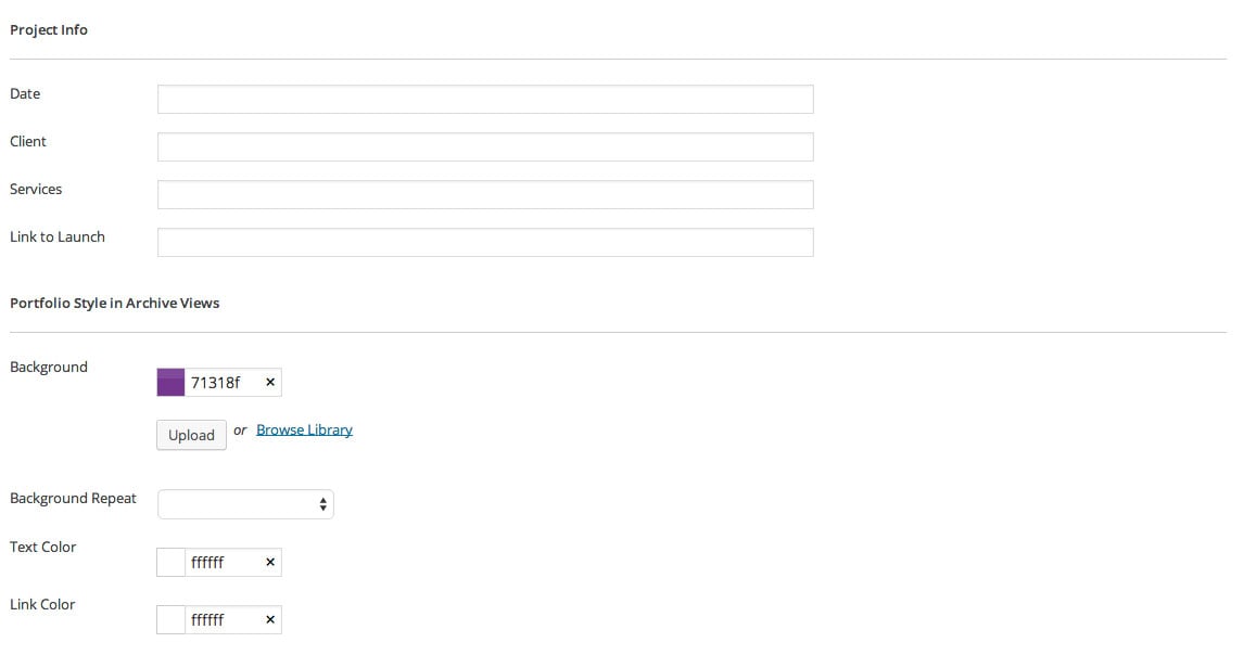
Project Info = (Optional) Input information you would like to appear with your portfolio post
Date = Input any date you would like
Client = Input who your client is
Services = Input what services you did for the client
Link to Launch = Input the link of the actual site where your content was used
Portfolio Style in Archive Views - It allows you customize each post background and color in the archive view.
Background = Background color/image of the post container
Background Repeat = Background repeat mode of the background image
Text Color = This color will apply to all text color within the post container
Link Color = This color will apply to all the link within the post container
Displaying Portfolio Posts on Pages:
First create a new Page (in admin, select "Add New" under the "Pages" admin menu)
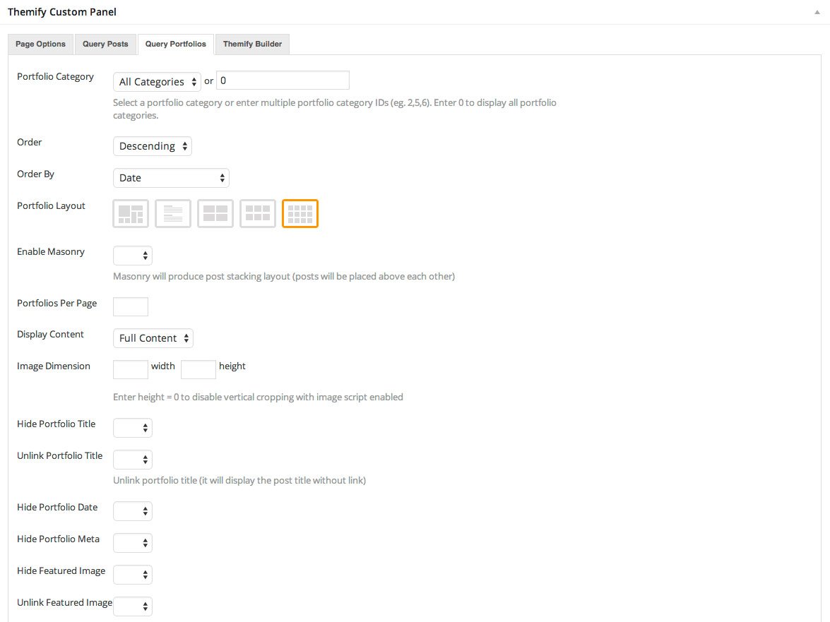
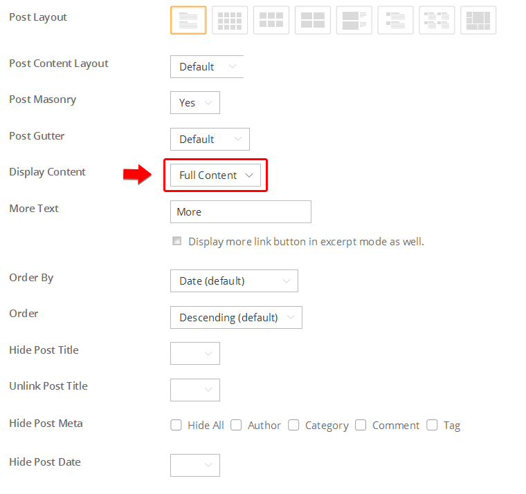
In Themify Custom Panel, click "Query Portfolios" tab, select either "All Categories" or a Portfolio category and select the other options as you like:
Portfolio Category = This option is used to set which categories will be included or excluded in the post list.
Order = This option is used to set whether posts will be ordered in ascending or descending order.
Order By = This option is used to set the attribute that posts will be ordered based on.
Portfolio Layout = This option is used to set the layout of portfolio posts, such as grid columns, list posts, etc.
Enable Masonry = Enable or disable masonry layout.
Portfolios Per Page = This option is used to set the number of portfolio posts shown per page.
Display Content = This option is used to set what content is output for each portfolio post. (None, Excerpt, or Full Content.)
Image Dimensions = This option is used to set the dimensions the portfolio images will be displayed at.
Hide Portfolio Title = This option is used to set whether the post title will be displayed.
Unlink Portfolio Title = This option is used to set whether the post title will operate as a link.
Hide Portfolio Date = This option is used to set whether the post date will be displayed.
Hide Portfolio Meta = This option is used to set whether the post meta will be displayed.
Hide Featured Image = This option is used to set whether the featured image will be displayed.
Unlink Featured Image = This option is used to set whether the featured image will operate as a link.
Hide Page Navigation = This option is used to set whether the page navigation for portfolio posts will be displayed.
Displaying Portfolio Posts using shortcodes:
You can use the [themify_portfolio_posts] shortcode to display the Portfolio posts anywhere in the content editor, Text widget, and the Builder Text module. Below are some sample portfolio shortcodes using different parameters:
= display latest Portfolio posts from portfolio categories Web Design and Illustration, given that their text slugs are "web-design" and "illustration".
Available parameters:
limit = number of post to query/show
category = category ID number or category name (default = all categories)
image = show post image or not (yes or no)
image_w = featured image width
image_h = featured image height
title = show post title (yes or no)
display = display whether full content, excerpt or none (content, excerpt, or none)
post_meta = display post meta (yes or no)
post_date = display post date (yes or no)
style = layout style (masonry-layout, grid4, grid3, grid2). You may also add custom css class in here (eg. style="grid4 custom-class"). Custom CSS class is only required for developers to apply styling.
order = specifies ascendent or descendent order (ASC or DESC)
orderby = criteria used to order posts (author, comment_count, date, menu_order, rand, title)
unlink_image = remove the link on featured image (yes or no)
unlink_title = remove the link on the post title (yes or no)
more_link = display a custom more link after the posts
more_text = text that will appear in more_link
Designing Portfolio with the Builder
You can use the Builder to design any page and post including the custom post type like Portfolio on the demo. The Builder helps you to make rich media layouts easier by drag & drop elements on the page. Below is a sample portfolio single we designed.
To create a Portfolio single with the Builder:
In admin, select "Add New" under the "Portfolios" admin menu
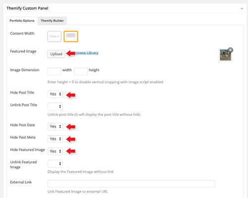
In the Themify Custom Panel:
Sidebar Options = Choose no sidebar
Content Width = Fullwidth
Masonry Layout = Choose how you want your portfolio to appear in archive view.
Featured Image = Upload or select an image from the library
Gallery = Click "insert gallery" and choose images that you would like to appear in masonry gallery in the portfolio single view.
Hide Post Title = Yes
Hide Post Date = Yes
The above will hide the elements in the Portfolio single because we will use the Builder to layout the content.
Then publish and view the portfolio post on frontend.
From the top admin bar: select Themify Builder > Turn On Builder
Now you can use the Builder to add modules on the page (this process is very similar like above on how to build pages with the Builder)
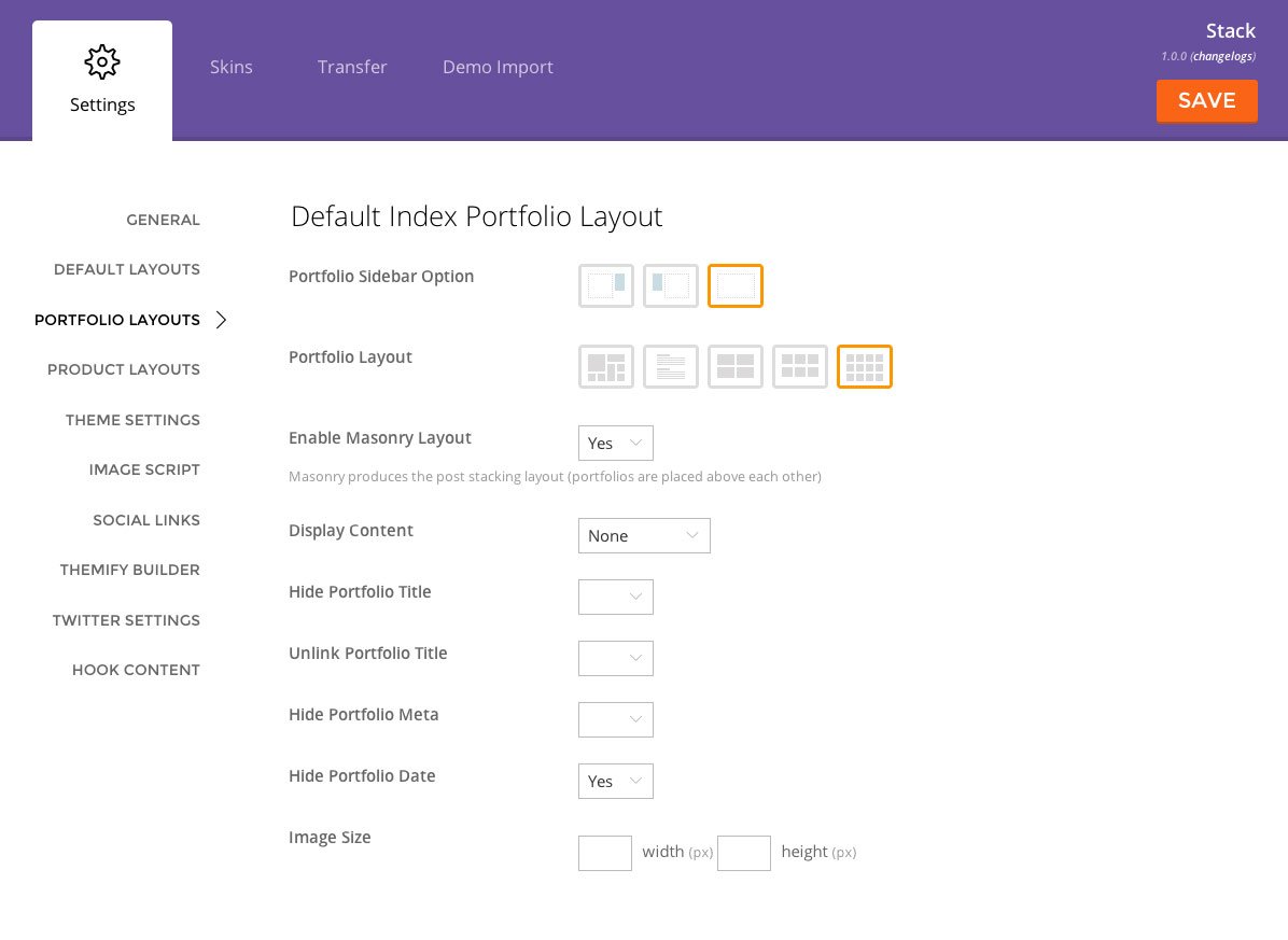
Setting the Portfolio Layouts
To set the portfolio layout options, go to WP Admin > Themify > Settings > Portfolio Settings
Default Index Portfolio Layout = refers to the portfolio archive view (ie. portfolio posts queried with shortcodes, Query Portfolio pages, portfolio category pages, etc.)
Default Single Portfolio Layout = refers to the single post view of the portfolio (project)
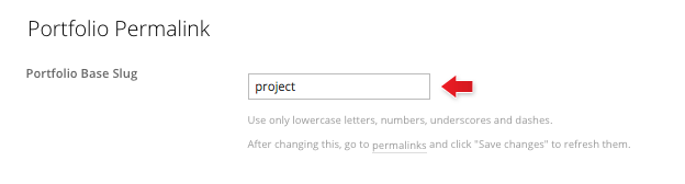
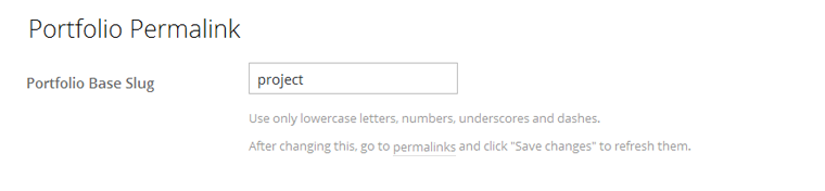
Changing the Portfolio Permalink Slug
To change the portfolio post base slug, go to WP Admin > Themify > Settings > Portfolio Settings.
The default portfolio base slug is 'project' (eg. it would be http://yoursite.com/project/portfolio-name). You may change it to anything (only lowercase letters, numbers, dash and underscore allowed).
After you changed the base slug, go to WP admin > Permalinks and click on "Save changes" button to refresh the setting.
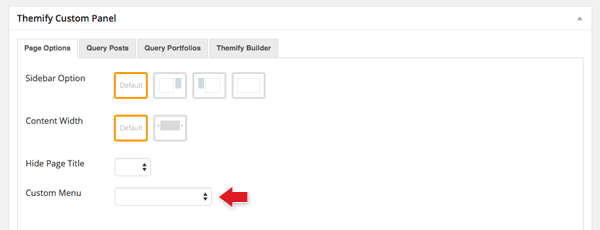
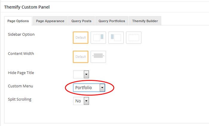
Custom Page Menu
This theme allows you to assign a custom menu in the Main Navigation Menu of each individual page. Remember that this custom menu option is only available in Pages (not Posts).
To set custom Page menu:
First, make sure you have created the menu in the WP Admin > Appearance > Menus
Then add or edit any page where you want to have a custom menu
In the Themify Custom Panel, under the "Custom Menu", select a menu from the dropdown
Setting Up WooCommerce Shop
To setup a WooCommerce shop:
Note: This theme matches the shop styling with the theme design to provide one fluid consistent design throughout the site.
Go to WooCommerce > Settings to config your shop such as selling locations, tax, checkout page, shipping, and email notifications.
To add Products: go to Products > Add new (refer this documentation on how to add products)
If you need help on the WooCommerce plugin, refer to their documentation
WooCommerce comes with a few shortcodes that can be used with the Builder. To insert the WooCommerce shortcodes, drop in a Text module and paste in the shortcode.
Show recent products: [recent_products per_page="12" columns="4"]
Show featured products: [featured_products per_page="12" columns="4"]
Show a single product by ID: [product id="99"]
Show multiple products by IDs: [products ids="1, 2, 3, 4, 5"]
Show "add to cart" button of a single product by ID: [add_to_cart id="99"]
Show products from specific category: [product_category category="tshirts" per_page="4" columns="4"]
Show on-sale products: [sale_products per_page="12"]
Show best selling products: [best_selling_products per_page="12"]
Show top rated products: [top_rated_products per_page="12"]
If you are not familar with WooCommerce shortcodes, use the WooCommerce Addon to speed up your workflow. It also have more product layout options than using the WooCommerce shortcodes.
Setting Default Post and Page Layouts
Generally, the theme works out of the box. All the sidebar options and image dimensions are pre-defined in the theme. If you need to change the default sidebar options, featured image dimensions, content/except display, post meta, etc., it can be done in the WP Admin > Themify > Settings > Default Layouts.
There are three default layout options under Themify > Settings > Default Layouts:
Archive Sidebar Option: refers to the default home page, category, search, archive, tag pages, etc.
Default Post Layout: is the post page direct URL (also known as "Single Post").
First, create a new Page (go to WP Admin > Pages > Add New), name it "Blog" or any page title as you want.
View the page on the frontend, click "Turn On Builder".
Drop in a Post module and configure the options as you like.
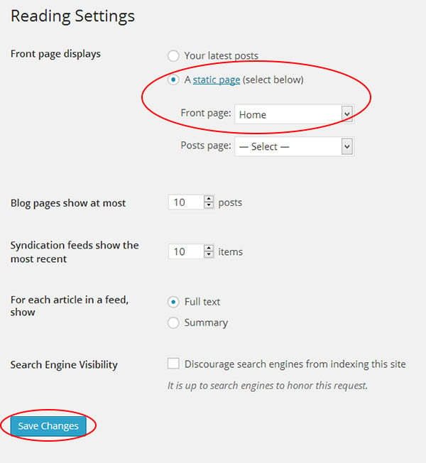
Setting a Custom Front Page
You can set any page as the front (home) page. This means you can use the Builder to design the page and assign it as the front page. To set the Front Page:
Go to WP Admin > Settings > Reading.
On the Front page displays, select the "A static page (select below)" option and then select a "Front page".
Leave the "Posts page" default. If you want to create a custom Blog page, read this tutorial instead of setting the "Posts page".
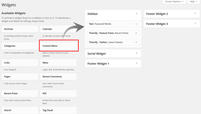
Adding Widgets
To add widgets to widgetized areas (eg. sidebar and footer widgets):
Go to WP Admin > Appearance > Widgets.
The big panel on the left side shows all available widgets. The small panels on the right are the widgetized areas.
To add a widget: drag and drop the widget from the left panel to the right panel.
To remove the widget: drag the widget back to the left panel (Available Widgets panel). If you want to keep the widget setting for future use, drag it to the Inactive Widgets instead of the Available Widgets panel. It will save your widget settings. To retrieve the widget, drag the widget from Inactive Widgets panel instead of the Available Widgets panel.
Go to WP Admin > Themify > Skins, select a skin by clicking on the thumbnail and click Save.
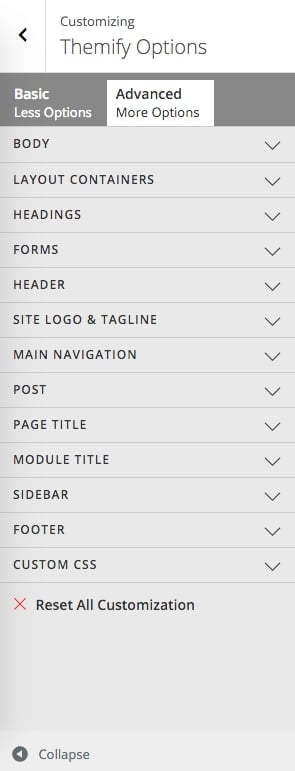
Styling The Theme
To style the theme frontend appearance:
Go to WP Admin > Appearance > Customize.
It will take you to the Customize panel with live preview where you can style the appearance of the theme design (ie. color, background, font, spacing, border, etc.).
FYI: Refer to Customize documentation for more info.
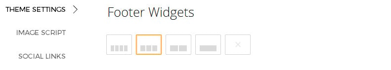
Footer Widgets
To set the Footer Widget column layout, go to WP Admin > Themify > Settings > Theme Settings.
To drop the widgets in the Footer Widgets, go to WP Admin > Appearance > Widgets.
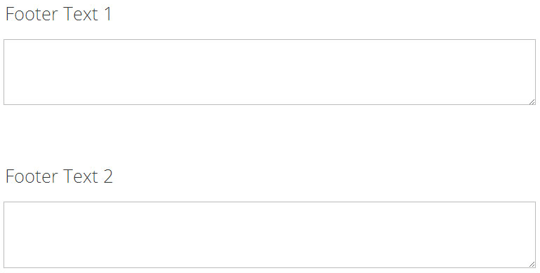
Footer Text
To replace the footer credit links:
Go to WP Admin > Themify > Settings > Theme Settings and enter the footer text.
HTML tags are allowed in the Footer Text.
To have empty footer text, tick the hide footer text checkbox.
To welcome 2015, we're very excited to introduce an amazing brand new theme — Stack. Inspired by Windows 8 Metro design and Themify Metro theme, we've built this theme to work seamlessly with the Tiles Addon (included in the theme), allowing you to create amazing metro designed layouts using the drag & drop Builder. Stack is a fluid and responsive WordPress theme that works on all resolutions, and on any device (desktop, tablet, and mobile). It comes with masonry & infinite scroll features for WordPress Post Formats, portfolio, and WooCommerce shop.
STACK Theme 40% Discount
To celebrate the release of this new theme we're giving 40% OFF to all Stack theme purchases from now until January 11, 2015. Just use the coupon code: STACK. Update your site with this amazing new theme now!
To install themes with the WordPress theme uploader:
Download the "theme.zip" file from the Member Area
Note: some browsers (eg. Safari) auto extract zip files automatically. Right-click on the download link and select "Save Linked File As". This will allow you to download the theme as a zip file.
Login to your site's WP Admin.
Go to Appearance > Themes.
Click on the "Add New" button, then click on the "Upload Theme" button
Upload the theme.zip file (note: it is the theme.zip, not the theme-psd.zip that you just downloaded from the Member Area).
Activate the theme
FYI: You can also install themes with FTP method. Read the Installing Themes tutorial for more info.
Demo Import
If you are starting a fresh site, importing the demo content will help you understand how the theme demo is built. The Demo Import feature will import the contents (posts, pages, comments, etc.), Themify panel settings, menus, and widgets setup from our demo to your site. You can erase the demo content afterward.
To import the demo setup:
Go to WP Admin > Themify > Settings > Demo Import and click "Import Demo" button.
Note that the featured images will be replaced with an image placeholder for copyright reasons.
To erase the demo setup:
On the Demo Import tab, click on the "Erase Demo" button which will then remove the demo content.
FYI: If the Demo Import does not work on your site, you can use the WP Admin > Tools > Import tool to import the demo content manually.
Site Logo & Tagline
To display a logo image instead of the site name text:
Go to WP Admin > Appearance > Customize > Site Logo and Tagline.
Under "Site Logo", select "Logo Image" radio button.
Upload a logo image.
Specify the logo image width and height.
You can also change website Tagline from here:
Go to WP Admin > Appearance > Customize > Site Logo and Tagline.
Scroll down and under "Site Tagline" select "Text" radio button.
Enter your site Tagline.
Click "Save & Publish".
Main Navigation Menu
To create a custom navigation menu:
Go to WP Admin > Appearance > Menus.
Click on "create a new menu" to create a new menu (eg. Main Menu).
Add the menu items from the left panels.
To create a dropdown menu: drag the menu item towards the right (the item(s) will be indented).
When you are done adding the menu items, click "Save Menu".
To assign menu locations:
Scroll down to the bottom where it says "Theme locations" and tick the menu location checkbox.
Main Navigation = main menu on the header
Footer Navigation = footer menu on the footer (Note: some themes might not have Footer Navigation).
TIPS: You can display menus on sidebar widgets, remove the main menu, create empty links, and lightbox links. Read Custom Menus for more detailed tutorial.
Setting Up the Social Links
Step 1) To set up the social media links:
Go to WP Admin > Themify > Settings > Social Links tab.
The theme comes with some pre-filled social links. Simply enter your social profile URL in the Link input field. For example, enter 'https://twitter.com/themify' for the Twitter link.
You can choose to display either "Icon Font" or "Image".
If "Icon Font" is selected, click on "Insert Icon" to select an icon (over 320+ icons available).
If "Image" is selected, you can upload your own graphic icon by clicking on the Upload button.
To add more links, click on the Add Link button at the bottom.
To remove a link, click on the delete icon.
To arrange the display order, drag and drop the link container.
Step 2) Displaying the Social Links:
Once you have the Social Links setup, go to WP Admin > Appearance > Widgets. Drag and drop the Themify - Social Links from the Available Widgets panel to the Social Widget panel.
Optional: Customize Widget Title - such as "Follow Us". You can also "Show link name" and adjust icon size.
Hiding the RSS Icon
To hide the default RSS icon in the header:
Go to WP Admin > Themify > Settings > Theme Settings.
Under the "Exclude RSS Link", tick the checkbox that says "Check here to exclude RSS icon/button in the header".
Hiding the Search Form
To hide the default search form in the header:
Go to WP Admin > Themify > Settings > Theme Settings.
Under the "Exclude Search Form", tick the checkbox that says "Check here to exclude search form in the header".
How to Import Full Section Scrolling layouts
To import a pre-designed split scrolling layout:
Add a new Page.
On the page's Themify Custom Panel > Page Options, select:
Full Section Scrolling = Yes
This will disable the sidebar, preset the content width, and hide the page title automatically.
On the Discussion panel, uncheck "Allow discussion" checkbox (this will disable the comments on the page).
Publish and view the page frontend.
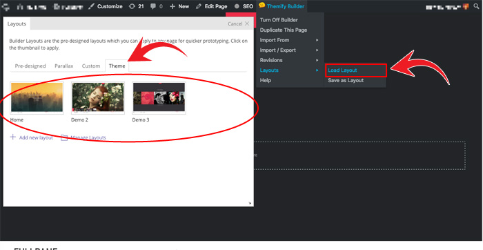
Turn on the Builder on frontend, on the top admin bar, select Themify Builder > Layouts > Load Layouts.
A lightbox window will appear where you'll be able to toggle between Pre-designed, Parallax, Custom Builder, or Theme layouts. Click on "Theme" tab and click on a thumbnail image to import.
Pre-design tab consists of all Layouts in the Builder.
Parallax tab consists of all Layouts that have parallax scrolling effect.
Custom tab is where you find your own custom Layouts.
Theme tab consists of the layouts built specifically for this theme.
When it asks to replace or append the layout, click "Replace Existing Layout".
Now you may replace the images and text as you like.
Designing Pages with the Builder
The video below shows how to create the Fullpane demo homepage using the Builder. Follow the step by step and the video to learn it.
Important Notes:
Row Height:
Default = the content in the row will be aligned vertically in the middle
Full Height = the content in the row will start from the top of the row
Each row will have a page marker that is part of the full section scrolling feature.
Row Anchor: To auto scroll to a particular row when the menu is pressed, go to your row option and write the text that you would like to anchor that row to your menu. To learn how to create a single page menu for your homepage to the Creating a Single Page Menu section on this documentation.
Step 1) To create the demo pages using our Builder as shown on our demo:
In admin, go to Pages > Add New
Enter page title
On Themify Custom Panel:
Sidebar Option = No Sidebar
Content Width = Fullwidth
Hide Page Title = Yes
Custom Menu = Choose the menu that you would like to appear as the menu for your page (we chose Builder-home-menu)
Full Section Scrolling = Yes
On Discussion panel, uncheck "Allow comments" to disable comments on this page
Publish the page and click "View Page" to view the page on frontend
Step 2) Using the Builder to construct the page content and layout:
From top admin bar, select Themify Builder > Turn On Builder
First row:
Drop in a Text module on the first row and enter your text. Demo = "Welcome to Fullpane" in heading 1 and we centered it.
On the styling tab we added Effect = "FadeInLeft".
Drop in another Text module underneath the first module and enter another text. Second line is heading 3.
In the same text module, we inserted a button shortcode. To create your own custom button shortcode, click here.
On our demo page we used this shortcode - [themify_button style="rounded outline white" link="https://themify.org/fullpane/features"]Features[/themify_button]
On the styling tab we added Effect = "FadeInUp".
To customize the row, hover the menu icon located on top-left of the row > select Options
In the row options, enter the following options:
Background: Pick a background image by browsing your media library (i.e. https://themify.org/fullpane/files/2014/01/fullpane-landing-bg.jpg).
Background Mode: Choose "Fullcover".
Font Color: White (#ffffff).
Row Anchor: Put the exact text that you would like to scroll to when you press the text in the menu. Demo = "Welcome".
Second row:
Drop another Text module on the second row and enter the text as you like and center it in the text editor. For this row, we showed our Portfolio posts and used heading 2.
On the styling tab we added Effect = "FadeInLeft".
Drop another Text module below the first Text module and insert Portfolio shortcode: [themify_portfolio_posts="grid4" limit="4" image_w="320" image_h="280"]
To see how to set-up the portfolio post type, refer to the documentation: Portfolio Post Type
Button shortcode used on this row - [themify_button link="https://themify.org/fullpane/post-type-layouts/portfolio-layouts/" style="outline white"]More Work[/themify_button]. In the demo we also centered the button.
On the styling tab we added Effect = "FadeInUp".
Now let's edit the row options. Go to the row menu icon and select Options, enter the following options:
Row Width: Fullwidth (Choose this option to fully show the Portfolio Post type and have the same effect as our demo)
Background Color: Choose any color that you would like. On our demo, we used color code #01C9A1.
Row Anchor: Put the exact text that you would like to scroll to when you press the text in the menu. Demo = "Works".
Note: make sure you have added Portfolio posts first, otherwise this themify_portfolio_posts shortcode won't show anything.
Third row:
Drop another Text module. For the demo, we used this row to showcase our gallery posts.
To get the same look as the demo use this shortcode - [themify_gallery_posts limit=“8” style="slider”]
To see how to set-up the gallery post type refer to the documentation: Gallery Post Type
On the styling tab we added Effect = "FadeInUp".
Again, hover the row menu icon and select Options. Enter the following options:
Row Width: Fullwidth
Row Height: Fullheight (100% viewport height)
Row Anchor: Put the exact text that you would like to scroll to when you press the text in the menu. Demo = "Gallery".
Fourth row:
Drop another Text module on the fourth row and enter the text as you like and center it in the text editor. For this row, we showed our Testimonials posts and used heading 2.
On the styling tab we added Effect = "FadeInLeft".
Drop another Text module. For the demo, we used this row to showcase our Testimonial posts.
To get the same look as the demo use this shortcode - [themify_testimonial_posts style="slider" limit="5" image_w="60" image_h="60" auto="5"]
To see how to set-up the testimonial post type, refer to the documentation: Testimonial Post Type
On the styling tab we added Effect = "FadeInUp".
Again, hover the row menu icon and select Options. Enter the following options:
Background Color: Choose any color that you would like. On our demo we used color code #F554AF.
Row Anchor: Put the exact text that you would like to scroll to when you press the text in the menu. Demo = "Testimonials".
Fifth row:
Drop another Text module on the fourth row and enter the text as you like and center it in the text editor. For this row, we showed our Features module and used heading 2 for the Services title.
On the styling tab we added Effect = "FadeInLeft".
Select 4 columns on the row layouts then drag and drop a Feature module:
Feature Title: Input any text you would like to appear at the bottom of the circle. On our demo we inserted the "Web Design" text.
Text Editor: Insert any text you would like to appear at the bottom of the feature title.
Layout: Choose the layout you would like your features module to appear. We chose the third layout.
Circle: Input the percentage that you would like the circle animation to fill the circle to. Stroke is the thickness of the circle animation. Choose the color that you would like on the color picker. There are 3 sizes: small, medium, and large.
To copy our demo here are the parameters we used:
Percentage: 70
Stroke: 2px
Color: #64B218
Size: Large
Icon Type: Choose to upload an icon or image. For the demo, we used the "fa-desktop" icon and the #64B218 color for the icon color.
On the styling tab we added Effect = "FadeInUp".
Repeat these steps for the remaining 3 other columns. Below are the icon types and colors that we used for the following feature modules:
Column 2: Icon - "fa-calendar-o"; Color - #8352A8; Size - Large
Column 3: Icon - "fa-shopping-cart"; Color - #ff0303; Size - Large
Column 4: Icon - "fa-bar-chart-o"; Color - #1F94B8; Size - Large
Hover the row menu icon and select Options. Enter the following options:
Background Color: Choose any color that you would like. On our demo, we used color code #ADFFEF.
Row Anchor: Put the exact text that you would like to scroll to when you press the text in the menu. Demo = "Services".
Sixth row:
Drop and drag a video module.
Video Style: Choose the layout you would like your video to appear. For the demo we chose the first layout.
Video URL: Insert any YouTube, Vimeo, or other video sources video that you would like.
Video Width: For the video width we placed this at 100%
On the styling tab we added Effect = "FadeInUp".
Hover the row menu icon and select Options. Enter the following options:
Background Color: Choose any color that you would like. On our demo, we used color code #030303.
Row Anchor: Put the exact text that you would like to scroll to when you press the text in the menu. Demo = "Video".
Seventh row:
Drop another Text module on the seventh row and enter the text as you like, and center it in the text editor. For this row, we showed our Team posts and used heading 2 for the title.
On the styling tab we added Effect = "FadeInLeft".
Drop another Text module below the first. For the demo, we used this row to showcase our Team posts.
To get the same look as the demo use this shortcode - [themify_team_posts style="grid4" limit="4" display="none" image_w="85" image_h="85"]
To see how to set-up the team post type refer to the documentation: Team Post Type
On the styling tab we added Effect = "FadeInUp".
Again, hover the row menu icon and select Options. Enter the following options:
Background Color: Choose any color that you would like. On our demo, we used color code #8FEEFF.
Row Anchor: Put the exact text that you would like to scroll to when you press the text in the menu. Demo = "Team".
Eighth row:
Drop another Text module on the seventh row and enter the text as you like, and center it in the text editor. For this row, we made a call to action row and used heading 2 for the title.
On the styling tab we added Effect = "FadeInLeft".
Drop in another Text module underneath the first module and enter another text. Second line is heading 3 and we inserted links on some of the text using the text editor features.
In the same text module, we inserted a button shortcode. To create your own custom button shortcode, click here.
On our demo page we used this shortcode - [themify_button style="rounded outline white" link="https://themify.org/fullpane/demo-2/"]Demo 2[/themify_button] [themify_button style="rounded outline white" link="https://themify.org/fullpane/demo-3/"]Demo 3[/themify_button].
On the styling tab we added Effect = "FadeInUp".
In the row options, enter the following options:
Background: Pick a background image by browsing your media library (i.e. https://themify.org/fullpane/files/2014/01/fullpane-landing-bg.jpg).
Background Mode: Choose "Fullcover".
Row Anchor: Put the exact text that you would like to scroll to when you press the text in the menu. Demo = "Buy".
Save: don't forget to save the Builder when you are done with each step.
FYI: There are more features available in the Builder. Please refer to the Builder documentation for more info.
Section Scrolling
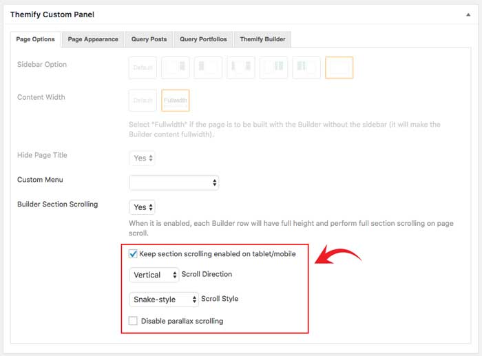
Ultra comes with the section scrolling functionality. This allows you to scroll through your page one row at a time. You can enable this feature on each page by editing your page and scrolling down to your Themify Custom panel > Under the Page Option tab. Enabling the Section Scrolling will automatically set to hide the page title, "No Sidebar", and set the page to "Fullwidth" and "Fullheight" for each row.
Selecting "Yes", you'll see the following options appear:
Keep section scrolling enabled on tablet/mobile - Check this option to enable the section scrolling feature on mobile or tablet.
Scroll Direction - Choose the scroll direction "Vertical" or "Horizontal" scrolling.
Scroll Style - Choose "Snake-style" to allow the rows to continuously scroll. The "Single Direction" scroll style only scrolls until the very last row and won't continue to scroll.
Disable parallax scrolling - By default the parallax scrolling feature is enabled. Selecting this option will disable the parallax scrolling effect.
ScrollTo Row Anchor Menu (Single-Page Menu)
To achieve scrollTo row anchor:
Step 1) First enter the Row Anchor name in Builder > Row > Options (e.g. "portfolio").
Step 2) Then in the WordPress menu link (WP Admin > Appearance > Menu), insert the anchor name as link URL = "#portfolio" (basically add # in front of the anchor name).
Step 3) On the page where you want to have the single page menu, select the menu in Themify Custom Panel (the Themify Custom Panel is located below the content editor when you add/edit the page).
Result: When the #portfolio link is clicked or when users go the URL with the #portfolio anchor (eg. http://yoursite.com#portfolio), it will scroll to the row where it specified Row Anchor = "portfolio".
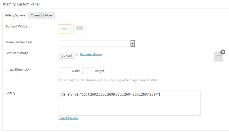
Gallery Post Type
Gallery posts are designed to show full section galleries in the Section post.
Adding Gallery Posts:
To create a Gallery post, select "Add New" under the Gallery admin menu.
You can provide a title and description content using the standard WordPress edit page, and further customization options are available in the Themify Custom Panel.
Featured Image = This option is used to set the featured image for the portfolio post. You can upload or use an image from the media library.
Image Dimensions = This option is used to set the dimensions the portfolio images will be displayed at.
Gallery = This option is used to create the image gallery that will be displayed. You can manually enter a gallery shortcode or use the "Insert Gallery" link to use WordPress' media panel.
Displaying Gallery Posts using Shortcodes:
You can use the [themify_gallery_posts] shortcode to display gallery posts. There are various parameters you can use with the [themify_gallery_posts] shortcode to customize output such as the following examples:
[themify_gallery_posts]
= display gallery posts with default settings.
[themify_gallery_posts limit="8" style="slider"]
= to have the same design as our demo gallery slider.
= display latest gallery posts from gallery categories galleries and home section, given that their text slugs are "galleries" and "home-section".
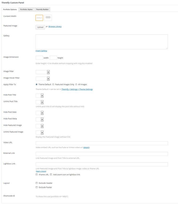
Portfolio Post Type
Portfolio posts are designed to show multimedia work on your site.
Adding Portfolio Posts:
To create a Portfolio post, select "Add New" under the Portfolios admin menu.
You can provide a title and description content using the standard WordPress edit page, and further customization options are available in the Themify Custom Panel.
Featured Image = This option is used to set the featured image for the portfolio post. You can upload or use an image from the media library.
Slider Gallery = This option is used to create an image gallery that will be displayed in a slider for the portfolio post. You can manually enter a gallery shortcode or use the "Insert Gallery" link to use WordPress' media panel.
Show Media = This option is used to set how the media in the gallery will be displayed in the portfolio post.
Slider = Gallery images will be output as a slider
Image = Gallery images will be output as images
Image Dimensions = This option is used to set the dimensions the portfolio images will be displayed at.
Hide Post Title = This option is used to set whether the post title will be displayed.
Unlink Post Title = This option is used to set whether the post title will operate as a link.
Hide Post Date = This option is used to set whether the post date will be displayed.
Hide Post Meta = This option is used to set whether the post meta will be displayed.
Hide Featured Image = This option is used to set whether the featured image will be displayed.
Unlink Featured Image = This option is used to set whether the featured image will operate as a link.
External Link = This option is used to link the post featured image and title to a custom URL.
Lightbox Link = This option is used to link the post featured image and title to open a URL in a lightbox. This defaults to expecting an image URL.
iFrame URL = If checked, this will open the URL as an iFrame within the lightbox and can be used to open external URLs such as other pages or sites.
Add zoom icon on lightbox link = This option sets whether a zoom icon will be shown on the featured image when set to a lightbox link.
Shortcode ID = This will list the shortcode which can be used to display this portfolio post
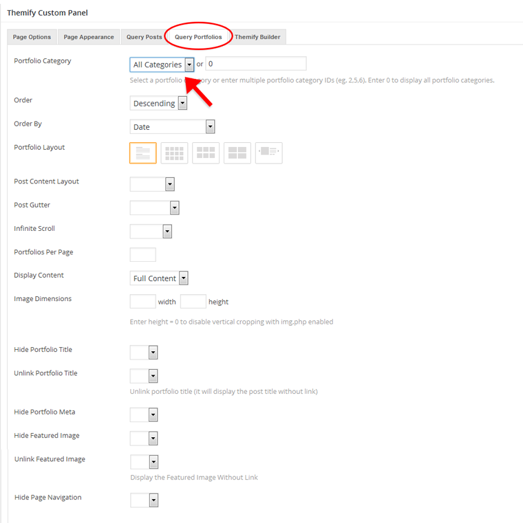
Displaying Portfolio Posts on Pages:
To display portfolio posts, you can use either the "Query Portfolio" tab on pages or the [portfolio] shortcode elsewhere.
When creating or editing pages, you can use the "Query Portfolio" tab in the Themify Custom Panel to output a list of portfolio posts.
Portfolio Category = This option is used to set which categories will be included or excluded in the post list.
Order = This option is used to set whether posts will be ordered in ascending or descending order.
Order By = This option is used to set the attribute that the order of the post will be based on.
Portfolio Layout = This option is used to set the layout of portfolio posts, such as grid columns, list posts, etc.
Portfolios Per Page = This option is used to set the number of portfolio posts shown per page.
Display Content = This option is used to set what content is output for each portfolio post (None, Excerpt, or Full Content).
Image Dimensions = This option is used to set the dimensions the portfolio images will be displayed at.
Hide Portfolio Title = This option is used to set whether the post title will be displayed.
Unlink Portfolio Title = This option is used to set whether the post title will operate as a link.
Hide Portfolio Date = This option is used to set whether the post date will be displayed.
Hide Portfolio Meta = This option is used to set whether the post meta will be displayed.
Hide Featured Image = This option is used to set whether the featured image will be displayed.
Unlink Featured Image = This option is used to set whether the featured image will operate as a link.
Hide Page Navigation = This option is used to set whether the page navigation for portfolio posts will be displayed.
Displaying Portfolio Posts using Shortcodes:
If you are not using pages, you can use the [portfolio] shortcode to display Portfolio posts.
There are various parameters you can use with the [portfolio] shortcode to customize output such as the following examples:
= display latest 8 Portfolio posts from Portfolio Category ID 13 in grid2 layout.
[portfolio category="web-design,illustration"]
= display latest Portfolio posts from portfolio categories Web Design and Illustration, given that their text slugs are "web-design" and "illustration".
Changing the Portfolio Permalink Slug
To change the portfolio post base slug, go to Themify > Settings > Portfolio Settings. The default portfolio base slug is 'project' (e.g. it would be http://yoursite.com/project/portfolio-name). You may change it to anything (only lowercase letters, numbers, dash and underscore allowed). After you changed the base slug, go to WP admin > Permalinks and click on "Save changes" button to refresh the setting.
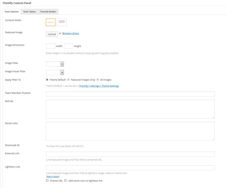
Team Post Type
Team posts are designed to show the various members of your organization or team.
Adding Team Posts:
To create a new Team post, select "Add New" under the Teams admin menu.
You can provide a title and description content using the standard WordPress edit page, and further customization options - such as providing the team member a position, skill set and social links - can be set in the Themify Custom Panel.
Featured Image = This option is used to set the featured image for the team post. You can upload or use an image from the media library.
Image Dimensions = This option is used to set the dimensions the team post featured image will be displayed at.
Team Member Position = This option is used to set the position listed for this team member when output.
Skill Set = This option field can be used to output content describing the team member's skills. You can use the progress bar shortcode in this field.
Social Links = This option field can be used to output content providing links to the team member's various social networks. You can use the team social shortcode in this field.
Shortcode ID = This will list the shortcode which can be used to display this team post.
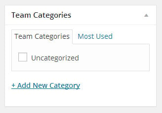
Team members can be given images using the standard featured image options, and you can categorize the Team posts by selecting or adding new categories in the Team Categories panel.
Team Social Link Shortcode
You can use the team social links shortcode to output various social links for team members. To display the social links, you can simply enter the shortcode in the post/page content box. You can configure the result by adding various parameters such as the following examples:
To display the Team posts simply enter the shortcode in the post/page content box. You can configure the result by adding various parameters such as the following examples:
limit = number of post to query (e.g. enter limit="4" will query 4 posts, enter -1 to query all posts)
category = category ID number or text slug (default = all categories). To find category ID number or text slug, click on "Team Category" link located under the Team admin menu
image = show featured image or not (yes, no, default = yes)
more_link = display a custom more link after the posts
more_text = text that will appear in more_link
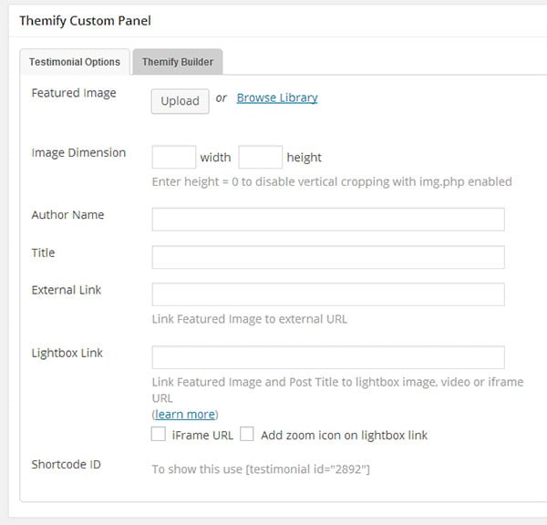
Testimonial Post Type
Testimonial posts are designed to be used to show various forms of customer feedback such as user testimonials, customer reviews, client feedback, etc.
Adding Testimonial Posts:
To create a new Testimonial post, select "Add New" under the Testimonials admin menu.
You can provide a title and description content using the standard WordPress edit page and set a featured image in the Themify Custom Panel along with other information for the customer testimonial such as author name and title.
Featured Image = This option is used to set the featured image for the testimonial post. You can upload or use an image from the media library.
Image Dimensions = This option is used to set the dimensions the testimonial post featured image will be displayed at.
Author Name = Used to set the name of the author of the testimonial.
Title = Used to set the title of the author of the testimonial such as their position at the company they represent.
External Link = This option is used to link the post featured image and title to a custom URL.
Lightbox Link = This option is used to link the post featured image and title to open a URL in a lightbox. This defaults to expecting an image URL.
iFrame URL = If checked this will open the URL as an iFrame within the lightbox and can be used to open external URLs such as other pages or sites.
Add zoom icon on lightbox link = This option sets whether a zoom icon will be shown on the featured image when set to a lightbox link.
Shortcode ID = This will list the shortcode which can be used to display this highlight post.
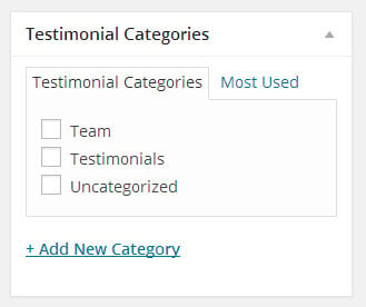
Testimonial posts can be given images using the standard featured image options, and you can categorize the Testimonial posts by selecting or adding new categories in the Testimonial Categories panel.
Displaying Testimonial Posts:
To display the Testimonial posts, simply enter the shortcode in the post/page content box. You can configure the result by adding various parameters such as the following examples:
[testimonial]
= display the Testimonial posts with default settings
= display latest Testimonial posts from 'client' (slug) category
Available parameters:
style = grid4, grid3, grid2, full
limit = number of post to query (e.g. enter limit="4" will query 4 posts, enter -1 to query all posts)
category = category ID number or text slug (default = all categories). To find category ID number or text slug, click on "Testimonial Category" link located under the Testimonial admin menu
image = show featured image or not (yes, no, default = yes)
more_link = display a custom more link after the posts
more_text = text that will appear in more_link
auto = autoplay pause length (default = 4)
effect = transition effect (default = scroll)
speed = transition speed (default = 500)
wrap = make an endless carousel (default = yes)
pager = show slider pagination (default = yes)
Progress Bar Shortcode
You can use the animated progress bars included with the Fullpane theme to display animated colored bars, which will fill to customizable amounts and display labels when output.
Displaying Progress Bars:
To display the progress bars, you can simply enter the shortcode in the post/page content box. You can configure the result by adding various parameters such as the following examples:
Installing Builder Addons is exactly the same as installing WordPress plugins.
To install the addon:
Firstly, download the addon zip file from the link provided in your Themify Member Area.
NOTE: some browsers (eg. Safari) auto extract zip files automatically. Right-click on the download link and select "Save Linked File As" and it will allow you to download as a zip file.
Login to your site's admin area.
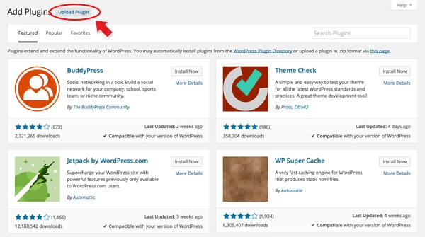
Navigate to WP Admin > Plugins > Add New.
Now, click the "Upload Plugin" link.
Select "Browse" and navigate to the plugin zip file which you downloaded in the first step and then select the "Install Now" button.
This will initiate the plugin installation process, and once finished, you can then activate the plugin.
Importing the addon demo layout
Each addon zip file contains a sample Builder data file which you can import to your site. It helps you to understand how the addon demo is created.
To import the addon demo data:
First, extract addon zip file to your local computer
You should have a folder of the addon. Inside there is a folder named "sample", and inside that folder there is a Builder data file in a zip format (eg. "addon_name_sample-builder-layout.zip").
To import the Builder layout, login to admin and then go to the page frontend where you want to import the Builder layout. From the top admin bar > select Themify Builder > Import / Export > Import, upload the sample zip file.
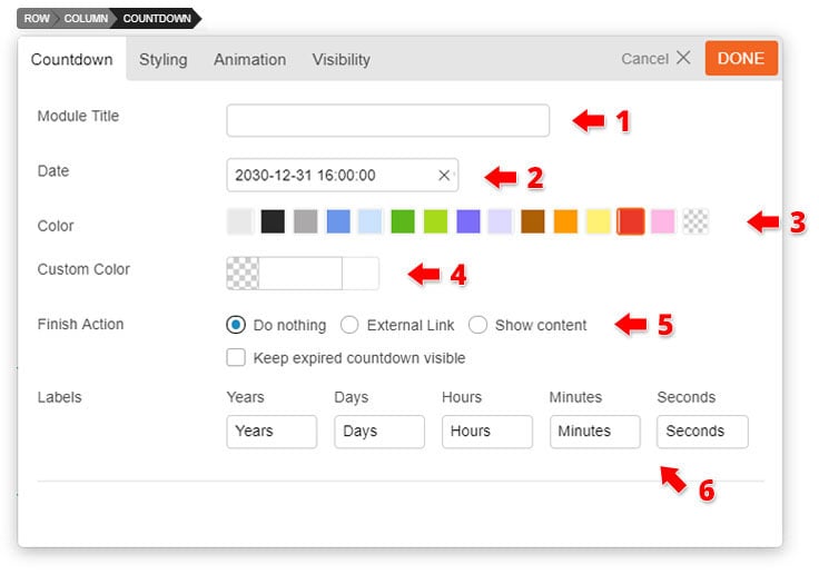
Using the Countdown Addon
Once addon is installed, you will find the Countdown addon module in the Themify module panel. The module is available in both backend and frontend edit mode (just like all standard modules).
In the backend: you can find the Countdown module in the Themify Custom Panel.
On the frontend: you can see the modules after turning on the Builder from top admin bar > Themify Builder > Turn On Builder.
Drag and drop a Countdown module in a row.
Countdown Options
1) Module Title = Insert the module title that will appear at the top of the module.
2) Date = Click the "Pick Date" button this will open a drop down calendar where you can choose the date you would like your countdown to end. At the bottom are the options where you can choose what time you would like your countdown to exactly end.
3) Color = Choose from our set of popular button colors.If you want a custom color you can do so on the styling panel.
4) Custom Color = Use the colour picker to pick a color for the background container of each number of the countdown timer. You can also adjust the opacity by adjusting the bar beside the color picker.
5) Finish Action = Choose what you would like to happen once the countdown finishes.
6) Labels = Enter any text you would like to label the seconds, minutes, hours and days. Note: The years auto appears depending on how long you set your countdown.